You might wonder whether the richest logo designs in the world are the most used and known ones, such as the Apple or Nike logos. However, that is not the case. Although their companies are large and globally famous, their logos haven’t changed that much. You will not see these well-recognized logos in this list, and you will definitely be shocked once you find out the most expensive logos and their costs.
Logos take time to develop a reputation toward the audience. In this blog, you may see some logos you have seen before, and some may be new to you. It is tough for brands to make a strong brand identity with a logo design. This is why these brands you see have made a huge investment in their logo designs, where there was zero room for errors. Thankfully, these logos succeeded and helped make a strong brand reputation in the market. Here, it is important to remember that your logo does not necessarily have to be the richest logo on this planet. Some logos out there weren’t the most expensive ones to create, yet they made a successful entrance into the competitive market.
So, let’s jump right into the list of the world’s most expensive logos. If you are looking for inspiration for your new logo design, you can learn from these and take notes on what to avoid and what to include.
12 Most Expensive Logo Designs
1. Symantec Brand & Acquisition
Symantec Corporation (now known as Gen Digital) is a multinational software company. The company is known for providing cybersecurity software and other services. This company is known as a Fortune company and stands out from the market because of its comprehensive security, system management, storage, and other solutions to its customers. Although they changed their logo design in 2022, we will discuss the design they made in 2010, which lasted for 9 years until the next change.
Here is the Symantec logo cost: $1.28 Billion
Get in touch with our 24/7 available representatives now!
Looking for an Affordable
Logo Design Services
Chat With us to avail 30% OFF
The Symantec logo design became instantly recognizable worldwide, with a wordmark and an emblem that was recognizable without the wordmark.
Although the Symantec logo design did not seem expensive, the VeriSign check mark added value and worth. The checkmark symbolizes trust, loyalty, and proof of website security. This VeriSign check mark stayed as the emblem for NortonLifeLock. Some have argued that there was no need for this Symantec logo cost to be so high. It has been mentioned that the price could have been negotiated and lowered. However, others mention that this may have been a strategy for this logo design to be recognised in the first place.
The Symantec emblem is a yellow circle with a black tick inside, drifting away from the end. This emblem signifies trust and proven loyalty, and customers feel accepted.
So, whether the Symantec logo cost is justified depends on the value Symantec placed in the VeriSign checkmark and its long-term strategic goals. If this checkmark boosted the company’s market sales in any way (which it did), then this could be seen more as an investment.
Interested in KPop? Read our blog: 35 Popular K-Pop Logo Designs That Are Totally Daebak.
2. British Petroleum Logo & Marketing Campaign
In the list, this is the second most expensive logo design in the world, reaching a whopping $210 Million. British Petroleum, or BP, is known to be one of the world’s largest gas and oil companies. Let’s see why the logo design costs so much.
Get in touch with our 24/7 available representatives now!
Looking for an Affordable
Logo Design Services
Chat With us to avail 30% OFF
The logo design looks more like a badge and is recognizable because of the vibrant colors used. Additionally, this is more of an emblem since the letters on top of the actual logo are in simple, modest lowercase “bp” lettering. The first thing that customers will see is the stylized flower (we will later interpret why this logo design was made this way).
The emblem has four colors: dark green, light green, bright yellow, and white. This logo is welcoming and delightful to look at. It is bright and confident, showing that the company is strong and professional. Now, let’s interpret this logo design to justify why it is on the list of expensive logos in the first place. If you have noticed that petrol stations place their logos high on the promotional stands, they also mention the services they provide and other products they have. If you see this emblem from afar while driving to a petrol station, you will instantly notice this symbol and go for it. Another thing is that if you are driving, this symbol is hard to ignore and could even remind you that you need to fill the gas. So, if you really think about it, this sunflower-shaped “Helios mark” has done justice to the brand, making it to the list of the world’s most expensive logos.
Do you know about LEGO? Ever wonder what the first LEGO logo looked like?
3. Accenture Logo Design
The next most expensive logo design making it to the list is the Accenture logo design. The Accenture logo cost is a jaw-dropping $100 Million. Why? Let’s look into it. Accenture is a global professional services company that provides various services and solutions in technology, operations, consulting, and more strategy. The company helps organizations to improve their performance and create sustainable value for their stakeholders.
The Accenture logo is straightforward and not that different from the other logo redesigns it has done in the past. However, this logo design seems to be the most expensive of its multiple redesigns. The logo is pretty straightforward; it completely reflects the messages of the name itself to emphasize the service availability. All letters are in lowercase lettering, and to further stress the company’s development and dynamic future, they added a “greater-than” sign above the letter “t.” Because the logo letters are in blocky black lettering, the average person’s focus will go on the purple greater than sign.
The Accenture logo cost may seem pretty absurd to you since the last logo design for this brand was the same; the only difference was the color of the greater than sign, which was blue. Yes, that was the only difference. What makes this logo design more expensive than the last one? Well, it is possible that the logo design went through a lengthy redesign process involving multiple design firms and countless revisions. The design may include marketing materials and other aspects, too. So, it is possible that the Accenture logo cost was split into other places, too, but summed up to be this total for the final logo design.
The more reading the merrier: From River To Smile: Decoding The Secrets Of The Amazon Logo.
4. American Airlines Redesign
American Airlines is one of the major airline sectors in the US. It is headquartered in Texas and is one of the largest airlines in the world based on the number of passengers carried and revenue made. Additionally, it is one of the most trusted airlines in the US and the world. American Airlines made it to the list of the most expensive logos since its estimated cost is $50 Million.
Here is why we think it cost this much, and this opinion is based on American Airlines’ old logo designs from 1934!
Here, you will see the current American Airlines logo design, which consists of an emblem and a wordmark. The logo looks elegant and simple, and the emblem is placed on the right. The symbol looks like a flight symbol, and to some, it looks like an eagle. If you look at either of them, that means the designer’s idea was a success, and the reason for this logo being the richest logo design is justified. The emblem consists of three colors; red, blue and silver. The color scheme represents the American flag, as does the emblem since America’s national animal is the bald eagle. This emblem implies freedom and striving for success.
Know more: Top Brand Mascot Logos And What Inspired Them.
5. Tropicana Juice Rebrand
The Tropicana juice brand is an American favorite fruit-based beverage company founded in 1947 by Anthony T. Rossi. The Tropicana logo is worth an estimated $35 million, making it to the list of the most expensive logo designs in the world. This brand’s logo design underwent a couple of redesigns before it was finalized into the one you see before you.
The $35 million cost likely encompassed the logo design and a broader marketing campaign to introduce the new packaging. This could include TV commercials, print ads, and in-store displays.
Look at the features that made this logo design worth $35 million. The Tropicana logo redesign was last done in 2017 and has remained this way until now. The wordmark is in the same typeface, and there is a leaf above the “I.” The color fades from top to bottom from a lighter green to a deeper green. The wordmark is enlarged, making this logo design more recognizable all over the globe.
However, it has been mentioned that Tropicana’s expensive logo redesign did backfire for several reasons, one being that the customers did not like the new and simpler version and packaging. But here, we are not talking about failures or successes, but the fact that this logo redesign and branding were expensive.
6. Posten Norge Rebrand
Posten Norge is a Norwegian postal service owned by the state. It’s the only company with the right to distribute and deliver letters less than 50g across the whole country of Norway. So, they decided it was time to redesign their logo and invest a whopping $55 Million, making it yet another one of the most expensive logo designs in the world.
The design itself is pretty straightforward. It includes a word mark, an emblem, and two colors. The emblem includes a circle shape consisting of two hales where the upper half is gray color, and the lower is red, along with the word mark text.
7. Australia & New Zealand Banking Group (ANZ) Logo
The ANZ Logo Design was created when two large banks merged, forming the Australian and New Zealand Banking Group, a joint venture company. It is the biggest bank in New Zealand and the third-largest in Australia.
The company invested a significant amount of money in its new logo design, which features the letters ANZ, an abbreviation for its name. The logo uses white and blue colors to convey stability, security, and safety, which are important qualities for a bank.
In addition to the logo design, the company also invested $15,000,000 in a large marketing campaign that ran from 2010 to 2012. Of course, at first glance, you may not understand what makes this logo design so expensive, but the market research, rebranding efforts, and so much more that went into it to make it land on the expensive logo design list had their reasons!
8. BBC Logo Redesign
Everyone knows about BBC News, but did you know its logo was worth $1.8 Million? Well, if you didn’t, now you know! Either way, we had to add this to the list of expensive logo designs since the previous design did not suit the company as much as the one you see today. And here it is:
The last logo design had color under the letters, and the whole wordmark was italicized toward the right, making it seem like it was rushing forward. The new designs took the core element of the old design but made it more streamlined, modern, and sophisticated.
9. Pepsi Logo Redesign
Who doesn’t know about Pepsi and the “cola wars”? Pepsi is a carbonated soft drink that is cola-flavored and manufactured by PepsiCo. This brand underwent several transitions before it landed on this logo design that you see before you.
This logo design cost $1 million, making it one of the most expensive logo designs. It is minimal and includes three colors: red, white, and blue. In 2009, a reported $1 million went towards a redesign that aimed for a flatter, more minimalist look and a subtle “smile” within the design.
The brand’s current logo, created in 2014, is one of the simplest versions in the company’s history. The emblem, positioned to the left of the wordmark, has been updated to look modern and strong with its frame removed. The lettering is still in lowercase, and the “E” of the custom sans-serif typeface resembles a white wave from the iconic emblem.
Read more: Unveiling How Colors, Fonts, And Shapes Influence Customer Behaviour In Logo Design.
10. City of Melbourne Logo Design
In 2009, Melbourne was undergoing significant changes as it positioned itself as a modern and progressive city. As part of this transformation, a new logo was needed to symbolize the city’s new identity.
The logo for Melbourne City was created by the Sydney office of Landor Associates. It features sharp lines and varying shades of green and blue, reflecting the city’s corporate strength and modern values. The design successfully captures the city’s vibrant and dynamic nature, receiving positive feedback for its adaptability and impact on Melbourne’s brand identity.
Since it had an estimated cost of $625,000, we had to add it to the list of most expensive logos. Matching the cost of the London Olympics logo design, Melbourne’s city logo was redesigned in 2009. This sharp, modern design incorporates a stylized “M.”
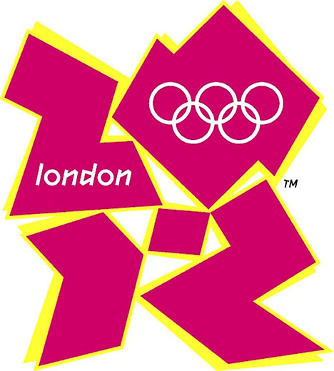
11. London 2012 Olympics Logo
Every 4 years, the world eagerly anticipates the Olympics. Due to the potential financial gains and the competitive nature of host cities striving to outdo previous hosts and enhance their reputations, the chosen city makes a significant investment in the event.
This investment encompasses not only sports facilities and tourist attractions but also extends to logo design and brand identity. For instance, the city of London spent $625,000 on its Olympic logo design.
The designer’s intention was to evoke the style of cubism and incorporate elements of London’s architecture. However, the logo’s abstract nature faced significant criticism, with many expressing dislike due to its lack of cultural or historical representation.
12. Citibank Logo Design
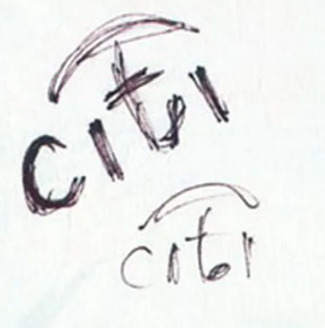
How the Citibank logo design came into existence might shock you and make you feel how easy it is to create a logo design (although that is not the case). So the story goes like this: Paula Scher was the designer for this logo design you see before you. How was it made? Well, on a napkin.
Yes, this is the original photo of how this logo design was created. And since it made it to the list of the richest logo designs in the world, it cost a whopping $1.5 Million. Below this is what they turned it into by adding color and… yeah.
It is simple and suits a bank logo. I mean, the designer did a good job. And it is worth this much for a reason.
Read more: 5 Mistakes To Avoid In Logo Design.
End Thoughts
After reading this post and doing research to discover how these logo designs were worth so much, I discovered that the most expensive logo designs mainly came from rebranding projects from well-established and big companies. It is also important to note that these prices include logo design, rebranding, marketing, research, and more. These logo designs were seen more as a long-term investment than something simple and were successful in that case. It is important to know that well-made and successful logo designs do not have to be this expensive. If that were the case, start-up companies would not have a chance!
A logo design must represent the brand well by incorporating the brand voice, philosophy, and a couple of other qualities. If you wish to take inspiration from the list of the world’s most expensive logo designs, be our guest. If you want professional and affordable logo designers to make it for you, check out LogoVent. We promise you that your wallet will not be empty with us!
Did you enjoy our list of the world’s most expensive logo designs? Then, definitely read about 30 of the world’s most famous logos to gain more inspiration!
