Most definitely, this short read will make you feel nostalgic and old, maybe (kidding), but if you are able to remember these iconic Mascot logos, you’re in for a good time! Once you notice these Mascots like the McDonald’s Clown and KFC’s Colonel Sanders, you feel a special spark of reminiscence.
These mascot logos have gone beyond the horizon of compellingly affecting their customers, from the illustrations to color concepts. For some, these mascot logos are comforting; for others, they represent trust and connection.
These mascot designs didn’t just start off this way. They were built with determination and faithful intuition. We’ve done the digging for you so you can learn more about these prominent mascot logos.
Let’s get straight to the list and learn more about these illustrious mascot logos. If you need some inspiration and wish to target your objective toward food mascot designs, you are at the right place.
However, if you already have a plan in mind and want to get started with your project right away, reach out to Logo Vent and get started on your food mascot design to be as awesome as these ones.
Note: To make this fun, organized, and concise, we will be labeling certain logos under certain headings to show what they represent the most.
Iconic Brand Mascot Logos
1. Memorable Mascot Designs
M&M’s
In recent years, these colorful candies have been evolving for some time. It hasn’t stopped them from being one of the most playful and notable mascot logo designs. The question is, what inspired the birth of these yummy candies, and how did they turn into mascots?
Long story short: During the Spanish Civil War, Forrest Mars Sr (the son of the Mars Candy Company) saw a couple of soldiers eating small chocolate pellets with a hard candy outer shell. Yep, that’s what inspired the creator. Imagine!
To make his vision come true, Forrest partnered up with William Murrie (son of Hershey executive), from which they ultimately came up with the name “M&M’s” (Mars & Murrie).
Moving on to the part about the mascots, the red and yellow ones were introduced in 1954, while the rest of the mascots came later in the 1990s. Just look at these mascots now!
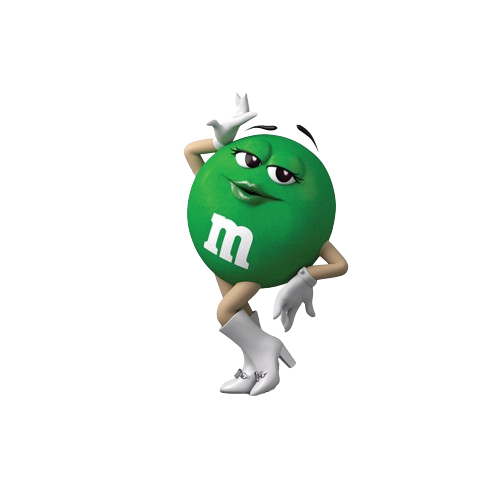
Bright, colorful, playful, and major inclusivity. M&M’s are progressing further and further. Even if you haven’t ever tried them, you would still know who and what these little guys represent.
Learn more about How Colors, Fonts, And Shapes Influence Customer Behaviour In Logo Design.
Next time you enjoy an M&M’s candy, remember its fascinating journey from wartime observation to the candy empire, filled with innovation and a sprinkle of marketing magic.
Snap, Crackle, and Pop
Surely, you’d remember these little elf-like characters on a particular box of cereal. But which one? Of course, they’re on the Kellogg’s Rice Krispies cereal box! These little guys were given such names since they resemble the little crackle and pop sounds of the Rice Krispies once they’re in your mouth. If you think hard enough, you may even remember what that feels like! For us, it brings back childhood memories!
Who designed these tiny people? It was the famous illustrator Vernon Grant! The names given to these gnomes were onomatopoeia. Back then, there was a little radio song ad that went like this (P.S. This is what inspired the creator to make these mascots):
“Listen to the fairy song of health, the merry chorus sung by Kellogg’s Rice Krispies as they merrily snap, crackle, and pop in a bowl of milk.”
![]()
Before, these adorable gnomes looked a bit older with large eyes, ears, and noses. Later, in 1949, they upgraded the characters by giving them a more youthful look, as you can see from the above picture.
These three little guys will always be a part of childhood memories since they are still popular, and this company’s branding strategy is truly a hit. However, it did take a couple of tries to make these fairy-like elf-gnomes (too many words given to these characters since that’s what they look like; you can’t blame us 😀).
It shows that you don’t have to be a master in creating such mascot logos. You can always hire professional mascot logo designers to do that for you, too. Things have become so much easier!
Pringles
Do you see Mr.P? We are sure that you have seen him, tried multiple of their flavors, and you are definitely obsessed with his mustache. Apart from all that, this iconic Mr.P mascot logo has set our chip-eating standards high! Like, c’mon, you can make duck chips with Pringles because of their legendary shapes (we know you know what we are talking about).
It is known that Loius R. Dixon played a huge role in recreating the Pringles mascot logo design, which is the one you would recognize. Louis R. Dixon is credited with creating Julius Pringles’ definitive design that still resonates with consumers today. Yes, that is Mr.P’s full name, Julius Pringles.
![]()
Ultimately, the true inspiration for Julius Pringles stays a mystery, part of the brand’s playful and enigmatic charm. Whether he was born from a specific person, collaborative brainstorming, or pure marketing genius, Julius Pringles has successfully secured his place as a recognizable and beloved mascot in the world of snack foods.
Tony The Tiger
Kellog’s Frosted Flakes Brand has its identity as Tony the Tiger mascot logo. This iconic mascot logo design was created by Leo Burnett Co. and gained its first registered trademark in 1952. Tony the Tiger was then used in every box and packaging from this brand’s production site.
![]()
Although this mascot logo design may seem like a simple feline pitchman, it also is the face and representation of the valuable Kellogg’s Food brand. From the choice of color shades to the color combinations. For example, when we see a certain shade of orange with navy blue, Tony the Tiger pops into our minds. Literally.
This tiger went through several transitions before it was to look like this. In the 1950s, it had more of a cartoonish look to it. During the 1970s, Tony became a bit ripped (like muscular ripped xD). Later, during the 1980s, Tony was often shown wearing sports gear, implying that he was always active, giving an energetic feel. It wasn’t after the 2000s that the tiger was given a more 3D-animated look.
The Quaker Man
We are sure that you know about this guy. You have seen him on packages, tin cans, and instant oats boxes! Quaker is one of the oldest mascot logos and iconic food brand logos. You would see subtle advertisements for this brand’s mascot in movies and TV shows. The Quaker Man is regarded as one of the most popular U.S. breakfasts.
![]()
Fun Fact: this man is real; his name is Larry. Just in case you were wondering.
The Quaker Man also embodies certain symbolic qualities. The straight posture and unwavering gaze signify integrity and trust. The simple, plain clothing represents honesty and humility. These interpretations align with the brand’s values of quality, honesty, and wholesome products.
Before this colored version, Jim Nash created a black-and-white headshot in 1945. Around 1957, the mascot logo was given some color. Then, later, during the 1970s, a renowned graphic designer who went by the name Saul Bass gave the mascot logo an entirely new look by adding blue and white.
See? Even memorable and iconic mascot logo designs evolve. You can even own a spectacular mascot logo design for your brand. Do keep in mind there will be some trial and error, and that is what shows dedication and effort!
2. Effectiveness in brand communication
Colonel Sanders
Known for its scrumptious Fried Chicken and so much more. This mascot logo design has made its way to global recognition. The mascot is the face of the company, literally. The creators did an amazing job designing this mascot logo since it is the most popular food mascot logo design. It has effective brand communication, and that has been the case for a long time.
Looking for an Affordable
Logo Design Services
Get in touch with our 24/7 available representatives now!
Chat With us to avail 30% OFF
A short history of this mascot logo is that during the Great Depression, the founder, Colonel Sanders, used to sell fried chicken by the roadside. In 1952, the first KFC logo appeared in the “Kentucky Fried Chicken” lettering next to the Colonel Sanders logo. The acronym “KFC” was introduced by another Schechter & Luth design agency. The transition took place in 1997 when Colonel Sanders’ mascot logo was outlined more thinly, and it looked less cartoonish and slightly more realistic.
![]()
It’s just everything about this mascot logo design that fits perfectly together. The color theory and the specific shade of red that matches the whole KFC aesthetic truly have a psychological impact on its consumers, which is why the effectiveness of this mascot logo design has a generational impact.
Ronald McDonald
Which kid and adult will not know about Ronald McDonald? And even if you don’t know about this mascot logo design, then you will know that it is one of the most popular mascots known to man. Ronald McDonald was among the most recognized brand mascots after Santa Claus. His bright yellow jumpsuit, red hair, and cheerful smile are instantly associated with McDonald’s. This level of recognition means instant brand awareness and association, which is crucial for brand recall and customer loyalty.
Fun Fact: Don’t scroll down on Google images after searching for Ronald McDonald since
![]()
Children of all ages adore this clown, and we are sure that you have taken a picture with Ronald McDonald when you were a child. Either that, or you are creeped out by clowns, which is totally normal.
Nonetheless, the creators of this mascot logo design have done an outstanding job, and we know for a fact that this guy will never be forgotten.
If you are looking for ways to gain unforgettable logo designs like these, get started on your project.
Mr. Peanut
Planters Peanut Company came up with the idea to create a mascot logo named Mr. Peanut. The peanut literally has its shell on with a fancy monocle, spats, a top hat, a cane, and white gloves. This guy is old-money fancy!
![]()
The history behind this posh-looking peanut: in 1961, a schoolboy named Antonio Gentile took part in a design contest and gave his drawings. Out of the lot, his was selected, and a commercial artist named Wallach further enhanced the drawing by adding a monocle, top hat, and cane.
This renowned mascot logo design has remained this way since then. People also prefer to keep its originality the way it is since several debates have been running around Mr. Peanut.
Chester the Cheetah
Who can ever forget this mascot logo design? When you look at it, you instantly think of those cheesy, crunchy corn puffs snacks, right? That is exactly what this cheetah represents. His face is the company! Cheetos are popular because of their effective mascot logo branding strategy. They made several advertisements for Chester and short films that engaged the kids back in the day.
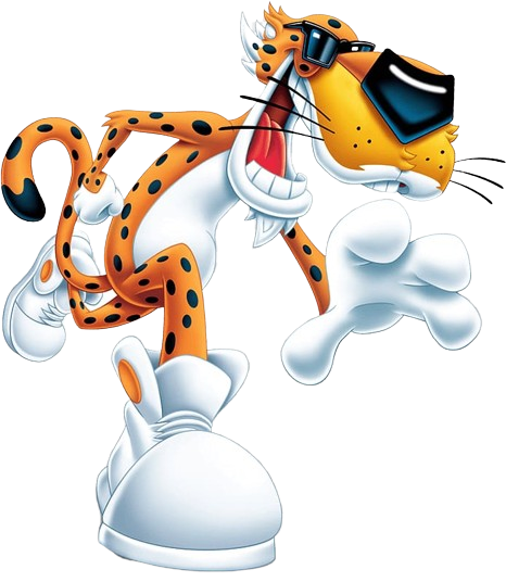
The bright orange fur, cool sunglasses, and cheeky grin make Chester instantly recognizable. He stands out on shelves and advertisements, grabbing attention amidst visual clutter. His exaggerated features and cartoonish style are simple to remember and leave a lasting impression on young minds.
Toucan Sam
Toucan Sam is loved among all kids: vibrant, energetic, and delivering quality breakfast! This mascot logo has been serving for almost generations. His success is no accident but is the result of a well-crafted and effective branding strategy to make mornings fun for kids and adults.
Toucan Sam’s adventures in Frosted Flakes commercials are full of humor and excitement and often involve overcoming challenges. These narratives capture children’s imagination and make cereal more than just a meal; it is an adventure.
![]()
Usually, you’d see him holding a spoon, but there are different variations. But his overall aesthetic has always remained considered and iconic for generations. While retaining his core identity, Toucan Sam has undergone subtle updates over the years to stay relevant and modern. This ensures he remains relatable to new generations without losing his nostalgic charm.
3. Uniqueness and Creativity
Wendy’s
Wendy’s logo features a real person, Melinda Lou “Wendy” Thomas-Morse, daughter of the founder Dave Thomas. This personal touch adds a sense of authenticity and warmth, humanizing the brand beyond a generic cartoon character.
The inscription “mom” hidden among the stripes on Wendy’s collar subtly alludes to the brand’s focus on home-cooked goodness and quality ingredients, differentiating it from competitors emphasizing artificial flavors or mascots.
![]()
While retaining the core elements of the red hair and pigtails, the Wendy illustration has been updated over the years, becoming more contemporary and dynamic without losing its recognizable charm. This flexibility ensures the logo stays relevant while maintaining its nostalgic value.
Pro Tip: We believe that with the right guidance and professional team of logo designers, you too can own a logo design representing your brand and increase your status through the power of logo designs. We encourage you to contact LogoVent for this!
Coco the Monkey
Coco the Monkey! He’s been the cheeky and lovable mascot of Coco Pops (known as Choco Pops in some countries) since 1963. He went through a bit of changes throughout, and now, in 2024, you’ll see him have a more kiddy look. It seems like these guys will never age. Of course, this is to attract the younger crowds, though. But it works on us adults as well!
Coco is a friendly chimp with bright brown fur, big eyes, and a mischievous grin. He usually wears a yellow shirt and blue trousers, reflecting the cereal’s signature colors, but now he has a white shirt, probably to represent milk.
![]()
In essence, Coco the Monkey is not just a mascot; he’s a friend, an adventurer, and a symbol of childhood fun and chocolatey goodness. He has successfully helped build the Coco Pops brand and remains a cherished icon for many cereal lovers, young and old.
Cap’ n Crunch
The Cap’n Crunch mascot logo is of a naval captain from the late 18th century. As you can see, he is old, with no wrinkles or sun spots, has a big, thick beard and thick brows, and wears the captain’s hat with his uniform. On his hat, you can see the giant C and the overall details of this ascot logo are something that all kids will definitely remember.
![]()
From the illustrations to the color coordination and the eyebrows hovering over the captain’s hat, this mascot logo design has made an intentionally catchy impression on all kids and adults.
Trix Rabbit
Probably not as unique as you think, but if you compare this to a regular rabbit, for sure, kids will remember the Trix Rabbit more. Okay, that was a joke. But yes, the branding and advertisement strategy for this particular mascot logo design is so compelling to kids and adults that it has ultimately become the most amusing food advertising character of all time!
![]()
The Trix mascot logo design was first introduced in 1956 by General Mills; the idea came from turning the previous rabbit puppet into a Trix mascot logo instead. Later, the illustrations were so good and emitted this energetic feel that the mascot logo design turned into a semi-animated series of the “Silly Rabbit.”
I mean, just look at its goofy little face and overall stance; it does look wild, unique, and fun!
Kool-Aid Man
Every ’90s kid knows this guy. And if you do recognise him, then you are old, my friend (Just Kidding… Again xD). This mascot logo is of a glass pitcher filled with a popular powdered sugar drink mix. This brand has been renowned in the U.S. and is very popular among children. In fact, most kids would make a Kool-Aid man stand during the summers as a hobby or to earn a little, just like those lemonade stands.
Fun Fact: According to The Time Magazine, Kool-Aid Man is mentioned in the list of “Top 10 Creepiest Product Mascots.”
Kool-Aid Man came to life (not literally) in 1954, created by Marvin Potts. The idea of drawing a pitcher with a face on it came to his mind when, one day, he saw his son drawing on a foggy window.
![]()
This mascot logo you see above is meant to bring joy and fun and Kool you down completely on a hot summer day. The original flavor is Cherry Kool, and you can see that he is holding a smaller version of himself in his hands. Yes, hands. And his legs, well. The more you stare at it, the creepier it gets.
Regardless of how it may seem to you, the designers did an amazing job making this mascot logo memorable. Now, in 2024, people still recognize the Kool-Aid Man. This mascot logo design appeared in commercials, promotions, and merchandise. It just shows how a simple design like this has become memorable and iconic. However, linked with this is also the quality of the product and the branding strategy, to which we believe they have done a good job.
Over To You!
Mascot logos are a memorable and effective way to make your brand gain the recognition it deserves. They attract both kids and adults and give the brand a unique and iconic face. Hopefully, after this list of the top brand mascot logos, you will gain further inspiration and will have an idea of what you are looking for in your brand mascot logo!
People have been using this strategy for decades, and never has it failed to show its power. It is not only necessary for food brands to own mascot logo designs; you can create them for any industry! So, if you wish to create a mascot logo design and are looking for affordable professional logo designers to save you time and energy, contact us at LogoVent and see that magic happen right before you!