If you are a hardcore K-pop fan, not only will you enjoy this fun read, but you will also gain extensive knowledge of the significance and strategic methods logo designers for K-pop bands use. The whole world is aware of the rise of K-pop identity, and you have surely seen them almost everywhere.
Not only have they gained popularity through their stunning visuals and amazing performances with their catchy songs, but their logo designs also completely represent them. And that makes a huge impact on their recognition and worth! Music fans all over the world celebrate their favorite K-pop group by purchasing their merchandise and instantly being able to recognize their symbols and take out the meanings behind them. Some K-pop logos have a larger symbolic identity than others. We are here to discuss the most famous K-pop logos that have greatly impacted the entire K-pop industry and its fans!
You will gain inspiration from these K-pop logo designs, and if you plan on creating a logo design of your own, you can most certainly hire professional logo designers who know their way around these complex strategies! Get in touch with our 24/7 available representatives now!
Looking for an Affordable
Logo Design Services
Chat With us to avail 30% OFF
It is important to note that a compelling brand identity is crucial for musicians. Not only does it represent their band, but connects thousands of people and other industries, too! So, let’s get started!
Read more to learn how to Elevate Your Brand On A Budget!
Why Do K-Pop Artists Need A Logo?
Even if you are just starting out or already have an established band, having a logo design to represent your brand is a huge building block of your identity and career as a music artist or band. Usually, solo music artists don’t have logos, but some in the K-pop industry tend to own a logo to represent them. Some K-pop idols prefer to have their whole band name, while some prefer to choose a symbol to represent them. We will look into 35 of the most popular K-pop artists and how their logos greatly impacted the K-pop industry and fandom!
In this blog, some logo designs will have more descriptions since our experts have broken down their significance, and you can learn their hidden meanings!
Are you interested in creating similar logo designs that mean something? Logovent is here to get started on your journey!
35 Daebak K-pop Logo Designs
1. BTS (Bangtan Boys)
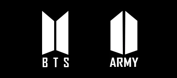
From the image above, you can note that there are two logos. The first logo on the left is the official design, representing the famous boy band known as BTS. They are known for their unique and memorable choreography and catchy songs. Now, why do they have two logos? Which may be a question that wandered into your mind. Well, it combines strategic influence on their fandom and creates a symbolic and close connection with their fans!
Let us go into a little more detail with this K-pop logo design since it represents so much more than just two geometric figures. Although one could find several different hidden meanings in this simple yet unique logo, the logo features two trapezoids that symbolize doors, meaning ARMY meeting BTS at the doors.
According to the group’s official Twitter account, the logo conveys “us and army becoming one together.”
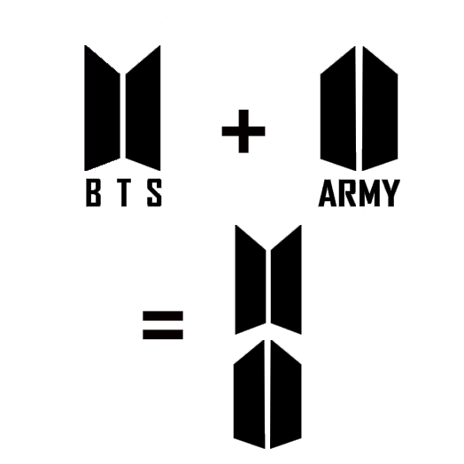
Here, you can see that when both logos are put together this way, it forms a kind of shield or a bulletproof vest, as most fans like to call it. See how a simple logo design ends up having such emotionally binding meanings?
2. SEVENTEEN
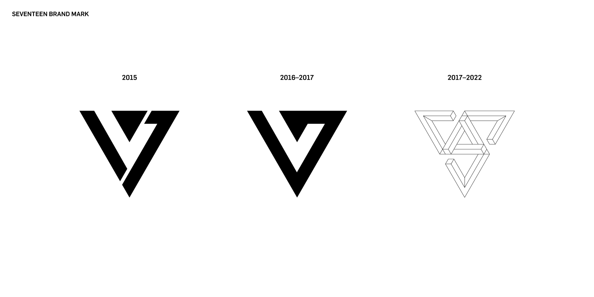
Although they have changed their brand logo a few times, the hidden meaning behind this logo design has not changed! This specific symbol has influenced many professional graphic and logo designers since it is so simple yet sophisticated. To some, it may seem like a few simple shapes, but others perceive it more creatively! Which is exactly what the creators of this logo design wanted! And they successfully accomplished it! Get in touch with our 24/7 available representatives now!
Looking for an Affordable
Logo Design Services
Chat With us to avail 30% OFF
The design is made up of three blocks placed together, which may symbolize the three subunits of the Korean pop group Seventeen. Together, these blocks form the shape of a diamond, which is a reference to their fandom name – Carats. Additionally, the three blocks also form the number 17, which is the group’s name. So, with this design, you have three pieces that represent the three subunits, and together, they form the group name ‘Seventeen.’ As a whole, the design forms a diamond, which represents the fans who hold the group together.
3. BlackPink
![]()
The symbolism and meaning behind BlackPink’s logo evolved with the group’s popularity. It represents the global K-pop movement and serves as a symbol of empowerment with its recognizable black-and-pink color scheme. The group wanted to show that they are not just beautiful ladies but also strong and talented individuals by using the pink color as a commonly known representation of femininity and black as strong and masculine. Although the designer for this logo did not use any shapes, they made sure that it also symbolizes that they are a team that encompasses not only beauty but also great talent!
4. Twice
![]()
TWICE, a popular K-pop group under JYP Entertainment has a monogram logo that incorporates bright colors such as pink and apricot in various gradient designs, which provide visual depth. The font used in the logo has curved designs that reinforce the group’s feminine qualities. Known for its bubblegum pop sound, TWICE is recognized for its unique and visually appealing logo.
5. EXO
![]()
6. SHINee
![]()
The logo designers for this specific logo did revamp SHINee’s old logo; however, it still represents the same symbol of a diamond. The typography and placement of each letter ultimately created the shape of a diamond. This is a fun and creative way of representing the brand!
7. MAMAMOO
![]()
The Mamamoo logo has a distinctive style, achieved by removing the spaces between the letters and excluding the crossbars from the “A.” This results in a smooth and seamless transition from one letter to the next. The overall shape of the logo resembles a spiky wave with two circles at the end, resembling an infinity symbol. Despite its simplicity, the logo is highly memorable and easily recognizable.
8. Red Velvet
![]()
Here is another simple yet glorified K-pop logo from the remarkable group Red Velvet. This logo is of the letter R, and its font is feminine and resembles a ribbon.
9. iKon
![]()
The design of iKON’s logo was inspired by a section of the South Korean flag. The word “icon” in the logo was replaced with “K” to represent Korea.
10. SuperM
![]()
The logo design for the group “SuperM” features sharp angles and dynamic curves, which give it a modern and powerful look. These elements reflect the group’s energetic performances and powerful music. The line in the logo is oriented upward, suggesting ambition, growth, and a desire for success. The logo cleverly uses a single line to create both the letter “S” and a stylized letter “M.” This continuous line represents the unity, connection, and flow of energy among the members and their music.
11. Got7
![]()
“GOT7” is the stylized font that represents the group’s name, highlighting their unity and identity. The bold and colorful number “7” signifies the seven members of the group, conveying their individuality, teamwork, and completeness within the group. The interconnected design of “GOT7” emphasizes the strong bond and collaboration between the members, while the bold “7” signifies the unique personalities and strengths each member brings to the group. The overall balanced design implies wholeness and synergy within the group, conveying a sense of completeness and harmony. Get in touch with our 24/7 available representatives now!Looking for an Affordable
Logo Design Services
Chat With us to avail 30% OFF
12. Monsta X

This K-pop logo has two meanings. The first meaning is “Monsters on the K-pop Stage,” and the second meaning is “My Star.” In translation from French, “Mon” means “my,” and “sta” is consonant with the English word “star”. The “X” sign in the logo represents mystery and adds strength and boldness to the name and the logo of the band.
13. WINNER
![]()
Here, we have another interlinked and continuous logo design with a trendy and simplified font to represent the K-pop band WINNER.
14. Stray Kids
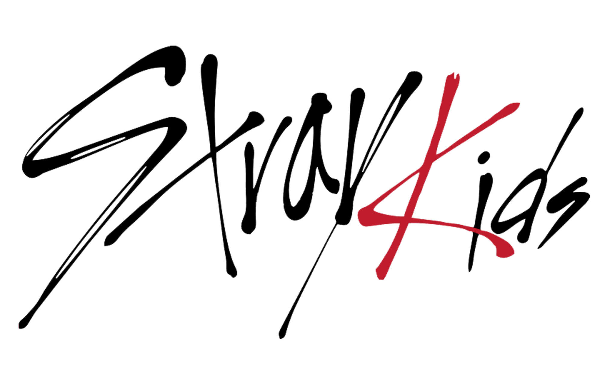
The logo of the band “SK” has two interpretations. One interpretation is that it represents the initials of the band’s name. Another interpretation is that the “Z” replaces the “S” in “Kids,” giving it a more youthful and rebellious vibe. The bold colors and angular shapes in the logo showcase the band’s hip-hop influences and “stray kids” concept. The interlocking squares suggest the growth and potential of the band members as they come together. The logo also reflects the group’s unique sound, which combines powerful rap verses with catchy melodies and diverse musical influences.
Learn more about: Typography: An Important Element In The Field Of Graphic Designing
15. itzy
![]()
16. TXT
![]()
TXT is an acronym for “Tomorrow x Together.” The name reflects the band’s desire to build a better future together and pursue their dreams as a group. The logo visually represents this spirit by showcasing individual strengths coming together to achieve a shared vision. The badge was first created for the K-pop band in 2019, and it is still used as their primary official logo. It also introduced the “three X” concept, which every new release badge is built upon. The logo version is the only one available, and it is underlined with the complete name of the band. The logo is made up of two lines, with the bold enlarged top line featuring the “TXT” name stylized as two bold plus signs (for both letters “T”) and a cross of the “X.” All the elements in the logo are of the same size. The abbreviation is placed above the uppercase “Tomorrow X Together”, where both letters “T” is replaced by the plus signs. The inscription is set in a modern sans-serif typeface and is plain black.
17. aespa
![]()
Aespa is a K-pop girl group whose main themes revolve around the digital age, breaking free from stereotypes, and a touch of femininity. These motifs are all interconnected and culminate into the representation of a butterfly. If you take a closer look at the first two letters of the group’s name, you can notice a subtle resemblance to the shape of a butterfly.
18. ATEEZ
![]()
19. ENHYPEN
20. TREASURE
![]()
Treasure’s logo has multiple layers of symbolism that represent different aspects of the group and its identity. The twelve Shining Stars/Diamonds stand for the twelve members of the group, reflecting their individual talents and unity as a whole. The Treasure Chest symbolizes potential, hidden gems, and the journey of uncovering something valuable. It represents the group’s aspirations and their commitment to showcasing their skills and talents. The text and color scheme consists of a bold, futuristic font paired with a dynamic blue and gold color scheme. This combination evokes a sense of confidence, energy, and innovation.
21. (G)I-DLE
![]()
22. IVE
![]()
23. STACY
![]()
24. LE SSERAFIM
![]()
25. NMIXX
![]()
26. Kep1er
27. f(x)
![]()
28. Big Bang
![]()
29. 2NE1
![]()
30. Girls’ Generation
![]()
31. KARD
![]()
32. Viviz
![]()
33. BB Girls
![]()
34. Wonder Girls
![]()
35. Sistar
And We’re Done!
While not all logos hide deeper meanings, their core purpose is to represent a group and resonate with their fans. Whether you’re a passionate K-pop fan, an aspiring musician, or just someone looking to craft a unique brand identity, our logo showcase offers inspiration from diverse and iconic K-pop designs.
Ready to create a memorable logo or enhance your existing one? Let the experts at LogoVent help you bring your vision to life. Discover how our top-notch services can make your brand stand out with striking and affordable designs. Explore our Design Agency to start your journey today and achieve the perfect visual identity for your brand!
Finalized whom to hire for logo design? But what about your website? Read our guide on “20 Leading Companies And Platforms For Hiring Top Website Developers In 2025” to hire the best web developer in USA.