Some of the most well-known brands of the world also have some of the most popular logos. These may not appear to be the most intricate in design, but they frequently have a deeper meaning, are memorable, and make an impression.
By quickly browsing the world’s most famous logo brands, we can learn more about what makes a famous brand logo, regardless of whether it has been around since the brand’s inception, has seen little but consistent changes through time, or is radically different from its predecessors. Read on to learn more about the logos that have gained worldwide recognition. You might take ideas for your own logo design from these examples.
1. Nike
Carolyn Davidson created one of the logos famous in history. Yes, we are talking about her swoosh for Nike.
Nike was named after the Greek goddess of victory, and the swoosh is meant to evoke the shape of her wings. Like a checkmark, it represents completion or the mantra “Just do it.” You can see how easily brand values can be integrated into an abstract, basic design with a fluid form that evokes motion and speed. Get in touch with our 24/7 available representatives now!Looking for an Affordable
Logo Design Services
Chat With us to avail 30% OFF
2. Chanel
Luxury, sophistication, and the founder’s Parisian heritage are all represented in the interlocking initials of Chanel’s famous brands logo.
The famous logo design uses only black and white. The brand’s name, represented by a wordmark logo, is frequently placed beneath it with considerable white space. Aside from the entanglement, there are no added benefits. This orderliness and symmetry are fitting for the label that created the first “little black dress.” This logo’s strength lies in its simplicity, which allows it to convey the brand’s ideals even when used on something that isn’t normally associated with it.
3. McDonald’s
McDonald’s logo affectionately referred to as the “Golden Arches,” was modeled after the actual arches that graced the chain’s first restaurant facades. The design of the logo combines the two arches seen on many restaurant franchises to form the letter mark “M.”
The chain’s “’50s drive-in” look is driven by the trademark golden arches emblem superimposed over a signature red background. Because McDonald’s has used the image so extensively, it has been synchronized with the McDonald’s brand. This emblem appears on all McDonald’s materials, from food containers to employee uniforms, restaurants, and billboards. Any takeaways? Maintain coherence.
4. Tesla
One of the logos of companies that changed the course of one of the world’s major industries is, naturally, a sleek, futuristic “T.” The founder of the company said that the logo was meant to represent “a cross-section of an electric motor.”
Tesla’s logo, like that of other famous business logos, features the initial of the company before it is branded. The “T” is likewise meant to conjure an upward motion, this time one that is electrically propelled and headed toward the future. Add depth to a monogram logo with the right choice of small elements.
5. Apple
Apples carry a lot of symbolism, as seen by their prevalence in stories as diverse as the Adam and Eve story and the story of the apple that fell on Isaac Newton’s head. Legends abound as to the significance of the apple and the bite in it, including that it was the cyanide-laced apple that Alan Turing bit into and that it was meant to be a visual pun on the word “byte.”
According to designer Rob Janoff, the bite was meant to set the apple apart from other similar fruits. But the fact that there are multiple legends regarding the logo’s origins is indicative of its cultural significance. In this case, the word “apple” is represented visually by a sleek and literal representation of the apple sign (with the slight modification already indicated). Being the one of the famous companies logo, it unites timeless, grounding knowledge with that which is modern, fluid, and ephemeral.
6. Shell
Another example of the effectiveness of word-object association is provided by Shell. Although the company’s logo has evolved over time, it has always featured a single seashell.
The Pecten Maximus, a mollusk with a big, unique shell, served as inspiration for the logo. Art deco influences may be seen in the contemporary design’s use of curves and points, as well as the use of primary colors red and yellow. You shouldn’t limit your search for visual inspiration to just your field of work. Shell’s influential logo was not inspired by conventional ideas of garages or oil. Get in touch with our 24/7 available representatives now!
Looking for an Affordable
Logo Design Services
Chat With us to avail 30% OFF
7. Starbucks
The founders chose the name Starbucks after Moby Dick’s most sane character, Starbucks, who also inspired the “Starbucks Siren” insignia logo design.
After that, legend has it that they combed through maritime tomes in search of a siren to serve as the corporate mascot. These seafaring allusions are also congruent with Seattle, the company’s birthplace and a large port city.
Adding unique characters from a specific subculture to a logo makes it more approachable and memorable. Build a more memorable and relatable identity for your brand by doing this. It’s possible that you can find literary inspiration for your brand in the characters you’ve read over the years. Perhaps there is only one facet of their character that reflects the principles of your company. Some of the best logos of all time use cultural elements in their designs like the Starbucks logo does.
8. Toblerone
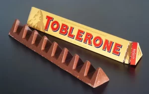
The Toblerone brand’s logo is the most recognizable logos in the world. It’s a logo designed with a specific place in mind. It consists of a wordmark and a mountain—the Matterhorn, to be exact—which also served as the idea for the chocolate’s distinctive shape: tasty triangular pieces strung together to evoke the appearance of a mountain range.
It’s easy to ignore the optical illusion in the logo until it’s too late. Redditors entered a frenzy when they realized a bear was concealed under the Toblerone mountain’s etching. Clever strategies like this can do wonders for marketing by increasing exposure and interest in the company. Do you want similarly impressive logo design but are afraid of it costing an arm and a leg? Don’t be. Our logo design packages are more than affordable. Take a look.
9. Coca-Cola
One aspect of the Coca-Cola logo that has remained constant is the use of a cursive, italicized wordmark with a wave or ribbon-like tail underlining the initial “C.”
The renowned logo’s font is the key here because it has a vintage look without appearing antiquated. The above-depicted “red disc” logo design has lately made a comeback in an effort to standardize the many different Coca-Cola variants.
10. NASA
Nasa’s current, spherical logo, imaginatively coined “the meatball,” was actually their first logo. Fairly literally presenting a planet-like silhouette, the wholesome logo depicts stars and orbits across it in the colors of the American flag.
The meatball was replaced by another logo, entitled “the worm”, between 1975-1992. This wordmark logo featured continuous, curvy letters that echo the bodily movements of a worm. Looking at it now, it feels a little retro and Star Wars-esque. Yet, back when it was released, it was considered to be contemporary, minimal and futuristic.
Nasa turned to nostalgia branding, when they made the change back to the meatball, saving the worm design primarily for their rockets. They understand the strong associations that audiences have made with their legendary logos. The meatball reigned during their most infamous period, with Neil Armstrong wearing the symbol across his chest as he landed on the moon. The brand has monopolized on these positive memories and associations still held by audiences today with the meatball while finding space for their stylized worm design.
11. The London Underground
The London Underground’s logo, called the “roundel” is in use for more than 100 years. It was created by simplifying the image of a wheel and establishing the Johnston Typeface by utilizing sans-serif fonts to ensure maximum readability.
Being one of the popular company logos, this logo comes with different colors for various stations and modes of transport However, the blue and red color scheme is the most popular one. The minimal logo is simple to comprehend, and reliable. It offers everything you could want from public transport.
12. IBM
One of the leading American logos is IBM‘s iconic 8-bar logo that hasn’t changed since its first developed in the late Paul Rand (who has also developed trademarks of UPS, Enron, Westinghouse among others). The stripes symbolize the speed and energy The bold and capital letters signal authority, confidence and a strong sense modern minimalistism. At the time the use of negative space using a font in this way was considered to be highly ingenuity. Today, it relies more on the viewers’ nostalgic feelings for that time time.
13. Prada
The luxury fashion giant, Prada is a firm believer in their original logo wordmark in such a way that they haven’t changed the design. This is common among famous designer logos as they symbolize heritage and tradition.
Its “R” is a final stroke that is angular and blocky. It is in contrast to the curvatures of the rest of the letter as well as its thin strokes on the A right next to it. The variation in weight of the font (the thickness and thickness of each letter) creates motion and flow in the wordmark that is otherwise stationary.
Unlike funny logos, Emblem logos are often used to symbolize heritage and tradition. Prada’s emblem is an simple and angular outer shape with its logo as well as a coat of arms, and a ribbon. It’s both modern and traditional design make it one of the best clothing company logos. It’s also a good idea to make common logos distinctive to decorate products with.
14. PlayStation
When PlayStation made the decision to concentrate upon 3D Polygon Graphics, the company required an identity to reflect the shift. Designer Manabu Sakamoto came up with a logo with an optical illusion that was perfect for a gaming-related brand with having an upright “P” along with an “S” which lay flat on its feet.
The colors used in the logo are principal colors blue, red and yellow with green providing a subtle transition between. Through a simple method to create depth which appeared both new and exciting the logo helped PlayStation communicate that it was a company that was committed to innovation and is a step ahead of its competitors. In order to have a new logo that separates an organization from others constant research is crucial.
15. The Olympics
All over the world The five rings that are linked together represent the same something to the worldwide public: the best of the world in sports. Five rings symbolize five continents with each having each having a distinct color, joining together in a synchronized movement. In order to convey this feeling of cohesion the designer has connected and interwoven the rings into spherical shapes.
The “Olympic rings” represents the Olympic Games globally. Via International Olympic Committee
All in all, the Olympics logo is an excellent illustration of cross-cultural design which means that the designers picked the symbol of the Olympics that could be enjoyed equally by all the world. How can you accomplish this? Study your market thoroughly and make sure that the shapes, colors icons, figures and colors that you choose to use don’t represent positive or negative notions across different cultures. With all these impressive logos, you must be feeling the need to have a next-level logo for your own brand. Our logo design services are at your fingertips. Reach out to us today for more information.
16. Marvel
Marvel launched its bold black and red logo during the 2000s’ early years, the face of iconic comics for the millennium. “Marvel” is bold white letters against an intense red background, with letters that are close to each other and occasionally even interspersed or connected. The intentional, hurried look creates a sense and urgency, similar to the action-oriented superhero.
There is still the old, retro logo that is shown above. It contains”Marvel Comics, “Marvel Comics” on a few merchandise, including the comics. It is a reference to the concept of nostalgia marketing, which is that uses the positive associations associated with familiarity to build trust in consumers.
17. Amazon
Amazon‘s famous logo for wordmarks is simple with only the right amount of details that convey the identity of the company.
The simple black and white logo is easily readible. The arrow links “a” with “z” with a single movement, similar to how your experience would be when you are on the platforms. This arrow can also be known as “the smile” and adds a warm design to your logo. The curve that is below the “z” at the point where the arrow is positioned is softly bent and gives an element of motion.
The best part is that it could be compressed into the Favicon, which is the icon that appears on the webpage, tab, or URL. A logo that is able to be broken down to a smaller icon is crucial, particularly when it comes to digital products.
18. Barbie
Among the best logos in the world – Barbie logo design stand tall. It was inspired by its creators. In 1959, the striking bright pink and fun sans-serif typeface in cursive style was a novelty that the industry of toy dolls hadn’t seen before.
The idea was to directly communicate with children. Fun playful, whimsical and ready to play. In the course of time the logo was revamped several times, but the company finally returned to the original logo that had the retro design. The logo became an integral element of the iconic Barbie style as toys that are adventurous and contemporary trendsetters.
The iconic logo was timeless enough to see this iconic Barbie doll through the ever-changing times, from beach goers to astronauts. It demonstrates the importance of a logo distinctly stylistically (and impression) driven is essential for any company that has regular and frequent product launches.
19. Google
Google released the latest version of its logo in the year 2015. The purpose of the latest version was to design an image that was the ability to be responsive, and could be used on any screen, without losing its authenticity. Since its inception the logo has been refined with every update. The logo was always identical, only becoming more pleasing to the eye.
It’s also a design that allows for significant changes without losing its fundamental structure. I’m thinking of it being the Google Doodle. The fact that a logo is simple and basic enough gives a business the ability to experiment with the design in accordance with current events. The dynamism of the logo gives it (and the business) the ability to be relevant.
20. Pepsi
The Pepsi iconic logo, known as the Pepsi Globe was first based on the bottle cap. It was adorned with red blue, white and white colors to represent American patriotic spirit throughout World War II.
The story behind the Pepsi logo has much to do with its being an alternative product to Coca-Cola. This is an illustration of a logo which is successful due to the fact that it does an excellent job of separating the brand from its rivals. The logo was initially an edgy style wordmark on its logo, but it then it changed to a modern sans-serif font to differentiate them from Coca-Cola. The spherical symbol was retained to let consumers know that they’re the same brand however, they were modernized and upgraded in order to keep the vital customer confidence.
21. Tate
The version that accompanied the company’s journey to become a well-known brand was a wordmark that was part of the name. To this, the designer in charge Marina Willer added a signature blur effect. The concept behind blur effects was to make people concentrate their attention and look at the logo. This is pretty smart, don’t you think?
The team came up with 75 variants from the exact TATE each differing by looking a bit further in or out of the focus. This concept, although amazing and unique to other designs, caused some confusion within the organization in the end. In 2016 it was “simplified” in the interest of consistency. This is the logo that we see above. Get in touch with our 24/7 available representatives now!Looking for an Affordable
Logo Design Services
Chat With us to avail 30% OFF
22. National Geographic
The National Geographic logo looks simple enough, but a lot of market research was conducted prior to designing it. Having an identifiable, flexible identity was the primary goal for the design firm Chermayeff & Geismar. Also, an attentive focus on detail is how the design was created the iconic gold border of the magazine in the logo, right in addition to the white all-caps serif.
It’s simple enough to cover any background, making it ideal for magazine’s iconic photos and covers. It is also important to remember that if the magazine expands to include affiliates, the logo might be accompanied by an additional word in order to differentiate them from one the other. A logo that’s not too specific and is structurally solid can last as the brand expands and expands.
23. Mercedes-Benz
At the time, owners of time decided to use Mercedes’s three-pointed symbol as the logo because it represented something to their family. The symbol was one that that their father’s death had used to signify their family’s home, and also something that became a symbol for air, sea and land.
While the symbol of a star may not be something that’s revolutionary, it’s impossible to believe that it’s only an ordinary “star.” It’s a Mercedes-Benz Star design features distinct shadings that make it appear more substantial and bring its 3D metallic look to mind with all the angles and sparkles. It’s also contained in a circular form, which has three points that touch creating the impression that the circle is filled with everything needed.
24. Instagram
It is important to note that the Instagram emblem is the icon for the app and has been since its inception. It’s not a lot of a surprise because Instagram is and has always been an app, but it is the reality that this small image of a camera been a symbol of the company throughout its enormous growth is quite important.
This one of the famous app logos was originally modelled on an actual Polaroid camera since the app let you capture and share photos quickly. The logo isn’t as appealing as it was initially designed, however it has the same shape of the Polaroid camera, but it’s a little more symbolic and less literal. The point here, time is that a good logo is able to convey the corporate’s goals and objectives in a single symbol. To see more impressive logo design examples of niche brands and smaller businesses, you can view our portfolio. With hundreds of logos successfully designed and delivered, we are proud of our work.
25. FedEx
When it comes to worlds most famous logos, FedEx logo stands apart. FedEx logo is well-known from a design standpoint. The widely praised logo is not just simple to look at, it also it also has a unique design trick that utilizes negative space to create an arrow between “E” in the middle and “x.” The Arrow conveys the speed of delivery, a clear sense of direction, as well as the delivery service is so smooth and easy that you hardly notice that it’s happening.
This iconic logo is an excellent illustration that “less means more” The use of negative space can allow you to create a strong logo without overcrowding it elements.
26. Mastercard
Credit cards are symbol in and of itself. The design of the card is required to be the same across different brands since they all use similar mechanisms, and we all have the same wallets, and the list goes on. Therefore, all the work involved in differentiating the credit card of one brand from the other is based on the marks on the product the card itself.
Mastercard recognized that it required an identifiable symbol to serve as its brand identity and, with those two circles interlocking it was able to achieve exactly the right thing. As we look at the way that the logo has changed over time the same pattern we’ve seen on other famous company logos has been present. The company decided to use the two circles as their logo. The clever application of color layers gives depth to the simple logo. Little design details can be a significant contribution in creating an unforgettable design.
27. Walt Disney Pictures
The basis part of the “Walt Disney” wordmark logo is used across the various brands owned by the company. It’s comprised of the signature of the founder, however, it also has some calligraphic elements. For instance”D” is the “D” from Disney (that appears more like a G some). For example, the “I” is filled with what appears to be pretzels. These tiny details entice imagination and invoke a sense of wonder – ideal for a crowd of kids and sassy adults.
Carefully executed calligraphic designer brand logos could have a good amount of character and human. This is beneficial for businesses who want to show their personal side in contrast to the corporate.
28. Formula 1
The original red the black, and white Formula One logo, now in use, was drawn up as the race began to gain international recognition and fame. Being one of the famous brands logos, it was eye-catching and effective due to a variety of reasons. The logo’s punchy design is in italics, while the red portion composed of tiny Arrows. Why? Because this directional view gives the power of a speeding vehicle. It is ideal for the story the brand is trying to tell the story of speed. If you take a closer look, you’ll notice it is the case that “1” is a result of negative space.
The updated version is a less complicated version, which is more in keeping with current fashion trends in simple monograms. It’s subtle but effective. smaller changes tend to be more appealing to loyal fans.
29. WWF
The model OFF WWF was a panda called Chi Chi. The logo featured Chi Chi primarily because she was a well-known part of the endangered species. Being one of the outdoor brand logos, the logo needed to be an emblem that communicated the conservation work across borders and different languages. Another reason was the fact that it was a natural blend of in black and white.
This image shows that a mascot can be an effective strategy for brands that want to connect with their audience on a an emotional level. It’s an emotional and effective storytelling tool.
30. MTV
MTV isn’t as renowned as it once had, but throughout the 80s and all up to the decade of 2000, MTV as well as its iconic logo were household names all over the world.
A thing like MTV was not seen on TV before, therefore its logo was among the awe-inspiring product logos in the world. The huge block-letter M that is positioned in front of the scrawled “TV,” represents the merging of two distinct styles: TV and music. The design and tone are irresistible, while the vivid static logo is easily animated by using various colorways patterns, patterns and motion graphics.
Conclusion:
Looking back, do you spot patterns in the way these best brand logos are created?
There are a variety of common threads. The most iconic logos feature their own distinctive typeface. They are skilled in their use of color and negative space. They are averse to simplicity that is complicated. This is particularly evident when viewing the evolution of a logo.
Discovering the essence of your brand starts with understanding who you truly are. Once you’ve unearthed that core identity, the next step is to distill it into a simple, repeatable symbol. At Logo Vent, we excel in this transformative process, ensuring that your logo embodies the power and uniqueness of your brand. To elevate your business with a logo that stands out, explore our expert logo design services and see how we can help you make a lasting impression today!
