Ever since the recent Netflix logo iteration, people have been able to recognize and remember it even more. While the first iteration may not even seem like it was ever Netflix, in reality, it was. We will get to that later.
The Netflix logo has become so simplified, organized, and recognizable that the word mark is now another part of the logo and is further reduced to just an emblem, “N.” That “N,” with its typeface, a specific shade of red, and simplified details, defines Netflix as you see it today. It has shaped its identity and has become famous for a reason.
Let’s delve deeper into each iteration of the Netflix logo and the compelling reasons (and the “Tudum”) behind these design changes. Understanding the evolution of the Netflix logo and the necessity for these alterations will provide a comprehensive view of the brand’s adaptability and growth.
What is Netflix?
Netflix is a giant movie and TV series streaming platform. It includes movies and original Netflix adaptations. Think of it as a huge library that has several kinds of movies and TV shows of multiple genres. This streaming platform, however, is not free. You have to pay a monthly subscription fee. Users can stream Netflix on any device from their TVs, phones, tablets, and laptops. Get in touch with our 24/7 available representatives now!
Looking for an Affordable
Logo Design Services
Chat With us to avail 30% OFF
You can stream several kinds of movies, TV shows, and even original documentaries on Netflix. This has made it easier for people to legally watch movies without any disturbances. Another great feature that Netflix has is that you can view your downloaded movies or TV shows offline anywhere. Additionally, Netflix includes content personalization, which recommends movies and TV shows based on your previous watches. Netflix also includes a child-friendly version. This means customized profiles can be made for kids to ensure safe streaming and kid-friendly suggestions.
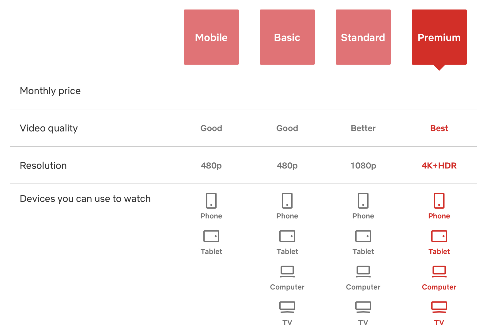
(Prices are taken out in case of fluctuation)
Definitely check out our blog: 35 Popular K-Pop Logo Designs That Are Totally Daebak.
How Did Netflix Begin?
Before we explore Netflix’s logo journey, let’s get a quick overview of the streaming giant.
Netflix was originally known as Kibble. It was founded by former marketing director Marc Randolph and Reed Hastings (a computer scientist and mathematician) back in 1997, and yes, Netflix is older than Google (shocking, right?)
The word “Netflix” comes from a combination of words like “net” and “flix,” where net means the internet and flix, a slang term for movies, means to flick. This adds to flicking through the net for movies or “deciding on what to watch next.” There can be many meanings that you can take out from this. But the main purpose is to flick through the streaming app powered by the internet to watch something.
According to Statista, because of its popularity, the famous subscription streaming service Netflix has reached around 269.6 million paid subscribers globally as of the first quarter of 2025. Seeing the rise of subscribers year by year, it is only normal to predict that by 2025, the numbers will increase. The giant streaming service is so prevalent that it accounts for 15% of the world’s online traffic.
Although Netflix has gained immense popularity over the years, not everyone knows that it is a company that has been around since 1997. It would have a mail-based DVD rental business, where it started the concept of subscription models with no late fee back in 1999.
Netflix is known as the first online DVD rental company in the world. The company’s idea came from a simple trial conducted by the founders, Hastings and Randolph, to check if DVDs could be sent through the mail. Back then, Netflix already had around 925 rentable titles.
Observing YouTube’s increasing popularity as a video streaming app, Netflix transitioned into streaming services in 2007. Although Netflix’s decision was considered long before, this move capitalized on the growing popularity of online video content and the growing accessibility of high-speed internet.
Netflix has definitely come a long way since its humble beginnings, and as with every brand that undergoes drastic changes, its logo has also undergone several iterations.
More logo designs to learn from: The Evolution Of Instagram Logo: From Camera To Icon.
More to Know About Netflix
Netflix has truly mastered the art of recommending trending movies and TV shows to its users. This makes the overall streaming process much easier since they have already decided what you would like to watch based on the previous movies or shows you have watched.
Currently, one of the top 10 popular TV shows on Netflix is Supacell (Season 1). This show tells the story of five South Londoners who unexpectedly discover they have superpowers. While real-life issues persist, lives cannot just pause. This show has made 100% rotten tomatoes, and you can stream it on Netflix.
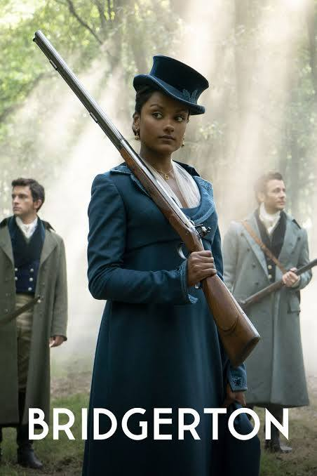
Another trending TV series is Bridgerton, which made it to the top 4 in global Netflix streaming. The main plot follows the Regency era in England, and the story revolves around eight close-knit siblings of the powerful blood of the Bridgerton Family. The attempt here is to find love.
Here is another popular TV series, actually a documentary or, better yet, a docuseries. The Worst Roommate Ever is about a series of unsettling events about a bizarre and inhumane story about a woman who poisons her best friend. If you want to watch eerie docuseries like this, Netflix is the place to go.
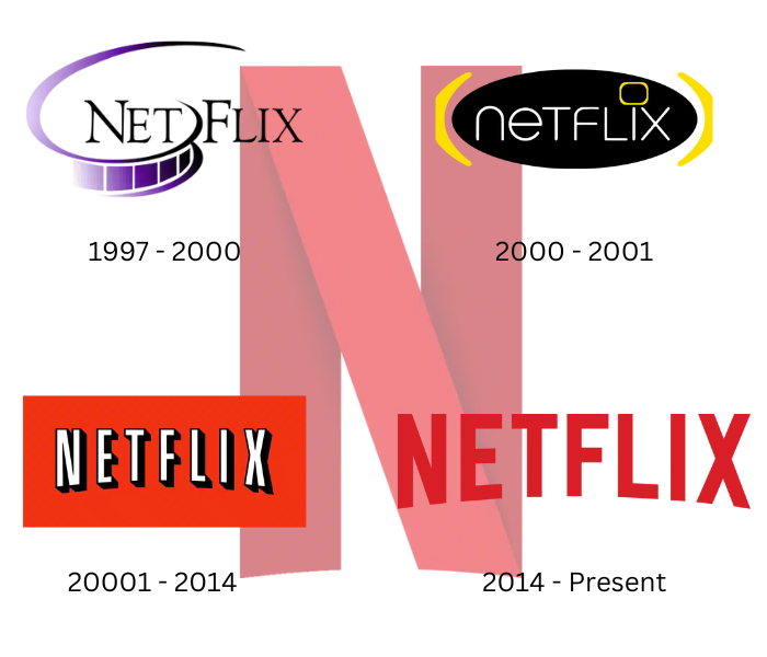
Netflix Logo Evolution
Now that you know a little backstory about Netflix and how it all began, we will look into and discuss the evolution of the Netflix logo and why changes were needed.
The First Netflix Logo (1997 – 2000)
Yes, this is the first Netflix logo. However, to bring this logo design some justice, it is better than the one you will see after this.
The first Netflix logo gives off old movie-style vibes, which seemed perfect for 1997. The serif typeface used for the wordmark was pretty common for movie and DVD-selling industries back in the day. Here, you can see that the black-to-purple film separates the words “Net” and “Flix,” where the letters N and F are slightly taller than the rest.
This first Netflix logo design was used for 3 years before the designers or founders decided to change it to the one you will see next.
The Second Netflix Logo (2000 – 2001)
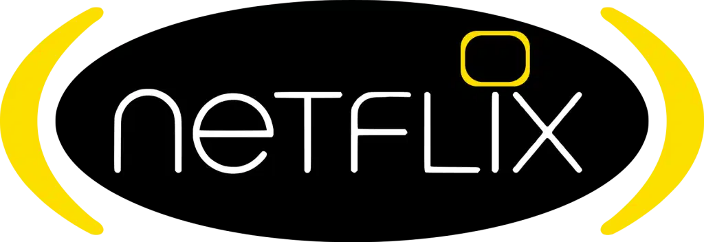
Here, the designers attempted to make a shift from vintage to “hip” or try to give it a more futuristic vibe. Well, however, if you want to interpret this, you can see that it does not really suit the brand image of Netflix that much. The color yellow was chosen. It was replaced by the black purple used in the previous Netflix logo interaction.
The Serif typeface was replaced by a softer version, with no flicks in the end (see the pun there). Instead, the edges of the wordmark were more rounded. The text is coloured white since the background is black. More on the letters: If you notice, the letters T, F, L, (and maybe) X are in uppercase letters. I’m not sure what to make from this, but it can be assumed that this was to add to the Hip-Hop vibe.
Another observation made is that the dot on the “i” is replaced by a soft-edged, yellow-stroked rectangle that imitates a TV.
The Third Netflix Logo (2001 – 2014)
The third Netflix logo seems more like a Netflix logo. And it is much more familiar since, during this era, Netflix began to rise and gain more popularity globally. You can see the colors purple and yellow were not even considered as an option (thank goodness), and the logo has been simplified.
While the Netflix logo letters remain white, you can see that they are given a 3D effect with the black “shadow” behind each letter. While the top part of the letters all align, the bottom, if you look closely, has a slight curve. The background is a bold red color, implying growth and dominance in the field of online movie streaming. This shade of red immediately captures the attention of the viewers. The black, white, and bright red contrast is certainly eye-catching, and this was the main intention of the logo.
However, this Netflix logo is still the best attempt from the ones we have seen so far. The designers knew that they could do better.
Interesting read: Ideas For Designing Logos For The Automotive And Car Industry.
The Fourth Netflix Logo(2014 – Present)
This is the power of logo simplification! Finally, the Netflix logo simplified and erased the excess clutter even more, making the main and sole focus on the word NETFLIX. The designers removed the 3D effect and instead made the curve stronger, making the letters N and X appear closer to the screen. Instead of the background being red, the designers kept the letters red and the background white. This almost represents a target but for humans ready to binge-watch movies and TV shows.
Because of the uncluttered and right choice of colors, this Netflix logo design resulted in becoming one of the most memorable and attention-grabbing logo designs worldwide.
This is all thanks to making the Netflix logo design simple and minimalistic, just enough that it represents the company well and stays easy to remember for viewers. Additionally, the background is kept white is a smart idea because when you open Netflix and before you get ready for streaming, you see a spectrum of colors like so:
The Netflix Emblem
While the overall Netflix logo is perfect enough, the designers decided to shorten it and make an emblem to further simplify it so it can be visible in smaller sections.
Take this for example:
See how the N stands out from the whole picture? This N is usually seen as it is folded or overlapping on itself. You will see it before the beginning of your movie or TV series and even at the beginning of opening the application or movie service. The N, even when it stands alone, one can instantly recognize it as part of the Netflix logo.
Here is a blog for gamers: The PlayStation Logo And Its Significance.
Netflix Logo Specifications
Netflix has not publicly disclosed the exact shade of red it uses, but we like to do our research.
This shade of red (almost many) goes well with white and black, which is why they used these colors in the 2001 Netflix logo.
However, it is important to note that the color red can change because if you look closely at the emblem N, you will notice a deeper red shade in the first two straight lines of the letter N, and the diagonal line is a brighter red shade. Another disclaimer is that the shades overall can be different depending on your device and the settings you have put it on. For instance, if you have a blue light filter on your phone, you will see a different shade of red.
Related read: Mastering Color Theory: Your Ultimate Guide.
Short Insight Behind the “Tudum”
While the final Netflix logo design itself is perfect, the addition of a sound effect called “Tudum” (you can definitely hear it in your mind) serves as an added element for quality entertainment. The inventor behind the “Tudum” is Lon Bender. Now, Netflix cannot be without the Tudum since it is part of the company’s overall advertising and branding.
However, Tudum is also an official companion site, apart from being the fun sound effect. This helps viewers find additional information and fuels their fandom about their favorite TV series and movies. On this, you can view exclusive content such as behind-the-scenes, bonus videos, interviews with the actors and more.
Learn about the Tesla logo evolution: Disclosing The Tesla Logo: Reimagining Mobility.
Key Takeaway for the Netflix Logo Evolution
The first and most important fact that is noticeable is that even the best of the best companies go through several logo iterations before they decide on the one that one logo design that defines their brand.
Styles change as time passes. Maybe they will change their logo design again in the future. Who knows? But what you should understand from this is that the design should be kept simple and catchy and act as a trophy that represents your brand and its purpose. Change is inevitable and important, no matter how successful your brand is. If your logo design is outdated and your brand is progressing, it can lead to some drawbacks that you may not notice right away but can later on.
While designing your own logo might sound exciting, partnering with a professional team like LogoVent ensures you get a custom logo that perfectly reflects your brand identity and stands out in the market. Instead of going it alone, trust our experts who use the latest tools and best practices to deliver a logo that is both impactful and competitive. Ready to elevate your brand? Visit our Logo Design Services page and let us help you create a logo that truly represents your vision.
While inspiration for logo design is done, its time for your website. Read our guide on “20 Leading Companies And Platforms For Hiring Top Website Developers In 2025” to hire a professional developer to create a stunning digital presence.
FAQ’S
When was Netflix invented?
Netflix was invented back in 1997. Marc Randolph and Reed Hastings founded it in Scotts Valley, California.
Why is the Netflix logo curved?
The Netflix logo is curved to catch the average viewer’s attention. This trick helps viewers focus more on the logo design.
Is Netflix older than Google?
Yes, Netflix is older than Google. While Netflix was founded in the year 1997, Google was founded one year later, in 1998.
What was Netflix’s first name?
Netflix was originally first called Kibble, but it changed by 1997, as decided by the owners.
