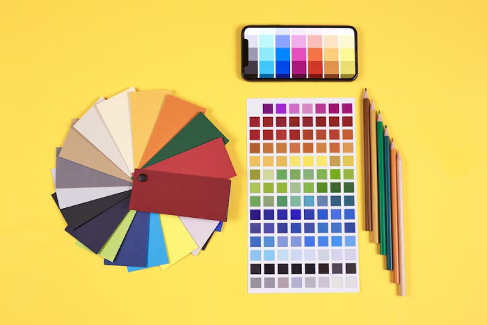
You’d be surprised how color influences the human mind. While the color theory has certain inherent principles and designated associations, its application in logo design and other variants is not entirely subjective. Here, you’ll discover the mixture between science and art while using color theory for your projects. Our experts have immense experience with how certain colors contrast, mix, and match each other. We decided to share its beauty and communicate it to all young artists and those looking to learn more about color!
This simple and comprehensive read will give you a fresh perspective and insight into color theory and its application. To make it easy, we have split these sections with respect to the color wheel, separating primary, secondary, and tertiary colors. To further enhance your experience, we will add some remarkable examples to give you a clearer understanding. So, if you are on the journey of creating an iconic logo design or product for your brand that is as award-winning as the Coke logo or McDonald’s logo, you have come to the right place to learn all these secrets!
Pro Tip: Never underestimate the power of color theory; it adds game-changing effects to your overall digital performance!
What is Color Theory?
Color theory is the study of how various colors interact with each other and how they can impact our emotions and perceptions. It acts as a toolkit for artists, designers, and creators to choose the most suitable colors for their projects. With the help of color theory, you can select colors that complete and match each other and convey the intended mood or message in your work.
Designers use this concept to add power and weightage to their end product. For example, the color red has a dominating effect on the Coca-Cola brand. Even if they change their letter/font color from white to black, the color red remains strong. For some, the color red embeds a powerful form of symbolism. Now, just to compare, McDonald’s also has red in their logo, but it’s not the first brand/product that pops up in one’s mind. That is because of the yellow contrast they used with the red color. When these two colors come to mind, that’s when you will think about McDonald’s instantly. You cannot even imagine the McDonlad’s logo with red only; the yellow that is paired with it gives the red that symbolic power!
Color theory has been used even before it was ever introduced! This is because people have preferences, and it is very normal! A fun fact is that everyone also has their own personal color palette. This is a strategy artists use to enhance people’s features using personalized colors that work for them! The same strategy is applied for logo development but for branding and long-lasting purposes. Along with this concept, you will learn more about the importance of logo design for branding success.
The Color Wheel
We are going to divide this section into three subheadings: primary, secondary, and tertiary colors. We will look into their significance, effects, and how they will help you build your brand.
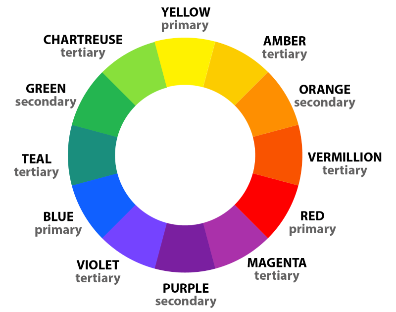 In the chart above, you will see all the colors and their respective categories. Before we start with the fun colors, you should know a little about its origins!
Sir Isaac Newton was the first to design a color wheel back in 1666. Artists, makeup artists, and graphic designers all use this color chart. And you would be surprised how they use this one wheel in order to come out with a spectrum of ideas!
Looking for an Affordable
Logo Design Services
Get in touch with our 24/7 available representatives now!
Chat With us to avail 30% OFF
For example, makeup artists use the color wheel to decipher which colors cancel out each other to better match every individual skin tone. Or how painters use this color wheel to know which colors complement and bring out the best from the other colors. Not every color matches with each other. Some colors really bring out the worst of the other colors, and when not applied right, you could end up in a sticky situation.
The color wheel is a visual representation of colors that consists of three primary colors – red, yellow, and blue. These primary colors can be mixed to create three secondary colors – green, orange, and purple. Additionally, there are six tertiary colors that are produced by mixing primary and secondary colors together, such as blue-green or red-violet.
In the above color wheel, you will notice more variations and hues for each color. This is the process of adding white and saturating the color. Regardless of how pastel your color palette goes, you would still want to remain in the same color family.
For example, if you are going for a pastel green shade for something but then there is bright, neon orange in contrast, it would cause a very bad impression. Here is an example of such a logo:
![]()
Even though all neon shades are used, the colors are not complementary and have been placed wrong.
Learn more: 5 mistakes to avoid in Logo Design.
Primary Colors (Additive Color Mixing)
The science behind how we are able to see color is that it is because of light waves. This is the process of how lightwaves interact and mix with each other to create colors you see before you in various intensities. Yes, all this happens within microseconds! The more light added, the brighter your color mix turns out to be!
If you ever look really closely at the TV screen (which certainly is not recommended), but if you have, then you definitely see little specks of red, blues, and greens everywhere, all combined to create several colors or combined to make white light!
Secondary Colors (Subtractive Color Mixing)
Remember finger painting in kindergarten? Mixing colors there used the “subtractive” model, adding paints to remove light and create new shades. Similarly, any physical surface you see – from paper to packaging – uses this model. Unlike screens that mix colored light, pigments here absorb certain wavelengths, reflecting only the remaining colors we perceive.
Pigment-based painting traditionally uses red, yellow, and blue as primary colors, allowing artists to mix them into a broad range of hues. Color printing, however, demands different needs. Inkjet and laser printers leverage cyan, magenta, yellow, and black to achieve a wider color spectrum on paper.
Color Schemes
Coming to the application of these concepts, we will look into some popular brands and how they used the power of color theory to their advantage. These concepts will include logo designs with complementary, analogous, and triadic strategies.
Complementary Logo Designs
![]()
Although this logo has undergone several changes, they used the orange and blue colors from the color wheel, symbolized as complementary colors that stand out and go well with each other. Another factor is that Fanta stayed true to the color of their drink by including orange in their logo. It really brings the blue hues out of the color. Making this memorable and remarkable!
Analogous Logo Design
Mastercard’s iconic red, orange, and yellow are prime examples of an analogous color scheme, where hues reside next to each other on the color wheel. It’s worth noting that color interpretations can vary slightly across cultures. However, Mastercard’s choice of universally recognized colors and their symbolic associations solidify the desired brand image across a global audience.
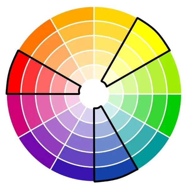
Triadic Logo Design
![]()
In a bold triadic combination, the Burger King logo features the primary colors red, blue, and yellow, creating a dynamic and memorable visual identity. Overall, the color choices in Burger King’s logo are not random. They are carefully selected to create a visually appealing, appetizing, and memorable brand identity that aligns with the company’s target audience and overall message.
Learn more about How Colors, Fonts, And Shapes Influence Customer Behaviour In Logo Design!
Does Color Theory Really Matter?
We have given examples of excellent logo designs with their robust color concepts from another example of bad color theory (that is a completely random logo regardless; it does not stand out). Color theory plays a major role when it comes to your branding and marketing strategies. To some, it has a first/last impression phenomenon, while for others, it’s a complete hit or miss.
You would want your logo design to turn heads and to be praised. Colors play a tremendous role, triggering parts of the brain and influencing one’s thinking. Additionally, colors have a heavy priming effect on our perception and memory. Also, if you are planning to design a logo but find color theory hard to understand, you can hire LogoVent’s Professional logo designers. They use this unique and thrilling strategy to shape Logos that really stand out.
Colors, more than just aesthetics, carry inherent meanings and evoke specific emotions. Leveraging color theory allows logo designers to go beyond a pretty picture and craft something that speaks volumes. So, color theory isn’t just about decoration; it’s the silent language that shapes brand perception, builds emotional connections, and paves the way for long-lasting recognition.