We get it—owning the perfect logo design is difficult, but we are here to tell you that it is not unachievable. We have seen the most popular brands and stores undergo several logo transitions before they got that ONE logo design that fits them perfectly. That logo represents them like a trophy, is memorable, and effortlessly defines the brand and the services they provide. One trend we noticed that was pretty common amongst all the popular brand logos you see, such as Amazon, Apple, and Vogue, is that they learnt about the art of logo simplification.
Simplification art in logo designs is so important. It is definitely a fundamental principle and written rule for logo designers and brands to focus on. When you simplify logos, you can see how uncluttered and simple your logo design can get, and this can happen in one go if you learn from previous logo designs or what mistakes to avoid from logo designs. Now, the real question is, “Why are popular brands returning to minimalist logos or logo simplification?” Top graphic designers have noticed this trend: the more nitty-gritty details there are to your logo design, the less memorable and recognizable it will be and the less attractive it will be. If I were to choose between the two options, detailed or oversimplifying logos, I would choose an oversimplified logo since it has a better scope in the market.
In this comprehensive read, you will get to know the difference between detailed, simplified, oversimplified, and minimalistic logo designs. We have gathered the best examples that represent each category. If you want to expand your knowledge, are a graphic designer, or seek advice from professional logo designers, this article is perfect for you. So, let’s get started!
Read more about Top Brand Mascot Logos and What Inspired Them.
What Are Simplified, Detailed, Oversimplified, and Minimalistic Logos?
Let’s do some pre-study and refresh our minds before jumping right into the details.
Logo Simplification
Simplified logo designs are de-cluttered and visually clearer, concise, and easier to understand or interpret at first glance. They involve removing all the extra unnecessary details from your logo designs. Although there is a debate that some logo designs require a couple of details, without those details, they will be hard to interpret. Here is the best example of logo simplification design.
Adidas
Adidas had about ten transitions before it changed to the logo you see next to that pretty detailed one. The first logo was there to represent the brand’s origins and prove they are the superior footwear.
Logo simplification is the process of reducing unnecessary details that just don’t fit right. Take the Adidas logo, for example. There are multiple word marks and several designs. So, the designers learned from their previous logos and evolution around them, which is why they came up with these three bold slanted lines ascending. There is no word-mark or such a feature that shows its Adidas, but people know since that is how they continued their transition of logos over the years, Get in touch with our 24/7 available representatives now!
Looking for an Affordable
Logo Design Services
Chat With us to avail 30% OFF
Thanks to the designers’ consideration of logo simplification, they created a clean, uncluttered, and recognizable logo that will definitely be remembered for a long, long time. Of course, this is alongside the brand’s loyalty to its clients.
Detailed Logos
Detailed logo designs are the opposite of simplified logos. They prioritize intricate elements and visuals to create a rich and potentially symbolic image. Here, the KFC logo design is used as the best example.
KFC
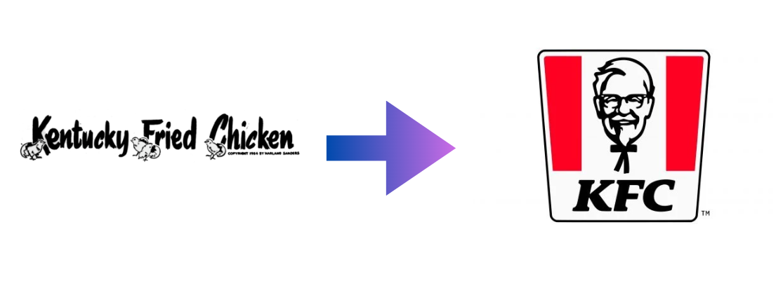
Compared to KFC’s first logo design, it has simplified a bit, but viewing their current logo design, it is slightly more detailed, but in the right way. The first logo design is overly detailed, with the little chicks at the “K, F, and C” letters. In the current KFC logo, you can see the brand’s founder, Colonel Sanders, with a black bowtie (which many see more funnily as if the bowtie looks like a stick body). This logo design creates a strong sense of heritage, trust, and personal connection with the brand.
See how the current KFC logo design is detailed: The logo includes a shaded sketch of the founder, with smaller details like his glasses, beard, hair, and smile lines all visible. Then, the logo is inside a striped bucket, with the sides colored red. Below the entire logo is the wordmark KFC. Because of the realistic effect in the sketch, this is considered to be a detailed logo.
Fun read: 35 Popular K-Pop Logo Designs That Are Totally Daebak.
Over Simplified Logo
An oversimplified logo design can take the concept of simplification too far, potentially sacrificing the brand identity and making it difficult to recognize. This is a risky procedure that graphic designers attempt. It can either make the brand’s image look more classy and create a sense of curiosity among clients who want to know more about it, or they will genuinely be confused and know how to feel about it.
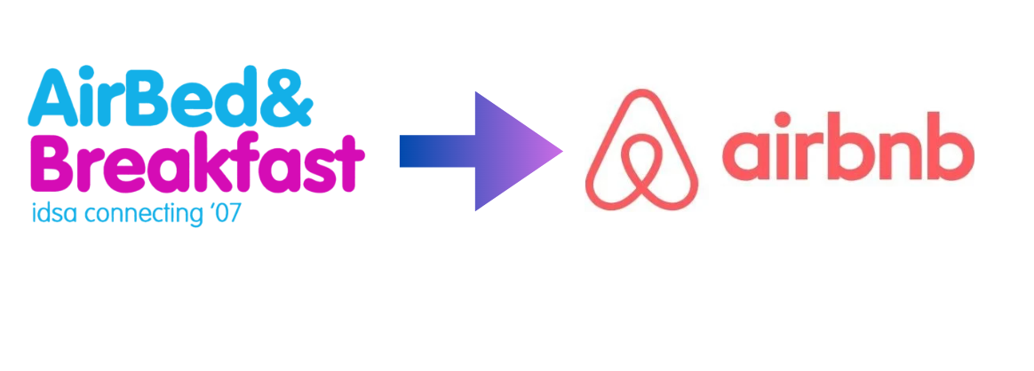
Airbnb
While the Airbnb logo design may not be considered an example of an oversimplified logo, it is. From 2007 till 2014, the brand never included an emblem that looked like a guitar pick, and they also removed their bright blue and bright pink color. Now, the logo design seems much more sophisticated, but people generally don’t get it. The minority wasn’t able to interpret the logo design as much.
Minimalist Logos
Minimalist logos are all about achieving maximum impact with minimal elements. They consist of clean lines, simple shapes, and a very limited color palette to create a logo that is both visually appealing, easy to understand, and memorable.
LOUIS VUITTON
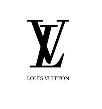
When talking about successful minimalist logos, yes, the Louis Vuitton logo design is classified as a minimalist one since it consists of letters that also make up an emblem, and below the logo is the wordmark. This wordmark logo design is printed and embedded everywhere in all their accessories and whatnot. They even have their own OG patterns that cannot be replicated or compiled.
Coming back to the minimalist logo design, the Louis Vuitton logo design was made once. It did have a couple of trial and error going on. Still, the designer decided to stay with this minimalist look that has shaped a brand identity and is recognizable to the point where it’s popular worldwide.
It’s important to understand that logo designs don’t always have to be overly detailed or overly simple. Creating a logo design that aligns with your brand’s image and helps build a strong reputation for your brand globally can be quite a journey. Some designers can make their initial designs work, similar to the Louis Vuitton logo, while others may take the process of simplifying art a bit too far.
Suppose you feel stuck regarding your logo design. In that case, Logo Vent is an affordable logo agency that helps businesses, regardless of their size and niche, to help you own a trophy logo design that perfectly resonates with your brand image. Our team of designers is aware of current trends and what a hit or miss is. Don’t hesitate to hire a logo agency since even the best of the best brands hire agencies to help them with their logo design. The only difference is the prices since our prices won’t make your wallets cry. Give us a try!
Read more about popular logo designs: Evolution Of The LEGO Logo: A Complete History.
Simplification Art in Logo Designs
1. Focus On the Core Point
While creating a logo design, one can get a little bit carried away with ideas. You get that thrill and joy of wanting to create a logo design that stands out. This is where professional logo designers step in to help you slow it down a bit. Because we know the current trends and have done market research, we see how popular brands simplify logo details to better match their brand image. The first step in attaining this is to focus on the core message of your logo design.
Ask yourself these questions:
- At first glance, what will my audience see?
- Will they understand what my logo design is about?
- If I redesign my current logo and omit details that make it look old-school, will my audience remember what my brand is about?
When designing or redesigning a logo, you must focus on your brand’s main message. With that, you can be creative, of course, but not to be carried away. This message should clearly define your brand’s value, identity, and mission. Keeping all these intact is challenging while stripping away the extra elements or details that do not really contribute to communicating your message. By centering your design around an evident and straightforward message, you’ll make a more focused and impactful logo.
2. Reduce the Number of Details
This is an unwritten rule in logo design: you must reduce the details of your logo design and trust the process. You need to ask yourself if those small details of your logo design are necessary or not. Can your logo design be done without those details? That is where the power of drafts comes into play; you make drafts, view them on different days, take the opinions of others or better yet, ease your mind a bit and hire professional and affordable logo designers.
By simplifying art in log designs, you stick to limited visual elements such as symbols, texts, and colors and avoid the desire to include too much than actually needed. For first-timers, it seems fun and interesting to include details in your logo design, but think of it this way: if you were to embed your logo design on your products, would it be visible? Or if you open a shop and your logo design is on top, will your audience be able to recognize your brand at one glance? Or would they see too many colors and details and not understand them? Take the most popular brands, for example, Nike, Apple, and Audi, which are known for their simple logos. They put them on their products. They have logos on their shops, which has become a recognizable symbol for many. Their first logo is extremely detailed, and their current design is simplified.
Here is a tip: Consider those elements and details that are essential to your brand to help convey your brand’s core message, and declutter those elements that are redundant and unnecessary.
3. Minimalist Typography
Did you know that “Helvetica” is the most common and popular typeface used by brands? Famous brands like Oral-B, BMW, and Panasonic use this typeface. The kinds of fonts you choose for your content and your logo design portray you as a brand. This is why big brands are very careful about the types of fonts they choose for their logo designs. Many people would expect big brands to create their own custom typography, given their vast resources, and some brands like Yahoo! and Heineken have done so. However, the majority of these brands prefer to use an existing font and modify it to fit their style and vision. Soon, the font becomes strongly associated with the brand.
One of the most widely used fonts by famous brands is Helvetica. Originally known as Die Neue Haas Grotesk, Helvetica is a sans-serif typeface developed by Max Miedinger, a Swiss typeface designer, with a contribution from Eduard Hoffman in 1957. It was created at the Hass-type foundry (Haas’sche Schriftgiesserei) in Münchenstein, Switzerland.
Now moving on to why minimalist typography is important for simplicity logo designs, firstly, it is the appearance, the face and shows the effectiveness of your logo design. Choosing a typeface that is clean, readable, suits your overall logo, and brand is important. Here is an example for you to understand better.
Pepsi Cola.
Yes, you read that right, their logo design was not always blue white and red with the bold Pepsi text in the middle.
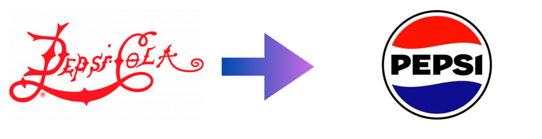
Although Pepsi Cola’s first logo was named Brad’s Drink, we chose this one because of the font…
Because of the spikes and thorns, it gives me Christmas vibes. Clearly, the first logo design was overly decorative, detracting from its simplicity and legibility. Compared to this logo and the rest of the logos they redesigned (approximately 20 times), it shows that it took time, effort, dedication, and a lot of brainstorming to come to a conclusion for the current logo design you see today.
It is safe to stick with one or a maximum of two typefaces, not more, to avoid a cluttered and confusing logo design.
4. Simplify Color Usage
Using a simpler color palette makes the logo more versatile for different applications. With fewer colors, the logo can be easily reproduced on various materials and backgrounds without losing its impact. This is important for maintaining brand consistency across physical and digital branding elements. Additionally, a limited color palette allows for easier one-color printing options, which can be more cost-effective for merchandise or promotional materials.
A well-chosen limited color palette can create a more visually striking and memorable logo. By avoiding clutter and focusing on a few meaningful colors, the logo’s design becomes more focused and delivers a stronger visual message true to your brand. This allows the chosen colors to play a significant role in conveying the brand’s personality and values. For example, a bold red and blue logo might evoke feelings of power and trust, while a soft green and yellow logo might suggest calmness and nature.
Related Read: Mastering Color Theory: Your Ultimate Guide.
5. Embrace Negative Space
We often believe that completely filling up your logo design and leaving no negative space means that you have put in all the effort and left nothing undone. This logic is completely wrong. Leaving negative space in your logo design is crucial; leaving empty areas around your logo design creates balance. Isn’t that something we all aim to achieve in life, so why not achieve that balance in logo designs?
You must use your negative space strategically to create a more balanced and harmonious composition that allows your logo’s core elements to shine. Additionally, negative space can help improve legibility and add visual interest to your design.
The best example is how FedEx used negative space for a tricky little message and hidden arrow representing advancement, forward progress, and company growth.
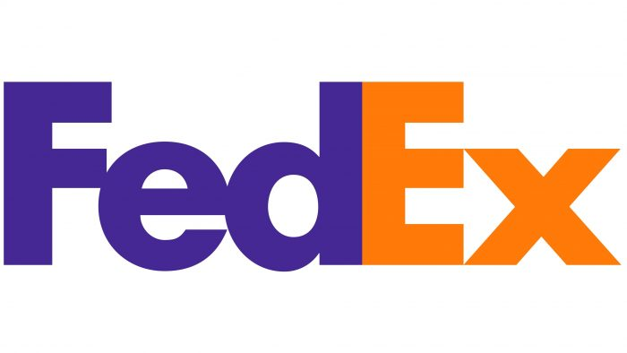
Here are the logo designers for this interesting design. Used negative space to incorporate a hidden arrow between the E and X. Hopefully, you can see it, but if not, then here you go:
![]()
We are unsure if this was intentional, but it did attract the audience well, prompt them to come up with theories and logic and make them talk about it. So, in other words, it is successful. All thanks to singing the negative space right.
Learn about Amazon’s logo smile: Decoding The Secrets Of The Amazon Logo.
6. Take Inspiration
There is nothing wrong with taking inspiration from other successful logos; we encourage our readers and customers to do so. You never know what idea sparks in your mind that could make it successful. Discussing popular logo designs, their failures, successes, changes, and redesigns to simplify logo design. By taking inspiration, you are studying these timeless logos from iconic brands, and you can gain valuable insights and points into simplification.
By seeing these failures and successes, you can motivate yourself to analyze these logos and understand how they used the details to effectively communicate their brand’s message through such a design. It can be hard to believe, but even popular brand logos and their team of logo designers do the same. They lay out the most famous logo designs and best redesigns and study these designs, seeing what they omit from them, what has been added and how they were modified.
Are you still unsure about your logo design? Not sure where to start? Reach out to Logo Vent today for a free consultation with top designers. We’re here to help you brainstorm ideas and kickstart your logo design through effective communication with our consultation team.
7. Refine And Tweak
If not on the first try, try again and again and again. Success takes time, commitment, effort, and multiple retries. It is important to remember that without failure, there is no success. Here is your motivational quote of the day!
The process of logo simplification often involves several retries and iterations. As you keep working on your logo design and come up with something better, do not throw away your old design. We know you will go back to it and use that for reference. By continuously assessing your logo designs and the failed versions, you can gain better insights and come up with de-cluttered ideas.
Additionally, for the best critic, we encourage our readers or new graphic designers to ask colleagues, friends, and family for advice on how they think your logo design is. Take their feedback. Not every feedback needs to be applied, but note the repetitive feedback on a certain detail. For example, if you are continuously told that your typeface does not match the logo design, then you should consider another.
Takeaway: Less is More!
This is a popular phrase that does not necessarily have to be applied to everything, but on logo designs, it is a rule. Simplicity inspires confidence. It shows the power that your brand knows what it is doing by simplifying its logo. When your audience views your logo design, they take a quick snapshot of it, and they are able to remember it. Your logo design has a magical priming effect on them. This is when your audience remembers your logo design when they see something that reminds them of it, for example, color or font.
A simplified logo is even easier to remember because it lacks small details that can distract your audience from the design. Your logo design is your brand’s reputation, and several can view it and want to know more about you. It also makes a distinctive presence in the market. From these several examples, you should gain a sense of motivation that even famous brands can make flop logo designs, but they bounce back. If you are on the run for a logo design and want to create one for your brand, you can always hire professionals to help assist you in gaining that ONE logo design that meets your brand needs. With Logo Vent, you have a professional and motivated team behind your back to help you gain a simplified logo design that represents your brand flawlessly.