It is unlikely that anyone would be curious to learn about the Walt Disney logo. You must have seen the logo design in countless places, including Disney World, Disney+ TV, and their products. The first thing that comes to mind when you think about the Walt Dinsey logo is the “When You Wish Upon a Star.” The colors Blue and White also come to mind since that is their signature color. You will also hum to the tune. You certainly will remember it. These are the little extra additions they made to their logo through other factors in order to make it more memorable. And the designers did a pretty great job at it.
Disney has become one major success story through the power of storytelling. The company has built a strong brand awareness, which drew the emotions that are common to everyone all over the world. The logo evokes a memorable emotion of childhood, which is so unique and special that it really takes you back to those years when it remained a hit in black and white as well. Today, the Disney logo is considered to be one of the most recognizable logos and brands in the whole world.
If you are curious to learn more about the incredible logo symbol and the brands that tell fairy tales and create magical moments, you have come to the right place. Here, we will discuss Disney’s history and how the logo design has changed over the years.
What is Walt Disney?
Walt Disney is one of the world’s most recognizable entertainment companies. Established in 1923, it has many entertainment-related businesses, including family movie productions, cartoons, and more. It also has a well-established and active amusement park and several kinds of merchandise, including toys, video online games, TV channels, books, and music.
Walt Disney is mainly known for its famous Mickey Mouse character, which is basically the face of the company. All the characters created by Walt Disney were originally made in black and white since that is how old the company was.
Are you interested in logo evolutions? Read more with our blog, “The Evolution of Instagram Logo: From Camera to Icon,” to get the best insights.
Brief History of Disney
Known as the Disney Brothers Cartoon Studio, it was founded in Hollywood, California, back in 1923 by Walt Disney and his brother Roy. During this time, he was working for the Kansas City Film Ad Company, which is where Walt Disney’s love in the cartoon entertainment industry began. He became more and more interested in drawing cartoons and graphics for several publications.
Steamboat Willie was recognized and released in 1928, and that is when Mickey Mouse became one of the most recognizable cartoon characters in the world of animation. In 1934, after the success of the Mickey Mouse shorts, Walt Disney began producing feature films.
Since then, several people have stated that Walt Disney and the company have produced the most groundbreaking films. As one of the world’s largest media companies, the Walt Disney Company has had a huge impact on the entertainment industry for adults and kids.
More to learn: How to Create a Powerful Logo Slogan: The Do’s and Don’ts.
The Meaning Behind the Walt Disney Logo
While the Disney logo is a famous icon, it does carry a story and meaning behind it for the target audience. When the logo comes on the TV before you watch any Disney movie, paired with the music and the animation, it evokes a strong emotion in the viewers since they know what it is all about.
The current Disney logo comprises Cinderella’s Castle, one of the most popular fairy-tale movies. Before, the logo did not have this, but they added in the logo for a reason. Minimalist logo designers may say that it is unnecessary, but there is a strong reason why they added it to the new logo design. This is one of the most crucial elements of the logo design since it conveys a special message to viewers, the entertainment industry, and the brand’s business. You may have seen the Disney logo on its own the way it is, but most of the time, you will notice that it has a magical effect. The castle also symbolizes fantasy, magic, and creativity, where the creative factor in the Walt Disney Company is limitless.
However, the logo has undergone several iterations since its creation in 1929. It started as a simple wordmark or text-based logo and then continued to improve over the years. The Walt Disney Company made those changes to adapt to the recent times, and today, because of all of those efforts and changes, it has become one of the most recognizable and memorable brand identities worldwide.
Here is a fun read of more logo evolutions: Tracing the Lines of The Netflix Logo Evolution and the Iconic.
Disney Logo Evolution
Now that we have given you a little backstory about Walt Disney and how it came into existence, you will learn more about its logo design’s significance and its impact on its target audience and viewers in general. Additionally, you will learn why changes were made to the logo design and what caused those changes.
If you’re looking to create a logo that tells your unique story,
our expert logo designer are here to help!
Get Started Today to transform your vision into a standout logo!
Chat With us to avail 30% OFF
The Introductory Logo 1929 – 1937
![]()
This was the first Walt Disney logo; it is more of an introductory logo design that shows the new audience what it is all about. They added more words around, such as “sound and “cartoon,” to show that the cartoons are not silent. Back in the day, silent animations were the whole thing, but adding sound made the whole entertainment process even better. You can see that only black and white were used; some words had more body than others, and in the middle, you can see the iconic Mickey Mouse and the Shorts.
This is a classic example of how log designs were created back in the day, and for that time, it was completely normal. The huge Mickey Mouse split the wordmark in half, which was another common design “effect” used, and the image had the classic 80s era, where it was greeting or waving at the fans. Clearly you can see that Mickey Mouse was the face of the whole thing here.
At the top of the Walt Disney logo design, you can see the inscription of the “Walt Disney Productions.” Below the logo, you can see the address of the Walt Disney Company mentioned. All the details were added back in the day, it was how it was. However, when you look at it, you can get overwhelmed by all the information on the logo, the writing, and the different font sizes here and there.
A lot about logos, no? Click here to learn about 20 Leading Companies And Platforms For Hiring Top Website Developers In 2025 to get a brilliant website for your brand.
The Big Trim 1937 – 1948
After 7 years, they decided that it was time to make changes to the logo, and boy, was it a major trim. One would have thought that the extra text would be removed, but they were also designed to remove our beloved Mickey Mouse from the logo. You can see, however, from this logo design that they were a few iterations away from making the logo design that defines them.
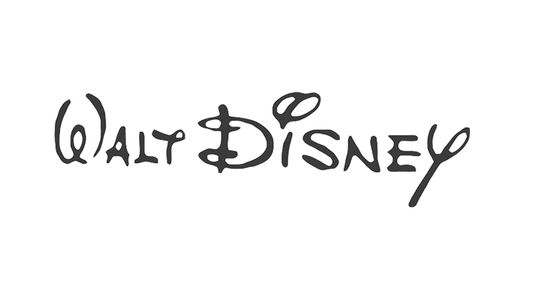
Now you can see that the logo design is only the wordmark with WALT DISNEY written in a fancy font. The little swirls you can see are what make the logo wordmark so special. If any other company mimics these curves in their wordmark logo design, it seems as if they have taken inspiration for this logo design or straight-up copied it. Overall, the Walt Disney wordmark looks like it was handwritten with an ink pen.
The wordmark is thinner compared to the old version, which had more body and was consistent with only the owner’s name.
Learn more: Mastering Color Theory: Your Ultimate Guide.
The Stylized Walt Disney Logo 1948 – 1979
![]()
This is the third Walt Disney logo design. The company decided to stay with the same wordmark and only change the font. It was bolder and more stylized, more so written in cursive, where the letters were joined together. They only changed the typography. This version of the font seems to look less legible; the lines were darker and thicker, and they were not straight; instead, they were wavy. All of the letters are connected apart from the W and D.
Read more: Elevate Your Brand On a Budget With Our Cheap Logo Design.
The First Cleaned-Up Logo 1972 – 1983
![]()
Now, this is the more cleaned-up or polished Walt Disney wordmark logo. In 1972, they decided to clean up the font using the proper methods to make the logo look more legible. They also added the word Productions in a simplified sans serif font to bring more emphasis on the Walt Disney Word mark. But it does not really match that well, of course. The above wordmark was stylized, and the bottom word looks plain. However, it seems that the designers were going for a contrasting effect.
From Productions to Pictures 1983 – 1985
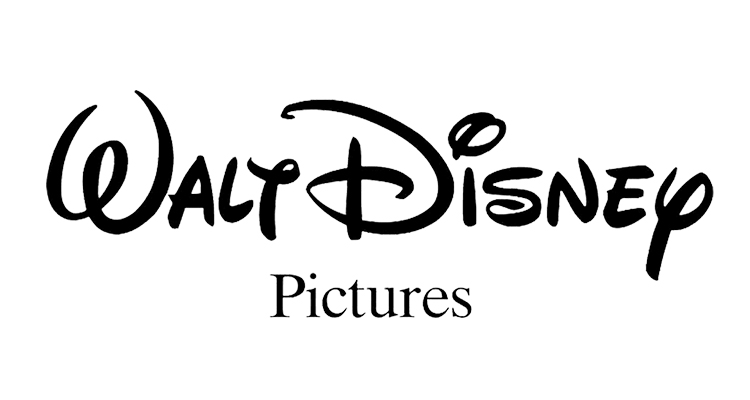
The designers decided to keep the same look for the Walt Disney wordmark and instead changed the word productions to pictures, giving a more informal effect. Additionally, the word Pictures appears in a serif font, creating a more complete look and not making the lower text seem too plain.
Here is a read for K-pop lovers: 35 Popular K-pop Logo Designs That Are Totally Daebak.
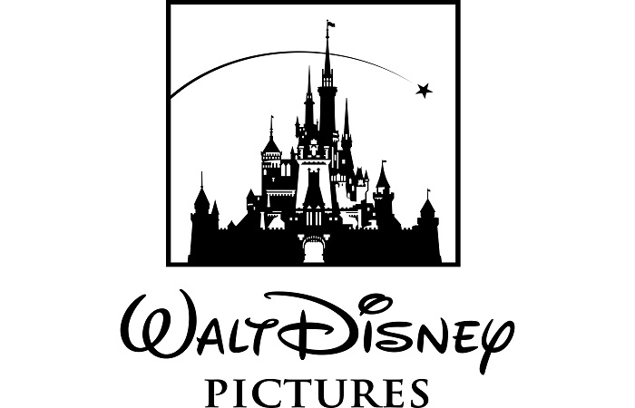
Here Comes Cinderella’s Castle 1985 – 2006
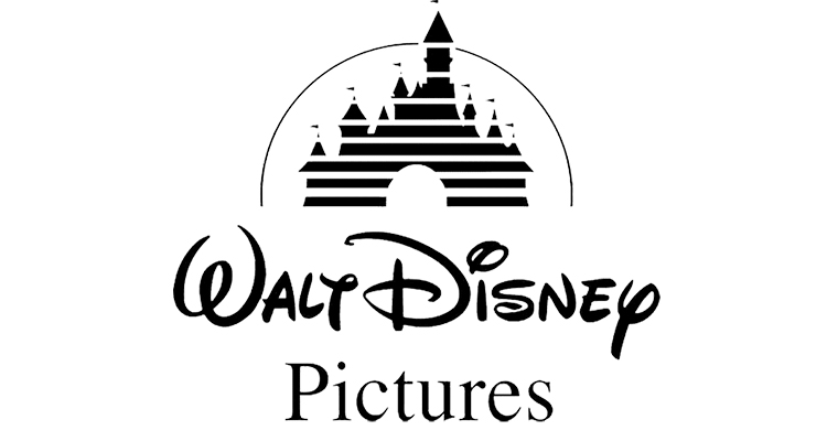
This looks so much more familiar, right? The designers decided to stick with the idea of including Cinderella’s Castle in the logo. The present-day Cinderella’s Castle logo was decided in 1985 and continues to remain this way to this day. It has improved, but the concept remains the same. The designers placed it right on top of the Walt Disney wordmark. The word Pictures broadened to make the logo design look more compact. Above the Castle, there is a curve that represents a shooting star, except that you cannot really see the star. This became one of the most attractive elements of the logo design. The lines across the castle were an effect that was very common during that time.
Here is a fun read for you: Evolution of the LEGO Logo: A Complete History.
The Enhanced Castle 2006 – 2011
The Walt Disney Company decided to refine Cinderella’s castle and make it more detailed in 2006. It looks less cartoonish and more realistic since some Disney movies did work in real adaptations. The wordmark stays the same. The word Pictures is in full upper case letters this time. Adding more body to the logo wordmark.
Now, compared to the old shooting start concept, this looks much better since you can actually see a star. The castle details really bring out the magic from the entire logo design, the towers, the details of the windows, and the entering gate. It shows that you are going to enter the magical land of music and mystery.
The Shortened Design 2011 – NOW
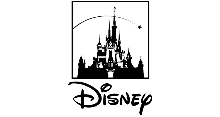
Not any major changes were made to the new Walt Disney logo design, except for the fact that a few alterations were made. The 2011 Disney logo only consisted of the Disney wordmark, and Cinderella’s Castle was made smaller in the box to fit the length of the Disney wordmark. The words Walt and Pictures were removed. This makes the audience completely focused on the word Disney. These changes helped the company take a strong step toward the prototype it made in Paris.
Interesting read: Gucci’s Logo: A Ride from Equestrian Roots to High Fashion.
Design Elements of the Walt Disney Logo Design
Here, we will break down the 3 most important elements of the Disney logo design and what made the design epic as it is today.
The Font
The Walt Disney Company created a string font base. Even if initially it was not perfect, the font style is memorable and is remembered as the Walt Disney font. The font was initially written in a handwritten style, and if you look at it closely, it looks like an autograph, which it does. The stylized font version for the Walt Disney logo design was its main signature, and we could have had it any other way. In 2004, the script was changed from Waltograph Disney to just Waltograph.
Read more: Ideas for Designing Logos for the Automotive and Car Industry.
The Color
While over here, you will notice that the colors used were only black and white, but in the actual pictures, when you look closely, the colors are mainly white and blue that are used. There are some sparks of added colors, such as yellow, pink, white, and red. For example, the Disney Channel Logo simply uses the blue and white version of the logo.
More logo evolutions for you: The Historical Evolution of the Google Logo.
The Magical Shooting Star
While the Walt Disney Logo is known for the overall magical concept it created, the addition of a shooting star really made the whole logo design fall into place. It has officially become the symbol of fantasy, wishes, imagination, and hope. The shooting star goes across Cinderella’s castle, where it symbolizes that wishes do come true.
Therefore, the history of the Walt Disney logo design represents how logos take time to evolve and that the right logo design comes together after some time. However, back then, there was not much knowledge or awareness about the importance of a logo design and its minimalistic features. So, suppose you are planning to design a logo for your next project and make it look as magical as the Disney logo design. In that case, you can choose professional logo designing services such as LogoVent to create the perfect logo design that matches the aesthetic of your business or purpose. Create a strong visual identity with the right logo design concert and make it right in the first go. It does not matter if you have a small budget. Our logo designing services are affordable and perfect for businesses of all sizes, even if you are a new startup business.
Learn more about the power of logo simplification with our comprehensive blog: Learn the Art of Logo Simplification for Powerful Logo Designs.
And That’s a Wrap
The Walt Disney logo is an iconic and special symbol of the world’s most viewed and prominent entertainment industry. Its concept of childhood and adulthood creates a special bond with the audience. The elderly people remember the Mickey Mouse logo, while the more recent generation remembers the castle version of the logo. All in all, they remember the logo because of its features and uniqueness. Regardless of the number of iterations and changes made to the Walt Disney logo, it still had a strong impact on the viewers, and the message delivered was correct. Logos are the most important aspect of a strong logo design.
Suppose you want to create a strong first impression for your target audience and deliver the right message through a minimalistic logo design that is memorable and unique. In that case, LogoVent can help you achieve that successful logo design as our designers are well aware of the strongest strategies that work on how to attract the right target audience and help you outshine your competitors.