As professionals in this domain, our predictions for logo designs in 2024 are currently on the move. The competition has only begun, with more great logo redesigns and innovative rebranding strategies showing up, we could not be more excited.
In this quick read, you will learn all the trending logo redesigns in 2024. From colors, lettering, logo simplification, and more. So let’s get straight into it, see the best logo redesigns this year, and gain inspiration from these for your logo design for a fresh new start.
When Should You Redesign a Logo?
While the answer to this can differ depending on several factors, it is common for mature companies to redesign their logos to spice things up a bit for their rebranding strategy or if they notice that their sales and revenue are declining. Smaller companies should also consider redesigning their logos if they sense their message is not going across to the right audience.
For example, if you are a small company that only customizes tote bags but your logo design sends a message to viewers that you are a company that customizes anything, it will misdirect them. Another reason when you should redesign a logo is when your brand evolves significantly. This would attract your audience even more, making them aware of your brand and the logo design.
Get in touch with our 24/7 available representatives now!Looking for an Affordable
Logo Design Services
Chat With us to avail 30% OFF
A logo redesign should bridge the gap between your brand’s vision and the public’s perception. It should convey a strong and precise message to your audience and ensure that it is a strong symbol for your brand and company.
Read more: Tracing The Lines Of The Netflix Logo Evolution And The Iconic.
Top 12 Logo Redesigns in 2024
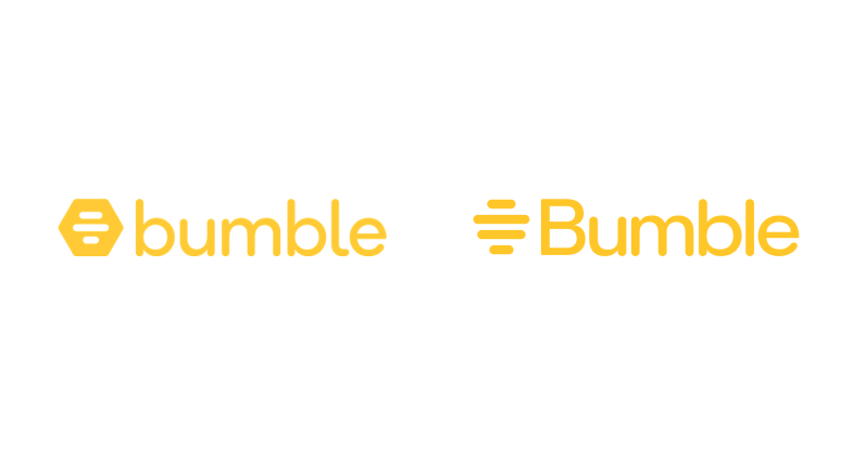
1. Bumble
After the pandemic, Bumble decided to launch a logo redesign in 2024 as part of a brand refresh. The new logo featured a crafty tagline that read, “We changed so you don’t have to.” The redesign boosted Bumble’s brand identity and represented a major push towards the app, making it stand out from its competitor dating apps.
Changes Made
Compared to the first Bumble logo, the updated capital B represents company growth, and the lettering has been changed to bold. While the dating app’s rebranding may not have drastically changed, seeing the efforts made to make its logo design stand out from its competitors is still exciting. The next change is the addition of lines before the word Bumble, and they removed the hexagon shape.
Here is the significance of changing and removing the hexagon shape with additional lines. If you notice, the hexagon shape resembles a small part of the honeycomb, while removing the shape and adding more lines represents a “bee hive” that shows the app is growing and more people are joining it, advancing towards a full-blown beehive!
Learn more about this evolution: The Evolution Of Instagram Logo: From Camera To Icon.
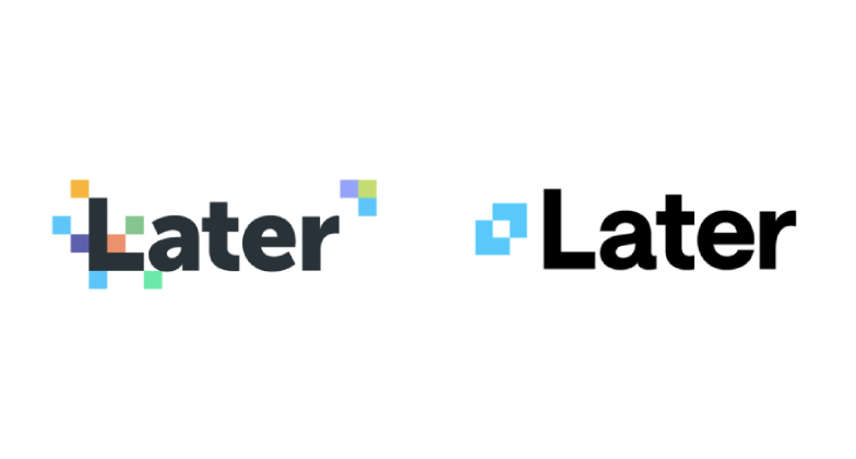
2. Later
Later is a social media management platform that released a solid logo redesign in 2024. The new logo features a soft blue color shift, a completely new logo font, and an icon.
Changes Made
The first prominent change you will instantly notice is the removal of extra pixelated color blocks, scattered around here and there, to a simpler structured icon design. This is a more minimalistic approach, focusing more on the brand word rather than adding extra colors that don’t fit as right. The logo redesign for later brings more clarity and precision to the overall look, and the wording font also changed from less bold to slightly more elongated.
Here, we mentioned that this logo design is minimalistic, one of the most prominent trends we predicted for 2024—and we were right! If you are interested in learning more about the art of logo simplification, minimalist logo designs, and how to redesign them, check out our blog, “Learn the Art of Logo Simplification for Powerful Logo Designs,” to get the best-trending advice.
More ideas for you: Ideas For Designing Logos For The Automotive And Car Industry.
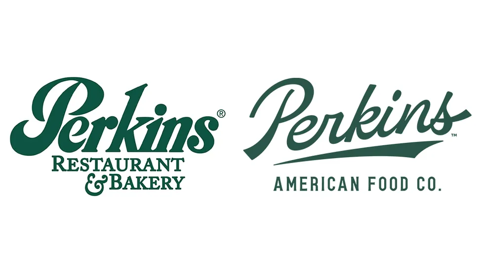
3. Perkins
While the new Perkins logo redesign may not stand out as much, it did, in fact, make its logo design more 2024 adjusted. The US restaurant chain decided to redesign its logo, and you will notice how it looks more true and relevant to the brand and its message.
Changes Made
Here is what we have noticed, and that is pretty obvious from their 2024 logo redesign, the color, font, and the removal of extra words. The shade of green is slightly toned down, and the font has changed, making it look more fancy. The old logo included the whole phrase “restaurant & bakery” and changed to a more simplified and precise version in all capital lettering, “American Food Co.” The part “co.” represents company growth, and that is more than just a restaurant and bakery.
Interesting read: The Million Dollar Logo: 12 Most Expensive Logo Designs In History.
4. GOSH Charity
Here is another great logo redesign example for 2024. The changes are subtle but more impactful on the audience. We see the GOSH Charity logo redesign as very effective and conveys a strong message to viewers and those who simply look at the logo design.
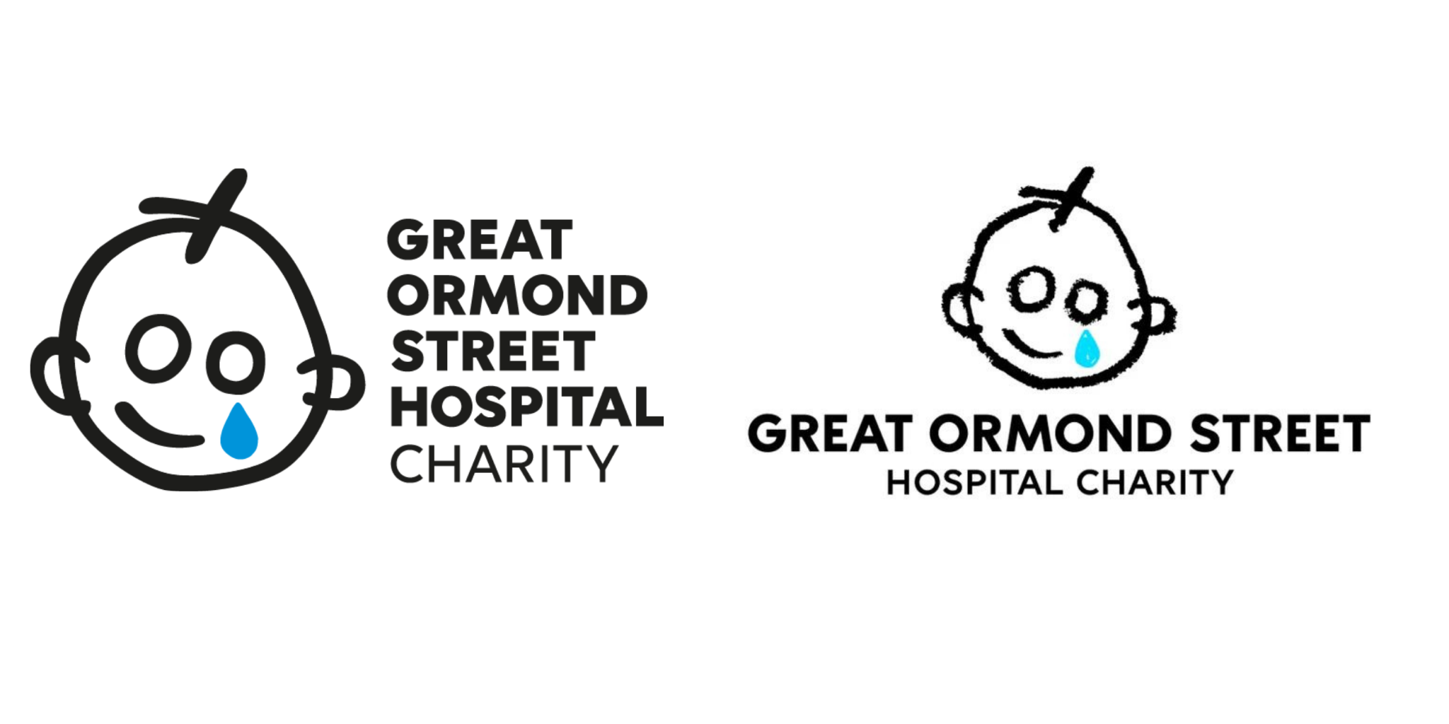
Changes Made
While the redesign is not that drastic, the first logo shows a drawing of a child smiling with a teardrop. While this drawing looks more structured, the logo redesign for this is the same drawing but with a crayon effect. This brings more dimension to the image because kids love to color and draw, and crayons are widely used among them. This logo redesign implies a stronger brand message and will attract the right audience because of this drawing alone.
What makes K-pop logos interesting? Read our blog, “35 Popular K-Pop Logo Designs That Are Totally Daebak,” to learn why!
5. RSPCA
RSPCA is a British animal welfare charity with a strong position in the UK. Here, you will notice a major change in their logo redesign for 2024. Their old logo design lasted for many years, which is why they decided to make the changes. This year’s logo design is bold and bright, creating a new turning point for them.
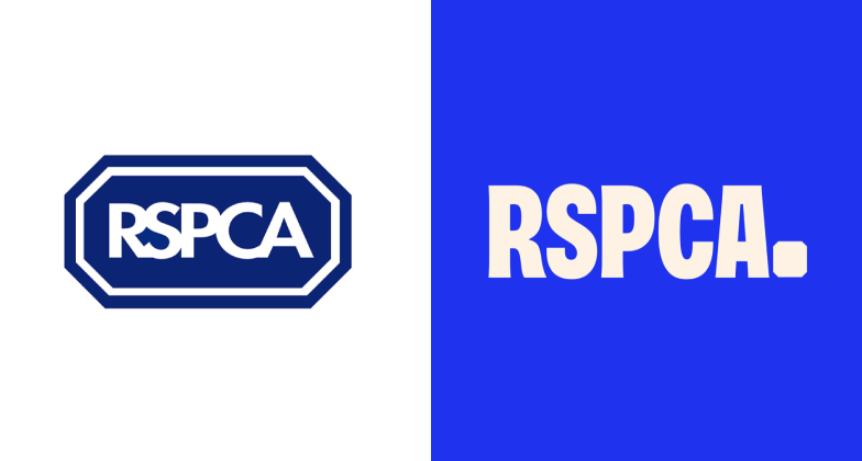
Changes Made
Their old logo design seems more structured and gestures a darker blue color. The new logo redesign removes the structured shape, and the blue color is more vibrant and wide, bringing more focus to the letters RSPCA. This creates a sense of urgency toward the target audience. The new font features sans serif.
6. Klarna
Klarna, a Swedish fintech brand, is well-known for its ‘Buy Now, Pay Later’ payment services. The company’s in-house creative team recently revamped the brand’s personality and logo, delivering one of the most impressive brand refreshes in the financial technology industry.
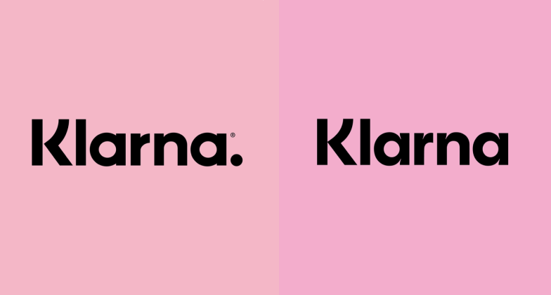
Changes Made
Klarna’s new logo and brand have really stood out. Their new visual system features bright colors, bold imagery, and some deceptively simple logo revisions, all working to capture the company’s recent changes.
7. PEZ
Pez is an iconic brand with a top logo, and we love how the team at Zunder Studio has kept it simple with this redesign. This simple and mighty update really improved the overall brand image.
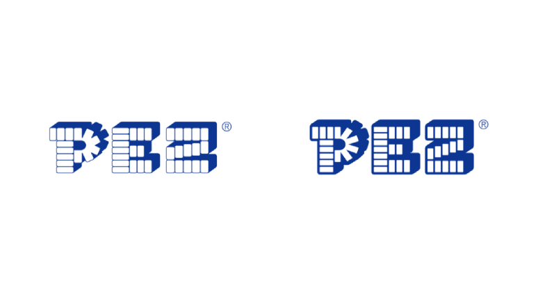
Changes Made
The logo redesign features much more volume and depth than the overall logo. Better spacing adds a timeless charm to the design. This is a great example of when you should consider redesigning your logo to align with modern trends and gain more brand recognition through this strategy.
8. Docusign
As part of their April rebrand, DocuSign’s in-house team created a clean, new logo symbol and brand identity. The agreement management platform aims to be recognized for more than just e-signatures, and the update to the brand’s visual identity is a solid step in the right direction.
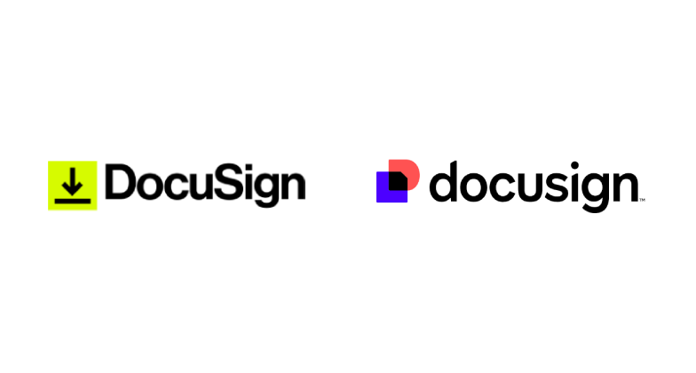
Changes Made
Here, you can see the obvious change and addition of color to the DocuSign logo redesign. The letters are all in small cases, and the end of the logo redesign features a small “™.” The first logo design is a basic effect. Adding new colors that complement each other adds a punchy, bright, and fun effect to the overall logo.
Learn more about color theory through our blog, “Mastering Color Theory: Your Ultimate Guide.”
9. Ocean Spray
Many people associate the juice brand Ocean Spray with Fleetwood Mac and a guy riding his skateboard. However, for the Colorado-based design studio Stone, which designed the new Ocean Spray logo, the brand signifies much more than that (although it still mostly revolves around the skateboard guy).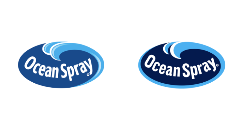
Changes Made
Ocean Spray’s new brand and logo are important reminders that great design comes from a thorough exploration of the company’s history. The new logo design reflects this depth of insight with a rich, dark blue color that carries more weight, a more legible and impactful font, and a removal of unnecessary details from the old logo.
10. Decathlon
Decathlon, a sports equipment brand, underwent a tight logo redesign this year, thanks to the renowned creative studio Wolff Olins. The logo is part of a global design system update and features a new energetic font, logo symbol, and beautiful brand identity.
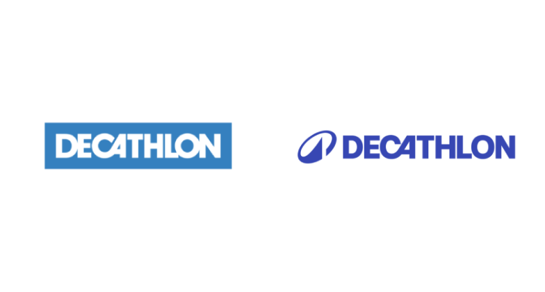
Changes Made
The logo redesign features a small, simple icon with a kinetic swoosh feature that makes the word Decathlon more iconic. The logo’s color is deeper, adding more depth and focus to the word.
11. Kimberly-Clark
With a brand new start and a fresh new logo to look at, Kimberly-Clark created a beautiful brand identity through the power of logo redesign, and this is what we found creative about it.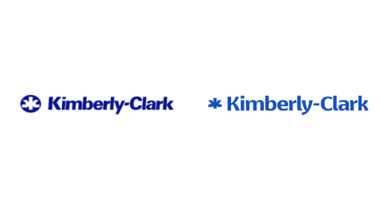
Changes Made
The new logo redesign includes a very cool monogram logo icon, which showcases the company initials ‘K’ and ‘C’ in a way that may not be immediately obvious. The trend of turning a negative space logo icon into a positive one is one of the most interesting logo trends we’ve noticed over the past couple of years.
12. Lamborghini
Since the pandemic, car brands such as BMW, Toyota, and Aston Martin have all been simplifying their logos. Now, after 20 years, Lamborghini is also updating their logo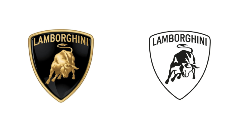
Changes Made
Since it’s such a legendary emblem, this one might be controversial. However, the designers did a stellar job leaving the enduring appeal of the old logo untouched while making the new one more dynamic and digital-friendly. It comes as part of a wider brand recharge, or should we say supercharge, as Lamborghini seeks to evolve for the digital era.
Know more about us: Elevate Your Brand On A Budget With Our Cheap Logo Design Services.
Are You Ready to Redesign Your Logo with LogoVent?
Suppose you are new to the idea of logo redesigning and are wondering why a company would redesign its logo if it was a hit in the first place. There are several reasons why you should and why you shouldn’t. Some famous brands such as Amazon, Apple, and Nike have not redesigned their logos for a while now. So why should you?
The answer is subjective and personal, according to each brand’s needs and requirements. Some companies can make a sudden and drastic effect, adding drama and attention to their brand, which is another impactful strategy that does work towards grabbing the audience’s attention.
At LogoVent, we specialize in transforming brand identities through innovative logo design and redesign. In 2024, the right logo can make all the difference in standing out from the competition. If your current logo no longer resonates with your brand or fails to capture the attention it deserves, it’s time to consider a change. Our expert team is up-to-date with the latest trends and can create a logo that truly reflects your brand’s essence. Don’t miss out on the opportunity to refresh your brand’s image. Redesign your logo with LogoVent today and see how our professional and affordable services can elevate your brand to new heights.
FAQ’S
When should I redesign my logo?
When the market changes noticeably, and you feel that your brand is losing its identity, you should redesign your logo to make an epic comeback.
What logos need rebranding?
Logos that might need rebranding could be outdated due to design trends, don’t accurately reflect a company’s current offerings, or cause confusion about the brand identity.
Can AI redesign my logo?
AI can redesign your logo, but you will not get that personalized custom touch since AI takes elements and designs existing on the web. It will take several rounds of trial and error for you to get the right logo redesign. Hiring a professional logo agency can provide you with better results.
Is it OK to rebrand a logo?
Yes, it is acceptable to change your logo, especially if it does not resonate with the audience, fails to represent your brand effectively, or appears outdated.