Did you know? Approximately, there are 8.5 billion searches on Google per day. Stats show that almost 99,000 search queries are processed by Google every second, resulting in roughly 2 trillion global searches annually. People prefer using Google as their search engine, and now it has become one of the giant American multinational technology and corporation companies focusing on tech-based fields. Google is now one of the most trustworthy search engines, providing users with accurate results on a single page in less than seconds. It is always on the run for improvement and keeps progressing and building its venture.
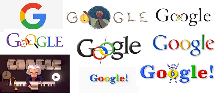
Just like that, the Google logo also underwent several iterations. The average person may have seen the colored version of the Google logo. Thanks to designers and creative thinking, the Google logo became more recognizable, iconic, and simple. We know you will be shocked to see the first symbol of Google. But considering back in the day, creativity was vague, and there weren’t many areas to take inspiration from, we can say that… they tried!
Let’s look into the history of Google’s logo and the meanings behind it to add some concepts.
Read more: Learn The Art Of Logo Simplification For Powerful Logo Designs.
Google Logo History
“BackRub” The First Google Logo (1996)
Yes, you read that right. BackRub was the first name Google was given. It was called BackRub. Now, to give some context as to why they named it something creepy, and that can be misinterpreted. The creators, Page and Brin, chose this name since the engine’s main function was to search through the giant internet’s “backlinks.” So they decided to call it BackRub… So no matter what anyone says, “BackRub” will always be known to be the Original Google logo design.
What makes this creepier is the image or logo (it is more like a two-in-one scenario), which is literally a hand that seems to be rubbing a back. The background is gray, and the logo is red. All of it together looks unsettling.
Thankfully, they decided it was time to change it all. So back in 1997, the owners changed the company’s name from “BackRub” to “Google.” Google derives from the Latin term “googol,” which translates to 10 to the 100th power. They chose the name Google for the search engine because the search engine could quickly provide users and viewers with large quantities of results. If you scroll all the way down the results page, you will see Google written out like “Goooooooooooogle.”
This was present until Google decided to remove the numbered page navigation (pagination) with infinite scrolling. This means that users can continue to scroll down to see more results without having to click on a new page. However, we assume they kept it this way because of the googol concept.
LogoVent has been designing logos with such ingenious concepts for years. Don’t believe us? Check out our portfolio.
Learn more about 35 Popular K-Pop Logo Designs That Are Totally Daebak. Get in touch with our 24/7 available representatives now!
Looking for an Affordable
Logo Design Services
Chat With us to avail 30% OFF
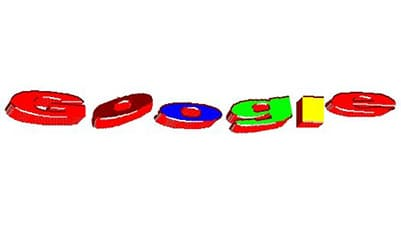
The Side Ward Google Logo (1997-1998)
Before the actual first Google logo came out (that you will see later) this version came to quickly change the old version. And thank goodness they did.
Yes, it is the first time that they added color and gave the logo a kind of 3D-popping look. The design was initially used only for the beta version but eventually became the foundation for all subsequent visual identity designs. The three-dimensional jumping letters were drawn in different colors, giving the design a slightly amateurish yet funny look, which eventually evolved into something truly iconic.
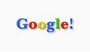
The Actual First Google Logo (1998)
Try to forget that old logo. We know this is Google’s first actual symbol. I really want to believe that, and so should you.
According to some sources, the owner, Page, created this first Google logo, while other sources comment that Brin (the other owner) had designed it with a free image editor. Regardless of who made it, they did a great job entirely changing the logo and name from whatever it was. Now, you may wonder why there was an exclamation mark at the end of the old Google symbol. This is because of Yahoo!’s logo. All tech companies would follow each other’s leads back in the day.
Interested so far? Read more about “From River To Smile: Decoding The Secrets Of The Amazon Logo”
Ruth Kedar’s Google Logo Designs (1999-2010)
Here, we will see several versions of the Google logo. The changes were made by a mutual friend who was introduced to Brian and Page. He was a Stanford assistant professor, Ruth Kedar.
Ruth designed a couple of prototypes, and since the owners were not enjoying the previous logo, she created several versions of the Google logo. And here they are:
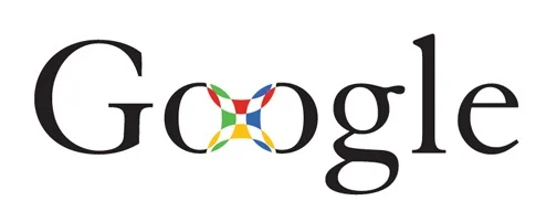
Prototype 1
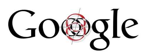
Ruth started off by making the Google font black, and between the two O letters, she added color. This design looks more like a visual illusion, where you enter some void of color. We are not really sure why it was made this way, but one interpretation of this design is that the attempt was to make the design look like a Chinese finger trap. The Google logo font used here was Catull typeface.
Prototype 2
The second design made by Ruth used the same typeface with the font remaining black. This was done in order to emphasize the red and black target, looking at O in the middle. Removing those colors gave the logo design a dark edge, which did not fit right with the entire Google logo look.
Prototype 3
The designer decided to add the colors back to bring life to the logo, and these colors now play a huge role in how users view Google as a whole. These colors define the tech-giant company now. So, adding them back was meant to happen. This time, Ruth decided that both O’s would be interlocked with one another, and each half of the letter would include the colors. Those background lines were still there for some reason. I’m not really sure what to interpret out of those.
Prototype 4
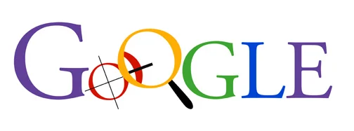
Here, the designer added a new color to the logo, but it did not stay for long. The creative aspect of the Google logotype was the addition of a magnifying glass on one of the Os. This was to emphasize the fact that Google is a “search engine.”
Prototype 5
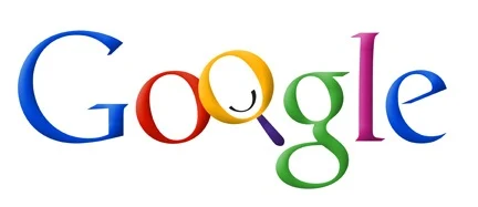
This time, Ruth removes those lines from the one O and keeps the other O like a magnifying glass. Those lines did not really make sense, but the overall Google logo looks much better. However, changes were still to be made.
Prototype 6
The idea of the magnifying glass did not fit well with the overall look of the logo design. So, Ruth removed it, and now the focus is mainly on the colors and font of the Google logo. You can see that she is so close to the original Google logo; it is just that one additional color that needs to be removed. However, she is almost there!
Prototype 7
The seventh prototype design was the simplest yet. Ultimately, Kedar wanted to show Google’s potential to become more than just a search engine, hence the removal of the magnifying glass. She also changed the traditional order of the primary colors to reemphasize how unconventional Google was.
Prototype 8
This version’s colors and the slanted angling for the O’s make it feel youthful and energetic.
Prototype 9
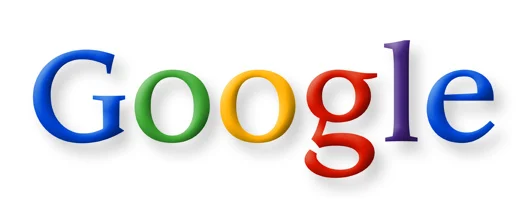
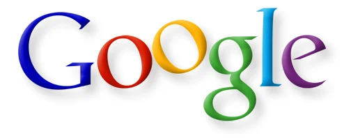
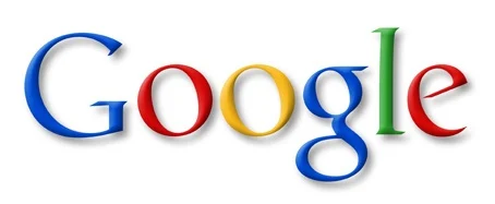
This is said to be Ruth’s final Google prototype logo design. As you can see, it is one of the most minimal out of the lot. This was known to be the original logo from 1999-2010.
Want to learn about the most expensive logo designs? Read our blog: The Million Dollar Logo: 12 Most Expensive Logo Designs In History.
The Shadow Removal (2013-2015)
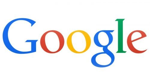
The owners decided to remove the shadows and bring back the flat logotype look, making the Google logo look more minimalist and strong. The colors for the logo design were finalized, and the purple was removed. The Google logo font used was Sans Serifs, making it look more distinct than the previous ones.
A Fresh Beginning (2015-Now)
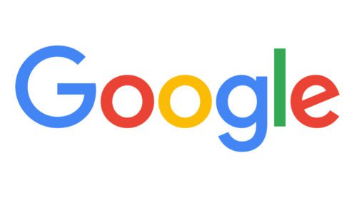
Google not only has a new logo but also a kind of emblem.
Product Sans is a sans-serif typeface, which makes it easy for Google’s designers to adjust and modify the logo for various sizes, such as the face of an Android watch or the screen of a desktop computer. As Google’s product line becomes more diverse, having a design that can adapt is crucial.
The logo is intended to have a youthful, fun, and non-threatening appearance, conveying the message that Google is not like other large tech corporations but rather a cool one. This design decision was forward-thinking, as concerns about data privacy have escalated since Google introduced this design in 2015.
The same color palette as the one introduced in 1998 was used, except now the hues are brighter and more consistent. The colors in the logo are arranged according to a tetradic color palette, creating an optimistic and energetic feel. This has contributed to Google’s remarkable success. In addition to being eye-catching, bright colors appeal to global cultural diversity and have a unifying power.
Are you interested to know about the LEGO logo evolution? Read the blog “Evolution Of The LEGO Logo: A Complete History” for the best insight!
The Dynamic Google Logo
If you have ever noticed, when you begin to run a voice search on your phone or any device, you will notice that Google has dots bouncing around. This shows that the Google logo is dynamic and changes. Once you are done with your query, those dots turn into an equalizer that replies to your voice. And then that same equalizer morphs back into dots, like a rippling effect.
If you think about it, this is a more expressive and developed way of including listening, replying, thinking, incomprehension, and confirmation of your queries. It shows that Google is listening and is ready to reply any second now. It represents quick action and continuous search.
Dynamic logos are incredible at attracting users when designed well? Think your logo could be dynamic too? Contact LogoVent today and we will help you bring your vision to life.
The Growth of Google Doodle
In 1998, Google began its first trial with Google Doodle. It is a temporary modification of the Google logo used to pay respects and emphasize the importance of a figure, holiday, or event. This unique touch to the logo design shows that Google, as a tech giant, recognizes and celebrates holidays, important dates, and even seasons such as Mother’s Day, Easter, and more.
Here is the first-ever Google Doodle:
Over the years, the detail of the featured doodles has evolved. In 2000, Brin and Sergey asked their intern Dennis Hwang to create a doodle for Bastille Day. Users loved it so much that they appointed Dennis “chief doodler.” Today, doodles are often used to commemorate holidays, special occasions, and the birthdays of scientists, thinkers, artists, and other important people. The first doodles tended to mark well-known holidays, like Valentine’s Day and Halloween. But over time, they have become more global and creative. For example, on September 1, 2017, a doodle celebrated the first day of school.
These are a couple of the most popular Google Doodles that people adored so much.
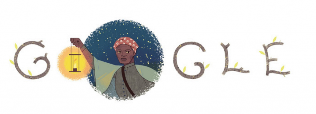
In February 2014, Google celebrated Harriet Tubman’s extraordinary life with a Doodle featuring her image and a lamp. The Doodle aimed to highlight her escape from slavery and her daring missions to rescue others from the same fate.
This feature is notable for a few reasons. In 2014, a study revealed the lack of diversity in Google’s Doodles. Despite being just a simple design on a search engine landing page, this Doodle was a clear reflection of the social impact Google can have. In fact, over half of all Doodles up to that point were white men.
Harriet Tubman (Feb 1, 2014) Google Doodle
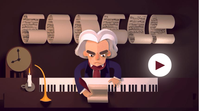
An interactive game has been created to commemorate the 245th anniversary of Beethoven’s baptism (his exact birthdate is unknown). It highlights significant events in the great artist’s life, both the highs and lows, and encourages players to assemble movements from his most famous works.
This Doodle stands out for several reasons. It presents a coherent narrative and encourages user interaction. Additionally, it showcases some of the greatest art in European history. Most importantly, it takes what is often considered a challenging or inaccessible art form and makes it approachable. This exemplifies Google at its most enlightening and playful.
Ludwig van Beethoven (Dec 17, 2015) Google Doodle Short Video
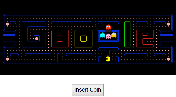
PAC-MAN (May 21, 2010)
The Pac-Man Doodle was a huge success and deserves an article of its own. It is said to have cost the economy $120 million in lost labor time, tapping into our nostalgia for one of the most popular video games of all time. Created for Pac-Man’s 30th anniversary, the first-ever playable Doodle replicates the experience of the old arcade game.
Initially launched for a two-day period, Google expected it to surpass the popularity of your everyday Doodle. The response was even more fervent than they had anticipated..
If you’re crazy about your logo design being on par with such giants but don’t have the budget to spare, don’t worry. LogoVent’s affordable logo design packages have got your back.
Read more: A Visual Timeline: The Microsoft Logos Transformation Through The Years (1975-2024).
Characteristics of the Google Logo
Here are the three main characteristics of the Google logo and the reasons why it is so recognizable and distinct.
1. The colors
Because of these 4 colors used, they are a signature color scheme of the Google logo.
2. The Ability to Adapt
Google, the leading search engine, features a versatile logo that can adapt to any support. Since 2013, it has implemented a responsive design for perfect visualization across all dimensions.
3. Simplicity
The company’s logos are not extravagant and always remain simple and clean. Combined with bright colors that bring the logo to life.
Wasn’t That a Journey!
By viewing and going through the Google logo history, you can see that the Google logo was made through the process of trial and error. It shows how the designers thought back in the day with limited inspiration to take from and limited tools to design, yet they came up with the best logo design that perfectly resonates with the tech giant industry!
Even the most famous brands and industries seek expert help with their logo designs—so why not you? At LogoVent, our Logo Design Services are designed to be both affordable and innovative, catering to businesses of all sizes. Our experienced team creates professional logos that not only resonate with your brand image but also make a memorable impact. Enhance your brand’s visibility and effectiveness with a logo that truly stands out. Discover how our logo design services can elevate your business today!
