The Instagram app icon is one of the most recognized symbols in the world. It represents confidently sharing moments, pictures, and viewpoints across the web. The logo has evolved over time to become a modern, minimalist design, attracting billions of users to the platform daily. Instagram has grown into a social media platform where people view and share pictures and engage in activities like liking, saving, and buying products. Its popularity is evident from the fact that users spend hours on the app.
Let us dive deeper into the entire evolution and meaning of the Instagram logo.
Learn more: The Importance Of Logo Design For Branding Success.
When Did Instagram Launch?
The Instagram app launched on 6 October 2010. It was initially available only for iOS4. Pretty old and exclusive, right? Kevin Systrom, an American computer programmer, and Mike Krieger were the founders of Instagram.
Since then, the app has skyrocketed in its 14 years. Today, it nears over 3.8 billion downloads worldwide and is predicted to grow further, of course!
How Do Marketers and Content Creators Benefit from Using Instagram?
Whether you are a content creator or a marketer, you can use Instagram to your advantage since billions of users use the app daily. You can explore more than 1000 Instagram symbols to give your bio a different look with a minimalist vibe. This way, your viewers stay engaged.
Your content and these symbols also help build your voice and tone on this visual platform. To get maximum use of this social media platform, ensure that your Instagram branding is on point.
Instagram provides a productive ground for marketers and content creators, offering a unique blend of reach, engagement, and community building. Marketers can gain from Instagram’s massive user base to amplify brand awareness and connect with potential customers in a visually captivating way. Get in touch with our 24/7 available representatives now!
Looking for an Affordable
Logo Design Services
Chat With us to avail 30% OFF
Targeted advertising tools allow them to reach specific demographics and interests, ensuring their message resonates with the right audience. Shoppable posts transform product discovery into a seamless experience, allowing users to browse and purchase directly within the app. Features like Instagram Stories also offer a glimpse into the brand’s personality and behind-the-scenes action, fostering a sense of connection and loyalty.
On the other hand, content creators can use Instagram to cultivate a dedicated following and potentially monetize their talents. The platform allows them to showcase their work to a global audience, be it photography, videography, art, music, or any creative expression. Engaging content formats like Reels and Lives cater to diverse creative styles, while hashtag strategies help content reach relevant communities.
Building a loyal following translates to potential brand partnerships, influencer marketing opportunities, and the chance to establish an e-commerce presence through Instagram Shopping. Instagram empowers creators to build a brand around their passions and connect with a supportive audience.
The Evolution of the Instagram Logo, Meaning and Symbol
The Polaroid Camera Instagram Logo: 2010 – 2010
![]()
In 2010, Instagram introduced its first logo, which was designed to convey a message to its target audience. The logo featured a camera lens, large red and black dots, a viewfinder, and a flashlight at the top, with a colorful long strip at the end. Additionally, the word “Instagram” was positioned above the red dot.
This Instagram logo design certainly looked more like a frontal shot of a Polaroid camera in 2010. Back then, this logo design was still okay for representing what the Instagram app was about. Plus, it gave off a retro feeling that was completely understandable why the designers opted for the design this way.
The Viewfinder Logo: 2010 – 2011
![]()
This time, the new IG logo was designed by a professional. Systrom hired a professional designer, but this logo lasted only one year. Since the previous logo had too many elements and was cluttered, the designers decided to use a minimalist design approach. The new IG logo was the work of a photographer and designer, Cole Rise. He created the new Shutter IG logo with a minimalist approach.
The rainbow design shifted from the center to the top left corner. The Insta logo was now brown, intended to give it a more formal look. The wordmark was shortened to “Insta,” and the typeface used was a sans-serif font. By this time, selfies had become pretty popular. The new IG logo had a viewfinder in the top right corner, similar to where the viewfinder would be for taking selfies.
The Added Depth IG Logo: 2011 – 2016
![]()
At first glance, the details may seem the same, but take a closer look. You will notice that the lens has a 3D-like glare, and the top dark brown part of the logo has a “texture” resembling leather. Additionally, there was a slight contrasting gradient.
This new IG logo was regarding the rainbow strip on the top left corner. The strip was wider this time, displaying all four primary colors: yellow, red, blue, and green. The Insta abbreviation appeared in bold serif.
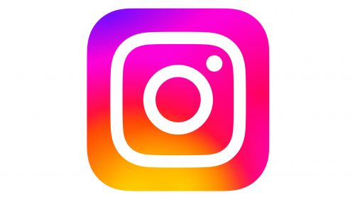
The Minimalist with Colors: 2016 – 2022
The Instagram logo underwent a significant change in 2016. The new version featured a flatter and more minimalist design with a burst of gradient colors. This redesign gave the social media app a fresh look and made the logo more memorable. The updated logo had rounded, softer edges, a Polaroid shutter, a square shape, and rainbow brand colors.
In the new design, only an outline of the camera with bold white and a dot at the top corner to portray the shutter was used. The gradient filled up the entire logo, making it look trendy and captivating.
Overall, it was considered one of the best minimalist approaches for the logo, with each element being well-defined but not overly detailed. The new design took on a more abstract look, with a flatter logo and a gradient that started from either blue or red. The wordmark “Insta” was removed, as the logo now represented Instagram effectively on its own.
Read our Blog: 5 Mistakes to Avoid in Logo Designs.
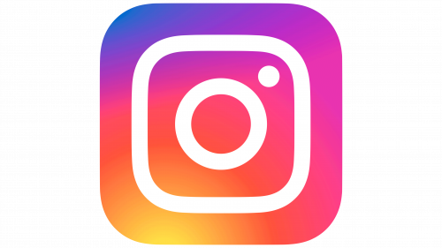
A Vibrant Version: 2022 – Today
Now, you may wonder what the difference is between the 2016 IG logo and the 2022 one. The detail is in the colors! The vibrancy, the life breathed into the logo! While there were no changes in its shape or the other details, the blue color at the top left was toned down a bit, and the overall logo gives off a more yellow, red, pink, and purple vibe. The overall logo became brighter than before, making the logo more noticeable.
The creative director for the Instagram logo mentioned that they wanted to keep the logo the same but add more energy, power, and expression to the design, which is exactly what the design gives off.
Modern logo design is sleek and refined. It’s what sets apart modern brands from outdated brand design. Your brand can shine just as bright with LogoVent’s brilliant logo design services at your fingertips.
Relevant Read: Unveiling How Colors, Fonts, And Shapes Influence Customer Behaviour In Logo Design.
Instagram App Icon Meaning
The original Instagram logo was criticized for having too many details crammed into a small space, making it too busy. However, a simplified version that was much better received was redesigned.
The first logo symbolizes hope during a recession, while the second version aims to represent the start of a photo-sharing app for people to connect and share their lives. Today, the logo is a source of positivity and embodies Instagram’s role as a social media platform.
The vibrant colors of the Instagram icons are still as meaningful as ever. The color selection is intended to brighten people’s lives and improve their overall outlook, symbolizing hope, vibrancy, and happiness.
The shape of the logo contributes to the impact of the IG logo design. Its square shape looks unique due to the rounded corners, giving it a softer finish. The Instagram logo has evolved from a heavily cluttered design to the minimalist logo you see today. This journey demonstrates how much the design has improved and how logo design trends have changed over time, with people now understanding the significance of a minimalist logo design.
If you’re looking to create a minimalist logo design or revamp your current logo but don’t know where to start, Logo Vent can provide the best solutions for all your logo design needs. Our team creates fully customized logo designs that are tailored to your specific requirements and effectively capture your brand’s essence. Your logo design should communicate your brand’s core message and be easily understood by your audience. With us, you’ll get just that.
You know the best part? LogoVent’s services are affordable as well. Check out our logo design packages that start from just $69.
Related Read: Master Logo Simplification: Achieve Powerful Logo Designs.
Wrapping Up
The evolution of the Instagram logo highlights the power of minimalist design in reflecting a brand’s growth and identity. Just as Instagram has refined its logo over time, your brand can benefit from a professionally designed logo that embodies its unique message and vision. At Logo Vent, we specialize in creating impactful and minimalist logos tailored to your needs. Ready to elevate your brand with a striking new logo? Discover our affordable and expert logo services by visiting Logo Agency and see how we can bring your brand’s identity to life.
FAQ’S
Why Did Instagram Start as a Whiskey App?
While Instagram is a video and photo-sharing social media app, it was launched in 2010 by Kevin Systrom. The prototype name for Instagram was Burbn, inspired by the creator’s love for bourbons and whiskeys.
What camera is the Instagram logo based on?
The co-founder, Kevin Systrom, designed the original logo for Instagram back in 2010. The inspiration was taken from a Polaroid OneStep camera, which included a rainbow strip.
Why has the Instagram Logo become so Iconic?
While the initial Instagram logo’s inspiration was taken from a Polaroid camera, the actual iconic part of the IG logo was the drastic, vibrant change to the logo design, with the minimalist touch and hues of colors.
What was Instagram Originally Intended for?
Initially a purely photo-sharing service, Instagram added 15-second video sharing in June 2013. Some in the technology media viewed this as Facebook’s attempt to compete with the then-popular video-sharing app Vine.