We probably all know that a logo is the face of a brand, and it needs to be unique, recognizable, and timeless. We also know that logo design should be a vector file and that a logo should be original yet also simple. These are the common rules that all designers should follow when creating a logo. However, there are other equally important rules that are not talked about much anywhere, and these can make or break the success of an originality logo.
In this blog post, we will dive deeper into the world of logo design and explore the 10 rules of a good logo that are often overlooked but are crucial for creating a memorable and effective brand identity. So, whether you are a designer or a business owner, read on to discover how you can create a winning logo that truly represents your brand.
Top 10 Rules for a Good Logo Design
Our professionals have spilled the secrets. Here is a list of the top 10 rules for what makes a good logo design. It is important to know these points. This way, you will know what to incorporate into your logo design to make it exceptional.
Avoid Revealing Your Weakness to Clients
As a logo designer, it’s crucial to never display any signs of weakness to your clients. This means that you must present yourself with confidence and a logical approach to selling your ideas. Half of the trick to getting your logo designs approved and sold is based on storytelling. If you appear weak in terms of your design confidence, it will be much harder to achieve this.
Let me explain with an example. If I am designing the best logo design for an organic food company and I present my clients with initial concepts, I must be able to back up every decision I’ve made with logic and confidence. I should never say things like, “I was going to use a pale green, but then I got stuck between this blue color. Because I couldn’t decide, I decided to show you both.” While this may seem helpful, it looks like you’re not sure about your designs and skills to the client.
The client consciously and unconsciously wants to be completely confident in your ability and decision-making skills as a graphic designer. If you come across as professional and confident, you have a better chance of your designs being approved and getting paid.
Make Sure Your Logo is Tailored for the Right Person
A beginner logo designer may create a logo based solely on their personal preferences, principles of logo design, or the latest trends without considering the needs of the client. A middle-tier designer, on the other hand, would create a logo that caters to their client’s specifications. However, a truly professional and skilled designer would create a logo with the client’s targeted market group in mind. This emphasizes the importance of confidence in delivering the design to the client. By explaining the reasoning behind the design choices and selling the story of how it will appeal to the target market and increase brand awareness, the designer can effectively communicate the purpose of the logo to the client. It is crucial to always keep in mind who the logo is being designed for, and this should be evident from the research conducted before the design process.
Read A Detailed Guide On The Math Behind Logo Size.
Logo Type should Complement Brand Identity and Message
Getting the logo mark or the symbol is just halfway through the game. The logotype itself is equally as crucial and should continue the message you are trying to convey to the target markets.

If you look at Chanel’s logo, you can see the logo type is modern, sleek, and important in nature. This is carried by the modern sans-serif style and also a nice amount of kerning between each letter and is presented all in uppercase lettering.
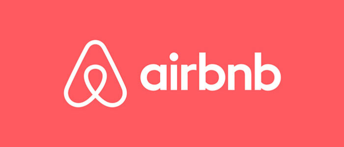
If we then take a look at Airbnb, they have rounded yet modern and friendly logotype examples. Why? Because the brand wants rebranding to appear as friendly and welcome to people yet also cutting edge and modern at the same time. The typeface style and the fact that they have used only lowercase letters will help to push this narrative to the audience.
When presenting your conceptual ideas to the client, show how your choice of logotype targets a certain group of people and how it is going to represent the brand from a psychological point of view is only going to add conviction and your power as a designer trying to sell them your visual ideas.
Not showing how you have arrived at these decisions is only going to go against you when it comes to persuading them. You can think of it kind of like a courtroom, where you need to present evidence in your favor.
To learn more about logotypes, read our blog post “All The Logos And Their History.”
Looking for an Affordable
Logo Design Services
Get in touch with our 24/7 available representatives now!
Chat With us to avail 30% OFF
Don’t Forget the Importance of Analyzing Competitors
It’s common for designers to overlook or dismiss this aspect of a brand’s design as unimportant. However, this approach is completely wrong, and many professional branding agencies in the market will agree. One of the most critical aspects that designers need to consider is studying the competition.
Competitive analysis is vital because your client’s competitors are constantly vying for their business and revenue. By analyzing what the competition is doing, you can better position your client’s brand in the market and give them a competitive edge.
If you design a logo that looks almost identical to your client’s competitor, your client will feel like they’ve been ripped off. Furthermore, the brand will not perform well because it won’t have a unique identity that stands out in the market.
Therefore, it’s essential to study the competition to avoid designing a logo that is too similar to its competitors. By doing so, you can tailor the best logo design to give your client’s brand an edge up on the competition and position it for success. Don’t overlook this critical step in the design process because it can make all the difference in the success of your client’s brand.
Simplicity is Your Best Friend
A simple logo is not only easier to remember but also more versatile. It can be easily scaled down for small icons or scaled up for large billboards without losing its clarity and impact. Additionally, a simple logo can be reproduced in various formats, including print, digital, and merchandise, without compromising its quality.
Future-Proof Your Logo Design
A well-designed logo should be timeless and adaptable, avoiding trends that may quickly fade away. Instead, focus on creating a logo that is simple, clean, and versatile. A timeless logo can be used across various platforms and formats, from business cards to billboards, without losing its impact. It is important to prioritize classic logo design principles and avoid overly trendy elements, and you can create a logo that will stand the test of time and continue to represent your brand effectively.
Using the Power of Negative Space
A well-designed logo should be adaptable to various applications and platforms. It should look equally good on a business card, website, or social media. By prioritizing simplicity, you can make sure that your logo remains clear and recognizable across different sizes and formats. Avoid overly complex designs that may become distorted or lose their impact when scaled down or up. A minimalist approach often leads to a more versatile and stable logo.
Test Your Logo Design and Take Suggestions
Testing your logo with a diverse group of people can provide valuable insights into its effectiveness. By conducting user surveys or focus groups, you can gather feedback on how well your logo communicates your brand’s message, creates the desired emotions, and stands out from competitors. This feedback can help you identify any areas that need improvement and improve your design accordingly. Additionally, testing your logo in different contexts, such as on various backgrounds or in different sizes, can help you make sure it remains versatile and durable.
Make Sure Your Color is Right
Maintaining consistent color usage across all brand materials is important for reinforcing brand recognition. When a brand consistently uses the same colors in its logo, website, marketing materials, and other touchpoints, it creates a strong visual identity. This consistency helps consumers to quickly recognize and associate the brand with its products or services. Moreover, consistent color usage can create a specific emotion and create a desired brand image.
Consider the Help of Professionals
Seeking professional feedback from experienced designers or branding experts can significantly improve the quality of your logo design. These professionals can offer useful insights, identify potential issues, and provide constructive criticism. They can also help you refine your design, ensuring that it meets industry standards and effectively communicates your brand’s message.
Conclusion:
When designing a logo or a brand identity, keep in mind that it is not an expression of art where you kind of make something cool or pretty. It’s a tool that needs to represent the brand in the market, almost as if it is going to war against other businesses. And if you are not a designer and want a state-of-the-art professional logo, reach out to LogoVent. Our company has the best logo designers in the market who are well-versed in principles of logo design and are ready to deliver a logo that helps you stand out.
