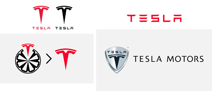
When it comes to automotive creation, if you think about it, not many brands have caught the public’s attention. At least not as much as the Tesla logo. People have quite the imagination, coming up with unique theories and concepts, such as the “Tesla logo cat nose” theory. It has been trending as one of the hot topics in the past few years, and we can see why. Beyond Tesla’s inventive electric cars and advanced technology, the growth of the Tesla emblem and logo stands as a symbol of its commitment and dedication to pushing limits.
Since the Tesla brand started in 2003, the logo has changed twice, and each iteration reflects both the brand’s evolution and the overall growth of the vehicle industry. Today, we will explore the Tesla brand from its beginning to the theories people came up with and what the Tesla emblem can actually mean. Let us dive right into the history of the Tesla Logo and learn about its significance, worth, and place in the electric car industry.
Brief Backstory about Tesla (Motors) and Revolution
Tesla Motors was launched in 2003 by Martin Eberhard and Marc Tarpenning. The company’s name is a tribute to the electric engineer Nikola Tesla, who was the mind behind the whole concept. In 2004, Elon Musk was eager to enter this establishment as a shareholder; he saw growth and potential. By 2008, Elon Musk had earned the roles of co-founder, CEO, and product architect for Tesla Motors while being a member of the Board since April 2004.
At this time, Elon Musk contributed $6.5 million during the Series A round funding, making him the largest shareholder for Tesla Motors. In May 2009, a 10% stake was acquired by Daimler AG in Tesla Motors for $50 million. Get in touch with our 24/7 available representatives now!
Looking for an Affordable
Logo Design Services
Chat With us to avail 30% OFF
The company’s first production vehicle, the Tesla Roadster, launched Tesla Motors’ journey into the electric vehicle industry. This ingenious Tesla model represented the potential of electric cars and incited an industry-wide shift toward eco-friendly transportation.
Interested in logo evolutions? Read our blog about the complete history of the LEGO logo.
Who Created the Tesla Logo?
RO Studio was the design firm and brain behind the branding for SpaceX (another of Musk’s ventures) and Tesla, designed the Tesla Logo. The name remained this way since Elon Musk did not come up with the company’s ideas. The Tesla logo pays tribute to the company’s namesake, Nikola Tesla.
Throughout the company’s history, starting with the Roadstar and then Model X, Model S, Model 3, and Model Y, each model stayed consistent through every milestone.
The Tesla Logo Evolution
The Tesla logo may not have had major changes since it is a nod to Nikola Tesla and represents the company’s sustainable transport mission. The stylized “T” featured by an electric motor signifies innovation, illustrating modernity and advancement in its font. The typography indicates luxury, power, and change in its color palette.
For more incredible and creative examples of logo design, see our humble portfolio. Our revamp of hundreds of brands has led to incredible increases in conversion and brand awareness.
Fortifying Safety and Representation of Roots
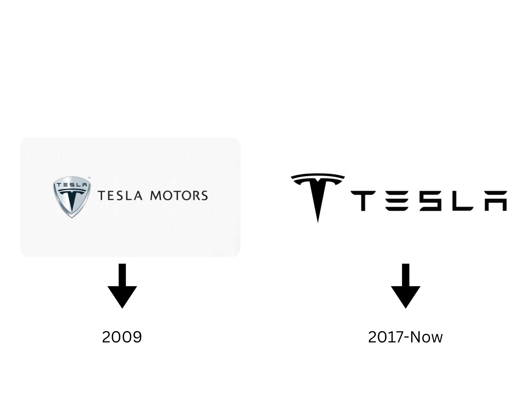
2003-2017
The old Tesla logo included a shield that symbolized security, credibility, and a callback to Nikola Tesla’s ideologies. The shield represented Tesla’s commitment to ensuring that safety is its number one priority to its customers and the protection of the environment through electric vehicles.
Although the first thing individuals will see behind the shield symbol is the stylized “T,” the explanation behind this “T” is pretty interesting, and we will discuss it more in-depth later in this article. However, to give some context, this unique T-shaped symbol denotes the cross-section of an electric motor. This logo version conveyed Tesla’s dedication to revolutionizing the automotive industry through sustainable and innovative technologies.
In the second interaction, you can see how the “T” symbol becomes more prominent, making people recognize cars beginning with T more effectively.
Logos are pretty fascinating, right? Read more on them: The Million Dollar Logo: 12 Most Expensive Logo Designs In History.
Futuristic, Sleek, and Streamlined (Latest Tesla Logo)
2017-Today

Related read: Learn The Art Of Logo Simplification For Powerful Logo Designs
When you remove the extra unnecessary details from a logo, it can become more memorable and recognizable among individuals because simplified logos are easier to visually comprehend. That is what makes a great logo. By removing the shield, RO Studio updated the wordmark of the logo, making it bolder. This resulted in the Tesla logo looking futuristic, which communicated not only the Tesla brand identity but also the reference to its products.
This change in the symbol for the Tesla car is the streamlined version Tesla uses today, while the old design represents Tesla’s evolution and advancement in the electric vehicle industry.
Another interesting read for you: From River To Smile: Decoding The Secrets Of The Amazon Logo.
Theories Behind the Tesla Logo
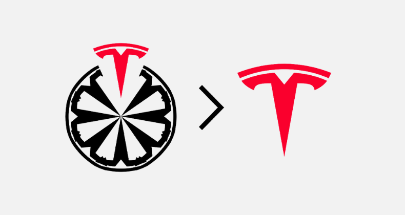
The first confirmed theory about the Tesla logo is that it is inspired by the cross-section of an electric motor.
The leg of the “T” signifies the motor’s stator, where the top curved bar shows the air gap. Using a letter as a symbol makes the logo design memorable and exceptional. The letter used as a symbol carefully includes Tesla’s brand product in the entire logo. This means that they are a brand that focuses on electric vehicles while also paying tribute to the inventor Nikola Tesla and his commitment to pioneering his work in electromagnetism. This way, there is a link between Nikola Tesla’s legacy and the logo, which represents the company’s determination and dedication to innovation and sustainability.
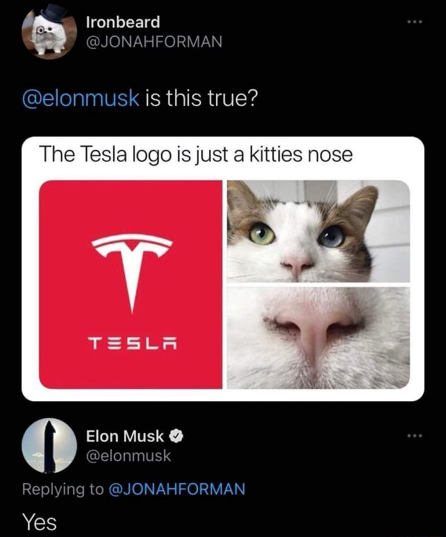
The second theory traveling around is that the Tesla logo was inspired by a cat’s nose.
The Tesla logo cat nose theory became popular because people interested in discovering more about it looked up the definition of a cat’s nose and what it represents. Typically, this creative interpretation of the Tesla logo implies that the tech company will often step into uncharted territories and take the initiative to make a change. From what we can see from the Tesla logo cat nose theory, a cat’s nose indicates a mixture of agility, curiosity, and safety. The Tesla company aims to convey to its buyers what they can expect from their Tesla vehicles this way. Want similar inspiration for your logo design?
LogoVent’s expert logo designers can help you. Schedule a consultation today!
Breaking Down the Font and Typography
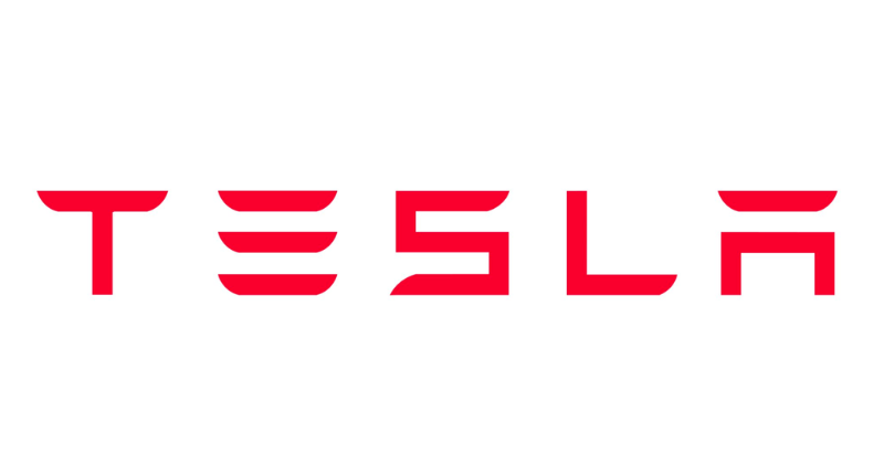
You can clearly see how simplified and easy the Tesla logo is. It looks like the central concept of electric energy. The font is minimalistic, where “extra” vertical lines are absent from the “E” and “A”. One look at this logo, and you can see that it reinforces the idea of futurism and simplicity, mimicking Tesla’s pioneering approach to electric vehicles. The Tesla logo’s slanted “T” shape gives us a visual representation of energy in motion. The overall outlook of the font and typography of the Tesla logo effectively convey the electric spirit and the brand’s commitment to creation and sustainability.
Would you be interested in next-level logo design that is also affordable? Here are some logo design packages you can kickstart your business’s rebrand with.
Power, Indulgence, and Evolution: Looking at the Tesla Color Palette
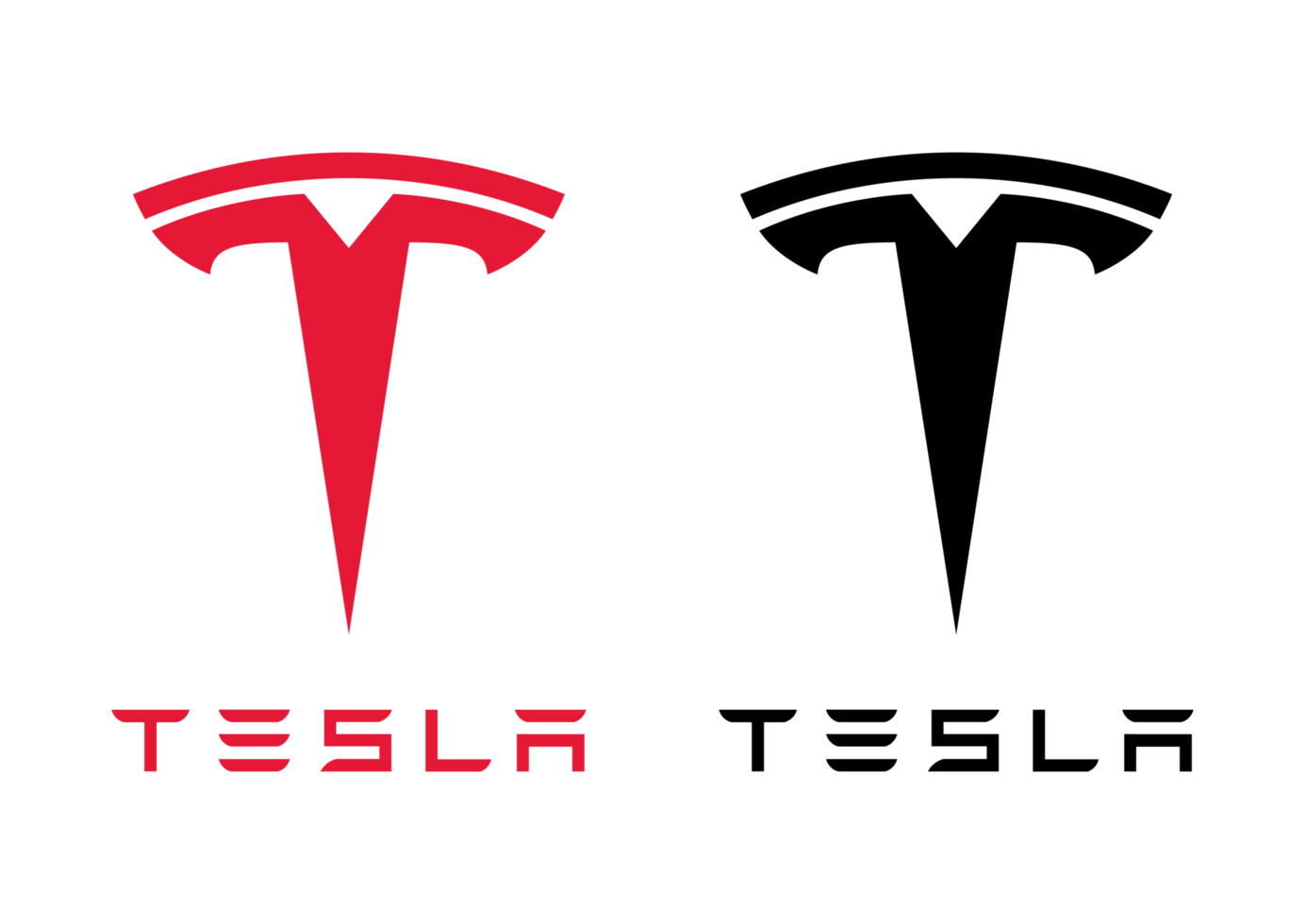
You would see the Tesla red logo on a white background or the black version of the logo on a white. Somewhere, you may also see a silver version, mostly on the cars. Researchers focused more on studying the logo design, stating that, on the one hand, the white color symbolizes purity, creativity and technological advancement. Meanwhile, the black color represents boldness and dominance in the tech industry and luxury.
Red is interpreted as passion, change and authority in the automotive industry. When you combine these colors, you can see how the brand effectively communicates Tesla’s commitment to delivering high-class, luxurious, innovative and sustainable designs that are futuristic and ahead of time.
Related read: Mastering Color Theory: Your Ultimate Guide.
Over to You
The Tesla logo has had a remarkable impact on the world. It became so influential that we created the concept of the Tesla logo cat nose theory. It is now one of the most widely recognized symbols, and so is the Tesla company. Before it would not have (maybe) been that recognizable since the previously designed logo had a shield, making the logo look a bit too much, but now it has been reduced to what you see today. Because of the sleek and effortless design of the Tesla logo, a priming effect has been established on people. That means when you see a design or a certain color of something else, it reminds you of a logo, which is what the cat nose did to us in the first place.
Inspired by the Tesla logo’s impact in the electric automotive industry? Create your own standout brand identity. At LogoVent, our expert designers blend innovation with market insights to craft logos that don’t just follow trends, they set them. Whether you’re launching a new venture or rebranding, our affordable logo design services are tailored to help you make a lasting impression. Ready to elevate your brand? Explore our Logo Design Services and discover how we can bring your vision to life!
Read more: 35 Popular K-Pop Logo Designs That Are Totally Daebak.
Some Frequently Asked Questions About the Tesla and its Logo
What is the Design Behind the Tesla logo?
The stylized “T” in the Tesla logo represents the cross-section of an electric motor. The end tail of the “T” symbolizes the motor stator, while the top curve of the “T” signifies the air gap
What Font is the Tesla Logo?
The font style used in designing the Tesla logo is called the Tesla Slab. It is a customized slab Serif typeface that includes cursive italics.
What is the Structure of the Tesla Logo?
The Tesla logo consists of two main lines with different meanings. The ” T ” vertical line is the motor rotor, while the horizontal line is the stator section.
Is the Tesla Logo a Tesla Coil?
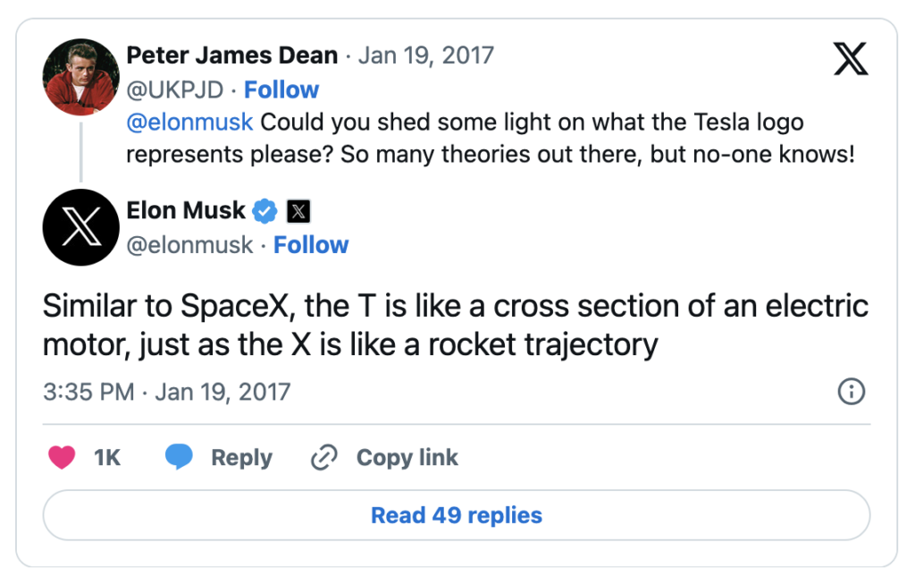
Elon Musk confirmed on X (Twitter) that the “T” represents an electric motor, similar to how the “X” designates a rocket trajectory in SpaceX’s logo. Therefore, the Tesla logo is not a stylized Tesla coil.
Who is the Real Designer for Tesla Logo?
The design firm, RO Studio, modified the current Tesla logo. Their firm is based in New Jersey.
