In 1994, Sony Interactive Entertainment launched its most loved PlayStation in Japan. It took the world by storm. Almost everyone has heard of PlayStation, as it has been one of the leading gaming platforms worldwide for years. So, whether you are an Xbox fan or play on Nintendo, you may have tried the PlayStation and enjoyed that experience.
While PlayStation itself is a success, it is important to see how the Sony PlayStation logo significantly impacted the brand’s overall look. You can see that the PS sign is the PlayStation logo symbol with just one glance. Because of the PS logo, you can see how professional logo designs are important to the way a brand is perceived.
Sony hit the jackpot with its PS symbols, which started with a “P” standing on an “S” logo in various colors. The logo added a retro touch, perfect for the year it was introduced. While it is a pretty simple logo design, that is what made it memorable and professional to consumers and those interested. This blog is all about PlayStation, the minor changes made to its logo, and the 28-year-long history mark it has set.
Interested in reading about logo evolutions? Check out: Disclosing The Tesla Logo: Reimagining Mobility.
The First PlayStation Logo: 1994 – 2009
![]()
Manabu Sakamoto designed the original PlayStation logo and is credited with the company’s watermark typeface for all PlayStation products. Before we delve further into the original logo, here is an interesting image to show after several prototypes, trial and error. This is how the masterpiece you see today existed.
Such iconic logo design is possible for your brand too. That too at affordable pricing. Check out our logo design packages here.
![]()
These are a couple of concepts Sakamoto created, leading to the epic logo you see today. This is definitely a source of inspiration and motivation for logo designers or those looking forward to owning a professionally made logo. It takes time and dedication to create that one simplified logo that resonates with your brand and acts as a trophy symbol for it.
While the PlayStation 1 and its competitors, primarily Nintendo 64 and Sega Saturn, belong to the fifth generation of console gaming, it is critical to note that this generation was the first to switch to 3D graphics.
Because of this, Sony had to develop a feature highlighting their brand and gaming console to stand out from the competitors. So, keeping that in mind, what better way to stand up against competitors and send a message than with a logo?
This was when the first PlayStation logo was created. The PS logo design consisted of a “P” and an “S,” where the “S” is laid flat, the “P” stands right in front, and the tail of the “P” connects to the ending of the “S.” What actually makes the PS logo design so alluring is how the letters were placed. In a way, you can see a 3D effect. Depending on how you look at this cool PlayStation logo, the vertical P can either be standing on the S or the S is the shadow of the P.
Apart from the PS symbol design, the color theory screams retro and nostalgic. While the P is completely red, the S shifts from yellow to green, then blue. What caught our attention first was the P. Keeping the P as one color, that too red, was an epic idea, and it is the first attraction. Red indicated passion, excitement, and anger. In the world of gaming, all three of these apply. In other words, red can be interpreted as a sign of energy that gaming brings out in one.
Red and yellow indicate warmth, whereas green and blue are cool colors, bringing balance to the logo design. Because of these colors, PlayStation is the first gaming logo to include diverse colors in gaming history. The PS symbol created an aesthetic that struck the public with shock and amazement, adding a great visual representation of the 90s fashions and overall aesthetic.
Read more: The Historical Evolution Of The Google Logo.
The Current PlayStation Logo: 2009 – 2022
![]()
After 15 years, the company decided to change the PlayStation logo. Not many changes were necessary, so the only notable difference is that the logo is now completely black, with the colors removed. While it can be said that there was no need to change the logo design in the first place, the logo designers wanted to go for a more monochromatic look, making the PS symbol seem modern and subtle. This added a touch of elegance and gave the PlayStation logo a more futuristic and bolder look. While the 1994 PS logo is still loved by many, the 2009 logo is adored the same.
The PS logo underwent changes, including the removal of colors and slight alterations to the geometric shapes of the letters. The vertical “P” now outlines and cuts through the “S” in the back. Before the changes, PlayStation released its second gaming engine, breaking records and becoming the most-bought console with over 150 million units sold. This unique approach not only offered consumers a new gaming console from a successful brand but also introduced a new logo design that matched the futuristic and modern aesthetic of the gaming engine, further exciting consumers.
Want to understand the concept behind a million-dollar logo? Read our blog “The Million Dollar Logo: 12 Most Expensive Logo Designs In History” to find out!
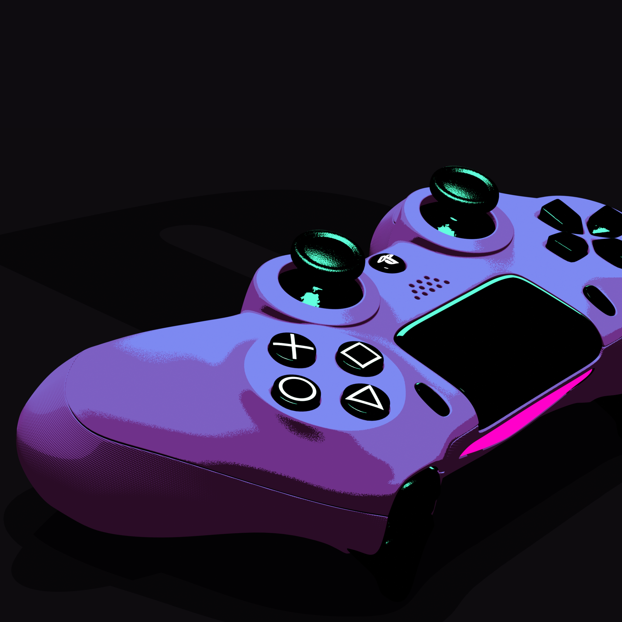
The PlayStation Controller
Like the logo and overall gaming engine, the PlayStation controller is significant in the brand’s succession and uniqueness. With Nintendo as its competitor and already owning gaming consoles, Sony had to develop an improved concept that would make it stand out from the competition.
One of the most memorable PS symbols was designed by Teiyu Goto, who was told to design the PS gaming console to be similar to the SNES controller (their competitor). Goto decided to design something unique and came up with the concept of grips and a control stick on the PlayStation controllers.

The significance of the PlayStation controller evolved alongside new consoles. One thing that stands out from the rest is the buttons. There are four action buttons: triangle, square, O, and X.
You can find such ingenious design ideas here at LogoVent that have helped our clients emerge as top competitors in their industries. Check out our portfolio here.
PlayStation’s Recorded Ties With Nintendo
There were historical ties between Sony and Nintendo, meaning that while Nintendo was already in the gaming business, Sony did not have any consoles before the PlayStation. This made them collaborate in a way. Sony provided Nintendo with an S-SMP chip that advanced Nintendo’s sound. The former CEO, Ken Kutaragi, was responsible for the ties made between the two companies.
Kutaragi intends to strengthen ties between the two giant companies and sees the potential for growth. However, Sony was wary about entering the gaming industry. This worked because Sony was obliged to make audio hardware for Nintendo and CD-ROM-based games. At the same time, Nintendo would deliver Sony with its first gaming console by making Nintendo cartridge games available on PlayStation.
Following negotiations, tension arose, and Nintendo decided to develop its own gaming console with features originally planned for the PlayStation. This move ended their collaboration with Sony, and instead, Nintendo announced a partnership with Philips.
Sony executives felt betrayed, but their response was not to back out but to keep going. The rest is history!
Conclusion
While not many changes were made to the PlayStation logo design, you can still see that before this masterpiece of a logo design was created, several prototypes, meaning trials and errors, were made. That implies how much effort, dedication, and thought goes into creating the right logo design that matches your brand, resembles the overall concept of the brand, and defines its purpose.
The PlayStation logo is a prime example of how a well-designed logo can leave a lasting impact on the gaming industry and its audience. If your company aims to make a similar strong impression, LogoVent is here to help. Logos are crafted to capture the essence of your brand, ensuring that your brand stands out and resonates with your target audience. Let us help you create the perfect logo that not only aligns with your brand’s goals but also elevates your brand identity. Explore our expert Logo Design Services and be loud and proud with a logo that speaks volumes. Schedule a consultation today!
FAQ’S
Where are PlayStations Made?
While PlayStations are originally manufactured and packaged in Japan, the PS4 is said to be manufactured in two countries, China and Japan.
Who Created PlayStation?
PlayStation is a video gaming brand produced by Sony Interactive Entertainment.
Who Designed the PlayStation Logo?
Manabu Sakamoto designed the original PlayStation logo and is credited with the company’s watermark typeface for all PlayStation products.
What do the PlayStation symbols mean?
While the triangle conveys the player’s point of view, the square represents a piece of paper. The “X” and “O” are like “NO” and “YES”, respectively.