Gucci is an iconic brand that started from its humble beginning and mounted its way up the fashion industry. It has established its headquarters in over 14 countries and 528 stores worldwide. While the brand itself added competition in the fashion industry, the logo design is one of the main reasons that made it so recognizable and famous today.
While the brand did come a long way, so did the Gucci emblem and logo. Here, we will discuss the importance of the evolution of the Gucci logo design. Regardless, let’s jump right into the Gucci logo and its impact on the brand. We have additionally added a couple of frequently asked questions so you can find everything you are looking for in one article. Let’s get started.
Are you interested in gaming? Read our blog “The PlayStation Logo And Its Significance.”
Brief History of Gucci
Originating from Italy, back in 1921, the owner, Guccio Gucci, had experience working in luxury hotels, which made him decide to open a small leather shop. While the brand’s main purpose was to design equestrian gear, he also designed high-quality accessories. From then onwards, the business grew and became synonymous with Italian craftsmanship and luxurious taste.
The Italian fashion house has a deep-rooted association with equestrian culture. This connection dates back to the early 20th century when the founder, Guccio Gucci, worked as a bellboy at London’s Savoy Hotel. It was during this time that he drew inspiration from the elegant riding gear worn by the hotel’s guests.
This equestrian heritage is still prevalent today in some of the brand’s most iconic pieces. One of the most iconic designs is the green and red strip of Gucci products.

Because of its rising success, the small Italian company expanded into a global luxury brand. While it is known for its innovation and sophisticated designs, the brand’s transformation was mainly due to the efforts of Guccio’s sons, from which one, Adlo Gucci, had expanded the business internationally and introduced clothing and accessories into a competitive product line.
Read more about unique logos: Disclosing The Tesla Logo: Re-imagining Mobility.
The Gucci Logo Evolution
A logo has a significant impact on any brand, particularly in the fashion industry. It visually represents the brand’s mission, values, and overall image. A well-designed logo enhances brand loyalty and credibility, leaving a lasting impression on people’s minds and conveying the brand’s essence at a glance. It also shapes the brand’s perceived values.
The first Gucci Logo: 1923
![]()
The first Gucci logo was created in 1923. It was hand-lettered to create a chic and classic look. Naming the brand after the owner is a very dominating approach, and that is what the logo design wanted to achieve in the first place. Get in touch with our 24/7 available representatives now!
Looking for an Affordable
Logo Design Services
Chat With us to avail 30% OFF
The Addition of G for Guccio: 1929
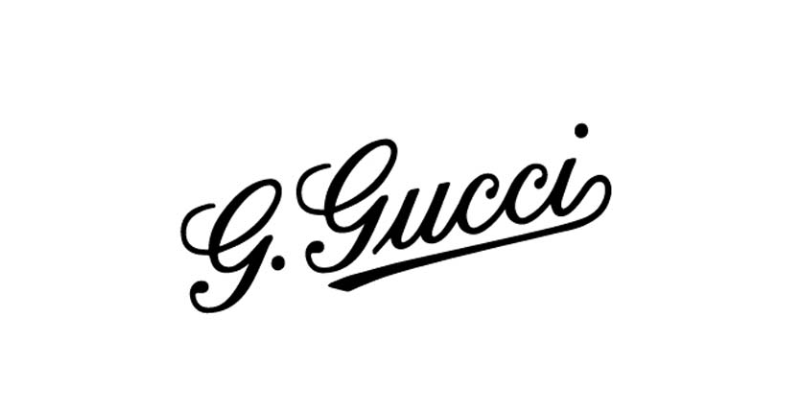
The second logo design features the owner’s first name, Guccio. While the initial logo also seemed okay, it felt like the owners’ names should have been included. The Gucci logo is directed upward, and the “G” design is different, so extra swirls are omitted.
The Gucci Emblem: 1934
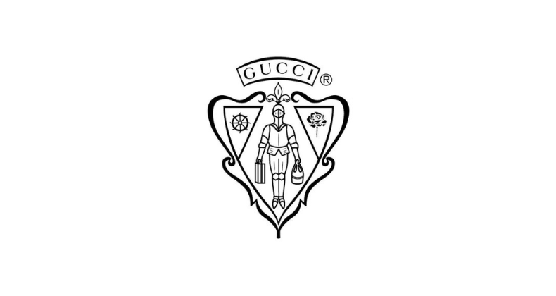
This was a major change to the Gucci logo. Here, you can see a knight inside a shield holding onto a set of bags or suitcases. The Gucci symbol included a mascot this time. It seems like an interesting approach, probably for that day and age. It did still stand out regardless. The Gucci emblem was hand-illustrated, adding extra credibility to the brand’s image. The Gucci sign was above this emblem. You can see the changes made to the Gucci typeface.
Read The Historical Evolution Of The Google Logo.
The Improvement of the Gucci Wordmark: 1958
After a while, the famous brand decided to make some changes. They may have felt that the brand name was too small in the previous logo, so they decided to improve it while keeping the emblem in place. This time, the Gucci wordmark was much bigger and included spacious kerning with a sleek font. You can almost see that the logo designers were pretty close to the 1998 Gucci wordmark. The knit emblem was reduced in size and was placed at the back.
The Change to Serif and Placement of Gucci Emblem: 1971
The Gucci logo kept the knight symbol from the 1930s, but the brand name changed from a modern font to a classic one. This new look felt more traditional and highlighted Gucci’s rich history in Italian fashion.
The Interlocking of the G’s: 1992
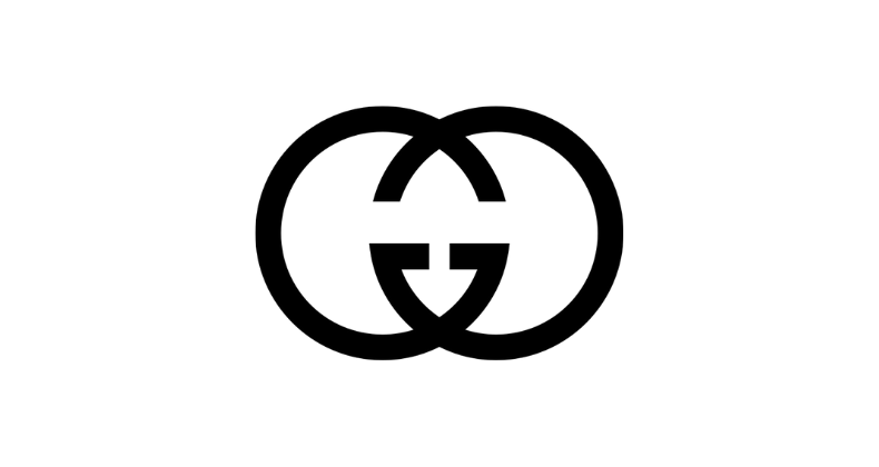
Aldo Gucci played a key role in shaping the brand’s visual identity in the 1960s by designing the now iconic interlocking Gs logo as a tribute to his father, Guccio Gucci. However, it wasn’t until the 1990s that this version of Gucci’s logo gained widespread recognition. This monogram, representing the founder’s name and the brand’s heritage, has become one of the most prominent symbols in the fashion industry. It can be found on numerous Gucci products and has made a lasting impact on the fashion world.
Interested in a logo as iconic as Gucci’s? Contact us for a custom logo design!
Have you noticed that the Gucci Logo was simplified? Here is a blog that can help you learn all about logo simplification: Learn The Art Of Logo Simplification For Powerful Logo Designs.
Tom Ford’s Influence on the Gucci Logo: 1998
![]()
In 1998, Gucci’s creative director, Tom Ford, gave the logo a modern makeover. The new design featured spaced-out letters, a bold move away from tradition. Yet, it still paid homage to founder Guccio Gucci’s love of innovation and timeless style.
The Gucci Logo Today: 2019 – Today
![]()
In 2019, Gucci introduced a new iteration of the interlocking Gs, representing two overlapping Gs in a different style. This modern logo iteration represents the brand’s dedication to growing while celebrating its roots and core values.
Why Does Gucci Have Two Logos?
You may have noticed that Gucci has two logo designs on its website and elsewhere. Here is an example:
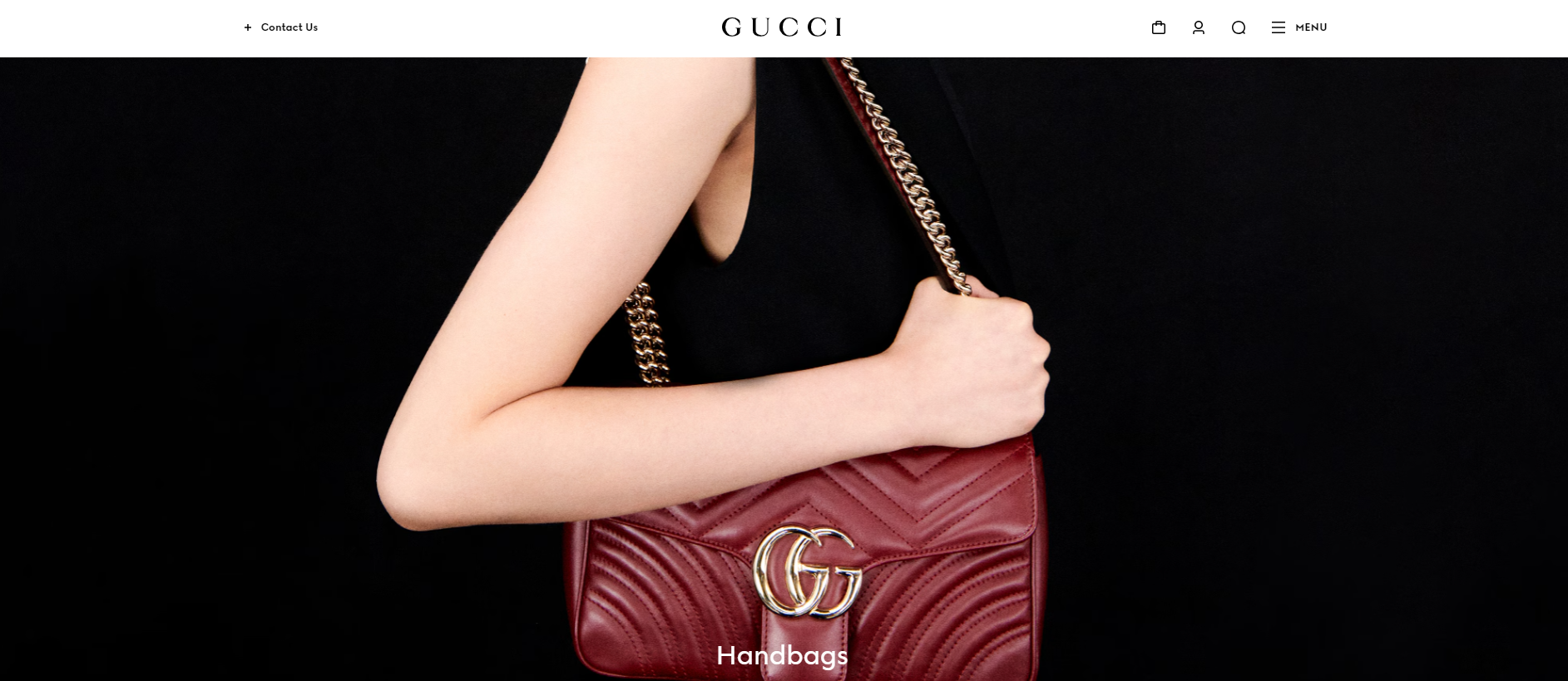
Above, you can see the 1998 Gucci word-mark and the 2019 logo design on the bag. Aldo Gucci, the son of Gucci’s founder Guccio Gucci, joined Gucci in 1933 and designed the logo for his father. Using the two G’s directly references Guccio Gucci’s initials, creating an artistic and enduring representation of the founder’s significance. The iconic double G Gucci sign was originally designed by Aldo Gucci, one of Gucci’s sons. The interlocking Gs represent the founder’s initials, Guccio Gucci, and later became a popular emblem. The company used this logo on its clothing, handbags, footwear, and accessories.
Find out about the million-dollar logo here: The Million Dollar Logo: 12 Most Expensive Logo Designs In History.
The Color Theory Behind the Gucci Logo
The color palette used in Gucci’s brand identity holds symbolic meaning, reflecting the brand’s Italian heritage and commitment to luxury. The iconic green-red-green stripe pattern, often featured in bags, leather goods, and shoes, pays homage to the colors of the Italian flag and traditional equestrian stripes. It’s rare for a brand to keep its original color palette. However, Gucci’s iconic red and green shades have stayed with the brand from its origin.
Related Read: Mastering Color Theory: Your Ultimate Guide.
The Focus on Font and Typography
Examining the different fonts used in Gucci’s logo designs, a common theme emerges – a commitment to elegance. The Granjon Roman font, used for both the interlocking Gs and the company’s wordmark, adds a sophisticated and classic touch to the overall design. This font choice conveys the brand’s luxurious and esteemed image, ensuring that the logo maintains a timeless and classic representation of Gucci’s values.
Key Takeaways
The Gucci logo design went through many iterations and changes before becoming the iconic symbol we recognize today. Creating a logo that truly represents a prestigious brand takes time and dedication. This process teaches us that achieving the perfect logo design often involves trial and error, as well as continuous refinement of concepts.
In today’s competitive market, having a professionally crafted logo is more important than ever. With LogoVent, you benefit from a team that stays ahead of design trends and utilizes cutting-edge tools to create logos that perfectly capture your brand’s identity. Don’t leave your brand image to chance—secure a logo that not only stands out but also instills confidence in your audience. Contact us today to explore our Logo Design Services and elevate your brand to new heights!
FAQ’S
What Does the GG in Gucci Mean?
The famous GG or double G symbol represents the founder’s name, “Guccio Gucci.” The company started in Florence in 1921, and the double “G” represented the founder’s initials.
What is the Real Logo of Gucci?
The real logo of Gucci is the iconic Double G or GG symbol you see today. The two Gs are placed on top of each other, with a slight cross-section on top of the other G, making it one of the most recognizable logos.
What does the Bee mean on the Gucci Logo?
The Bee on the Gucci logo is a tribute to a striking cache of 300 gold-and-garnet beads found in the tomb of the fifth-century monarch King Childeric. The first time the Bee on the Gucci symbol was used was in the 1970s.
What is the Idea Behind Gucci?
The idea behind Gucci was because of the founder’s experience at the Savoy Hotel in London. Because of this, Guccio Gucci combined exceptional Tuscan materials and craftsmanship with an elegant English aesthetic.
Who Owns Gucci Logo?
Although the founder of the brand is Guccio Gucci, Gucci began to rapidly expand under the direction of Gucci’s sons. After the company went public in 1995, after a long period, the company became owned by the French multinational corporation Kering.