If you have played with the LEGO blocks, saw them in the store, bought a LEGO gift set for the kids, or went to watch the LEGO movie. Everyone has a LEGO memory. It does not matter if you have purchased one, but you have seen it, and it is now a part of your childhood memory. These simple, colorful building blocks have made a tremendous impact on the entire world. LEGO blocks have been a part of so many of our lives in one way or another.
These LEGO blocks are known for their endless creative possibilities. Just like those endless possibilities those little blocks bring, the LEGO brand has limitless imagination when it comes to growing its iconic brand. Beyond these building blocks, the LEGO logo has become one of the most renowned and memorable logos in the entire world. It has also become an iconic logo in the kids’ toys industry.
So, whatever your story is with the LEGO logo and however you remember it (even if you ended up stepping on one barefoot because that hurts like a… You know what XD). This short read will tell you the history and evolution of the LEGO logo and how it has become one of the most unforgettable logos. The evolution will shock you. But if you are someone trying to seek inspiration, this article will tell you how even the most reputable brands undergo several transitions before they make that ONE logo that represents them as superior as they are today! Keep reading to gain more inspiration or learn about the LEGO logo!
Want to learn more about logo design evolution? Read our blog “A Visual Timeline: The Microsoft Logos Transformation Through The Years (1975-2024).”
What is a LEGO?
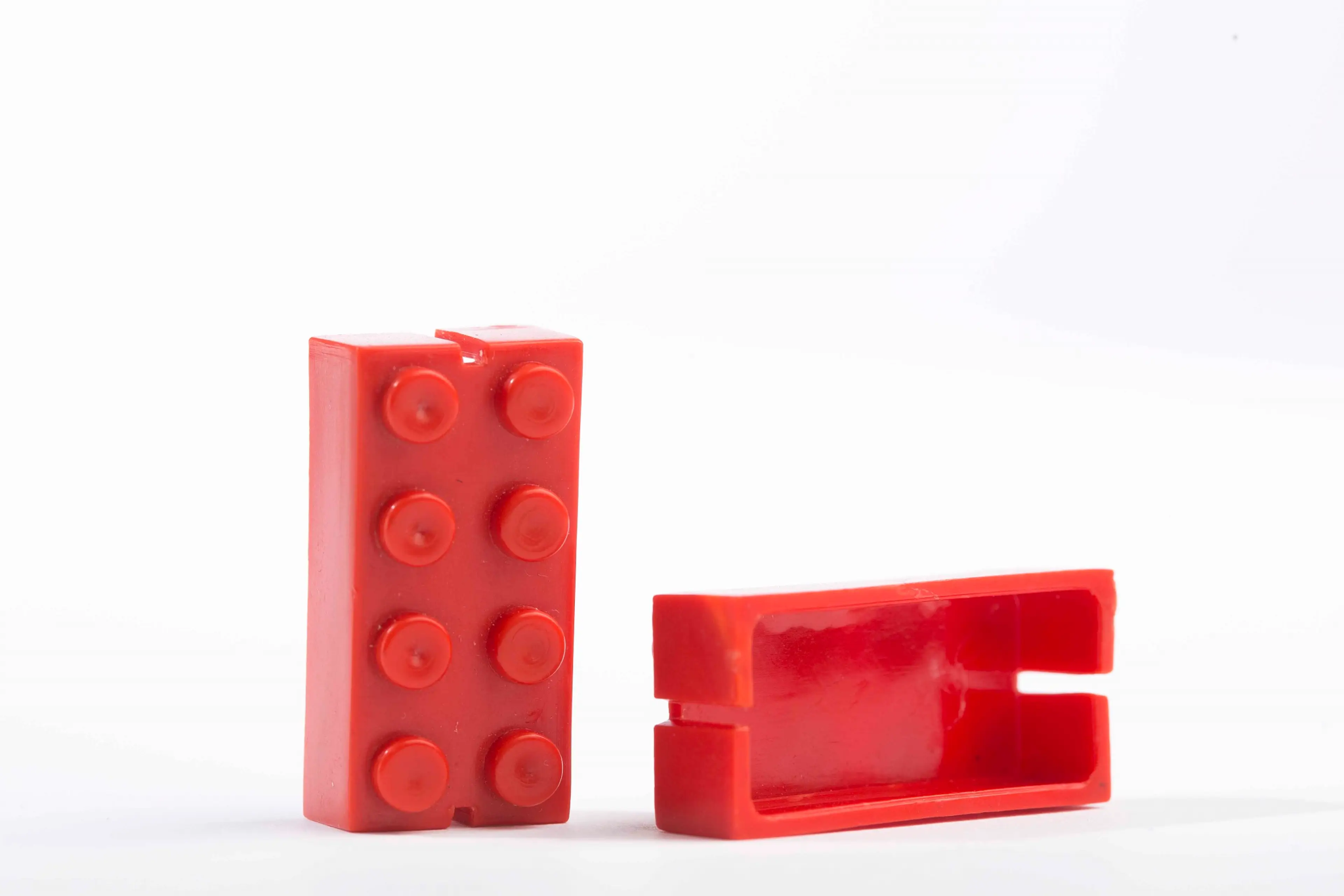
A LEGO block is a small colored block, first known as the “automatic binding brick” in 1949. It is stackable and can be used to create a tower or more figures. They now come in various shapes and sizes, and even with LEGO human-like figures.
You most likely already know about the LEGO logo and the entire brand. If not the blocks, then you most certainly have watched the LEGO movie. Regardless of how you remember it, the LEGO logo has become a pivotal part of our childhood.
Looking for an Affordable
Logo Design Services
Get in touch with our 24/7 available representatives now!
Chat With us to avail 30% OFF
To some, they may seem like simple colored blocks, but for kids, they were a whole field of creativity and endless imagination that made them feel joy and a sense of achievement. These symbols of innovation and creativity have made it long before they became what they are today.
So, to answer your question about LEGO, it is a toy that pushes our imaginations to the next level. Imagine plastic building blocks helping us achieve that level of imagination. LEGO blocks aren’t just for kids, by the way. They may have been invented for kids, but adults have an amazing time creating unique figures.
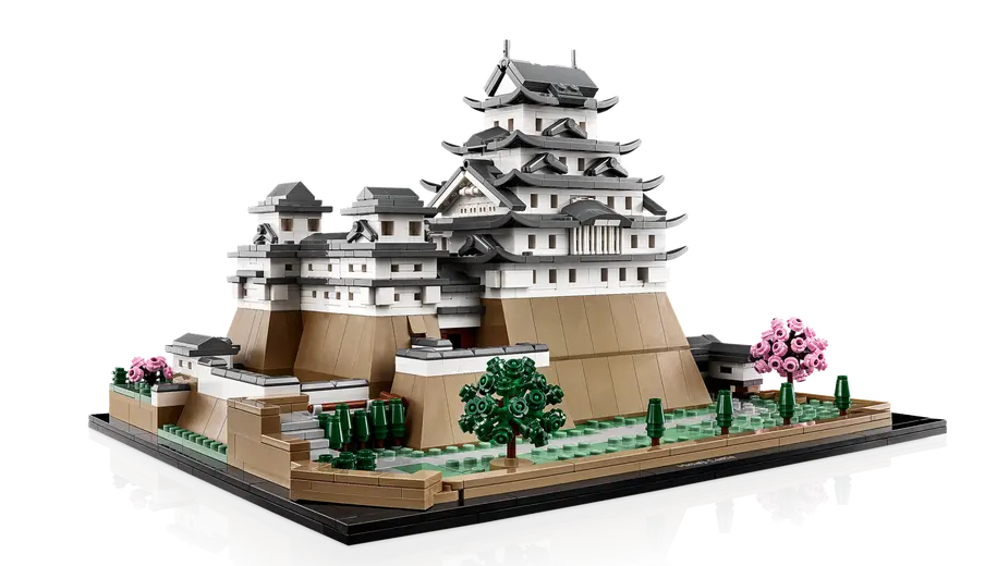
For example, take the Himeji Castle LEGO set. This looks more like a collector’s item or for decor. It is stunning and has so much detail it looks real from afar!
When it comes to what LEGO is, the LEGO toy industry was founded by Ole Kirk Kristiansen in 1932. The first LEGO block came a few years later, in 1936. The word LEGO means “to play well” in Danish.
Over the years, LEGO has upgraded its blocks to a whole new level. The example shared in the beginning clearly shows this. At first, they were simple building bricks, but now you can create complete buildings and ancient architecture with them since they design the blocks in specific ways to target those interested in them.
Now, we will move on to the LEGO logo and its huge impact on kids and adults! This is such a logo that is unforgettable and will be remembered even when you are old!
But before we do, if you are looking for next-level logo design services, you can contact LogoVent today for a consultation. But you might not be convinced yet. No worries, read on and see what we have to offer. Additionally, you can take a look at our comprehensive portfolio.
Learn more: How Do I Choose A Web Design Company?
The Evolution, Meaning, and History Of the LEGO Logo
When you see the LEGO logo over the years, one thing remains constant—the word mark. Through all their transitions, you will see what the logo designers opted to take out and keep in the logo.
As you see each transition of the LEGO logo. You will notice that the features remain playful and how the designers managed to create a logo that fits so well with the industry that you could not imagine it any better. You cannot even debate with it! So, let’s jump into the first-ever logo made for LEGO.
1934 – 1936: The first version of the LEGO logo
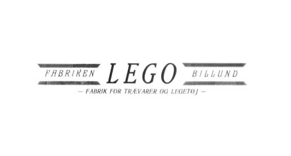
The first logo iteration featured the LEGO name in capital letters, bold, and vintage font. The letters are clearly printed in black and bold, giving off newspaper font vibes. Back in those days, this kind of font was popular and widely used among brands. While the logo may have stood out then, it did not give the impression that this brand focuses on creating toys for kids. It kind of seems like something more serious if you ask me.
1936 – 1946: The second version of the LEGO logo
A few years later, after the first LEGO logo was revised, the brand decided to update the logo design. While the first iteration was bold, blocky, and vintage, the second LEGO logo seems to be the opposite. Here, in this LEGO logo, you can see it features thinner lines and a softer font. This may have been done to make the logo printable on a wide range of toys.
Read more: 35 Popular K-Pop Logo Designs That Are Totally Daebak.
1946 -1950: The third multiple versions of the LEGO logo
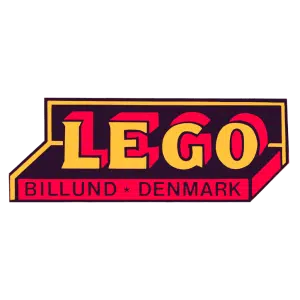
Coming back to the LEGO logo, the lettering is still in capitals and a 3D style. The shadows of the letters are red, which almost makes it seem as if the letters are popping out. Finally, the entire logo seems like it is in a box. This implies that the LEGO logo is sitting in a box, almost representing a toy box.
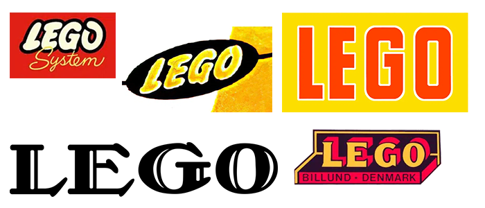
Although the LEGO logo discussed above was the initial third logo, two other logos were introduced this year. From 1946 to 1946, LEGO introduced a unique logo that was very different from the first two. This LEGO logo also includes bold lettering and capital letters, but it is slightly longer. It is in two colors, orange and black, with the text written under the logo in a different font.
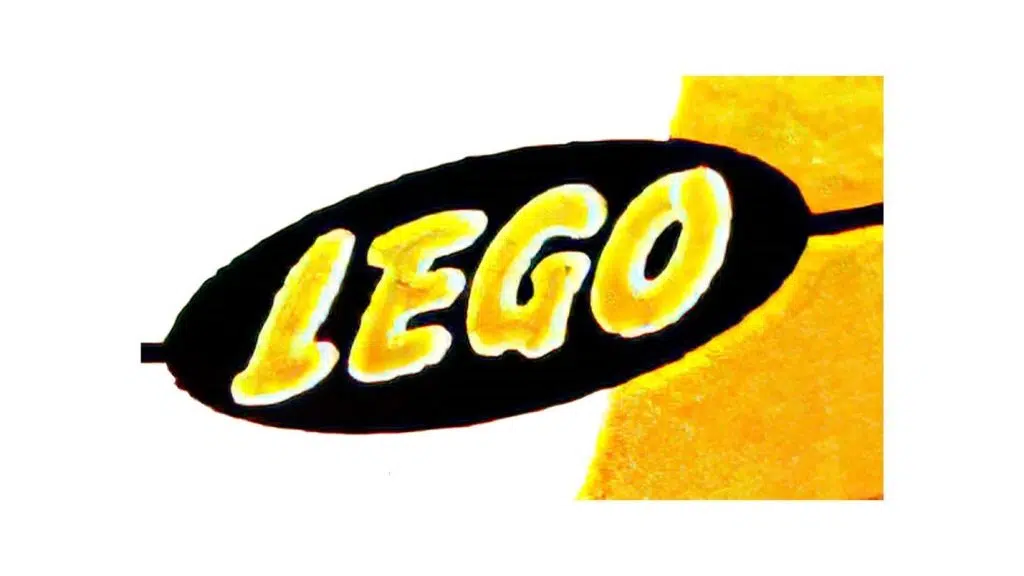
The second logo introduced during the third logo version era (it sounds odd to say, but this is what it was) was exclusively designed for wooden toys. This logo reminds me of a lemon. You may see why or see it now since I started it.
Regardless, it is very different from the rest. The letters remain bold and capitalized. From 1948 to 1950, this logo was introduced, with a black oval background and a wordmark printed inside the logo.
1950-1953: The fourth version of the LEGO logo
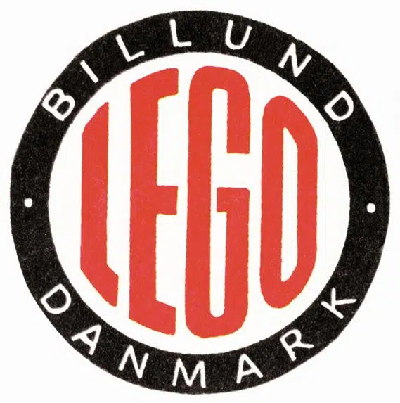
In this LEGO logo, you will see that changes have been made to the LEGO lettering. The designers ditched the bold block lettering and toy box design while utilizing the symbol in a different way. The logo is in a circle, and it resembles more like a stamp with the LEGO logo word mark in the center. That is outlined by a black circle that displays the place where it was founded.
1953 – 1955: The fifth version of the LEGO logo
Now, the designers decided to change the LEGO logo again. The last logo lasted only a few months, but this time, the designers included some of those features in this logo design, which then lasted for two years. The word mark was similar to the first iteration, but now, the letters were capitalized block red and outlined in white. The word-mark sat on a yellow block instead of a black background this time. This LEGO logo brings out a more friendly and approachable vibe to it. Making it seem like it is a toy brand. 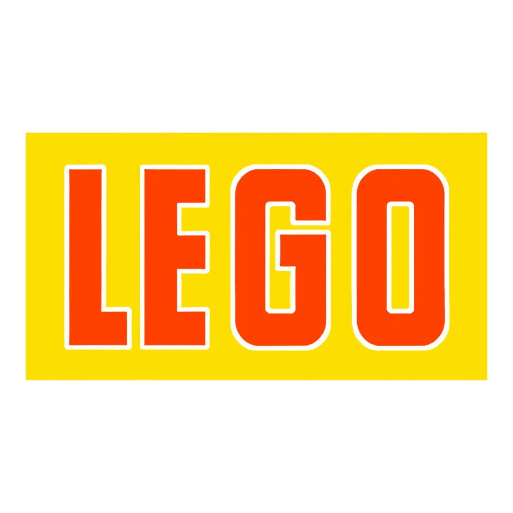
1955 -1959: The sixth version of the LEGO logo
1959-1960: The seventh version of the LEGO logo
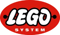
For this LEGO logo, the only difference made was that the designers added the word SYSTEM at the bottom of the logo.
1960-1964: The eighth version of the LEGO logo
1964-1972: The ninth version of the LEGO logo
1972-1998: The tenth version of the LEGO logo

1998-Today: The eleventh (current) version of the LEGO logo
Here is the LEGO logo that you see today.
The LEGO logo we see today is not very different from the logo most of us are familiar with. The changes made to the design are the spacing between the letters, which has been reduced, and the colors, which have been slightly darkened. Other design elements have remained the same, still conveying the same playful message as the previous versions did.
Want to tell your brand’s story with your logo? Why not bring LogoVent’s expert logo designers in? Our logo design services are not only effective but affordable.
About LEGO Logos Symbol
The designers for LEGO did not give much direction toward a symbol but instead to the LEGO word itself, which became a symbol on its own. The brand may have introduced different shapes that represented the LEGO blocks or a toy box, but the focus on LEGO remains the same.
About LEGO Logos Font
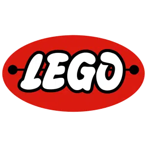
While the font has remained the same over the years, its key features are bold, round, thick, and blocky. This gives off a bubbly look, and rounded lettering gives a softer and more playful feel than sharp edges.
About LEGO Logos Color
Throughout the LEGO logo designs, four main colors have stood out over the years: white, red, black, and yellow. This highlights the color of the LEGO blocks and makes them more inviting, playful, and bold. At that time, these colors were considered gender-neutral, so boys and girls could play with the LEGO blocks. Imagine if it was all pink. You can just imagine.
Related read: Mastering Color Theory: Your Ultimate Guide.
Looking at LEGO Today
Looking at the LEGO brand today, it is not that drastically different from where it started; however, the innovative styles and inclusivity have made LEGO stand out now. They sell collector items, LEGO builds, and more. The brand generated the highest revenue in 2016 with more than $5 billion.
LEGO has had a more diversified approach. Apart from the building blocks and products, LEGO has branched its way into partnerships with movies such as Harry Potter and Batman and has designed unique designs.
Unique designs aren’t hard to achieve. But logo design that’s not only unique but effective and memorable? That’s rare. But not expensive like you might think. Seriously, our logo design packages start from just $69. Check them out right now!
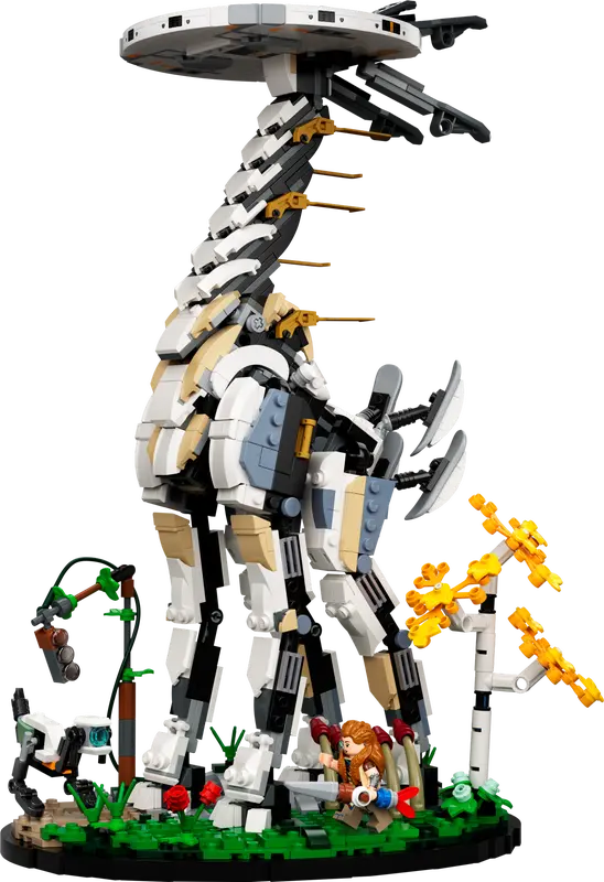
In Horizon, Sony PlayStation collaborated with LEGO to create a LEGO design of the tall neck from the game.
This is definitely for adults and is more like a showpiece than a toy. This is the extent of the LEGO industry’s diversity.
What to Learn From LEGO
One of the key takeaways from LEGO is its branding strategy. LEGO has successfully maintained a consistent and cohesive brand that is universally recognized. The company’s logo has remained true to its playful and vibrant nature, with features that are closely related to the toy. Although the logo has undergone minimal changes over the years, the core elements have remained intact. As the brand has evolved, it has adapted the logo to suit its needs while retaining the elements that work best.
The LEGO logo, in its current form since 1998, has become an iconic symbol recognized worldwide. This consistency across all mediums—from products to marketing materials—has played a significant role in the brand’s success. If you’re looking to create a logo that resonates and leaves a lasting impression, our professional logo design services are here to help. Visit our Logo Design Services page to get started on crafting a memorable and impactful logo for your brand.
