From TVs to dishwashers to fridges to smartphones and more, it is unlikely that you have not heard of this mega brand. Even if you are a die-hard iPhone user, you will still have one Samsung appliance in your house. The point is that chances are that you have encountered this South Korean multinational company in one way or another. And if it had to be guessed, if you simply see the Samsung logo, you would not have to think twice about it because you will instantly know which brand it is. The designers have truly done a remarkable job in making it a memorable logo.
Behind a great company that has made it this far to make a lasting impression, like Samsung, comes a great logo design. The Samsung logo design is a prime example of this. If people were to choose an appliance without any brand as compared to one with a logo on it, they would, hands down, choose the one with the logo design. In these cases, people recognize symbols, and they hold a heavy responsibility in representing the brand. A logo symbolizes a brand that you can trust because the company is not afraid to show its face to a large and diverse audience. They want to be recognized and discovered by people. So why would they do so to create a bad reputation?
So, regardless of whatever phone you are currently using, you will be a tiny bit interested in learning about this giant company and how it established strong grounds in the market. Continue reading to get a better understanding of this company and to learn how the company logo made a huge impact on the company.
A Short History of the Samsung Company
Lee Byung-Chul founded Samsung in 1938 when it was recognized as a trading company in Suwon, South Korea. In the following decades, Samsung expanded into several industries: textiles, food processing, retail, securities, and insurance. However, it was not until the 1970s that Samsung started shipping electronics overseas, which would ultimately become its most powerful source of income. During the late 1970s and early 1980s, Samsung grew into the global market by establishing several international subsidiaries.
As an outcome of the Asian financial crisis in the 1990s, the company experienced a dramatic transformation. It concentrated on improving the grade and quality of its products and innovating in the technology sector. It presented many triumphant product lines, including televisions and Samsung Galaxy smartphones. Today, Samsung continues to innovate and remain prevalent in the tech industry. The mega-company is on the leading and competitive edge of technology, and customers associate it with high-quality products.
More logo evolutions for you to learn from: The Logo Evolution of the Disney Logo.
The Samsung Logo Evolution
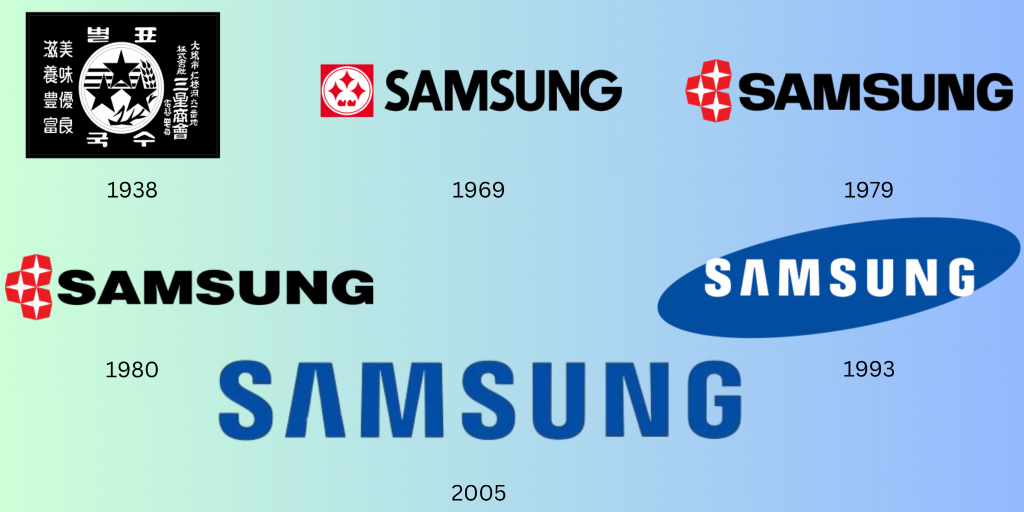
From the stars to the removal of them and into a simple, effective wordmark, the Samsung logo design has gone through enough logo iterations where it found the logo design for itself. As you can see, the evolution of the Samsung logo is nothing too complicated, and the designers were getting somewhere with the wordmark. This transformation has mirrored the company’s successful journey, where it reflects its own growth and domination in the market.
Using the power of a minimalistic logo design and a carefully chosen color palette, the Samsung logo is adapted to the digital and modern edge of the market.
If you are interested in learning about minimalism and simplification in logo designs, read our blog, “Learn the Art of Logo Simplification for Powerful Logo Designs,” to get the best tips and insights about this process. Remember, the more detail in a logo will be difficult for a viewer to remember. The trick is to keep your logo as simple and effective as possible. You will learn more once you read our article!
Now, let us get into the evolution of the Samsung logo!
The First Samsung logo: 1938
This first logo iteration was rackety, with many details and elements displayed, and it almost resembled a postage stamp. This version of the logo had a case of trying to incorporate too much at once with the stripes, stars, and wheat plants. It is like they were trying to force the idea that they work in a diverse sector and not just technology. Overall, this logo feels cluttered and too congested. There is just too much going on.
If you have noticed, this logo was so detailed that it would not even look good on products, meaning that they did not print it on their packaging or products initially. It was not until 1958 that Samsung began to do this, only before their company took off. Could you imagine this logo on the back of mobile phones?
Halloween is just around the corner. Read this blog by us to get ready for the spooky season: Top 10 Creative Logo Transformations For Halloween.
The Second Version of the Samsung Logo: 1969
Now, isn’t this a drastic change? From the giant, detailed black postage stamp-like logo to this comparatively more simplified logo, the designers must have considered this, thinking that this logo design could still be printed onto products and look more presentable.
The stars are still there; you can see they emphasize them, but they are more refined now. Imagine how the design team did this, making the logo look more abstract. Another prominent feature added to this Samsung logo design iteration was the addition of the Samsung company name. Because they added the wordmark, you will see next how they use this.
The Third Version of the Samsung Logo Design: 1979
Ten years after the second iteration of the Samsung logo design, the design team decided to reinvent and simplify the logo even more. This time, they removed those two little extra details, kept the stars, and removed the overall box that was framing the stars. If you look closely, the wordmark is slightly compressed, making it look bolder and prominent, as if it is taking up space on the overall logo.
You can already see how the simplified Samsung logo design looks sophisticated and dominant. All the logo designs after this (except one) kept the giant Samsung wordmark, knowing that it was one of the main reasons for making brand recognition easier.
More tips to learn from: How Temporary Logo Redesigns Can Affect Your Brand Identity.
The Fourth Version of the Samsung Logo Design: 1980
The third logo iteration lasted only one year. In 1980, the logo was redesigned. However, this time, the redesign only included small updates. The design team concentrated on amplifying the wordmark and made the “Samsung” brand name shorter and bolder, causing it to stand out more. Initially, you might not even notice the difference, but if you give it a long stare like we did, then you will see it.
This was also around the time that the world was transitioning from black-and-white televisions to color ones. As a result of this shift in technology, Samsung began to modernize its logo to mirror this colorful future of technology.
Note: If you are learning about the evolution of the Samsung logo to build a memorable brand identity for your brand, you must also know where to find the best web developer. Check out our guide to “20 Leading Companies And Platforms For Hiring Top Website Developers In 2024.”
The Fifth Version of the Samsung Logo Design: 1993
Now, the 1993 Samsung logo design looks more futuristic and closer to the one you see today. For Samsung, 1993 was a pivotal year for this mega company. This was the year that the logo we all know and love today was introduced. In fact, most of you must have already seen this logo design in places (that means we are old, JK!) This iteration includes an updated font placed within a blue ellipse. Looking at the wordmark, you will notice the A, which does not have a horizontal stick or bar. This helps the logo design stand out even more, giving it that edge and unique look. Because of this A, the whole logo looks iconic.
Read more: A Brief History of the ChatGPT Logo.
The Sixth Version of the Samsung Logo Design: 2005
Here, the Samsung logo designers decided to remove the blue ellipse and use that color to turn the font color blue instead. This is one of the main reasons why we still associate ourselves with the 1993 Samsung logo design version. However, you will still notice that their fifth logo design has not been completely dismissed, and they still use that one now and then.
More logo evolutions: A Full History of 7up Logo Evolution.
Key Takeaways From the Samsung Logo Evolution
Samsung is a mega company that took the tech world by storm. It took one idea and grew that small idea, reaching a global level today. Samsung has proven to maintain its place as a leading multinational company in the electronics space and as one of the largest companies, which comes as no surprise.
If you note, Samsung’s logo is one of the main and vital reasons to have helped build strong brand awareness, and it is safe to say that if it did not have a logo, viewers would not have had something to resonate with. It may not have been the tech giant you see today, and if so, it may have had to struggle substantially. Keeping this in mind, if you think of your own logo design and your firm, follow some of these strategies to simplify your logo and take the help of a professional logo designing agency such as LogoVent, and your firm can definitely go places.
Everything lies in the details, and it is not necessary to add too much detail to your logo that makes it look complicated and difficult to remember. It is also important to make sure that your logo design does not resemble your competitor’s logos. This is why it takes a lot of effort and skill to make a logo design that resonates with your brand image. At LogoVent, our seasoned logo designers create simple, scalable, and modern logo designs that deliver the right message to your intended audience. So, get started creating your first successful logo design with LogoVent.


