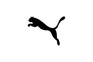
Puma is one of the most iconic brands in the sports industry, known for its high-quality athletic footwear, apparel, and accessories. Its logo, featuring a sleek black wildcat mid-jump, is one of the most recognizable symbols in sports branding. However, Puma’s story is not just about sportswear, it’s also a tale of rivalry, innovation, and legacy.
The brand’s origins date back to a family feud between brothers Rudolf and Adolf Dassler, who initially worked together in a shared shoe business. Their differences led to the division of the company, with Rudolf founding Puma and Adolf creating Adidas, two powerhouse brands that continue to dominate the global market today.
Over the years, Puma’s logo has undergone various transformations, reflecting the company’s evolution while maintaining its strong identity. In this blog, we’ll explore the history and evolution of the Puma logo, from its early designs to the modern emblem we see today.
What is PUMA?
Puma is a leading global sportswear brand specializing in athletic footwear, apparel, and accessories. Founded in 1948 by Rudolf Dassler, the company has grown into the third-largest sportswear manufacturer in the world. Puma is headquartered in Herzogenaurach, Germany, and operates in over 120 countries.
As of 2023, Puma employs approximately 18,681 people and reported revenues of €8.6 billion. The brand has a strong retail presence, with numerous stores worldwide, though recent economic challenges have led to cost-cutting measures, including closing unprofitable locations.
Despite market fluctuations, Puma continues to innovate and expand its product offerings across various sports, including football, running, basketball, and motorsports. The brand collaborates with top athletes and designers, maintaining its reputation for high-performance, stylish sportswear.
About PUMA – Meaning, History, & Everything In-between
The Birth of a Sportswear Giant
Puma is one of the world’s oldest and most influential manufacturers of athletic shoes, apparel, and accessories. Its story dates back to 1924, when brothers Rudolf and Adolf Dassler founded the Dassler Brothers Shoe Factory in Germany. Their innovative approach to sports footwear led to groundbreaking designs, including the first-ever soccer cleats with spikes, which revolutionized the game. This breakthrough, along with their commitment to quality, quickly established them as industry pioneers.
A Feud That Created Two Global Brands
Despite their early success, personal and professional tensions between the Dassler brothers led to an irreparable split in 1948. The division gave birth to two of the most iconic sportswear brands in history—Adolf founded Adidas, while Rudolf launched his own company, initially named RuDa, before renaming it Puma.
The same year, Puma released its first soccer cleats, the Atom, which immediately gained recognition when members of the West German national team wore them in post-war matches. This marked the beginning of Puma’s rise as a dominant force in the sports industry.
Innovation, Struggles, and Revival
Puma continued pushing the boundaries of sports fashion and footwear, consistently delivering cutting-edge products for athletes and sports enthusiasts. However, by the 1990s, the company faced financial struggles, with declining sales and a loss of brand identity. Puma was perceived as imitative rather than innovative, leading to a weakening of consumer trust.
The turning point came when Johan Seitz took over as CEO. Under his leadership, Puma underwent a major transformation, revamping its product lines, strengthening its brand presence, and securing collaborations that reestablished its credibility. This strategic shift restored Puma’s status as a leader in the sportswear market.
Puma Now
From its humble beginnings to becoming a global powerhouse, Puma has remained committed to innovation, performance, and quality. The brand continues to push the limits of design and technology, collaborating with top athletes, designers, and cultural icons. With a legacy rooted in resilience and excellence, Puma remains one of the most respected and influential names in the world of sportswear.
Puma Logo – A Symbol of Speed, Agility, and Strength
Since its renaming in 1948, Puma has always featured the wildcat in its branding, a symbol of speed, agility, and freedom. These qualities perfectly align with the brand’s commitment to high-performance sportswear. The name Puma itself was inspired by its founder, Rudolf Dassler, who believed his products should reflect the characteristics of the animal, including grace, power, and endurance.
The early versions of the Puma logo were quite different from the sleek design recognized today. At first, it was enclosed within an irregular hexagon, with a puma leaping through an elongated letter D. This design maintained a connection to the Dassler name while emphasizing movement and energy. As the brand grew, it adopted a simpler approach, removing the hexagon and letter, leaving only the leaping puma. This shift made the logo more striking and instantly recognizable.
Rudolf Dassler initially drafted the first version of the puma, but it lacked the polished, professional touch needed for a global brand. To refine it, Puma enlisted Lutz Backes, a well-known German artist and designer. His version of the leaping puma became one of the most recognizable emblems in sports history. The design captured the essence of motion, athleticism, and determination, perfectly complementing Puma’s vision.
The logo has undergone subtle refinements, but its core elements have remained unchanged. The leaping puma is more than just a symbol. It represents the spirit of athletes who push their limits. Today, it stands as a mark of excellence, appearing on Puma’s products worldwide, reinforcing the brand’s lasting legacy in the world of sports and fashion.
Looking for more iconic logo transformations? Check out our in-depth analysis of Nike’s swoosh evolution and how it became a global powerhouse.
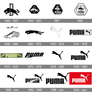
The History of the Puma Logo
As stated earlier in the blog post, the Puma logo was first created in 1948 when Rudolf Dassler founded the brand. The original design featured a leaping puma inside an irregular hexagon, jumping through an elongated letter D. Seeking a more refined look, Dassler enlisted German artist Lutz Backes in the early 1950s to redesign the emblem.
Backes created a sleeker, more dynamic version of the leaping puma, capturing agility and strength. In 1968, Puma introduced a simplified silhouette without borders, making the logo more recognizable. By the 1970s, the puma was positioned above the wordmark, solidifying its identity.
Though refined over time, the leaping puma remains a symbol of speed, power, and excellence in sports and fashion.
The Early Years (1948 to 1951)
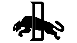
The first Puma logo was introduced in 1948, featuring a bold and dynamic design. It showcased a monochrome image of a sleek, black wildcat leaping forward from a sharp, narrow letter “D.” The letter was also in black but outlined in white, creating a striking contrast. This design symbolized speed, agility, and power, reflecting the brand’s focus on performance and athleticism.
Puma also introduced a reverse color version of this badge, placing a white puma and letter “D” on a black hexagonal background. This variation maintained the same essence of movement and strength while offering a different visual identity. Both versions of the logo were used until 1951, marking the brand’s early years with a strong and recognizable emblem.
The First Puma Emblem (1948 to 1951)
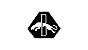
In 1948, Puma introduced a reversed color version of its logo, featuring a white wildcat leaping through a stylized white letter on a solid black hexagon. The hexagon had a horizontally extended base, giving the emblem a bold and structured look. This version of the logo emphasized contrast and visibility, aligning with the brand’s strong identity. However, it remained in use for less than three years before undergoing refinements in 1951, marking the next stage in Puma’s visual evolution.
A Bold Redesign (1957)

In 1957, PUMA took a significant step in refining its brand identity by revisiting its original design. The leaping cat and lettering were turned black once again, creating a strong and striking contrast. The hexagonal background was changed to white, framed by a bold black outline that enhanced the overall impact of the logo. Around the perimeter of this new hexagonal badge, the brand name was displayed in uppercase serif letters, reinforcing a sense of authority and professionalism. This iteration brought a more structured and polished look, laying the groundwork for the future evolution of PUMA’s visual identity.
Curious about the impact of branding in retail industry? Read our feature on Walmart’s logo journey and how it shaped the brand’s dominance in the industry.
Geometry Meets Branding (1958)
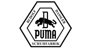
A year later, in 1958, the logo underwent another transformation. This time, the design incorporated more geometry and lettering, enclosed within a double hexagonal frame. The outer frame featured the inscription “Rudolf Dassler Schuhfabrik,” paying tribute to the company’s founder. At the center of the badge, beneath the gracefully leaping cat, the bold black “PUMA” wordmark was introduced, written in a rounded typeface. This version emphasized structure and balance, but the relatively small size of the puma within the logo failed to fully capture the brand’s core attributes—grace, agility, and endurance.
The Introduction of the Iconic Formstrip (1958 – 1968)
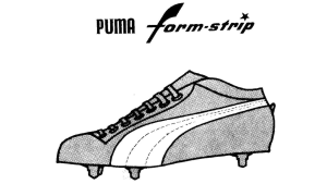
In the same year, 1958, PUMA introduced one of its most significant design elements—the formstrip. This smooth and elegant curved line was added to the brand’s footwear as a signature element, narrowing towards the top for a sleek and dynamic look. The formstrip quickly became synonymous with PUMA, much like the Adidas stripes and Nike swoosh. Even today, this minimalist yet powerful emblem remains an integral part of the brand’s design, continuing to be featured on most PUMA sneakers.
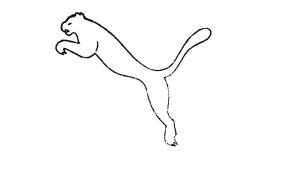
The Minimalist Cat (1968 – 1970)

The leaping cat made a return in 1968, becoming the central element of PUMA’s visual identity. This simplified and refined version of the puma featured a cleaner silhouette, free from unnecessary details. It was the first time the brand experimented with a minimalist logo, marking a shift towards modernity. Although this iteration only lasted two years, it paved the way for future refinements.
Interestingly, this version of the logo was designed by cartoonist Lutz Backes, a friend of Rudolf Dassler’s son, Gerd Dassler. Backes was initially offered a cent for every product sold featuring his design, but he opted for a one-time payment of 600 marks, along with a pair of PUMA shoes and a sports bag—an amusing historical footnote in the brand’s legacy.
The Vertical Leap (1970 – 1974)
A major transformation took place in 1970 when the leaping puma was repositioned more vertically. This was a defining moment for the brand, as it introduced the precursor to the logo we recognize today. The color scheme changed, with the cat now appearing in white with a delicate black outline, enhancing its grace and fluidity. This version was one of only three PUMA logos to exclude lettering, relying solely on the power of the emblem.
Logos are more than just symbols they define brands. Explore all the logos and their history.
Bolder, Stronger Branding (1974 – 1976)
In 1974, the leaping cat was once again turned black, now placed to the right of an enlarged, bold wordmark in a custom sans-serif typeface. The letters featured rounded edges, giving the logo a modern and approachable look. The design was framed within a horizontally stretched rectangular outline, enhancing its visual prominence.
During this period, PUMA also experimented with a different color palette. One version of the logo featured bright yellow lettering and a black cat on a green background—a fresh and energetic combination symbolizing growth, progress, and motivation.
Want to design a logo that stands the test of time? Our guide on 3 rules of good logo design that will help you create a lasting brand identity.
The Experimental Badge (1974 – 1976)
![]()
Alongside its primary logo, PUMA introduced another badge in 1974, used briefly for just a couple of years. This version was a horizontally oriented rectangular banner in green, featuring a pale yellow “PUMA” wordmark at its center. To the left, an illustrated football boot in yellow and green reinforced the brand’s strong connection to sports, while the leaping cat remained on the right.
The Formstrip Takes Center Stage (1976 – 1978)

By 1976, PUMA made a bold move by replacing the leaping cat with the formstrip in its logo. The italicized lowercase “puma” wordmark was executed in thick, modern sans-serif lines, with the vertical bar of the “P” elongated for emphasis. This marked a brief departure from the puma emblem, demonstrating the brand’s evolving design strategy.
The Return of the Iconic Puma (1978 – 1980)
PUMA’s visual identity saw two variations between 1978 and 1980. One version consisted solely of the solid black leaping cat, set against a plain white background with no additional elements. This was an exact replica of the puma from the 1974 badge.
Puma’s branding is all about agility and strength. If you’re interested in how colors, fonts, and shapes influence customer behaviour in logo design, don’t miss our post.
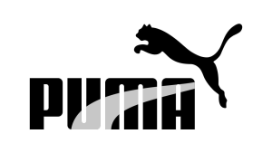
The other version, introduced in 1978, brought back the uppercase “PUMA” lettering. The puma was positioned above the upper right corner of the wordmark—a layout that would become the foundation of the modern-day logo.
Refining Perfection (1980 – Today)
From 1980 onwards, PUMA began refining its emblem into the sleek, contemporary logo we recognize today. The minimalist leaping puma stood alone as a symbol of motion, power, and freedom. By 1989, the brand further enhanced its visual identity by integrating the formstrip alongside the leaping cat, sometimes incorporating a subtle gradient effect.
Thinking of rebranding your business? Our case study on when to consider a logo redesign? [Top 6 Reasons].
Refining the Iconic Elements (1982 – 1988)
During this period, PUMA experimented with a combination of its most iconic elements. The leaping cat and the formstrip were both incorporated into the brand’s identity, creating a dynamic and recognizable look. The logotype also featured a subtle gradient effect, adding depth and dimension to the design. This era refined PUMA’s visual identity, blending tradition with modernity and laying the foundation for the logo’s evolution in the late 1980s.
The Final Evolution (1988 – Today)
In 1988, PUMA introduced a refined version of its logo, closely resembling the 1980 design. The typography was modernized, with the letterforms becoming smoother and more uniform. The logo’s sleek and sophisticated design reinforced PUMA’s reputation for innovation, quality, and expertise.
The Bold Red Update (2003 – Today)
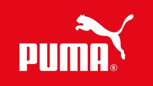
The last major redesign came in 2003, when PUMA introduced a version featuring a striking red background. The leaping puma and “PUMA” wordmark were set in bold white, making the logo more eye-catching and impactful. This version continues to be used today, reflecting the brand’s energetic and dynamic spirit.
Typography – A Blend of Strength and Elegance
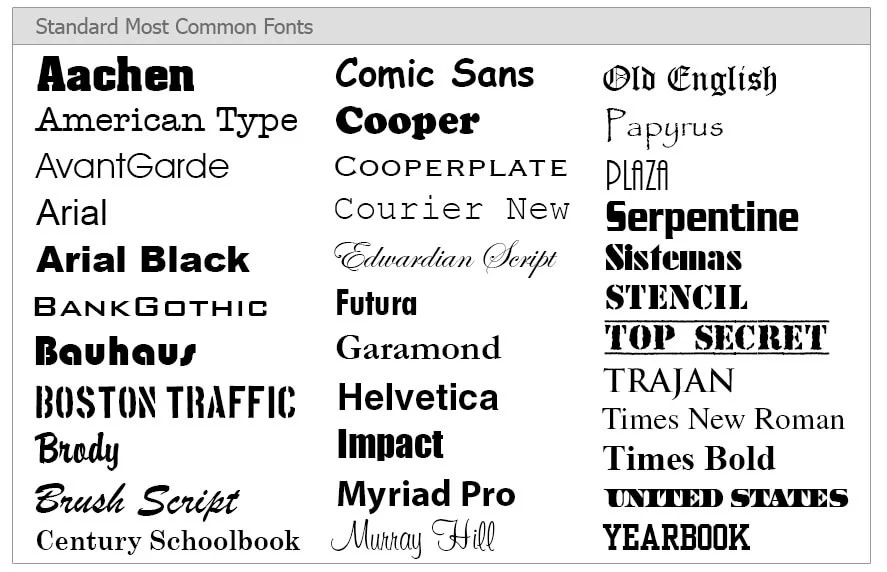
PUMA’s typography has evolved over the years while maintaining a strong connection to its early designs. The current typeface closely resembles the one introduced by Rudolf Dassler in 1957, characterized by rounded shapes and the absence of sharp angles. The most comparable commercial fonts to PUMA’s lettering include Quandor Regular and FF Softsoul Std Bold, though the brand’s version features custom modifications.
Puma’s logo typography evolved over the years. Discover why Typography is an important element in the field of graphic designing.
Color Palette – Timeless and Versatile
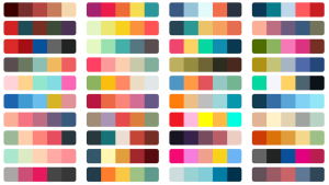
The classic PUMA logo is most commonly seen in black on a white background, ensuring maximum versatility. However, alternative versions exist, including a white-on-red variation and a dark navy-and-white color scheme. Each iteration maintains the brand’s strong and progressive identity.
The Symbolism Behind the Logo
From the beginning, the leaping puma has been at the heart of the brand’s identity. It represents movement, power, agility, and speed—all qualities deeply associated with athleticism and sports. The decision to keep the logo black and white enhances its flexibility, allowing it to be placed on any background without losing its impact. Black signifies excellence, strength, and stability, reinforcing PUMA’s legacy as a leading sportswear brand.
PUMA’s logo evolution tells a fascinating story of refinement and innovation, reflecting the brand’s journey from a small shoe company to a global sportswear powerhouse.
Get a Bold, Timeless Logo Like Puma for Your Brand
A powerful logo isn’t just a design—it’s the face of your brand, the first impression that speaks volumes. Puma’s logo embodies strength, agility, and confidence, making it one of the most recognizable symbols in the world. If you’re looking to create a logo with the same impact, our expert designers are here to bring your vision to life.
We specialize in designing logos that tell your brand’s story, resonate with your audience, and stand the test of time. Whether you want something sleek and modern or bold and dynamic, we tailor every design to match your unique identity.
Your brand deserves a logo that stands out. Let’s create something iconic together. Contact Logovent today and take the first step toward a lasting brand identity.


