Have you ever thought about how much of an impact logos can have on a business? Microsoft is a great example of this. Over the years, they have transformed their logo multiple times, and each transformation has become memorable for people. When people see the old Microsoft logos, it often brings back memories of their childhood and takes them down memory lane. It’s amazing to think how just one logo can have such a powerful effect on people.
In this blog, we will delve into the history of Microsoft’s logos. We’ll discuss why Microsoft made changes to their logos if there were any specific reasons behind it, and how people remember them.
The Beginning of Microsoft
Who would not know what Microsoft is? Apart from kids? We have been using this IT giant for decades! Microsoft was founded by Bill Gates and Paul Allen on April 4, 1975, to develop and sell BASIC interpreters for the Altair 8800 (an early microcomputer that was designed by MITS based on the Intel 8080 CPU). Thanks to the partnership with IBM, Microsoft was able to make a major breakthrough and supplied software for IBM PCs.
Ever since then, Microsoft has been known as the most renowned software firm in the world. It is prominent for its Windows (brand) operating system, Office products (Word and Excel), and IE (Internet Explorer). According to Macro Trends Charts, Microsoft’s total number of employees in 2023 was estimated to be 221,000. Of course, the data has changed since then. So, according to Statista, the numbers for 2024 are still estimated to be the same.
Additionally, according to reliable sources, Microsoft is said to be the most widely used Computer Operating System in the world. Making its market share 17% in the world.
The Microsoft Logo Evolution
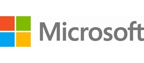
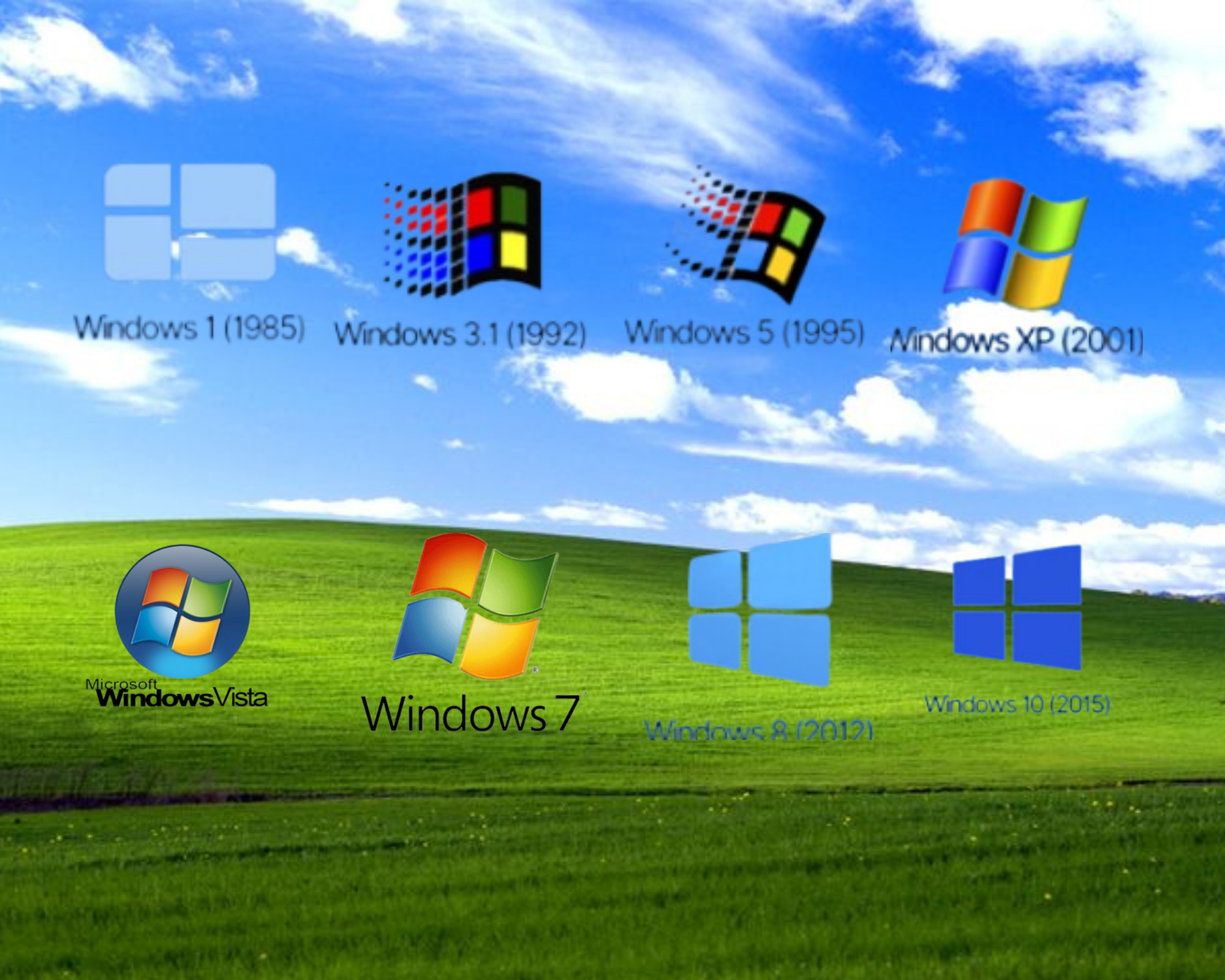
The current Microsoft logo design is classic and is likely to stay this way since it has a stronghold towards the brand. The Microsoft logo is a pure definition that shows how its minimalist, sleek, simple, and strong logo conveys the brand’s message with authority and supremacy. One of the main key features of the Microsoft logo is the attention-grabbing logo. It simply looks professional and promising. It would be hard to ignore or to trust. The Microsoft logo does not give off phony vibes. It looks expensive. Not too much, not too little. Just perfect.
Additionally, you cannot turn your head away from the colorful Windows icon either. This logo for Windows has been around for years, and the boomer and older generations will remember it. If you take a look at these Windows logos, you will most certainly take a trip back to childhood. This is the effect of a logo on us. We associate this Windows logo with trust since we have been using it for years. Therefore, we will recommend it to others as well.
Coming back to the Microsoft Logo, although it is known to be timeless, it is mainly recognized because of its typography. The simple Sans-serif type font in black is simply stunning for the brand. It just seems like Microsoft owns it now! The chosen font perfectly conveys the brand message and frame.
The font perfectly conveys the brand’s advancements and genuine technologies, innovation, and software. What makes this more dominant is that the brand uses this font for all of its software.
But as they say, “a phoenix rising from the ashes.” Microsoft, too, had to undergo several changes with its design in order to become THE Microsoft you see today. It was all trial and error, team effort, and market research to see what was attracting people from that era. Let’s jump into the evolution of Microsoft’s logos throughout the years.
The Birth of The Microsoft Logo
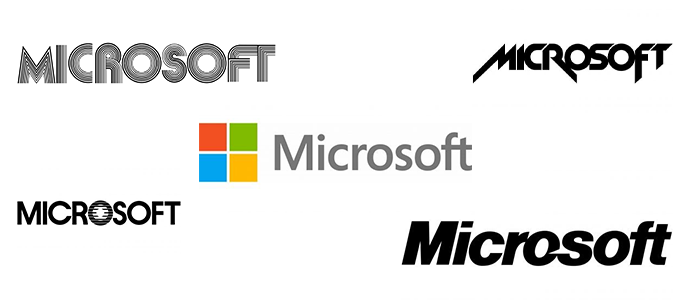
1. The First Microsoft Logo Disco Period (1975-1980)
Clearly, this era was all about sparkle and metallic shine—in other words, disco fashion during the mid-70s. Side by side, Hip-Hop fashion crept its way into creating a unique vibe and overall aesthetic in the fashion and logo industry. People mimicked this with their logos at that time to stay in the loop, which is exactly what Microsoft did in the 70s. Take a look.
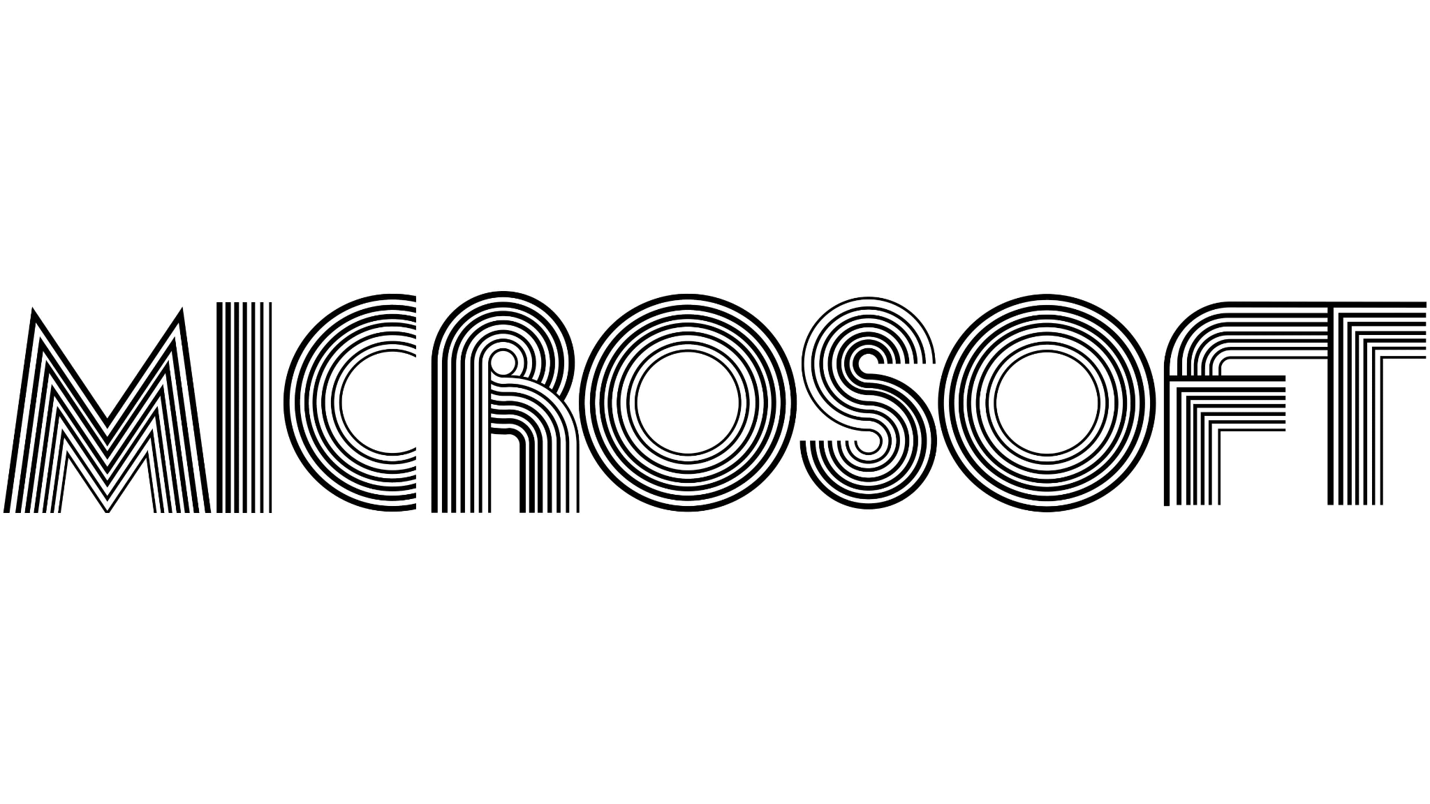
Personally, this logo reminds me of when you would align multiple pens in your hand and try to write anything. It looks groovy and gives a forward feel—in other words, a very retro-futuristic vibe. The style of this logo blends elements from the past with a vision of the future. The blocky letters and bold geometric shapes and curves represented advancement with respect to the technology of that time. It can also remind some of the disco music discs from the 70s. Get in touch with our 24/7 available representatives now!
Looking for an Affordable
Logo Design Services
Chat With us to avail 30% OFF
This logo has a thick typeface, and it is clear and recognizable. Although simple in nature, it still well suited the brand’s representation at that time. I mean, this logo definitely rocked during that period. If it still gives off those vibes to you, that means the logo did its job!
P.S. If you scroll up and down a little fast and look at this logo, you can see it move a bit. Pretty cool.
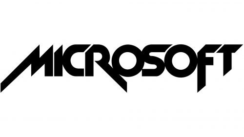
2. The Hard Rock Microsoft Logo (1980-1982)
Since trends were changing and other things were evolving, Microsoft decided to undergo a transition to fit in as well. And yet again, it did a great job at it. This Microsoft logo design was majorly influenced by the grunge/heavy metal bands during that decade. So, Microsoft underwent a metallic redo. Giving it a whole new look and aesthetic that was perfect for people to relate to during that period.
You can see that the letters M, R, and F stand out from the rest, creating a sense of more focus. The font style is sharp and gives a forward direction, probably indicating a futuristic vibe. The layout implies a more thunder-like font, but of course, to keep it simple and professional, the designer included sharp, edgy cuts to all the letters. Additionally, the designer for this logo used a more aggressive style and a lot of diagonals, again implying “forward” or “fast” representations. This clearly caught a lot of attention during the 80s
Simon Daniel, the designer for this metallic logo, used the New Zelek font, which implies an aggressive and piercing vibe. It gave a confident and daring brand identity. However, it wasn’t long until Microsoft decided to change its logo again with another remarkable design.
Read more: How to choose a web design company in 2025?
3. The Blibbet (1982-1987)
Now, you must wonder what a “blibbet” is. If you try searching for this word alone, the search engine will try to correct it to other words, or your keypad will autocorrect it naturally because this is not common.
Basically, a Blibbet is when the letter “O” is shaped by a sequence of parallel lines. This is often referred to as blibbet. If you ever see this kind of design, people will remember it as the OG design for Microsoft. This was more of a flagship design for the brand. This blibbet served as a stand-alone logo as well.
4. The PacMan “O” (1987-2011)
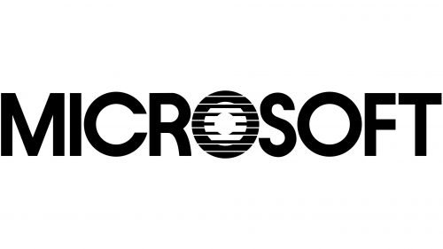
If you remember PacMan, boy, are you old (JK). But for real, PacMan made a true hit during the 80s. So, during this era, Microsoft decided to do a subtle redo. Microsoft’s logo appeared thicker, representing the company’s confidence and growth. However, the tiny slash, which does not go all the way through the “O,” making it look more like an open PacMan mouth, made this Microsoft logo design more memorable, fun, and unique.
5. Intro to The Windows Logo (2012-Present)
After 25 years, Microsoft recreated its logo in 2012. But this time, it included the Windows Design, which drastically changed the brand’s entire existence while creating a whole new look for Microsoft.
This design used the traditional window shape, with each panel in different colors, setting it apart from Microsoft’s previous logos. However, the designer, Jason Wells, continued to keep a soft and rounded Segoe UI font shift to create a dramatic yet simplistic change. This font further helped to recreate Microsoft’s brand image.
The Meaning Behind the Windows
This four-colored Windows logo design still exists today as it directly represents the Company’s ambitions. Apart from being an outstanding logo, these colors and window panels represent, or one could say, symbolize their brand. For instance, the Red Panel represents Microsoft Office or PowerPoint, the Blue Panel is for Microsoft Word, and the Green Panel is for Xbox or Excel.
Additionally, this logo is a huge example of how a logo design can make a huge impact and difference for a company, regardless of how giant it may be. This should inspire people that logos go through several transitions according to aesthetics and more until they become “the one” logo that defines that brand.
If you already have a logo that you want to redesign or want to create a logo from scratch but don’t know where to start, hiring professional logo designing agencies like LogoVent is a perfect route for you. With LogoVent, you will learn so much from their experts since they do ample market research and can predict the trends that will make your logo a hit till that time. This way, you can get the chance to brainstorm with their team, add your own personal ideas, and get the end result: a stunning logo design that resonates with your brand.
Fun read to gain more inspiration: Top Brand Mascot Logos And What Inspired Them.
Key Elements For Designing a Logo
1. Market Research
It is important to know about your competitor brands. As the saying goes, keep your friends close but your enemies closer… (Okay, they may not be your enemies, but you do have competition going on, so you have to do something about that, right?) You want to ensure that your logos do not resemble. With market research, you can also denote what fonts, styles, and aesthetics are trending within similar brands like yours. Additionally, this way, you can see if their brand logo is not standing out. What better can you do for yours? You will learn what styles to avoid when it comes to designing a logo for your brand and what you will consider for your redesigned logo. Ultimately, when you do the right market research or hire professionals who can do that for you, you can stand out from the crowd without a doubt.
2. The Simpler it is, The Easier it is to Remember
For example, in math, who would remember the quadratic equation? Not easy to remember, right? Your logo, on the contrary, should be. People undergo the priming effect when it comes to a logo and its colors. Your logo design should be simple to remember, where people get it at first glance alone. Sometimes, it is good to go crazy creative, where your logo makes people wonder what your brand may be about. To ignite curiosity in their minds. But not all logos have to do that. Plus, sometimes it is better to be safe than sorry.
3. Know Who Your BullsEye Audience Is
It is important to consider who you wish to attract, what age group, aesthetic, cultural, and so on. These details will help you combine certain logo elements to build a logo that resonates with that particular audience.
4. Give a Precise Message
Your logo should not be giving off confused signals. There is a difference between being confused and being curious. Make sure that the finished message you are conveying to your audience makes sense and is true to your brand.
5. Scalable Designs
A scalable logo design is one that can be resized without losing its quality. It can adapt to different kinds of media, either physical or virtual. Your logo must be able to retain its elements even so.
Summing Up
Microsoft’s journey through logo design highlights how evolving with trends while staying true to core brand values can make a lasting impact. If you want a memorable logo that not only stands out but also resonates with your audience, LogoVent is your ideal partner. Our team specializes in creating professional and affordable logo designs that elevate your brand. To learn more about how we can help you make a powerful impression, visit our Design Agency page today.
