Halloween is just around the corner, and you know what that means… It is time for logo designs to get spooky. Don’t worry, and it is temporary, though. But one thing is for sure: people will love it. Believe it or not, people are willing and interested in buying products that customize their logos in thought of the holiday season. Halloween is one of the most loved seasons, and there is a pretty great reason for that. This is the time when logo designers and people who are interested in customizing their logos get the chance to show their business’s spooky side and get in spirit with the season.
If you look closely, this is all the inside talk, and many companies suffer from major losses. But for those companies that make subtle changes to their logo designs or packaging, especially seasonal ones, you will notice those smart businesses. While they give cash for the short logo design change, they actually end up earning extra cash. It may sound confusing to you, but as professionals in this field, we know how limited package offerings and logo design changes boost the consumer’s and targeted audiences’ mood, making them feel the urge to buy those limited edition packages.
If you are looking for ways to make your logo design spooky for this season and attract more target audiences and more to your products and services, here we present the top 10 amazing logo transformations for Halloween to spark ideas for your creepy logo. We will be sharing a few extra tips along the way here and there, so let us get started!
Why do Logo Transformations for Halloween Happen?
Halloween is a time when everyone and everything transforms into their most spooky and scary selves, right? Why should logo designs back off from all this fun? This is the time for care, celebration, and a bit of creativity for marketing purposes, too. Believe it or not, this is one of the best times to promote a business to the best of its capabilities. While there is a small price to pay for the logo transformation process, it is also a smart temporary revenue-driven investment.
It is natural for brands and businesses to embrace the spirit of some holiday seasons and temporarily transform their logo designs to match the festive occasions. Logos play a pivotal role in creating a strong brand identity and attracting recognition within an instant. When you plan on going through a temporary and creative transformation for your logo design, it is a playful and engaging way to connect with customers and show them the other side of your business.
While temporary logo design changes may sound like a waste of time, they are not. Here, business-minded people play with the human psyche by temporarily changing their logo design to limited editions on packages. This is known to increase product and service sales and create a memorable and lasting impression on the audience.
Lastly, a Halloween-themed logo design can add a touch of whimsical fun to the brand’s message, making it more relatable, shareable, and engaging for the audience. It can help build brand affinity and credibility by showing that the brand is participating in these cultural events.
Learn more about logo redesign: When to Consider a Logo Redesign? [Top 6 Reasons]
Top 10 Spooky Halloween Logo Design Transformations
Now that you know the importance of logo design transformations and how they can help businesses increase their sales for that particular season. Here, we will look at some of the best creative and minimal logo design transformations for Halloween. While it is possible to get carried away with a Halloween logo design transformation, it is still important to remember to stay within the logo design rules. These are the perfect examples of creating a fun twist, perfect for seasonal fun and staying within the minimalist rule of a logo design.
Before we jump into the list, learning about minimalistic logo designs and logo simplification is important. It may sound fun to add as many elements and creative features to your logo design, but if done too much, it can actually turn into a big spooky blunder, and you would not want that. Learn more about logo simplification while keeping the logo transformations for Halloween in mind with our blog, “ Learn the Art of Logo Simplification for Powerful Logo Designs,” to get the best tips and tricks to help you with this temporary transformation process.
Now, we can get on the list!
1. Coca-Cola
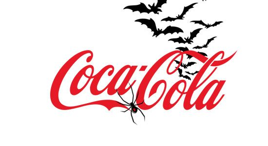
The first one on the list is none other than Coca-Cola. This brand is known for its logo transformations for famous holidays and even special events. You can see that they kept their original font typeface and overall logo the same. The only difference is the tiny add-ons of a creepy-looking black widow spider (of course, it had to be one of the poisonous spiders) and bats.
Get in touch with our 24/7 available representatives now!Looking for an Affordable
Logo Design Services
Chat With us to avail 30% OFF
The change here is not crazy, not too much, just right. The red and black contrast is perfect for the Halloween vibe, and we also feel that they chose the black video spider because of the red design on the back of its body to match the overall aesthetic.
Here is an interesting logo evolution to look at: The Logo Evolution of the Disney Logo.
2. Starbucks
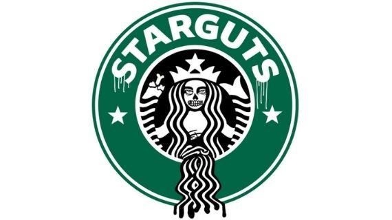
Starguts… oh no, we mean Starbucks decided to do a bold logo transformation to get into the festive spooky vibe. Did they nail it? Yes, they did! You can clearly see the mermaid is missing one fin or arm, and the guts are poured out, continuing in the same shape as the hair. Additionally, you can see the face is definitely distorted, where half of it looks like a skeleton, and the rest also looks creepy.
They changed their name from Starbucks to Starguts for the time being, and it seems pretty creative to do that. Did this transformation cost them money? Yes. But was it worth it for the number of sales that skyrocketed up during the spooky season? Also yes!
Found this idea inspiring and want to transfrom your website into a Halloween theme? Explore 20 Leading Companies And Platforms For Hiring Top Website Developers In 2025.
3. Mars
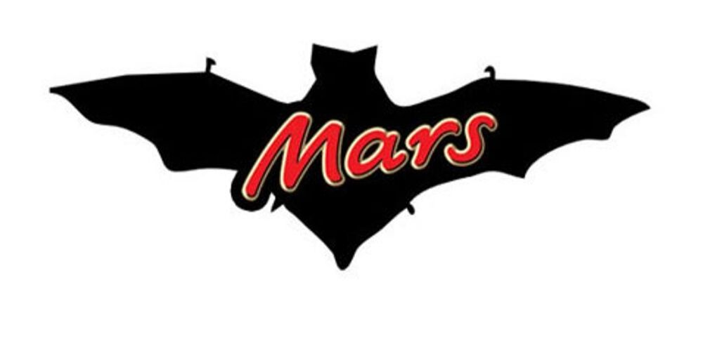
Here, we added Mars to the list, and you can certainly see the creativity they added to their logo transformation for Halloween. It is the same aesthetic, and the Mars wordmark is the exact same instead. The only change they made here was placing a bat in the background, and choosing a bat here was a smart choice. The reason for this is that the Mars chocolate bar packaging or background is black. For example, if they had added a zombie aesthetic to this with green or purple, it would not have matched the aesthetic of this brand.
If you ask us, this is a very smart and subtle logo transformation for Halloween. The designers came up with this pretty creative idea.
Important read: What is Brand Reputation? Everything You Need to Know.
4. Lays
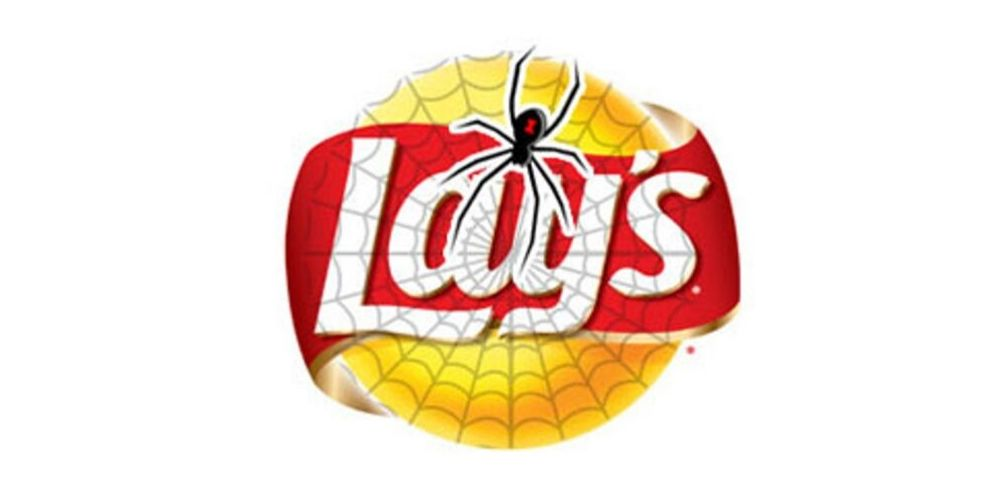
Here is another simple yet creative logo design transformation for Halloween. You can notice a trend in which when a spider is used, the Black Window is one of the most commonly used insects for the spooky season. The logo design is the same; however, they added a web across the whole logo.
5. Nike
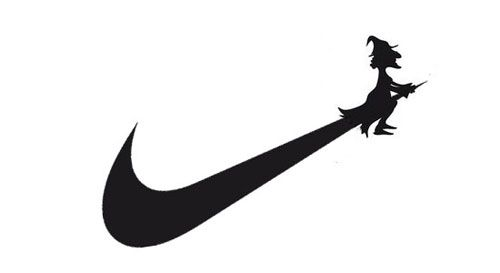
This is really a creative one. The Nike tick mark was used to its advantage. The end of the tick was used as a broom, which is a creative way to keep it inclusive for Halloween. They added a witch to the broom, as you can see. These subtle changes do not look too overwhelming for the audience and, in fact, impress them. Staying in the lane while also coming out with a creative Halloween logo transformation idea like this is exceptional.
6. Pringles
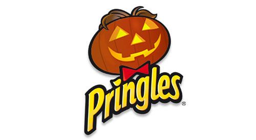
So many people love Pringles, and they have certainly done a great logo transformation for Halloween. They turned Mr. P into a carved, lit pumpkin. His hair is still on top, and the bow is there. While the temporary logo design change was there, they further went to change the packaging of their products to get more in the mood.
Keeping their transformation as a pumpkin was justifiable because the logo was round, and the design remained in shape as well. The designers really did a great technique with this, keeping it within the lane and adding a good creative edge to it. This attracted many buyers and audiences. It was also heard that those who were not interested in eating chips even bought it for the sake of the packaging.
Learn everything about the 7Up logo: A Full History of 7up Logo Evolution.
7. Barbie
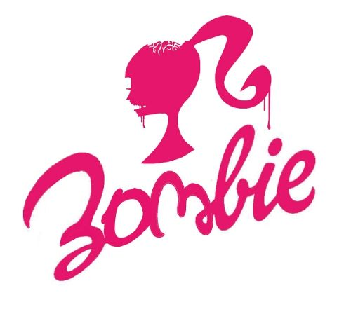
Who would have known that the Barbie logo could turn into something deeply creepy? If you look closely at the Halloween logo design transformation for Barbie, you will see that her head is open, and her brain is exposed. Yes, this is a zombie Barbie for you. They even changed the word mark from Barbie to Zombie using the same typeface.
The logo design has added effects here and there, such as the dripping effect to show slime or goo of some sort. It is truly interesting and fun to look at, really setting the Halloween spirit. Even some pretty and pink can transform for the spooky season.
8. Playboy
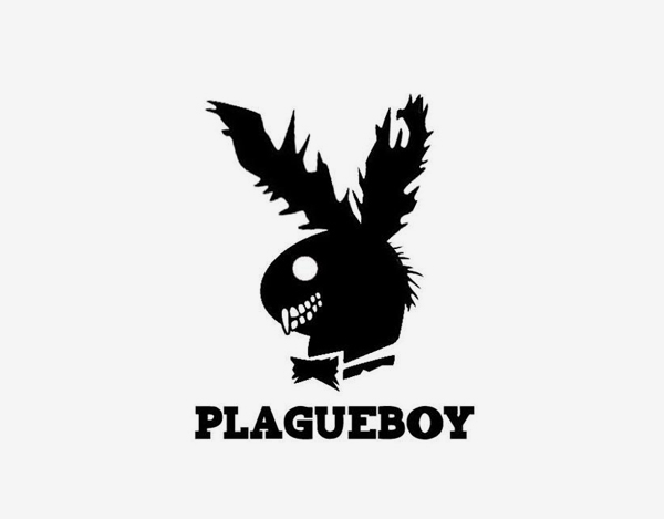
Yes, here’s Playboy’s other side, Plagueboy. If you know the actual Playboy logo, you can see it as much more polished, but this bunny has gone through things. It basically went through life, as you can see. We’re joking.
But really, this is a creative twist for the Halloween season. Here, the bunny is completely messed up, and the teeth can be seen as well, especially the canine sticking out. To be honest, the bunny looks like it is rabid. The dilated eyes make it all the more creepy.
9. Fanta
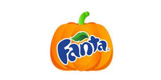
This makes complete sense, you can see that Fanta used the power of the pumpkin to their full advantage. This is one creative and sensible logo design transformation for Halloween. It is perfect since it is orange as well and it stayed within the logo design color theory as well.
They could have added little pumpkin bubbles if they had wanted; however, that would have been too many elements in the logo design. Here, they simplified the logo design process by turning the orange circle into a pumpkin instead.
10. LG
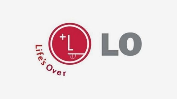
From “Life’s Good” to “Life’s Over, ” the designers really made the right changes to the logo design. Looking at the original logo, it seems that it can be tough to transform it into the Halloween logo, but with a bit of creativity and the power of a professional logo designer, they did it.
The LG logo transformation for Halloween kept the LG letters there, but instead of the wink, there is an X indicating it’s over, like the game-over sign. They also added a tongue at the end. The side of the logo emblem, instead of LG, is LO, indicating K.O., like the ones in the games when an avatar or character dies.
More ideas for you: Top 12 Best Logo Redesigns in 2025.
Transform Your Logo for Halloween with LogoVent
Now that you have gone through the list of these Halloween logo transformations, it is important that you know it is not completely necessary, but it is a great marketing strategy for the audience and to get more revenue within this season. This concept does not only apply to Halloween but also to other events such as Christmas or Easter as well. But normally, big companies do a temporary transformation for bigger and globally recognized holiday events.
Either way, each logo design you have seen here really signifies the Halloween season and gives it importance, making it fun for the business as well as the interested audience. After all, this is a temporary logo transformation, and if you learn how it affects the consumer’s psyche, you will then know why so many businesses do this. It brings a smile to the viewers and audience’s faces.
LogoVent is known for creating compelling and crafty logo designs, from sophisticated and polished to something even if you want something freaky for the season. The designs and concepts are endless. What is better is that you will have a one-on-one understanding with the best logo design team. You will be left with a customized logo design that sends the right message to your audience while simultaneously making them delighted to see a fresh look for the season.
