From a cozy donut shop in Quincy, Massachusetts, to a modern beverage powerhouse, Dunkin’ (formerly Dunkin’ Donuts) has brewed up one of the most dynamic transformations in branding history. As trends shift and consumer habits evolve, so too must a company’s identity, and that’s where smart branding and logo design services come in. Dunkin’s evolution is a masterclass in how to simplify, modernize, and still stay true to your roots, all through strategic visual identity.
Let’s take a closer look at how Dunkin’s logo evolved, what dropping “Donuts” really meant, and why its bold pink-and-orange identity has stood the test of time.
1950–1976: Retro Charm and Donut-Centric Branding
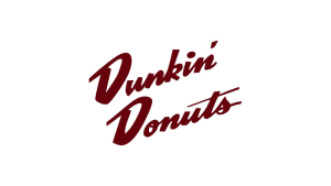
Dunkin Donuts Logo 1950-1960

Dunkin Donuts Logo 1960-1976
The original Dunkin’ Donuts logo featured a whimsical design, which was a coffee cup with steam rising, surrounded by hand-drawn typography. It screamed 1950s Americana, right down to the color scheme and diner feel.
Like McDonald’s iconic golden arches, Dunkin’s original logo embraced bold diner-style charm, leaning into familiarity and warmth that instantly resonated with customers
Throughout the 1960s and early 70s, the brand gradually introduced its signature colors, orange and pink, a combination that still defines Dunkin’ today. These colors were originally selected to reflect energy (orange) and friendliness (pink).
1976–2002: Enter the Wordmark Era
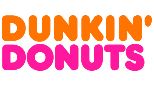
Dunkin Donuts Logo 1976-2002
In 1976, Dunkin’ introduced its most enduring design: a simple, all-caps wordmark using a rounded typeface in alternating colors, “Dunkin’” in orange and “Donuts” in pink. It ditched the coffee cup icon and leaned into typography to speak for the brand.
This logo remained unchanged for over two decades, appearing on everything from storefronts and uniforms to boxes and napkins. The stability gave Dunkin’ a visual identity synonymous with routine, reliability, and recognizable American breakfast.
Curious about other brands that stuck to their core color identity through evolution? Check out Coca-Cola’s logo evolution and how they preserved “Coke Red.”
2002–2019: Refinement Before the Leap
Dunkin Donuts Logo 2002-2007
Dunkin Donuts Logo 2007-2019
As Dunkin’ expanded globally and began emphasizing coffee more than donuts, the logo saw minor refinements:
- Smoother curves and modernized font
- Slightly brighter color tones for digital clarity
- The introduction of a steaming coffee cup icon above the logo, signaling a shift in brand priority
But by this time, the world was already calling the brand simply “Dunkin’.” So, in 2019, the brand made it official.
Thinking of updating your logo? Browse our affordable packages and let LogoVent create a design that fuels your brand’s future.
2019: Goodbye Donuts, Hello Dunkin’
Dunkin Donuts Logo 2019-Present
In a historic rebrand, the company dropped “Donuts” from its name and became just Dunkin’. While the font and color scheme remained largely intact, the message was crystal clear: “Dunkin’ is more than just donuts, it’s about coffee, speed, and convenience.”
The simplified logo is now just “DUNKIN’” in a custom variation of the Frankfurter typeface, in all caps, bold, and energetic. The orange and pink stayed, helping the brand retain decades of recognition while moving toward the future.
The rebrand worked because the company didn’t abandon its roots, it trimmed the fat while keeping the flavor. Check out LogoVent’s Nike logo breakdown
Typography: Bubbly, Bold & Brand-First
Dunkin’s logo typography has always stood out. The core typeface, Frankfurter, was customized over time to better suit print, signage, and digital use. Its roundness evokes friendliness and approachability, while the bold weight conveys trust and consistency.
Unlike more minimalist rebrands (see: Starbucks’ siren evolution), Dunkin’ kept its punchy visual personality intact.
Color Psychology: Orange & Pink That Work
Dunkin’s color scheme is one of the most iconic in QSR branding:
- #F58220 (Orange) – Energy, optimism, appetite
- #DA1884 (Pink) – Warmth, friendliness, emotional connection
This palette has remained untouched since 1976, and for good reason: it pops off packaging, works across digital, and captures attention in roadside signage.
Need help picking colors that stick? Visit our branding services page to learn how our color psychology expertise helps brands shine.
Logo Strategy: Why the Rebrand Worked
The 2019 rebrand was more than a cosmetic change, it aligned perfectly with Dunkin’s product strategy:
- Coffee now accounts for 60%+ of sales
- Shortened name fits mobile-first branding
- It reflects how real customers referred to the brand anyway
Much like Meta’s rebranding from Facebook, the new identity supported a larger business pivot without alienating existing fans.
Final Thoughts: A Logo That Runs on Brand Loyalty
Dunkin’s logo transformation shows how a brand can evolve without losing its soul. From retro diners to smartphone screens, the brand’s identity has adapted while keeping its energetic, people-first essence intact. If you’re planning a rebrand, big or small, take a page from Dunkin’s playbook: honor your roots, know your audience, and never underestimate the power of a bold font and a trusted palette.
Run your brand like Dunkin’; bold, streamlined, unforgettable. Ready to drop the fluff and design a logo that actually works? Get started with LogoVent’s logo design services and fuel your brand’s next big leap today!


