Nike is not just a brand; it is a global symbol of innovation, perseverance, and athletic excellence. Since its inception in 1964 as Blue Ribbon Sports and its transformation into Nike, Inc. in 1971, the company has revolutionized the athletic and streetwear industries, becoming one of the most influential and recognizable brands in history.
At the core of Nike’s identity is its iconic Swoosh, a logo created in 1971 by graphic design student Carolyn Davidson. What began as a simple design representing motion and speed has evolved into a cultural emblem synonymous with achievement and aspiration.
Over the years, the Nike logo has undergone subtle refinements to match the brand’s growth and changing identity while retaining the essence of Davidson’s original design. Each iteration mirrors Nike’s journey from a scrappy challenger to a dominant force in global sportswear and lifestyle branding. The logo, coupled with the brand’s “Just Do It” mantra, conveys an unmatched story of simplicity and power, inspiring millions worldwide.
In this article, we’ll explore the fascinating journey of the Nike logo, its design evolution, and how it gained iconic status. From its minimalist beginnings to its association with groundbreaking advertising campaigns and high-profile endorsements, the Swoosh is more than a logo—it’s a statement. We’ll also share actionable tips to help you create a logo that tells your brand’s story and resonates deeply with your audience.
Prepare to be inspired by the compelling tale of how the Swoosh transformed from a simple design into one of the most globally recognized symbols, embodying excellence, creativity, and bold determination. Let Nike’s journey fuel your imagination as you craft a brand identity that stands the test of time.
The beginning of the Swoosh
The iconic Nike “Swoosh” was crafted in 1971 by Carolyn Davidson, a graphic design student from Portland State University. At the time, Phil Knight, an accounting instructor and co-founder of Nike (then known as Blue Ribbon Sports), approached Davidson to create a logo for his budding shoe company.
Davidson spent approximately 17.5 hours designing the Swoosh and received a modest payment of $35 for her work—a fee that seems shockingly low by today’s standards. Although Knight wasn’t completely sold on the design initially, he recognized its potential and decided to move forward with it. Over the years, the Swoosh evolved into a symbol of athletic excellence and has remained Nike’s official logo, becoming one of the most recognizable and revered logos in the world.
Read more: How To Design a Visual Brand That Appeals to Gen Z.
Logo History: The Evolution of the Nike Logo
Over the years, the Nike logo has transformed multiple times, mirroring the company’s expansion and its influence as a cornerstone of sports culture. The journey of the Nike logo highlights the brand’s adaptability and its commitment to staying relevant while remaining grounded in its core values. Let us look at the evolution of this iconic logo.
The First Logo Evolution: 1964 – 1971
Before the Swoosh emblem and the birth of the Nike brand, the company was known as Blue Ribbon Sports and focused on reselling Japanese Tiger sneakers. The first logo, introduced in 1964, reflected this identity. It featured a minimalistic sans-serif wordmark combined with a stylized abbreviation. The design featured the letters “BRS” intertwined and slanted to the right, matching the italicized company name placed below them.
The composition cleverly arranged the “B,” which stood apart and slightly overlapped the “R” on the left. The “R” seamlessly transitioned into the “S,” which overlapped it on the right. Despite the simple black-and-white color scheme, the interlaced design of the letters created a somewhat intricate appearance. To balance this complexity, the italicized sans-serif wordmark beneath the abbreviation was kept straightforward, adding clarity to the overall logo.
Here is an interesting read for you: Why You Need a Vector-Based Logo Design
The Second Logo Evolution: 1971 – 1976
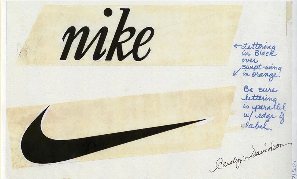
A variation of the Swoosh introduced in 1971 featured a bold, lowercase cursive wordmark overlaid on a contoured black Swoosh. Set slightly diagonally on a white background, this design emphasized motion and speed, aligning with the original concept behind the logo. Although this version was used for the shortest time in Nike’s history, it carried its unique charm and vintage aesthetic. Interestingly, elements of this retro style are still reflected in some of Nike’s modern sneaker designs, maintaining a connection to the brand’s early identity.
An important read: Top Common Branding Mistakes New Businesses Make
The Third Logo Evolution: 1976 – now
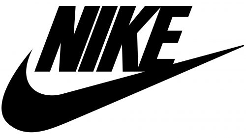
In the 1971 version of the Nike logo, the “Nike” inscription was directly placed over the swoosh. However, by 1976, the layout had been updated, shifting the text above the swoosh. Additionally, the lettering style underwent a major transformation, transitioning from a lowercase cursive script to a bold, geometric sans-serif wordmark in uppercase letters. Meanwhile, the swoosh itself returned to a solid black form, reminiscent of Carolyn Davidson’s original design from 1971.
The robust uppercase letters, characterized by straight lines and sharp edges, gave the sleek and dynamic swoosh a sense of strength and balance. Together, these elements projected an image of stability and power while maintaining a forward-thinking and innovative aesthetic that aligned perfectly with Nike’s brand identity.
Learn more: 20 Leading Companies and Platforms for Hiring Top Website Developers in 2025
The Fourth Logo Evolution: 1971 – now
In 1971, Carolyn Davidson designed Nike’s official logo, the iconic Swoosh. While the emblem has undergone various adaptations over the years, incorporating different fonts and graphic elements, its core design has remained consistent for nearly five decades. This steadfast simplicity has played a significant role in establishing Nike as one of the most recognizable and successful global brands.
Today, the minimalist design of the black Swoosh on a transparent background continues to be a powerful representation of Nike’s identity. It reflects the strength of simplicity and the brand’s commitment to innovation and excellence, resonating with audiences worldwide.
More to know: Samsung Logo Evolution: The Complete Story
Designing Your Iconic Logo: Lessons from Nike
Crafting an iconic logo doesn’t require complexity—it thrives on simplicity and purpose. The story of the Nike Swoosh reveals how a straightforward, meaningful design can become a timeless symbol recognized across the globe. Here’s how you can apply these lessons to create a standout logo for your brand:
Key Takeaways
The Power of Simplicity
Nike’s Swoosh is a prime example of how clarity and minimalism can make a logo memorable. When designing your logo, prioritize simplicity. A clean design leaves a lasting impression and is sure of adaptability across various mediums, from digital platforms to merchandise.
Meaningful Representation
Your logo should resonate with your brand’s core values. Like Nike’s Swoosh, inspired by the Greek goddess of victory, choose a symbol that reflects your mission. A well-thought-out design connects emotionally with your audience and reinforces your brand identity.
Timeless Inspiration
Draw creativity from diverse sources. Nike’s forward-thinking brand took inspiration from a centuries-old statue, proving that blending tradition with modernity can yield remarkable results. Be open to exploring ideas from history, culture, and art to infuse depth into your logo.
Experiment and Refine
Experimentation is key. Use tools like logo generators or sketch ideas with a designer. Test different variations and gather feedback to identify what resonates best with your audience. Iteration leads to refinement and perfection.
Build for Recognition
Craft a logo that’s easily recognizable, even without your brand name. This level of distinctiveness is what transforms a design into a symbol synonymous with your brand.
Action Steps to Start Your Journey
- Define your brand’s essence and values to guide your logo’s concept.
- Brainstorm symbols, shapes, or ideas that resonate with your brand.
- Test your logo across platforms to make sure it is adaptable and impactful.
“A great logo is a brand’s silent ambassador.”
Next Steps to Realize Your Vision
Ready to create a logo as iconic as Nike’s? LogoVent is here to guide you through the process.
- Custom Design Expertise: We’ll collaborate with you to design a logo that embodies your brand’s vision and values.
- Timeless Appeal: Our designs focus on clarity, creativity, and universal recognition.
Contact LogoVent today to transform your brand identity into a masterpiece.


