
When you think of Coca-Cola, chances are the flowing white script on a red background pops into your head immediately. That timeless logo is one of the most iconic pieces of branding in human history. Unlike competitors who reinvent themselves regularly, Coca-Cola’s logo has remained strikingly consistent since the 19th century, yet subtle evolution has kept it fresh and relevant across generations.
This is the story of a logo that didn’t need dramatic overhauls to stay on top. Instead, Coca-Cola mastered the art of micro-adjustments, emotional resonance, and cultural presence. Let LogoVent, masters of logo design services, take you on an exploratory journey. Here’s how this iconic script stood the test of time.
Want to understand how restraint can be powerful? Check out Disney’s logo evolution, another timeless design that changed little but achieved everything.
1886: A Pharmacy Creation with Personality
Coca Cola First Logo 1886-1887
Coca Cola Logo 1887-1890
Coca Cola Logo 1889-1892
Coca Cola Logo 1890-1891
Coca Cola Logo 1891-1899
Coca Cola Logo 1893-1901
Coca Cola Logo 1899-1903
The Coca-Cola logo was born in 1886, designed by Frank M. Robinson, the company’s bookkeeper and marketing visionary. He chose Spencerian script, a popular handwriting style of the time, because he believed the two capital Cs would look striking in ads.
And he was right.
What made it iconic:
- Bold, stylish script that stood out
- Personal handwriting feel in an industrial age
- Immediate brand distinction, even without a symbol
Handwriting is emotion made visual. It’s why script fonts endure, see Gucci’s logo evolution for a luxury parallel.
1900–1940: Trademarking the Identity
By the early 20th century, Coca-Cola had already become a household name. Rather than redesign the logo, the company trademarked the script and protected it fiercely. Small changes occurred, mostly to layout or background elements, but the core lettering remained untouched.
Coca Cola Logo 1903-1934
Coca Cola Logo 1934-1941
Coca Cola Logo 1941-Present
This period cemented the brand’s consistency strategy, while competitors were still experimenting.
Subtle changes included:
- Bolder strokes in some marketing variants
- Placement on red circular signs
- White on red contrast to boost visibility
Looking for consistency in your brand across platforms? Our logo design services ensure visual integrity from print to pixels.
1950s–1960s: The Red Disc and Bottle Integration
Coca Cola Logo 1958-Present
Coca Cola Logo 1969-Present
While the logo script remained intact, Coca-Cola introduced new brand containers and layouts that strengthened the visual ecosystem:
- The “red disc” was introduced to frame the script
- The contour bottle became synonymous with the brand
This era was all about integrating the logo into lifestyle advertising, Coca-Cola wasn’t just a drink; it was Americana.
You don’t always need to change your logo. Sometimes, you build the brand around it. Explore how Pepsi did the opposite with its many redesigns.
1980s–1990s: The “Classic” Rebrand
Coca Cola Coke Logo 1985
Coca Cola Logo 1987-2009
After the infamous “New Coke” misstep in 1985, Coca-Cola quickly backtracked and reintroduced the original formula under the name “Coca-Cola Classic.” This moment reaffirmed the emotional bond between the logo and the product.
What happened visually:
- The script logo stayed the same
- “Classic” was simply added below it
- The design became even more sentimental to fans
What’s the takeaway here, then? Don’t mess with what works. Consumers weren’t just loyal to the taste, they were loyal to the look.
2003–2010: Shading and Fluidity
Coca Cola Logo 2003
2007-Present
As digital media rose, Coca-Cola introduced refined gradients, lighting effects, and fluidity into its branding. The script remained untouched, but backgrounds and renderings became:
- Glossy
- Bubbly
- Reflective of movement and refreshment
These updates allowed the classic logo to feel alive in the modern era, especially across TV and web advertising.
Small adjustments in texture and light can modernize a static logo. Just like in the 7UP logo evolution, movement doesn’t always mean redesign.
2011–Present: Flat and Digital-First
Coca Cola Logo 2011-Present
Today, Coca-Cola leans into flat design, minimalism, and high contrast to ensure its logo is scalable across mobile devices, social media, and packaging.
The current logo is:
- The same Spencerian script
- Bright red background (Pantone 484)
- Often placed inside the red disc or paired with the contour bottle
Why it still works:
- Universal legibility
- Emotional nostalgia
- Brand integrity that rarely wavers
Want a logo that lasts through decades of tech evolution? We build future-proof brands through our affordable logo design services. Check out our design packages.
Why the Coca-Cola Logo Works So Well
1. Instant Recognition
You don’t need to read the letters, you know the logo at a glance.
2. Emotional Bond
The logo is linked with joy, nostalgia, summer, family, and celebration.
3. Global Consistency
Coca-Cola uses the same logo in nearly every country, a rare feat in global branding.
4. Visual Restraint
Rather than chasing trends, Coca-Cola leaned into timeless design, proving that consistency builds trust. Need to communicate stability and heritage in your own brand? LogoVent specializes in corporate identity design services that tell your story with clarity.
Coca-Cola’s Color Scheme: Simplicity in Three Bold Tones
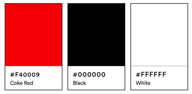
Coca-Cola’s Color Scheme
Coca-Cola’s branding isn’t just about script, it’s about color psychology at its finest. The brand’s visual power is deeply rooted in its iconic trio of hues, each playing a vital role in delivering recognition, emotional resonance, and contrast.
- Coke Red (#F40009): This is the heartbeat of Coca-Cola’s identity. Bright, warm, and instantly recognizable, this specific shade of red symbolizes excitement, energy, and joy, exactly the emotions the brand wants you to associate with its product. It’s also highly visible from a distance, which boosts shelf appeal and advertising effectiveness.
- White (#FFFFFF): Used for the Spencerian script and background space, white offers purity, clarity, and a sense of tradition. It creates sharp contrast with the red, allowing the logo to remain legible across every size and platform.
- Black (#000000): Sparingly used in early print and supporting typography, black adds weight and timelessness to the design when needed. Though not dominant, it grounds the brand when paired with red and white in certain packaging and collateral.
Together, these three colors deliver visual harmony that has stood strong for over a century, proof that a limited palette, when wielded with intent, can make a global impact.
The Coca-Cola Font: Scripted Legacy That Transcends Time
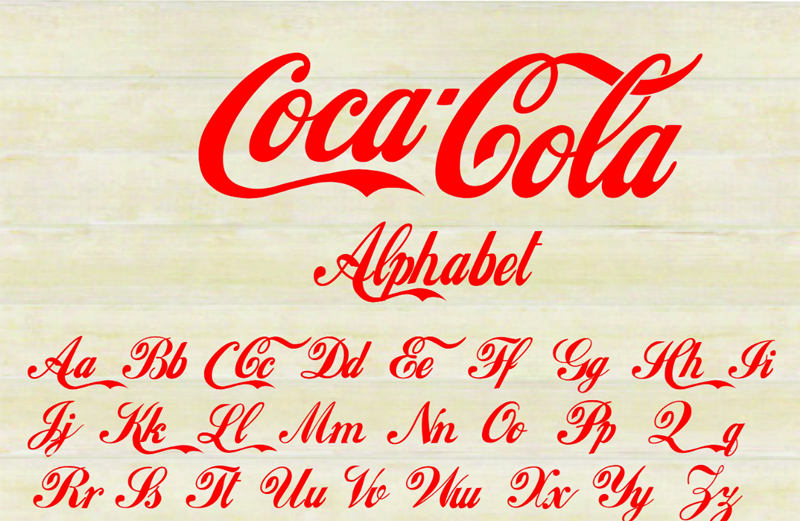
The Coca-Cola Font
One of the most iconic aspects of the Coca-Cola logo is its unmistakable flowing script font, a style that has become synonymous with the brand’s identity. Originally penned in Spencerian script, a popular handwriting style in the United States during the mid-to-late 19th century, the typeface reflects the elegance and formal flair of its era. When Coca-Cola’s bookkeeper, Frank M. Robinson, first sketched the name in 1886, he chose this script specifically to make the logo look distinctive and stylish, even in simple black-and-white ads.
What makes the Coca-Cola font so enduring is its versatility across time and mediums. Despite the evolving trends in typography, from sans-serifs to minimalism, the brand has remained loyal to its curvy, embellished letterforms. The sweeping “C”s and the smooth ligatures between letters embody not just a wordmark, but a feeling: one of heritage, warmth, and a kind of timeless Americana.
The font’s visual rhythm and consistent use have allowed Coca-Cola to retain a strong brand voice even as the logo adapted to new packaging, platforms, and global markets. Whether printed on glass bottles, vending machines, or digital screens, the Coca-Cola script never loses its charm or recognizability.
What’s Next for Coca-Cola?
While the script remains constant, Coca-Cola will likely explore more:
- Motion-based animations for digital platforms
- Personalized label integrations (e.g., “Share a Coke” campaign)
- AR/VR experiences that incorporate the logo in immersive settings
But the core? That white script? It’s not going anywhere.
Your logo doesn’t need to scream, it just needs to resonate. Coca-Cola proves the power of design discipline. Explore our portfolio for brand identities that do just that.
Final Thoughts
The Coca-Cola logo is the definition of timeless design. Through wars, recessions, pop culture booms, and digital revolutions, it stayed largely the same, because it didn’t need to change. It’s a reminder that a strong visual identity doesn’t come from constant reinvention, but from purposeful design and unwavering consistency.
At LogoVent, we help brands build anew, to leave a legacy that will last. We help them build identities that stand tall through every era. Whether you need subtle refinement or a fresh foundation, our logo design, web design, and SEO services ensure your brand is ready for today, tomorrow, and beyond. Ready to create your own design legacy? Let LogoVent craft a logo that speaks to generations. Contact us today.


