When it comes to instantly recognizable symbols, few logos in the world rival the golden arches of McDonald’s. Synonymous with fast food, global reach, and visual consistency, McDonald’s logo evolution isn’t just a marketing timeline, it’s a case study in branding that works. From a modest burger joint to a multinational powerhouse, the journey of McDonald’s logo reflects changes in consumer behavior, design trends, and brand strategy.
For businesses looking to build lasting visual identities, McDonald’s logo history holds valuable lessons. Let’s unpack how these iconic arches became a masterclass in modern branding, and why your business might need a similar design rethink.
Humble Beginnings: A Simple Start in 1940
Mcdonald’s 1940-48
Mcdonald’s 1948-53
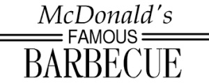
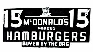
McDonald’s story began in 1940 with a basic logo that had little resemblance to the version we know today. Back then, it was simply “McDonald’s Famous Barbecue”, typographically straightforward and function-first. The brand wasn’t concerned with flair; it was focused on food.
But as the company streamlined its offerings to focus on burgers, fries, and shakes, a more memorable identity was needed. That’s when the golden arches, now inseparable from the brand, entered the scene.
Need to build a visual identity that evolves with your brand? LogoVent offers brand identity design services that scale with your business growth.
Want to learn more about logo evolution over the past century? Take a look at one of the premier fashion brands of the world. Here’s Gucci’s logo design evolution.
The Birth of the Arches: 1953–1961

Mcdonald’s 1953-61
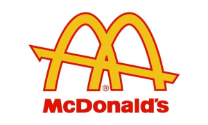
Mcdonald’s 1961-68
The famous golden arches weren’t originally born in a designer’s studio but as architectural elements. In the 1950s, architect Stanley Clark Meston added two arch-like structures to McDonald’s restaurant buildings. These were later stylized and merged into an “M,” giving McDonald’s its future symbol.
By 1961, Ray Kroc, the man credited with transforming McDonald’s into a global franchise, purchased exclusive rights and turned those arches into a standalone logo. It was bold, minimal, and visually unforgettable.
This early transition underscores the power of architectural branding: the use of space and structure to influence visual language. It’s a concept still relevant in corporate identity design services today.
Refining the “M”: The 1968 Golden Era
Mcdonald’s 1968-2003
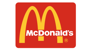
Mcdonald’s 1975-2003
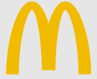
The iconic “Golden Arches” logo as we know it debuted in 1968. With cleaner lines and a symmetrical “M” shape, it became a universal beacon of fast, accessible food. The bright yellow hue against red backgrounds was deliberate, yellow evokes hunger, and red stimulates urgency.
Psychology-driven design isn’t a fluke. It’s a proven method in crafting logos that evoke emotion and action. The McDonald’s “M” didn’t just look good, it worked.
Want logos that trigger emotion and memory? Check out LogoVent’s affordable logo design services designed to do just that.
And if you want to take a look at how the other half gets their logos designed, check out our blog on the 12 most expensive logo designs of all time.
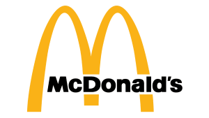
From Typography to Symbolism: 1993–2003
Mcdonald’s 1993-2003
Through the ’80s and ’90s, McDonald’s experimented with its typeface, sometimes enclosing the arches within a red box, other times pairing them with playful scripts. Yet despite these experiments, the core arches always remained untouched.
This design consistency built brand equity over decades. Even when stylization changed, the arches stayed central, proving that once a logo reaches iconic status, evolution is more about refinement than reinvention.
The ability to recognize when to evolve, and when not to, is a hallmark of strategic logo design services. At LogoVent, we help you strike that balance.
Don’t believe us? Check out our extensive portfolio and see for yourself.
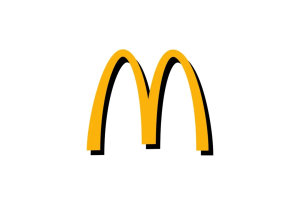
The Minimalist Shift: 2003–2010
Mcdonald’s 2003-2006
Mcdonald’s 2006-2018
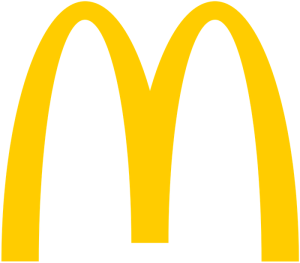
As the design world embraced minimalism in the early 2000s, so did McDonald’s. The “I’m Lovin’ It” campaign launched in 2003 brought a refined version of the logo, just the golden arches, with no type. It was a bold move that leaned into visual confidence. The brand no longer needed to spell out its name. The arches said it all.
This silent confidence represents the pinnacle of what great business logo design services can achieve: creating symbols that speak louder than words.
Here’s one of the greatest examples of this. Look at the evolution of the PlayStation logo design.
Flat, Clean, and Digital-Ready: 2018 to Present
Mcdonald’s 2018-Present
In 2018, McDonald’s adopted a flat design, stripping shadows, gradients, and 3D effects for a clean, scalable look. This move aligned with digital-first branding trends where logos must adapt seamlessly across apps, packaging, signage, and social media.
Flat design isn’t just a trend; it’s a necessity in today’s mobile world. And for businesses wanting modern logos that pop across screens, embracing clean aesthetics is key.
Thinking of upgrading your visual identity for the digital age? Ask about LogoVent’s animated logo design and insanely affordable packages.
Lessons from the Arches: Why McDonald’s Logo Works
- Simplicity Wins: The “M” is one of the simplest logo marks in existence, but it’s instantly recognizable in over 100 countries.
- Color Psychology Matters: Strategic use of red and yellow taps into instinctive emotional triggers.
- Consistency Pays Off: The brand resisted the urge to overhaul its core elements even as aesthetics evolved.
- Scalability is Essential: From signage to apps, the logo functions in every format without losing clarity.
These lessons translate directly to businesses of every size. Whether you’re running a restaurant, launching a startup, or rebranding your company, investing in the right logo is foundational to your brand’s long-term success.
A Logo That Grew With the Brand
McDonald’s has never stood still, but its logo evolution has been careful, calculated, and rooted in consistency. Each change aligned with brand strategy, consumer behavior, and cultural relevance. That’s the true power of smart design.
Your logo isn’t just a graphic. It’s the face of your business, and it should evolve with intention.
Looking to future-proof your brand? LogoVent’s web design services integrate branding, SEO, and modern UI in one powerful package.
Conclusion
The McDonald’s logo stands as a shining example of how strategic design builds timeless recognition. From its humble beginnings to its sleek modern version, the golden arches have weathered trends, redesigns, and decades of change, always remaining at the heart of the brand.
At LogoVent, we understand that kind of staying power is no accident. It’s the result of great design, insight, and execution. That’s why we offer logo design services that are made to last, whether you’re building a brand from scratch or evolving an established identity.