7up is known for its bright green shades and its famous lemon-lime soft drink drinks. It initially came into the market for medicinal reasons (as an anti-depressant!) in the 1920s and suddenly became one of the most beloved lemon-lime soft drink drinks of all time. Just like all famous brands, 7up went through a couple of logo iterations before it came to its final decision. They came up with many logo designs; some were hits, while others were misses.
If you are interested in learning more about 7ups’ logo evolutions, what changes were made, and how it gained dominance in the soft drink market, this fun read can tell you all about it. So, let’s get right into it.
![]()
7up the Anti-Depressant Soft Drink
In the 1700s, it was common belief that carbonated water contained healing powers. This is when pharmacies decided to get into the action, mixing plain carbonated drinks into different flavorings and colors to create the right concoction. So, back in those days, bubbly beverages were associated with health benefits and healing properties.
You must know that 7up and Coca-Cola have been the longest rivals since forever. It was known that Coca-Cola contained cocaine. However, we are unsure if this is a legitimate fact.
Dr. Pepper was the first soft drink to hit the US pharmacy in 1988. Its claim was to be a “brain tonic” with a unique flavor
After noticing this, it seems that carbonated drinks were associated with health benefits. While it is known that carbonated drinks help digestion, people have yet to discover whether bubbly drinks like this have any health benefits for the brain.
Read more about the Netflix logo: Tracing the Lines of The Netflix Logo Evolution and the Iconic.
7up’s Wholesomeness and Purity
Entrepreneur, Charles Leiper Grigg, created 7up. He was a St. Louis-based businessman who had previously launched an orange-flavored soft drink called “Howdy Orange.” According to them, it did well. However, the creator, Grigg, needed to answer some questions, such as whether it contained real orange in it or not.
Two years after this incident, then he started experimenting with his new creation, a lemon-flavored beverage. It took him almost 2 years to get this experiment right.
The 7up Ad
For him, the important qualities were that the drink should be refreshing and have thirst-quenching power. Before the stock market downfall, which caused the launch of the Great Depression, Grigg introduced “Bib-Label Lithiated Lemon-Lime Soda.” Wasn’t that a mouthful? This medicated drink was shortened to 7Up by 1936 since the number 7 is the atomic mass of lithium, so be glad this is what shortened the name.
Since this citrusy drink contained lithium citrate, a substance that was famously known for treating mental health disorders in the 19th and 20th centuries, it is still used to date to treat some patients with bipolar disorder.
Here is an old advertisement for 7up to show how wholesome and pure it was.
![]()
The branding and the messages were so successful that they remanded the industry after it in 1937. This was the rise of 7up. If you want your brand to rise the same way, you might be interested in expert logo design services. Why not check out our affordable logo design packages that can help your brand awareness to skyrocket?
More evolutions coming your way: The Evolution of Instagram Logo: From Camera to Icon.
The 7up Ad Campaigns
Here are some of the creative ad campaigns that 7up came up with:
1. 7Up the Uncola
This bold statement shows who they are going up against. The Uncola branding strategy was to describe the drink and set it apart from other cola drinks.
2. Take the Ouch out from the Grouch
This was a slogan created to promote 7up, which had medicinal effects and ingredients. It was used because 7up was known to boost moods.
3. Post-Prohibition
The creative 7-up marketers took advantage of the end of prohibition, initiating a string hint that 7-up went well with hard liquor. People today still follow this trend; now, it is called 7&7 (Seagrams 7 Whiskey).
4. You like it… it likes you!
This was created in an attempt to stir things up a bit, to add a bit more feeling and emotion from the brand to its consumers.
5. Make 7up Yours
This racy ad campaign featured commercials with comedian and actor Orlando Jones. The ad ran from 1999 to 2005 and spawned wide T-shirt sales of the star’s shirt.
More to know: Gucci’s Logo: A Ride from Equestrian Roots to High Fashion.
Significance of the Red Dot
The red dot is a simplified version of the original 7-Ups logo. They kept the red color in the logo to represent their dominance in the soft drink market. While the color palette for 7-Up is lime green and yellow shades, the red dot seems to stand out from the rest of the logo. Red in logo design is usually associated with power, dominance, boldness, and authority.
Want to stand out the same way 7up does among the soft drink market? Our logo design services are made for you.
7up Logo Evolution and History
Since the initial branding name was “Bib-Label Lithiated Lemon-Lime Soda” and turned into 7up instead, we should be happy that this change was made. So here we will get into the evolution of the logo from when it was labeled this medicated name to now.
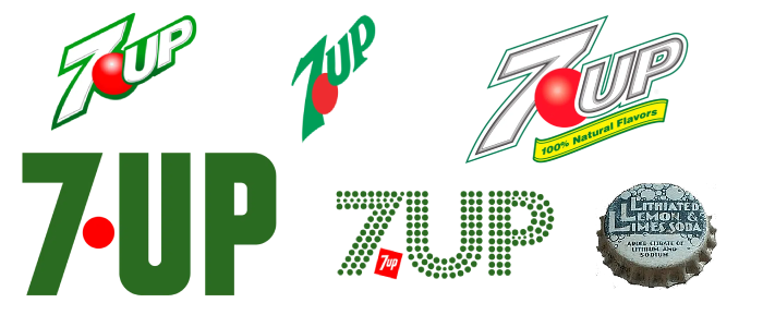
7up Old Logo
![]()
For this, we have to find the old bottle cap because, yes, this was the old 7up logo. You can see the number of Ls and the overall style. We will not give any funny comments about this because they tried their best according to that year. You can see the use of bubbles and the color green in the logo against a white background. The bubbles are different in size to represent the carbonated nature of the soft drink.
1930s 7up Logos
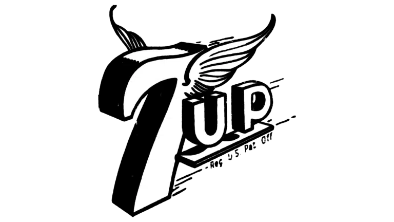
This year, the 7up logo underwent several changes before it stuck to one sold style.
This can be noticed as one of the most stylish logo designs since the number 7 included wings for some reason. Maybe it represents the feeling of the airy and bubbly nature of the drink. The overall logo gives a whole stylish effect, with bold contours and uppercase letter usage. This design provided an edgy feel and gave the impression of speed because of the lines.
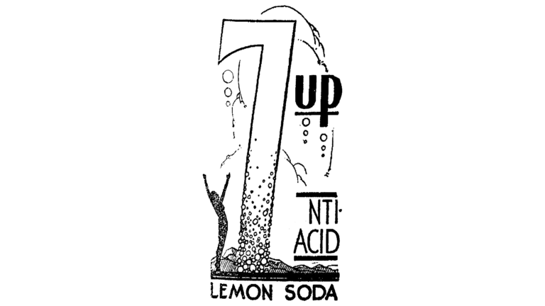
They decided to give the logo another huge makeover. It was a large, sophisticated “7” with a plethora of bubbles of several sizes in black. The number 7 was bigger than the number up, and it shows a human standing on the side of the number with their arms up, probably in praise of the drink.
![]()
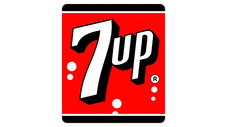
This is the third change made within the same year, and compared to the rest, it is way better. This now has a much more familiar effect and vibe to the recent logo, and you can se that the logo designers were getting there! The number 7 was given definition and weight with bold and extra shading. The overall logo is also an emblem, meaning it was easy for them to print the label onto smaller objects such as bottle caps. The bubbles were reduced, and this logo was used for almost a decade.
Ideas for you: Ideas for Designing Logos for the Automotive and Car Industry.
1939 – 1969
This was when they decided to add color to the color. Red and black were used, the square stayed the same, and the badge around it was the same. This time, the logo was given a more accurate definition. The main wordmark is rendered in bold and thick white and black, and the 7 white bubbles represent the number 7 and that it was a bubbly drink.
1966 – 1975
![]()
It seems that the designers decided to bring back the green color to the logo, and instead of the red background, they turned it into a dot. The dot separated the number and the word from each other. The dark green against white created an appealing effect and suited the logo and the words.
1970
![]()
This is a very groovy version of the 7up logo, and it almost looks trippy and fun. But, of course, changes needed to be made. The designers replaced the red dot with a smaller version of the 7up logo, which they thought might be creative. This logo created a very groovy aesthetic, and the green circles were fun and attractive.
1980
![]()
And they came back to the square again, removing the green color, and instead made the whole background red, including the dot and the wordmark white. The attempt here seems to make the logo more crisp and aesthetically pleasing.
1990s 7up Logos
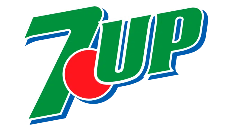
The designers then decided to bring back the green color and add a new color as a shade, blue. The red dot came back as normal. The attempt here was to bring more emphasis to the green shade and give it a pop-up look. The company decided to stay with this design for around 5 years.
![]()
In 1995, the 7up logo went through another iteration, where they changed the shade green for a lighter green, and the red color seemed to pop up even more. All this against a white background made the overall logo pop up. The logo characters seemed to change slightly, and the 7 was larger than the other elements.
![]()
In 1933, the attempt was to make the logo look edgy and sporty. The logo typography changed to a more italicized look, and the overall logo was slanted upwards.
![]()
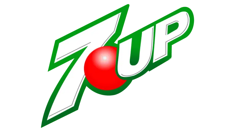
A new 3D logo with a glossy red dot and a smart “UP” with slightly curved serifs was released in 2007. It featured a white “7” with a green and black outline as a base. In spite of its short term with the company, this logo is widely recognized as one of 7UP’s most recognized symbols.
This is a logo design that you may be more familiar with. The logo is still slanted upwards, and the glossy red dot remains.
![]()
If you look closely, you will notice there is a shift of color from light to dark green for the logo. This is a pretty cool concept, and the glossy red dot turned out to be more glossy. The overall logo looks more polished and advanced; the dark green shade is definitely preferred, and it looks perfect.
For more interesting and creative logo evolutions, you can visit our impressive portfolio.
Learn more: Disclosing the Tesla Logo: Reimagining Mobility.
Over to You
While it is pretty normal for old brands to go through several logo iterations, it just shows that there is always room for improvement in logo design since preferences and trends keep changing. However, today, the logo is a success. Maybe there will be some other changes in the future. Who knows?
If you want a logo design that truly reflects your brand’s purpose and captures the attention of your ideal audience, consider partnering with a professional agency like LogoVent. Our expert designers delve deep into understanding your brand to craft a logo that resonates perfectly and conveys your message effectively from the start. Explore our affordable logo design packages, starting from just $69, and see how we can help you make a lasting impression!