In high competition, influencing customers to choose you instead of other brands requires understanding the importance of branding, especially the role of logo design. Unlike other business elements like quality of service and business promotion, designing a logo that appeals to audiences of all age groups and backgrounds needs high-end expertise and ample time. It also requires learning what audiences want to see, what elements they find influential, and designs that attract them. Other than that, designers need solid inspiration to design a logo that captivates audiences throughout the years. For instance, logos of popular brands like Google, Nike, Samsung, and Walmart are perfect for inspiration to build a brand image as successful as these brands.
Taking inspiration from the logos of successful brands is fruitful as it provides an overview of the story behind these logos, their history, and the design elements that make them irresistible. While designing a logo, inspiration is a step that can help you achieve success and gain audience trust, as you already know what the audience likes. In this blog post, we will take you through the journey of Walmart logo design, discussing its meaning, history, evolution throughout the years, and the design tactics that played a role in making it famous. Our focus will be to offer inspiration for a successful logo design process to help you design a logo that appeals to audiences and results in conversion.
What Do Old Walmart Logo and New One Mean?
Like any other giant brand, “Walmart” has a history and meaning to its name. As a widely known fact, Walmart is owned by the Walton family, typically James Lawrence Walton and Samuel Moore Walton, which inspired the brand’s name. The family decided to use the starting of Walton with the word mart to showcase that it’s the retail brand we know today as “Walmart.” To keep it simple, the logo was decided to be a wordmark that contains the words of their business name, W A L M A R T. Since then, this logo has become an icon that showcases quality retailing worldwide. Nonetheless, if you are trying to understand the meaning of the logo that says Walmart, viewing it just as a simple text will not do it justice. The meaning of this logo is beyond what we can see.
The meaning of Walmart’s logo is that they offer something for everyone that adds value to their lives. That being said, let’s move towards the origin of this logo, its brand story, and its evolution in the past years. Reviewing it closely will not only help you understand its meaning in a better way but also make you understand the overall design strength that made this logo famous.
A Quick Overview of Walmart Logo History
It was 1945 when the Walton family decided to establish a retail store, and since then, the story of quality and success has begun. Keep on reading to learn more about the history of the Walmart logo.
1. The Beginning (Origin You Can Say)
Samuel Walton’s vision played a critical role in making Walmart, a retail giant, happen. This journey started way before the first Walmart store was founded. Sam and Bud (James Walton, Samuel’s brother) purchased a Ben Franklin variety store in Newport, Arkansas. This was the Walton family’s first step in retail. To combat competition, these two brothers utilized a smart low-margin-high-volume approach and worked with suppliers who offered low costs. During the first year, the revenue of their store was boosted by 45%, and in 5 years, they earned an unwavering revenue of $250,000.
While initially successful, the brothers faced the issue with their location’s lease expiration. To solve that, they opened another store in a new location, which was called “Walton’s 5 & 10” store. In 1962, the first Wal-Mart Discount City store opened in Rogers, inspired by the well-known retail chain FedMart. Over the next five years, Walmart expanded rapidly, launching 18 stores across Arkansas and generating $9 million in revenue.
2. Expanding Walmart Across the Nation
Walmart’s expansion took off in 1968 when it opened stores in Sikeston, Missouri, and Claremore, Oklahoma, marking the beginning of its nationwide growth. A year later, in 1969, the company went public as Wal-Mart Inc., eventually rebranding as Wal-Mart Stores Inc. in 1970. By then, it had grown to 38 stores across five states, bringing in about $44 million in revenue. The expansion didn’t slow down—by 1973 and 1974, Walmart had entered Tennessee, Kentucky, and Mississippi. In 1975, the company made its way to Texas, operating 125 stores and generating over $340 million in sales.
The 1980s brought even bigger changes. In 1980, Walmart introduced four hypermarts, offering a wider variety of products. By its 25th anniversary, the retailer had nearly 1,200 stores and was approaching $16 billion in sales. That same year, Walmart invested $24 million in a satellite network, making it easier to track inventory, sales, and communication across locations. In 1988, Sam Walton stepped down as CEO, and Walmart opened its first Supercenter in Washington. By 1990, the company had expanded to California and Pennsylvania, solidifying its place as a retail powerhouse.
3. Expansion Beyond the Borders
Walmart took its first steps beyond the U.S. in 1991 by expanding into Mexico, followed by Canada in 1994. The company continued its global growth in 1995, entering Brazil, Argentina, and Europe. In 1999, Walmart strengthened its international presence by acquiring the British supermarket chain Asda for $10 billion. By 2005, the retail giant operated over 3,500 stores in the U.S. and more than 2,500 locations worldwide, generating over $312 billion in revenue—an impressive 2.4% of the U.S. GDP, which stood at $13 trillion. In 2007, Walmart introduced its now-iconic slogan, “Save Money. Live Better.”
Walmart’s impact on consumer savings was substantial. A 2006 Global Insight report estimated that the company helped American households save around $957 per person, totaling $287 billion. In 2011, Walmart launched “Walmart To Go,” its online delivery service. By 2015, it had become the largest commercial producer of solar energy, spearheading 17 renewable energy projects. The company later acquired Parcel, a tech-driven same-day delivery service, and introduced “Spark,” utilizing private vehicle owners for deliveries. In 2019, Walmart rolled out free one-day shipping on over 200,000 items for orders above $35. The COVID-19 pandemic further fueled online sales growth, increasing total sales by 10% as more consumers turned to Walmart for home essentials.
History & Evolution of Walmart Logo
If you are a graphic designer or a business owner willing to build a successful brand image, the Walmart logo can be a solid source of inspiration. This section will include the history and evolution of the Walmart logo, offering a detailed knowledge of branding and the logotype that best influences customers and retains them forever. Walmart’s logo seems to be a simple wordmark with no background history. Well, it is not true. Let’s move toward evaluating all aspects of the Walmart logo to understand what made it a hit. Moreover, it will also help you learn why rebranding is a good idea in the business and how Walmart used it to stand out.
1. 1945 – 1962

The earliest Walmart logo showcased the original name, “Walton’s,” honoring its founder, Sam Walton. It featured bold, red capital letters in a simple sans-serif typeface, reflecting the straightforward and practical approach of the brand.
Despite its simplicity, the design felt modern and progressive for its time. The clean, sharp lines gave it a strong visual identity, while the scarlet-red color symbolized power, excellence, and reliability. This choice of color and style helped establish a sense of trust and confidence among customers, setting the foundation for Walmart’s future success.
2. 1962 – 1964

In 1962, the company underwent a name change, officially introducing the “Walmart” brand to the public. With this transformation came a new logo, featuring sleek blue lettering in a slightly narrowed sans-serif font, with elongated character contours compared to its predecessor.
The transition to blue was a pivotal moment, signaling professionalism, trust, and expertise. The bolder, thicker lines of the letters reinforced Walmart’s confidence and growing presence in the retail industry, marking the beginning of its evolution into a household name.
Also Read: How To Design A Visual Brand That Appeals To Gen Z
3. 1964 – 1965

The black roundel initially served as an alternative Walmart logo, featuring the name “Wal-Mart” with a hyphen. This design had a bold and structured appearance, giving it a more graphical and authoritative feel, which aligned well with the store’s identity at the time.
While the emblem appeared dark and somewhat plain, it conveyed a sense of professionalism and confidence. Despite its simplicity, Walmart later revived this design, recognizing its strong visual impact and brand recognition.
4. 1965 – 1967
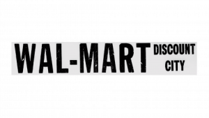
The roundel was removed, leaving only the store’s name in a bold, heavy sans-serif typeface. Positioned to the right, the phrase “Discount City” accompanied the main logo, reinforcing the brand’s identity as a budget-friendly retailer.
Both parts of the inscription featured a narrow, geometric sans-serif font, characterized by thick lines, sharp angles, and clean-cut letterforms. This design choice gave the logo a strong, structured appearance, reflecting Walmart’s commitment to affordability and efficiency.
5. 1967 – 1968
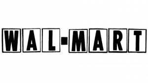
In this version, each letter was carefully enclosed within rectangles featuring a thin black border, creating a more structured and defined appearance. While the overall typeface style remained similar to the previous version, several notable refinements gave the logo a sharper and more modern feel.
The addition of rectangular frames added a sense of order and stability, making the brand name stand out more prominently. This design choice emphasized Walmart’s growing professionalism and commitment to maintaining a strong and recognizable identity in the retail industry.
6. 1968 – 1969

The 1968 redesign brought subtle yet impactful updates to the Walmart logo. The typeface was refined, with adjustments to the proportions of the letters, making them shorter and more compact. Their shapes became squarer, giving the logo a stronger and more balanced appearance.
These modifications contributed to a more stable and solid visual identity, reinforcing Walmart’s growing reputation as a reliable and well-established retailer. The refined design reflected the company’s commitment to consistency and professionalism, setting the stage for its continued expansion.
7. 1969 – 1970

The 1964 roundel emblem made a notable return, maintaining the familiar central board while introducing key refinements. The text in the upper and lower sections was updated, with the characters becoming smaller and lighter, enhancing the overall balance of the design.
A significant change was the shift in color, as the lettering adopted a pre-white hue, creating a strong contrast against the background. This adjustment improved legibility, making the inscription clearer and more visually striking than before, ensuring better recognition and readability for customers.
8. 1970 – 1975
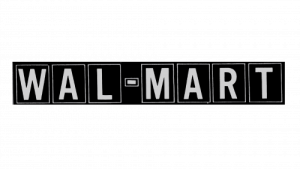
The rectangular lettered design made a return, but this time with a striking color inversion. Instead of the previous layout, the letters and the box borders were now white, while the background turned black.
This contrast created a bold and eye-catching effect, making the logo more visually impactful and easier to read. The refined design enhanced Walmart’s brand presence, reinforcing its strong and professional identity while maintaining the structured look of the previous versions.
9. 1975 – 1977

This version of the logo stood out from its predecessors with a distinctive and eye-catching style. The unique serifs and decorative dots placed in the center of each letter added a memorable touch, making the design instantly recognizable.
The bold, vintage aesthetic was reminiscent of Wild West saloons, evoking a sense of American heritage and tradition. This design choice reinforced Walmart’s identity as a homegrown brand, deeply rooted in the values of hard work, resilience, and community.
10. 1977 – 1981

While the overall design remained consistent, subtle refinements were made to enhance its visual impact. Notably, the hyphen became bolder, giving it a stronger presence within the logo. These small yet deliberate adjustments helped maintain the logo’s recognizability while ensuring a cleaner and more polished appearance.
11. 1981 – 1992

Following a major redesign, the Walmart logo underwent significant changes in both typography and color. The letters transitioned to a muted brown hue, embracing a simpler and more straightforward design. The typeface was a clean, regular sans-serif, reflecting a modern yet minimalistic aesthetic.
One of the most noticeable details was the tight spacing between the “L” and “M”, creating a slightly compressed appearance. This subtle yet distinct characteristic made the logo stand out, setting it apart from previous versions while maintaining its professional and approachable identity.
12. 1992 – 2008

Although the typography remained largely unchanged, the color palette shifted to a deep, dark blue, reinforcing a sense of trust and professionalism. Additionally, the hyphen was replaced with a star, introducing a unique and symbolic touch. This small yet impactful change added a sense of energy and distinction, making the logo more recognizable and dynamic. Variations in different colors were also introduced, providing versatility and adaptability across various branding materials.
You may find it interesting: Shapes In New Web Design Trends 2025
13. 2008 – 2025

In this redesign, all letters except the “W” appeared in lowercase, creating a more approachable and modern look. The previously bold, geometric typeface was replaced with a softer, rounded font, enhancing the brand’s friendly and welcoming personality.
A sense of warmth and optimism was introduced through the sunshine-inspired theme, reflected in both the color palette and emblem design. The combination of blue and yellow evoked trust and positivity, while the new emblem, resembling radiating sunrays, reinforced a fresh, energetic, and customer-friendly image.
14. 2025 – Today

In 2025, Walmart introduced a refreshed logo with enhanced blue and yellow shades, giving it a more vibrant and dynamic look. The lettering underwent subtle refinements, adopting a more condensed style with sharper bar cuts, adding a sense of modern precision.
The most noticeable update was in the iconic sunburst emblem—its rays became thicker and longer, making it the focal point of the design. This change reinforced Walmart’s bright, energetic, and forward-thinking identity, emphasizing its commitment to innovation and customer satisfaction.
Right Strategies to Build an Impactful Logo
As learned from Walmart’s logo evolution, a logo is more than just a visual symbol; it represents a brand’s identity, values, and mission. A well-designed logo can make a brand instantly recognizable, evoke emotions, and create a lasting impression. Whether launching a new brand or rebranding an existing one, having the right strategy is crucial in ensuring the logo is impactful and effective. Below are key strategies to build a logo that stands out and leaves a strong impact.
Simplicity and Clarity
A great logo should be simple and easy to recognize. Overly complicated designs can confuse the audience and reduce brand recall. Clean, minimal designs are more effective in creating a lasting impression and work well across different platforms.
Strategic Use of Colors
Colors evoke emotions and influence perception. Choosing the right color palette that aligns with the brand’s identity is essential. For example, blue conveys trust, red represents energy, and green signifies growth. A well-thought-out color scheme strengthens brand recognition and emotional connection.
Appropriate Typography
The font used in a logo speaks volumes about the brand’s personality. A bold, modern typeface conveys innovation and confidence, while a serif font suggests tradition and reliability. The typography should be legible and consistent with the brand’s message.
Scalability and Versatility
A successful logo should maintain its clarity and impact across all sizes and mediums. Whether displayed on a billboard or a business card, the design must be adaptable to various formats without losing its essence.
Uniqueness and Differentiation
Standing out from competitors is crucial. A logo should be distinctive and original to avoid confusion in the market. Copying existing designs can damage credibility, while a unique identity helps establish a strong brand presence.
Timelessness and Adaptability
Trends come and go, but a powerful logo remains relevant over time. Instead of chasing short-lived design fads, brands should focus on creating a timeless logo that can be refined when necessary without losing its core identity.
Brand Story and Emotional Connection
An impactful logo tells a story and reflects the brand’s values and mission. When a design resonates emotionally with the audience, it builds trust and strengthens brand loyalty, making it more than just a visual mark but a meaningful representation of the company.
Conclusion
This article explores the meaning and significance of the Walmart logo. The interpretation of the logo may vary depending on the perspective—whether you’re a business manager, marketing professional, or graphic designer. This blog delves into the brand’s history, logo evolution, and the powerful strategies that have elevated the recognition of the Walmart Spark. Professionals across various industries can gain inspiration from iconic brands and apply these concepts to enhance their own business success.
Strategic logo design plays a crucial role in brand growth by shaping audience perception, driving expansion, and strengthening brand identity. Walmart’s refreshed color palette embodies its commitment to value and customer service, making a visual impact on consumers. Partnering with an experienced custom logo design company like LogoVent can help businesses craft professional and memorable logos that drive engagement, increase brand recognition, and contribute to long-term growth.
We Have Covered Other Big Brands’ Logo Evolution, Check Them Out:
- Michelin Man Logo Evolution: History And Meaning
- Nike Logo Evolution: From $35 To A Global Icon
- Evolution Of The LEGO Logo: A Complete History
- Everything About The Discord Logo Evolution
- A Full History Of 7up Logo Evolution
- Samsung Logo Evolution: The Complete Story
- The Historical Evolution Of The Google Logo


