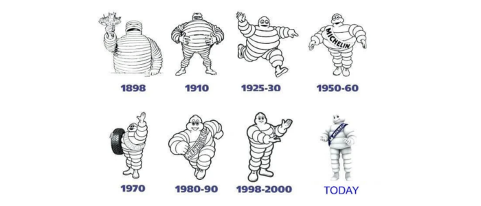
We’ve all seen it: the towering, 6-foot “balloon” figure known as the Michelin Man, or Bibendum, a mascot that’s as unforgettable as the tires it represents. With his unmistakable stack-of-tires physique and a face that exudes confidence, this icon has become a global ambassador for Michelin. But the Michelin Man we know today is the result of over a century of evolution. From a sophisticated, monocle-wearing character in 1898 to the more playful, robust figure of modern times, his design has adapted to reflect changing consumer tastes and marketing trends.
Originally conceived as a metaphor for tire durability—able to “drink up” the obstacles of the road—Bibendum’s journey mirrors the rise of Michelin as a leader in innovation. Whether as a friendly face on a billboard or a 3D mascot at events, this logo design encapsulates the brand’s commitment to performance and safety while maintaining a whimsical charm that resonates across generations. So, if you are interested in learning what made this logo design as successful as it is today, keep on reading. You will surely enjoy it!
Michelin Man: a Humble Beginning
Michelin’s illustrious history traces its roots back to the late 19th century. Founded by the visionary brothers Edouard and André Michelin in 1889, the company was born from a simple yet revolutionary idea. It all began in their rubber factory, where a cyclist arrived with a pneumatic tire that required repair. The brothers, intrigued by this innovative technology, spent hours meticulously detaching and repairing the tire.
This experience ignited a spark within the Michelin brothers. They recognized the immense potential of pneumatic tires and embarked on a mission to develop a superior product. Their goal was to create a tire that was not only efficient but also easy to install and remove. After countless hours of research and experimentation, the Michelin brothers achieved a breakthrough. In 1891, they patented their revolutionary removable pneumatic tire, a design that would forever change the automotive industry.
This innovation proved to be a game-changer. In the same year, Charles Terront’s Michelin-equipped bicycle triumphed in the world’s first long-distance cycling race, showcasing the superior performance and durability of its tires. This victory marked the beginning of Michelin’s legacy as a win in tire technology and a symbol of quality and innovation.
More to know: Top Common Branding Mistakes New Businesses Make
Michelin Logo Evolution
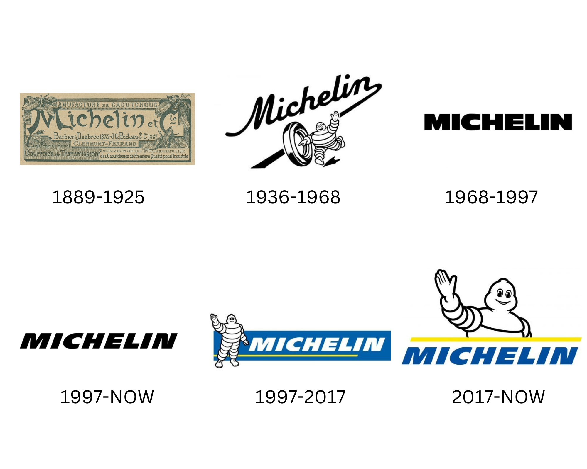
Here, you will notice the journey of the Michelin brand logo evolution. By going through this, you will discover and learn why changes were needed to the logo and what the designers thought would make it better and more recognizable to its audience worldwide. Let us get into the evolution of the Michelin logo and see how they turned this into one of the most memorable star logos to date.
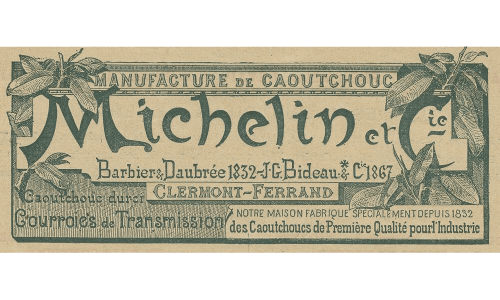
The First Logo: 1889 – 1925
Yes, we know. This will either remind you of a dollar note or a little ticket, a vintage coupon used back in the day. That is exactly what it was aiming for. When you take one look at this, does it make you think that it manufactures tires or fixes up cars? Not really right. Initially, the aim of this logo was to make it look like a ticket to create a rectangular emblem. There is a lot of imagery and text going on, as you can see.
This included two palm trees on either side of the “ticket” and a bunch of leaves on the bottom, with more text. However, in the middle of the emblem is the Michelin brand name written in a Gothic font. Probably in an attempt to make it “stand out.” The Michelin text was bigger than the rest of the little text. However, there are still a lot of tiny details and too many things to read. Yeah, it does look vintage, but would it pass to make a memorable logo? Not really. This thought caused the designers to create a different logo design for the brand.
Read more: Are Online Logo Makers Worth It?
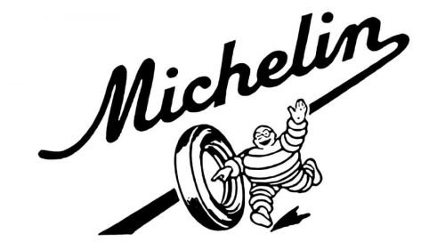
The Second Logo: 1936 – 1968
In the second attempt at the Michelin logo, the designers decided to completely remove the ticket-like emblem and use the power of white space instead. Additionally, this time, they also added the Michelin Man, or the Bibendum. You can see clearly that the mascot was running while rolling a tire, and the Michelin text was right above in a playful typeface.
The N letter from the Michelin wordmark acted as a road, and the logo was slightly tilted in an italic font. The logo design was executed in monochrome, meaning in white and black on;y, to make it look more friendly. The Bibendum is white, so to match that aesthetic, they planned to stay this way with it. This was a huge transition from the logo design above to the one you see here. Clearly, this took effort to make, and a lot of thought was put into it. The best thing about this Michelin logo design is that the designers took the path towards simplicity by keeping two colors and using minimal detail and design as much as possible to make it look more memorable and easily readable by the audience.
More logo evolutions for you: Samsung Logo Evolution: The Complete Story
The Third Logo: 1968 – 1997
The designers decided to go one step ahead and simplify the Michelin logo design further by removing the Bibendum and the little bit of added details. Although that was okay, of course, the brand needed to move ahead with future trends and logo design trends. This redesign took place in 1968 and changed the logo typeface to a much more modern aesthetic. Keep it to one solid color, and all the letters are in capitals and extra bold in sans-serif font.
The letters featured were thick and really stood out, making sure that the average viewer could read the text clearly. Those who know Michelin as the tire brand would know, but those who do not know would have a hard time figuring out what this is about. Nonetheless, the logo design is still outstanding and makes a great impression compared to the first one.
The purpose of making the logo design look this way was to create assertiveness and dominance in the field. The thick lines created a serious effect, and the straight cuts showed stability.
The Fourth Logo: 1997 – 2017
In the next logo, they decided to bring back the Bibendum to the logo design. This brought back some reconnection and meaning to the logo rather than simply being presented as “Michelin.”In this logo design, you can see that they kept the Michelin wordmark the same, but this time, it is white because of the blue rectangle. This allows the wordmark and text to stand out even more. Additionally, there is a small yellow slanted underline. The blue, white, and yellow color palette was made for the Michelin style.
On the left side of the wordmark, the Bibendum, or the Michelin Man Mascot, stands there with its full body form as if saluting. Certainly, this mascot created memories and also became the strong face of the Michelin brand.
The Fifth Logo: 1997 – Today
Now, the designers have decided to bring back the simplified wordmark logo for the Michelin brand to make it scalable and memorable. This wordmark could be easily printed on other products that the brand serves without compromising on quality. This style was of a slanted sans-serif, a very recognizable style, with stable letters and clean contours with sharp angles. Again, they used black text to assert dominance and create a bold effect.
The Sixth Logo: 2017 – Today
The 2017 redesign brought a new style and light to the overall Michelin brand with this new logo. The designers decided to bring back the Bibendum, but only half of it. You can clearly see its welcoming salute and smile, making the brand look inviting and trustworthy. This time, instead of the side, the designers decided to add the mascot on top of the word mark. This was a strategic placement of the mascot because you would instantly look at it and then the wordmark right under it. The yellow line turned out to be a bit thicker, separating the Bibendum from the wordmark. Also, the color of the wordmark turned out to be the brand’s star color.
An important read: 20 Leading Companies and Platforms for Hiring Top Website Developers in 2025
Ready to Create a Memorable Logo Design with LogoVent?
The Michelin Man logo and the company itself are synonymous with the iconic symbol known as Bibendum, or the Michelin Man. Bibendum’s popularity was highlighted in 2000 when a panel of 22 designers voted the Michelin logo the best logo ever created in a competition organized by the Financial Times. This recognition likely reinforced the public’s positive perception of the brand. The invention of the radial tire in 1946 is a significant factor contributing to Michelin’s growth and dominance in the tire industry. These tires quickly gained preference due to their superior performance, becoming the standard in Europe and Asia and eventually leading to widespread use in North America.
If you are interested in creating a memorable and attention-grabbing logo design, LogoVent can help your brand reach new heights and create lasting and promising first impressions.
