
Pepsi is more than just a soft drink, it’s a pop culture powerhouse with one of the most recognizable logos in the world. And yet, that familiar red, white, and blue circle hasn’t always looked the way it does today. From its script beginnings to the sleek wave we see on cans now, Pepsi’s logo evolution is a masterclass in bold rebranding, cultural alignment, and visual experimentation.
LogoVent provides premium logo design services. We’ve created a respected name for ourselves in the industry and we consider ourselves an authority on expert logo design. Which is why we’ve chosen to dive into the colorful history of how Pepsi’s logo kept fizzing through design trends, generational shifts, and competitive cola wars.
Much like the transformations seen in the Netflix logo or Microsoft logo, Pepsi’s branding journey reflects the pulse of its time, and the thirst for reinvention.
1893–1898: The Brad’s Drink Origins

1893–1898 The Brad’s Drink Origins
Before Pepsi became Pepsi, it was known as Brad’s Drink, a carbonated beverage created by pharmacist Caleb Bradham in 1893 in New Bern, North Carolina. Designed as a refreshing tonic to aid digestion and boost energy, the drink was originally sold at Bradham’s pharmacy fountain.
While no formal logo from this era has survived, early signage and advertisements used simple, utilitarian typography, likely printed or hand-lettered, on pharmacy-style placards or bottle labels. There was no brand personality yet, just a product name tied directly to its creator.
Why This Matters:
- It highlights the personal origins of the brand, connecting it to local trust and craftsmanship.
- It shows the transformation from a functional pharmacy drink to a cultural icon.
In 1898, Bradham renamed the drink to Pepsi-Cola, a more marketable and dynamic name that hinted at its digestive benefits (from ‘pepsin’ and ‘cola’ nut). And with that name change came the beginnings of a new brand identity, one that would evolve dramatically over the next century.
1898: The Swirly Script Era
Pepsi’s original logo was far from the geometric icon we recognize today. Created in 1898 by pharmacist Caleb Bradham, the first Pepsi-Cola logo was a swirly red script font that mimicked Coca-Cola’s handwriting-heavy style.
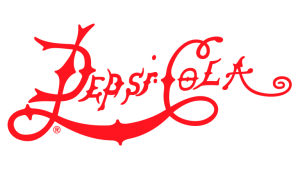
1898 The Swirly Script Era
Between 1903 and 1951, Pepsi went through a series of five subtle yet deliberate logo updates that refined its identity without straying far from its original script roots. The 1903–04 version introduced a bolder, more assertive take on the initial cursive lettering, establishing a visual rhythm that aimed to make the brand more legible in advertising.
Pepsi Logo 1903-1904
Just a year later, in 1904–05, the wordmark was slightly elongated and smoothed out, giving the logo a more polished, commercial appeal.
Pepsi Logo 1904-1905
By 1905–07, the flourishes became tighter, and the curves more calculated, signaling Pepsi’s desire to look more cohesive as a brand.
Pepsi Logo 1905-1907
The most lasting iteration during this stretch came in 1907–1934, when the logo featured an elegant, loop-heavy cursive that emphasized the handcrafted aesthetic typical of early 20th-century design. This version stuck for over two decades and helped cement brand recognition during a critical period of growth.
Pepsi Logo 1907-1934
Finally, the 1934–51 redesign brought a cleaner, slightly modernized script with fewer embellishments, this iteration paved the way for the upcoming bottle cap era, aligning the brand with mass production and nationwide visibility. While none of these changes were dramatic, they reflect Pepsi’s early attention to typographic consistency and visual maturity, long before it embraced bold graphic shapes.
Pepsi Logo 1934-1951
Design traits:
- Elaborate cursive typography
- Monochrome red palette
- Closely resembled its biggest rival
Though elegant, this version didn’t stand out much, it played it safe.
1950s: Enter the Bottle Cap
Pepsi Logo 1951-1962 – Bottle Cap
During World War II, Pepsi began incorporating patriotic elements into its branding to align with American sentiment. That’s when the red, white, and blue bottle cap logo emerged. This was a pivotal shift. The circular shape, tricolor theme, and cap-like edges created a distinctive identity separate from Coca-Cola, and that laid the groundwork for decades of recognizable design.
What it symbolized:
- American pride
- Friendly, mass-market branding
- A move away from traditionalism
Cultural context drives visual identity. The same principle powered the Disney logo evolution and its pivot from castle nostalgia to cinematic modernism.
1962–1973: A Modern Typeface Arrives
Pepsi Logo 1962-1969 – Bottle Cap
Pepsi Logo 1965-1969 – Bottle Cap
Pepsi Logo 1969-1971
In 1962, Pepsi dropped “Cola” from its logo and adopted a clean, sans-serif font, a radical step toward modernism. It was paired with a refined bottle cap motif.
This era marked Pepsi’s embrace of:
- Minimalism
- Legibility in advertising
- Global scalability
It was also the beginning of Pepsi’s long-standing rivalry with Coca-Cola becoming a design battlefield as much as a flavor war.
1971–1991: Stripes and Symmetry
Pepsi Logo 1971-1987
Pepsi Logo 1987-1991
The logo was flattened and simplified further in 1971, giving us a bold wordmark flanked by red and blue waves within a circular icon.
This version is often remembered as “the classic Pepsi look” and remained in use, mostly unchanged, for nearly two decades.
Why it worked:
- Symmetrical balance of colors
- Scalable on cans, signs, and packaging
- Fresh, energetic, and confident
Simplicity with rhythm, that’s what made Pepsi’s 70s design timeless. See the same balance in the PlayStation logo evolution.
1991–2003: 3D, Motion, and Gradient Madness
Pepsi Logo 1991-1996
Pepsi Logo 1996-1998
Pepsi Logo 1997-2003
Pepsi Logo 2003-2006
Pepsi Logo 2006-2008
The 90s and early 2000s were the age of chrome, gradients, and swooshes, and Pepsi followed the trend. The circle became 3D, the colors were brighter, and the typography was italicized to suggest motion.
This was branding in the era of MTV and action movies, where everything needed to move, even if it was standing still.
Design choices:
- Faux-realistic effects
- Bold, slanted fonts
- Vibrant energy targeting youth
Pepsi’s identity at this point echoed brands like MTV, where the logo became an experience, not just a stamp.
2008: The Controversial Smile
Pepsi Logo 2008-2014
Pepsi Logo 2014-2023
In 2008, Pepsi launched one of its most polarizing logo overhauls ever. The circular icon was retained but distorted into an asymmetrical “smile” shape. The wordmark was modernized and lowercase, removing much of its previous boldness. Initial reaction? Mixed. Some called it youthful and minimalist. Others thought it lacked confidence and seemed incomplete. But over time, the logo’s flat design and subtle playfulness won over skeptics.
Symbolism:
- The circle tilt resembled a smile or globe
- “Pepsi” appeared friendlier and more informal
- Fit the new wave of mobile-first branding
Even bold redesigns need time to breathe. Remember how Instagram’s new logo faced backlash, until everyone accepted it.
2023–Present: Back to Bold
Pepsi Logo 2023- Present
In 2023, Pepsi returned to bold sans-serif fonts and high contrast. The redesigned logo brought the text back inside the circle, a nostalgic callback to the 90s, but with modern proportions and digital readability.
This redesign focused on:
- High visibility on screens
- Powerful shelf presence
- A blend of old-school cool and modern function
The black wordmark gave it more authority, while the circle’s coloring was flatter and cleaner.
This blend of retro and future mirrors what we saw in the Volkswagen logo evolution, proof that going back can still push you forward.
Lessons from Pepsi’s Logo Evolution
1. Don’t Be Afraid to Take Risks
Pepsi’s many redesigns show a brand willing to experiment, even if it invites criticism.
2. Align with Cultural Mood
From wartime patriotism to millennial minimalism, Pepsi’s look always reflected the moment.
3. Typography & Hue Analysis
Pepsi’s latest logo reintroduces bold, uppercase sans-serif typography placed squarely inside the iconic globe, a confident shift from the lowercase, minimalist font of the previous era. The new wordmark exudes strength and visibility, designed to stand out across digital platforms and physical packaging alike.
The hue palette revives the brand’s classic color proportions with deeper blues, more vibrant reds, and stark white, a return to contrast-heavy visuals that reinforce energy and clarity. This fresh-yet-familiar approach makes the logo more adaptable across modern media while nodding to Pepsi’s heritage. It’s a strategic fusion of retro appeal and digital readiness.
Want to test what your logo says about you? Let LogoVent help you with brand identity design services that speak your language.
What’s Next for Pepsi?
As digital interfaces and packaging evolve, Pepsi’s branding is likely to:
- Embrace motion design and interactivity
- Tailor colors to smart device UIs
- Stay playful while reinforcing global familiarity
Pepsi knows that logo evolution isn’t about changing the brand, it’s about keeping it alive.
Need to evolve your own visual identity without losing customer loyalty? Our affordable logo design services give you the confidence to rebrand with purpose. Check out our affordable design packages today.
Final Thoughts
Pepsi’s logo evolution is a mirror to modern branding, colorful, dynamic, and never afraid to take a leap. From its swirling script to the iconic circular smile, every shift tells a story of a brand that understands not just marketing, but momentum.
At LogoVent, we help brands like yours craft identities that are not just trendy, but timeless. Whether you’re launching, rebranding, or revamping, we’ve got you covered with web design, logo design, and search engine optimization services that bring your business full circle. Ready for your own refreshing redesign? Contact LogoVent to shape your next logo; bold, strategic, and future-ready.


