
Mercedes-Benz – A Symbol of Luxury and Innovation Forged in the Skies
Not many logos in the automotive world carry the prestige of the Mercedes-Benz three-pointed star. It’s sleek, minimalist, and undeniably iconic, it’s more than a brand mark, it’s a statement of German engineering excellence, global ambition, and timeless design.
But this famous emblem didn’t just appear fully formed on a silver hood ornament. The Mercedes-Benz logo went through a fascinating evolution, from typography-based branding to a symbol that would come to represent land, sea, and air.
We at LogoVent provide next-level logo design services. And we are good at what we do. So, we decided to bring you our keen analysis at how Mercedes-Benz built a luxury icon, and what branding lessons we can learn from its journey.
“The sleek lines of the Mercedes star reflect the same design clarity we admire in the BMW logo evolution, refined, symbolic, and future-forward.”
1902–1909: Typographic Beginnings
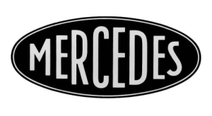
Mercedes-Benz 1902-09
The story starts in 1902 when the name “Mercedes” was registered as a trademark by Daimler-Motoren-Gesellschaft (DMG), named after the daughter of a major distributor, Emil Jellinek’s daughter, Mercedes.
At this stage, there was no emblem, just elegant script typography spelling “Mercedes.” It was refined, legible, and confident, just like the vehicles.
Design elements:
- No symbol or icon
- Wordmark carried the brand’s weight
- Evoked European elegance of the early 1900s
Logos that start with simple wordmarks, like Gucci’s logo or early Toyota branding, often evolve into icons as the brand grows in reputation.
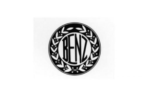
1909–1916: Ornate Experimentation + Enter the Star
Mercedes-Benz 1909-16

Mercedes-Benz 1916-26
In 1909, DMG registered both a three-pointed star and a four-pointed star. The three-pointed version was ultimately chosen and became the face of Mercedes.
The 1909 Benz logo exuded elegance and sophistication. Featuring a traditional circular emblem, it was framed by a bold double outline adorned with a stylized laurel wreath. At its center, the wordmark appeared in a distinctive custom sans-serif typeface, rendered in black against a clean white backdrop. This intricate yet balanced design conveyed both the refined aesthetic and the dynamic power that defined the Benz brand.
What did it stand for?
The three points represented Daimler’s vision of dominating transportation across land, sea, and air, a bold mission for the time.
This version of the logo was gold, with the star enclosed in a circle, exuding class and ambition.
What made it iconic:
- Bold use of geometry
- Embedded meaning with universal relevance
- Unique among auto brands of the era
“…the growth of the Tesla emblem and logo stands as a symbol of its commitment and dedication to pushing limits.”
— Disclosing the Tesla Logo
1926-33: The Fusion of Mercedes and Benz
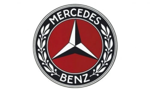
Mercedes-Benz 1926-33
In 1926, DMG merged with Benz & Cie, forming the now-legendary Mercedes-Benz brand. With the merger came a new logo that combined:
- The three-pointed star of Mercedes
- A laurel wreath from the Benz logo (a nod to its racing victories)
This new design was formal, regal, and richly detailed, befitting a company positioning itself at the pinnacle of automotive luxury.
Looking to merge old and new in your own brand identity? Our brand identity design services help startups and established businesses unify their past and future.
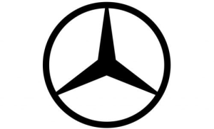
1933–1980: Simplification and Strength
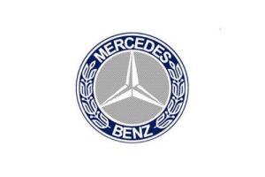
Mercedes-Benz 1933-80
Mercedes-Benz 1933-89
Mercedes-Benz 1989-2009
Throughout the 20th century, the Mercedes-Benz logo underwent several simplifications, removing the laurel wreath, flattening the design, and shifting to monochrome.
These changes were not aesthetic alone. They reflected Mercedes-Benz’s growing:
- Global reach
- Technological prowess
- Desire for timeless branding
By the mid-1980s, the logo was pared down to just the silver three-pointed star within a thin circle, a logo as elegant on a car hood as it was in a digital ad.
“But as they say, “a phoenix rising from the ashes.” Microsoft, too, had to undergo several changes with its design in order to become the Microsoft you see today…”
2009–Present: Flat Design, Eternal Appeal

Mercedes-Benz 2009-11
Mercedes-Benz 2011-Present
Modern branding requires digital flexibility. So, in the 2000s, Mercedes-Benz began using flatter, more digital-friendly versions of its logo while retaining the chrome 3D version for vehicles.
The current logo is:
- Simple
- Balanced
- Geometrically perfect
It works just as well on web banners, touchscreens, and business cards as it does on a luxury coupe’s grille.
Why it works in 2025 and beyond:
- Digital-first format
- Global legibility
- Consistent with premium identity
Flat doesn’t mean boring, it means future-ready. Even Instagram’s logo evolution followed the same trajectory.
Design Lessons from Mercedes-Benz
1. Symbols Create Legacy
The three-pointed star has transcended branding, it’s now part of culture. It stands for precision, status, and class.
2. Mergers Demand Design Harmony
The 1926 merger taught us that two visual legacies can be merged without losing authenticity.
3. Simplicity Is Always in Style
Whether it’s 1926 or 2025, the clean geometry of the star logo proves that good design never goes out of fashion.
Ready to evolve your logo for the digital age? Explore our affordable small business logo packages, crafted for growth and recognition.
Where the Star Could Go Next
The Mercedes-Benz brand is moving full-speed into the electric and AI-powered future. With the launch of EQ electric models and autonomous driving technologies, don’t be surprised if we see subtle logo enhancements:
- Motion-based logo animation in infotainment UIs
- Adaptable color schemes for digital dashboards
- Interactive branding in AR/VR driving experiences
But the core identity, which is the Star, will remain.
Want your logo to perform in motion and static? Pair your brand refresh with animated logo design for full-spectrum visibility.
Final Thoughts
The Mercedes-Benz logo evolution is more than a design timeline, it’s a case study in branding discipline, meaningful symbolism, and timeless simplicity. From a typographic wordmark to a globally recognized star, the brand’s journey teaches us that design done right becomes eternal.
At LogoVent, we help brands capture their mission in a single mark, whether that’s luxury, tech, speed, or innovation. Our team offers affordable logo design services, expert website design, and full-scale SEO solutions to help you build a brand that shines like a star, on screen, in print, and on the streets. It’s not just about how your logo looks. It’s about how it lives. Contact LogoVent to help you design for the future.


