When you think of aerospace giants, Boeing is one of the first names that comes to mind. As a dominant force in both commercial and military aviation, Boeing’s visual identity has seen a careful, calculated evolution over the decades. Each iteration of the Boeing logo tells a story of innovation, mergers, and a commitment to forward momentum, qualities that any brand would aspire to express through logo design.
From its humble origins in the early 20th century to the polished, minimal design it uses today, Boeing’s logo reflects both its history and its futuristic ambitions. Let’s chart the brand’s journey through the skies via its most defining logos. Looking to elevate your own visual brand? Explore our logo design services tailored for companies aiming to soar like Boeing.
1917 – The Birth of an American Aviation Icon
1917-28
The very first Boeing logo in 1917 bore the name “Boeing Airplane Company” in an all-caps, sans-serif typeface. It was basic, almost industrial in its execution, a product of its time. No iconography, no embellishments, just a black logotype focused on legibility.
At the time, the aviation industry was still nascent, and branding was largely functional. Boeing wasn’t focused on being visually bold, it was busy proving that its planes could fly and last. However, this no-nonsense branding laid a solid foundation of trust and engineering prowess.
1928 – Enter the Winged Totem
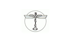
1928 – 1940
By the late 1920s, Boeing had established itself as a serious player. Its 1928 logo was its first major visual leap. It incorporated an abstracted Native American totem, a tribute to the Pacific Northwest’s indigenous art. The totem was placed within a circle, with wings extending outward from the central figure.
This logo was both cultural and symbolic, representing not only regional heritage but also the expansive nature of aviation. The wings were unmistakably aviation-related, while the totem gave Boeing a mythic, rooted quality.
Did you know? The concept of winged logos was also used by Volkswagen and Mercedes-Benz during similar periods to suggest freedom and motion.
1940 – Clean Typography Takes Flight
1940-60
By the onset of World War II, Boeing’s logo was stripped of its earlier cultural references. The logo became simpler: a sleek wordmark in bold sans-serif typography, often enclosed within a circle or oval. This new design echoed the brand’s focus on functionality and military contracts.
Boeing was rapidly building bombers like the B-17 and B-29. The clean, strong typography mirrored the company’s role in shaping the U.S. military air force, serious, sharp, and solid.
1947 – The Modern Age Begins
1947
As commercial aviation began to rise post-WWII, Boeing modernized its logo to match the new era. The font was italicized, slanted slightly forward, suggesting speed and innovation. While minimalist, this subtle change captured the momentum of the brand perfectly.
This version remained in use for decades and was seen on famous aircraft like the 707, 727, and 747, planes that defined the Jet Age. The italicized wordmark became synonymous with progress in global air travel.

1997 – The Merger with McDonnell Douglas
In 1997, Boeing merged with fellow aerospace titan McDonnell Douglas. To reflect this monumental shift, Boeing unveiled a new logo that combined both companies’ strengths.
This new design featured a stylized, swooping orbital ring, inspired by McDonnell Douglas’s logo, orbiting a modernized typeface that retained the italicized style. The orbital ring added a cosmic, future-forward aesthetic, signaling Boeing’s intent to dominate not just aviation, but space exploration as well.
This kind of visual fusion during a corporate merger is rare. For more examples of dynamic brand unification, check out Warner Bros. identity journey.
Present Day – Minimalism, Power, and Motion
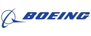
1997-Present
Today, Boeing’s logo is almost identical to the 1997 version, with minor refinements in vector weight and proportional balance. The logotype is crisp, bold, and futuristic, while the orbital element adds sophistication without crowding the space.
The deep blue hue communicates professionalism and trust, which is essential for a brand whose products are quite literally life-critical.
The Boeing logo is a masterclass in corporate minimalism. You can find these principles shared by modern giants like Meta and Microsoft.
The Psychology Behind the Boeing Logo
The Boeing logo evokes several key emotions and brand perceptions:
- Professionalism and Trust: The bold blue tones and strong font convey engineering integrity and safety.
- Innovation and Speed: The italic slant and orbiting ring suggest constant motion and exploration.
- Global Reach: The sweeping arc implies a planet-wide scope, fitting for a company involved in commercial jets, satellites, and space vehicles.
A Legacy Written in the Skies
From handcrafted biplanes to space-age satellites, Boeing’s brand identity has adapted to reflect the industry’s seismic changes while never losing sight of its purpose, pioneering the future of flight. Its logo, much like its aircraft, has become instantly recognizable across continents and generations.
Interested in working with a creative agency that understands legacy, precision, and evolution? Check out our portfolio page or contact us to start your project today.


