Stagecoach Legacy
As one of America’s oldest financial institutions, Wells Fargo has built a brand identity deeply rooted in history and visual consistency. From the iconic six-horse stagecoach of the Gold Rush to its sleek modernized wordmark, each logo iteration reflects the bank’s evolving mission and reputation.
Planning a brand refresh without losing legacy? Explore LogoVent’s logo design services, perfect for modernizing with respect and strategy.
1852–1960: The Stagecoach Era – Heritage by Horsepower
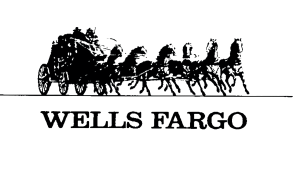
- 1852–1892: Wells Fargo began as an express delivery company in California’s Gold Rush era. Its earliest branding used an intricate black-and-white illustration of a six-horse stagecoach, complete with driver and cargo, above a serif wordmark reading “WELLS FARGO & CO.” The emblem conveyed trust, durability, and frontier-era reliability.
- 1892–1930s: The stagecoach became more detailed, transporting people, mail, gold. The serif wordmark featured heavier strokes, underlining stability. The carriage emblem was the visual anchor for decades.
Wells Fargo Logo 1852-1960
- 1940s–1960: Wells Fargo simplified the coach slightly for better print reproduction, but the six-horse, two-occupant iconography remained central. Serif typography stayed strong, reflecting the brand’s traditional banking image.
During this era, the stagecoach wasn’t merely decorative; it summarized Wells Fargo’s foundational services: secure transport and financial trust.
Wells Fargo’s official history timeline highlights how it became synonymous with express delivery, trust, and mobility in the 19th century.
1960–1996: Outlined Coach and Corporate Expansion
Wells Fargo Logo 1960-1962
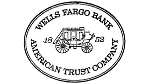
- 1960–1962: After a corporate merger, Wells Fargo shifted to a more modern emblem, a black outlined stagecoach inside an elliptical badge. Surrounding the coach in the outer ring: the bank’s name and founding date in serif capitals. This version visually transitioned the brand into a formal, bank-centered identity.
Wells Fargo Logo 1962–1996
Wells Fargo Logo 1962–1996
- 1962–1996: The outlined coach emblem gradually became secondary, used sometimes just as a tiny icon or printed image. The bold serif wordmark of “Wells Fargo Bank” maintained prominence in signage, stationery, and print identity. The ellipse was dropped in many applications, marking a shift toward simplified layouts.
This period overlapped with Wells Fargo’s charter change (1968) and holding company renaming after merging with Norwest (1998): visual brand elements laid groundwork for consistency through expansion.
The stagecoach isn’t just a symbol, it’s a branding element rooted in real history. This Smithsonian Magazine article explores how Wells Fargo’s marketing leveraged frontier iconography to gain customer trust.
1996–2019: A Red Square Emerges; Trust Meets Modernity

Wells Fargo Logo 1996–2019
- 1996: Wells Fargo acquired Norwest, consolidating branding. In 2009 (post-Wachovia acquisition), the brand unveiled a bright red square background with bold yellow serif “WELLS FARGO” type set on two levels. The stagecoach icon was retained atop the square, now more polished and colorful.
- The yellow serif font belonged to a modern Clarendon-type slab serif, echoing historical solidity and bank tradition. The contrasting red background offered visibility and warmth unmatched in finance branding.
- The stagecoach icon, now in yellow with red accent details, connected to the brand’s iconic heritage. The slogan “Together We’ll Go Far” often appeared beneath in red type. This update fused tradition with modern branding sensibilities and debuted during a time of rapid digital expansion for Wells Fargo.
Are you interested in how other iconic global brands have evolved over time? Our deep dive into the Volkswagen logo evolution reveals a journey just as rich in symbolism and reinvention.
2019–Present: Simplified Elegance, Rebuilding Trust

Wells Fargo Logo 2019–Present
- 2018–2019: In response to reputational crises, Wells Fargo launched a brand renewal campaign titled “This Is Wells Fargo”. The visual identity was updated, lettering changed from yellow to bold white, the serif font received tighter kerning, and the stagecoach icon was simplified in yellow with fewer details. The red square remained but was fine-tuned for digital clarity and mobile responsiveness.
- The simplified stagecoach now featured three horses instead of six, positioned in a modern silhouette style, which is a nod to legacy while signaling a new era. The thickened white letters improved readability across apps and signage without losing the established visual system.
This redesign aligned with a broader effort to convey cultural change and customer-centricity.
Interested in how heritage brands manage lasting identity? Read our Microsoft logo evolution post, another case of consistent wordmark refinement.
Typography & Color: Symbolizing Stability and Change
- Typeface: The logo uses Clarendon bold slab serif, an 1840s font adapted for modern bank branding. Its squared serifs and robust strokes project dependability and tradition.
- Color Palette:
- Red (#CD1309) – authority, trust, boldness
- Yellow (#FFFF00) (pre-2019) or White (post-2019) – visibility, optimism, clarity
- The stagecoach icon shifted from yellow/red to plain yellow for better reproduction on digital screens.
Design Lessons from Wells Fargo’s Identity Evolution
- Symbolic heritage can evolve gracefully. The iconic stagecoach, first tied to the brand in 1852, is a symbol of trust, perseverance, and westward ambition. For nearly 170 years, this emblem has endured, evolving from hand-drawn etchings to refined digital vectors. By maintaining this consistent thread, Wells Fargo shows how legacy elements can carry emotional weight and brand familiarity across centuries, even in an age of digital-first communication.
- Strong typography reinforces trust.The brand’s strong slab-serif wordmark is no accident. It reinforces trust, dependability, and tradition, critical traits for a financial institution. Serif fonts, especially those with substantial weight like Wells Fargo’s, signal authority and longevity. Unlike more playful or minimal fonts, this choice delivers a message of financial solidity and seriousness, an unspoken reassurance to customers that their money is in stable hands.
- Color contrast communicates modern clarity.The transition from yellow to white text against the iconic red background was a strategic move for clarity and accessibility. White creates a cleaner contrast, improving legibility on digital devices and smaller-scale applications, while maintaining the energy and boldness of the signature Wells Fargo red. The brand managed to modernize without compromising its legacy tone.
- Minor tweaks yield major impact. Take, for instance, the visual shift in the stagecoach illustration. Earlier versions featured six horses, intricate reins, and high detail. The 2019 logo quietly reduced this to two horses and a simplified form. Far from erasing history, this choice distills the symbol’s core meaning into a cleaner, more scalable design. It maintains emotional resonance while ensuring better performance across screens, print, signage, and promotional materials.
Looking for a brand evolution that respects your legacy while preparing for the future? Our portfolio showcases how we’ve helped businesses do just that, across industries and design styles.
Final Thoughts: Stagecoach to Streamlined Identity
From a six-horse carriage to a white-on-red wordmark, the Wells Fargo logo tells a story of transformation grounded in tradition. Each update honors the past, even as it adapts, to remain legible and relevant in today’s digital world.
If your brand needs a visual identity that stands the test of time, trust in LogoVent’s ability to merge legacy and clarity. Ready to design a logo built to last centuries? Start your journey with LogoVent’s professional design services today, purposeful, powerful, and principled. Contact us today to learn more.
