
In the realm of entertainment, few logos are as instantly recognizable as the Warner Bros. shield. From the golden age of cinema to streaming-era blockbusters, the WB logo has stood as a symbol of Hollywood prestige and storytelling power for over a century. With its iconic shield and stylized initials, the Warner Bros. logo has undergone subtle and dramatic transformations, each capturing the mood, style, and ambition of its era.
This blog traces the fascinating evolution of the Warner Bros. logo, showing how this legendary emblem has flexed with time, yet stayed rooted in cinematic legacy. Whether you’re a design enthusiast or a business looking to build lasting brand equity, the WB shield offers a masterclass in logo endurance.
Want a logo that grows with your brand but never loses its impact? Let LogoVent’s logo design services craft something iconic for you.
A Logo Is Born: The 1920s – 1930s
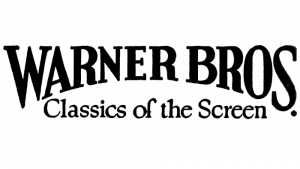
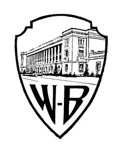
Warner Bros 1923-25
Warner Bros 1925-29
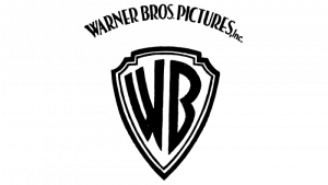
Warner Bros 1929-37
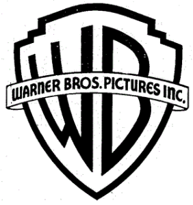
Warner Bros 1934-37
The original Warner Bros. logo debuted in 1923, featuring a photograph of the Warner Bros. studio behind a medieval-style shield bearing the initials “WB.” It reflected both grandeur and realism, signaling the studio’s pride in its physical space and technical capabilities during Hollywood’s early expansion.
As sound revolutionized film, Warner Bros. pioneered the “talkie” and cemented its place in history. The logo was bold, theatrical, and almost literal, serving as a gateway into a new age of cinema.
Explore how other brands embraced industrial heritage with our Volkswagen logo evolution.
1940s–1950s: Golden Age Sophistication
Warner Bros 1937-1953
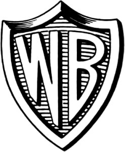
Warner Bros 1948-1967
By the 1940s, the studio had embraced color, and the logo was rendered in striking golds and reds. This version of the shield became a staple in the opening frames of classic noir films, cartoons, and prestige pictures alike.
Often accompanied by an orchestral score, the WB shield gained emotional weight, announcing each film with fanfare and elegance. This era defined the logo as not just a studio mark, but a seal of quality entertainment.
Want to give your brand the polish of a classic studio intro? Explore our brand identity design services that bring cinematic flair to your business visuals.
Looney Tunes Era: Animation Gets Playful
During the golden age of animation, the Warner Bros. shield took on a more playful life, appearing in cartoons like Looney Tunes and Merrie Melodies. Here, the logo would often zoom in or bounce to the tune of “The Merry-Go-Round Broke Down,” adding a lighthearted dimension to an otherwise dignified emblem.
This dual-use of the logo, serious in film, playful in animation, is a great example of brand adaptability without dilution.
Curious how animation branding evolved? Check out the Disney logo evolution and the vibrant 7UP logo journey.
1970s–1980s: Flat and Corporate
Warner Bros 1967-70
Warner Bros 1970-72
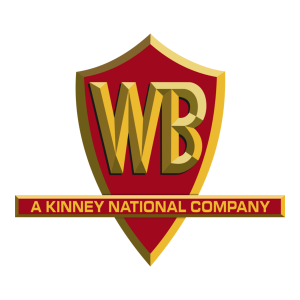
Warner Bros 1972-90
As the film industry entered a more commercialized era in the 1970s, Warner Bros. redesigned the logo for a cleaner, more minimalist approach. The shield was simplified into a flat outline, sometimes filled in with blue or black, often paired with Helvetica-style text spelling out “A Warner Communications Company.”
This version reflected corporate mergers and a new direction, but lost some of the theatrical flair that made the brand iconic. It was efficient but less emotive.
Rebranding after a merger or pivot? Our affordable logo design services make it easy to refresh without losing what makes your business unique. Check out our logo design packages.
The Return to Legacy: 1990s–2000s
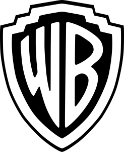
Warner Bros 1953-2019

Warner Bros 1993-2022
In the 1990s, Warner Bros. returned to its roots, reviving the three-dimensional golden shield with the deep blue background and white initials. This revival coincided with the success of major franchises like Harry Potter, The Matrix, and Batman, reinforcing the logo’s association with epic storytelling.
The visual detail in the shield once again matched the grandeur of the content it introduced.
See how franchise-driven branding plays out in the Netflix logo evolution.
The HBO Max Era: Streamlined Minimalism
Warner Bros 2019-23
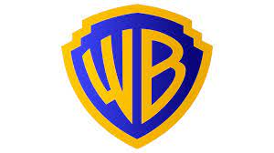
Warner Bros 2023-Present
With the rise of streaming and the 2021 launch of HBO Max, Warner Bros. again updated its logo, this time going fully flat and modern. The current iteration is a simplified, vector-style blue shield with white initials, accompanied by subtle animation.
It’s sleek, professional, and built for digital-first branding, from mobile screens to app icons and thumbnail overlays.
This version sacrifices ornamentation for clarity and scalability, ensuring brand consistency across platforms.
For more modern minimalist transitions, explore the ChatGPT logo history and Discord logo evolution.
What Makes the WB Logo Iconic?
1. A Strong, Recognizable Shape
The shield silhouette is timeless, easy to identify, and emotionally resonant, invoking ideas of legacy, strength, and authority.
2. Initial-Based Design
Using “WB” instead of the full company name makes the logo compact and versatile while maintaining uniqueness.
3. Balancing Tradition and Innovation
Warner Bros. has tweaked its logo often, but never abandoned the core elements that audiences associate with its brand.
4. Emotional Association
Audiences don’t just see the logo, they feel it. It precedes beloved films, unforgettable cartoons, and pop culture-defining franchises.
Want to build that kind of emotional recognition? Pair your visual identity with our website design and SEO packages for a complete brand experience.
What Businesses Can Learn From WB
- Stay recognizably you: Even when styles change, core elements like shape and initials can anchor your identity.
- Adapt for your audience: From cartoon zoom-ins to mobile thumbnails, WB adapted its visuals to match how and where people consumed content.
- Design for versatility: A logo that looks great on cinema screens and mobile apps? That’s the benchmark.
At LogoVent, we follow the same philosophy. Our logos are made to work across mediums, markets, and generations, whether you’re a content creator, e-commerce startup, or service provider.
Conclusion
The Warner Bros. logo has worn many faces: vintage realism, minimalist flatness, three-dimensional grandeur, and streaming-era clarity. Yet the shield endures, anchored by initials, shaped by storytelling, and recognized by millions.
This evolution reminds us that iconic logos don’t stay stagnant, they respond, reflect, and re-emerge stronger. And that’s exactly the kind of future-ready identity LogoVent delivers through our professional logo design services.
When it comes to building a brand with cinematic staying power, your logo is your opening act. Let’s make it unforgettable. Contact us today to start your journey.


