When you think of Volkswagen, chances are the image of a sleek, circular VW emblem comes to mind. It’s a symbol that has evolved nearly a century, going from one of the most controversial beginnings in branding history to one of the cleanest, most recognized logos in modern automotive design. But behind that simplicity is a layered story, one that intersects with politics, industrial design, cultural shifts, and the very idea of what a logo says about a company.
In this blog, LogoVent will trace the fascinating evolution of the Volkswagen logo, from its Nazi-era roots to today’s flat design aesthetic, and explore what makes this journey a must-study for any designer or brand strategist.
The Controversial Beginning: 1930s Wartime Symbolism

1937-39
1939-1945
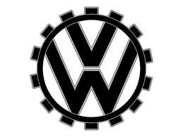
Volkswagen was founded in 1937 under the Nazi regime as part of Adolf Hitler’s plan to produce a “people’s car”, Volkswagen literally means “people’s car” in German. The original logo was deeply entwined with that ideology. It featured a gear-like outer ring enclosing a swastika-inspired design, and stylized “V” and “W” letters integrated into the center.
While most companies would shy away from discussing these associations, Volkswagen has worked diligently to distance itself from its origins and redirect its brand identity toward progress, inclusivity, and innovation.
Key Characteristics of the 1938 Logo:
- Gear-shaped outer ring symbolized industry and motion.
- Sharp, angular typography matched the era’s militaristic tone.
- Strong visual alignment with Nazi symbolism (now fully abandoned).
What We Learn:
A logo carries the weight of its context. Even well-designed visuals can become outdated or inappropriate as cultures evolve.
Thinking about a logo redesign? Let LogoVent help refresh your brand with affordable logo design services that speak to today’s audiences.
Post-War Rebranding: Stripping the Past (1945–1960s)

1945-1948
1948-1960
1960-1967
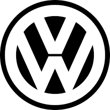
After World War II, Volkswagen underwent a serious brand cleanup (a no-brainer). The logo shed its swastika resemblance and transformed into a more universally palatable image. The new design retained the “V” stacked above the “W,” enclosed neatly in a circular border. Gone were the sharp militaristic features. What remained was simple, geometric, and highly readable. This was an early lesson in minimalist branding.
During this time, the company transitioned from its military origins to a global consumer brand. The VW Beetle, which would become a global icon, carried the new logo proudly.
Design Takeaways:
- Emphasized clarity and neutrality.
- Reflected the democratization of the brand post-war.
- Set the foundation for a global visual identity.
Want to see another brand’s logo evolution and how they kept up with the times? Explore this blog on Samsung’s logo design evolution.
The Era of Consistency: 1970s–1990s

1967-78

1978-89

1989-95

1995-2000
As the brand matured, so did the logo. Over the next two decades, Volkswagen doubled down on consistency. The circular badge remained largely unchanged in structure, but it evolved subtly in execution.
By the 1970s, the VW logo was fully enclosed in a clean, monochrome circle. In the 1980s and 90s, the company began to experiment with 3D rendering and metallic finishes. These effects added depth and realism, signaling Volkswagen’s embrace of technological advancement and global prestige.
What Makes This Phase Unique:
- Subtle refinements without major redesigns.
- Visual upgrades aligned with manufacturing quality improvements.
- Maintained brand recognition through careful evolution.
Speaking of the automotive industry, Michelin, the tire manufacturer, has been through an evolution of it’s own. Read our blog to find out more about Michelin’s logo design evolution.
The 3D Glossy Era: 2000–2019

2000-12

2012-19
The early 2000s were dominated by skeuomorphic design. Volkswagen, like many other automakers, adopted a highly polished, 3D chrome-like version of its emblem. This iteration was all about shine and surface; reflections, bevels, shadows, and realism.
While this style was trendy, it also marked a departure from the clarity that the earlier logos had achieved. The emblem looked great on car hoods, but less so on digital screens or low-resolution prints.
Features of This Style:
- Heavy use of gradients and lighting effects.
- Designed for physical appeal, less so for digital adaptability.
- Aligned with consumer perception of “premium quality.”
Need a future-ready brand? LogoVent also offers web design services that sync your logo and website perfectly.
While you’re here, you might also be interested in checking out other logo design evolutions. Why not check out Disney’s logo design evolution over the years?
Return to Flat: 2019–Present

2019-Present
In 2019, Volkswagen revealed a major brand overhaul, including a redesigned flat logo. This return to simplicity and digital friendliness was part of a larger repositioning of the company as forward-thinking, clean, and environmentally conscious.
Gone were the gloss and chrome. In their place stood a minimalist, two-dimensional version of the classic VW mark. This move echoed broader design trends favoring flat, scalable logos suitable for screens, social media, and apps.
Why This Redesign Works:
- Cleaner and more legible across all platforms.
- Aligns with the electric car movement and digital innovation.
- Reflects brand transparency and approachability.
Design Lessons from Volkswagen’s Logo Evolution
Volkswagen’s logo journey offers valuable insights for businesses of all sizes:
- History matters. Even legacy logos must evolve to reflect modern values. And you can’t run from your history but improve upon it.
- Simplicity scales. The cleaner the design, the more versatile it becomes across digital and physical touchpoints.
- Logos reflect brand transformation. As Volkswagen moved from nationalism to globalism, from diesel to electric, its logo shifted in tone accordingly.
You might get some essential design lessons from the design evolution of the one of the biggest athletic wear brands in the world: Nike. Check out our blog for more information.
Conclusion
Volkswagen’s logo is proof that no brand is locked into its past. With thoughtful design and strategic rebranding, even the most controversial origins can give way to a globally beloved identity. The transition from a gear-ringed emblem tied to nationalism to a flat, forward-thinking icon mirrors the company’s own transformation.
At LogoVent, we believe that your logo should grow with your business. Whether you’re launching a new product, updating your online presence, or distancing yourself from an outdated image, we offer logo design services that help your brand stay relevant, resonant, and ready for tomorrow. Ready to turn your brand story into a logo that lasts? Contact us today.


