From dusty assembly lines to cutting-edge hybrid models, Toyota has evolved into one of the most recognizable automotive brands in the world. But behind its global success lies a carefully crafted visual identity that has shifted dramatically over time. The Toyota logo, simple as it may appear, holds deep meaning, hidden elements, and a rich design evolution worth exploring.
In this blog, we’ll unpack Toyota’s logo journey, decode its symbolism, and spotlight what modern designers can learn from the brand’s emblematic evolution.
Before the Ovals: Toyota’s Early Branding (1937–1949)
1937-49
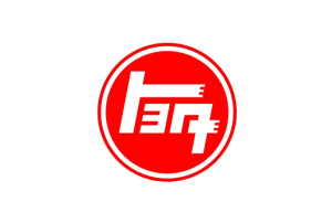
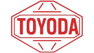
Toyota began as “Toyoda,” named after its founder Kiichiro Toyoda. In its earliest branding, the company used kanji script logos typical of Japanese industrial companies in the 1930s. The logos were more functional than symbolic, often appearing in traditional brush strokes or on metal plaques.
The turning point came with a public contest in 1936 to design a new logo, leading to a shift from “Toyoda” to “Toyota”, a name considered luckier and easier to pronounce globally.
Early Logo Highlights:
- Used Japanese kanji for “Toyoda.”
- Later transitioned to Katakana script for “Toyota.”
- Typography-driven with minimal graphic flair.
Design Insight:
Even typography can carry cultural meaning. Choosing the right wordmark is foundational in strong brand identity design services.
Want to create a culturally resonant logo? Our corporate identity design services make it possible.
Speaking of resonant logos, check out our blog on Tesla’s logo evolution too. There’s a lot to learn there as well.
The Red Rising Sun: Toyota’s First Westernized Logos (1949–1989)
1949-58
1958-69
1969-78
1978-89
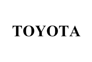
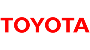
With post-war industrialization, Toyota began exporting cars worldwide. The brand adopted a more Westernized identity, introducing a red wordmark in clean, bold sans-serif letters. For decades, this version carried the company through rapid global growth.
The red color conveyed energy, passion, and modernity, values aligned with the brand’s engineering-first ethos. But it still lacked a graphic mark to stand alongside automotive giants like Mercedes or Ford.
Key Features:
- All-caps “TOYOTA” in red.
- Geometric, no-nonsense font.
- Represented discipline and trust.
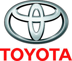
The Debut of the Triple Oval: 1989 and a Design Milestone

1989-2005
In 1989, to commemorate its 50th anniversary and assert a stronger global identity, Toyota unveiled its now-iconic triple oval logo. This was more than a visual update, it was a masterclass in symbolic logo design.
At first glance, you see a stylized “T.” But a closer look reveals three interconnected ovals:
- Two perpendicular ovals forming the “T” for Toyota
- A larger horizontal oval enclosing the two. This represented a global embrace.
Each oval has meaning:
- Customer trust
- The heart of the product
- Technological advancement
What makes this logo brilliant is its subtlety. It blends branding, philosophy, and usability into one harmonious icon.
What Makes It Work:
- Visually symmetrical and balanced.
- Works in any size, color, or application.
- Strong symbolism hidden in plain sight.
Want to see more logos with built-in storytelling? Check out our blog on Puma’s logo design evolution.
The Flat Era: 2000s–Present
2005-19
2019-20
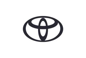
2020-Present
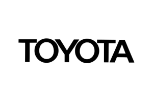
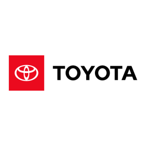
In line with digital trends, Toyota began flattening its logo in the 2000s. The emblem shifted from metallic gradients to clean, flat designs, making it more versatile across platforms, from vehicle badges to mobile screens.
In recent years, the logo has occasionally been used without the wordmark, reflecting confidence in the brand’s global recognition. Like Apple or Nike, Toyota’s emblem now stands alone.
Flat Design Benefits:
- Clean, modern, and highly scalable.
- Universally adaptable in digital environments.
- Ideal for monochrome, responsive branding.
Considering a modern refresh? LogoVent helps brands evolve with affordable logo design packages for every stage of growth.
Break Down: What the Toyota Logo Teaches Us
Toyota’s logo evolution isn’t just about visual upgrades. It’s a case study in timeless design with strategic depth. Here’s what creatives and business owners can learn:
1. Logos Should Tell a Story
The triple ovals symbolize not only a “T” but also an entire brand philosophy. This gives the logo staying power and emotional resonance.
2. Adaptability Is Key
Toyota’s logo remains effective whether it’s chrome on a car grille or white on a website header. Versatility is essential in today’s cross-platform branding.
3. Less Can Say More
The current logo is simple, but each line has purpose. It avoids trends while staying relevant, which is something every brand should aspire to.
Your logo is more than an icon. It’s the foundation of your identity. Explore our logo design portfolio to see why they’re the right fit for you to envision your brand evolution with.
Additionally, you might be interested in more logo design evolutions. Why not explore Discord’s logo evolution?
Symbolism Hidden in Plain Sight
Many don’t realize the Toyota emblem contains all the letters of the word “Toyota” within its ovals. That’s right, T, O, Y, O, T, A can be visually constructed from its overlapping shapes.
This hidden feature may not be obvious to the casual viewer, but it adds a layer of brilliance to the design. It’s a textbook example of how animated logo design or interactive visual storytelling could bring subtle elements to life.
Toyota’s logo design evolution has been a masterclass to see. You might also learn more about how to do logo design evolution right from Netflix’s logo design as well.
Hidden Design Wins:
- Reinforces brand name visually and subliminally.
- Offers content opportunities for motion design and animation.
- Appeals to design-savvy audiences.
Conclusion
Toyota’s logo journey is one of discipline, depth, and design excellence. From brush-stroked kanji to a globally beloved graphic symbol, it stands as a reminder that the best logos are born not just from creativity, but from clarity and intention.
At LogoVent, we specialize in helping brands create logos that are not only visually stunning but also deeply meaningful. Whether you’re starting fresh or evolving your brand identity, our logo design services and web design services are built to help your business grow, communicate, and connect. Ready to create an emblem that stands the test of time? Contact LogoVent today.


