Suzuki’s logo journey is a masterclass in minimalism, consistency, and thoughtful refinement. While many brands chase radical redesigns, Suzuki has steadily refined a single, powerful visual identity over nearly 70 years, transforming from a loom-maker in 1909 to a global powerhouse in motorcycles, cars, and marine engines.
At LogoVent, we specialize in logo design services that achieve exactly that, helping businesses craft visual identities that evolve with time while staying true to their core values. Just like Suzuki’s iconic “S” emblem, a great logo can become instantly recognizable, no matter how the market shifts.
1909–1937: Loom Company Roots and Drone-Bird Identity
- 1909–1920: The company launched as Suzuki Loom Works in Hamamatsu, Japan, using its surname in a bold, clean sans-serif typeface. At this time, the logo was purely text-based and often black-on-white for clarity in printed catalogs.

Suzuki Logo 1909-1958
- 1920s–1937: Suzuki’s symbol began evolving, a mirrored pair of stylized birds or eagle silhouettes positioned above and below the wordmark. The mirrored wings formed a loose “S” shape, signaling speed, motion, and emerging industrial ambition. The sans-serif text was uppercase, tight-spaced, and pragmatic.
This combined emblem was likely designed for legibility in print and early signage, and it subtly embedded brand initials through visual metaphor.
Before it became a household name in automobiles, Suzuki started with weaving looms. Explore Suzuki’s full company history on their official global site.
1937–1957: Transition to Motorized Identity
- Late 1930s–1954: As Suzuki shifted into motorbike manufacturing, first with the “Power Free” moped and then the Suzulight minivehicle, the mirrored bird logo persisted, now applied across new product lines.
- 1950–1954: The text logo evolved: a heavier, more geometric sans-serif appeared, often in monochrome. It appeared without the bird symbols in some print usages, as focus shifted to product branding.
These years were about establishing versatility. The emblem and wordmark remained interchangeable, adaptable across printed documents, vehicles, and parts packaging.
1958: The Debut of the Iconic “S” Monogram

Suzuki Logo 1958-Present
- 1958: A pivotal year. Suzuki officially introduced the now‑familiar stylized “S” monogram, designed by Masamichi Tezeni (Tokyo University of the Arts). The mirrored birds were retired in favor of a sharp, angular “S”, simplified but visually bold.
- The red “S” evoked the Japanese flag’s rising sun motif, while retaining geometric symmetry that looked modern and dynamic. Below it appeared the “SUZUKI” wordmark in uppercase sans-serif, solidifying brand clarity.
This design held traction for decades, its clean geometry allowed it to scale easily onto bikes, cars, and accessories.
1960s–1970s: Establishing Color Identity and Proportions
- 1960s: Minor adjustments refined the “S” shape, its angles softened and curves proportioned. The logo now consistently appeared in bright red for the “S”, paired with deep blue for the wordmark, conveying energy and trust, respectively.
- Early 1970s: Wider kerning and bolding improved legibility on vehicle badges. The monogram and wordmark occasionally appeared side-by-side instead of stacked.
Suzuki’s global expansion during this period meant its logo needed to be read across different languages and production styles. Versatility became a design priority.
1980s–1990s: Subtle Refinements for Digital Accuracy

Suzuki Logo 1980s Onwards
- 1980s: The red “S” deepened, and wordmark type shifted toward Helvetica Neue Extended Black for consistency across print and emerging digital media. Text was slightly compressed horizontally to fit signage better.
- 1990s: The pairing, “S” above, wordmark below, became standardized in global branding guides. In digital mockups and print materials, clean proportions and margin breathing ensured cohesion.
These decades featured no dramatic redesigns, just thoughtful adjustments paying homage to the 1958 baseline design.
Suzuki’s global expansion in the 1980s required a logo that could carry cultural weight across markets. This article from Dubizzle dives into how Suzuki positioned itself across said markets.
2000–2019: Digital Adaptation and Product Differentiation
- Early 2000s: The logo began appearing in simplified flat versions for online platforms and printed materials. The “S” maintained its red identity, while wordmarks varied in tone (sometimes gray or blue).
- 2010s: Standard iconography emerged for app icons, social media avatars, and parts catalogs. The stylized “S” functioned alone as a recognizable mark, simplified in monochrome or silver as needed.
Suzuki’s current branding continues to emphasize efficiency, simplicity, and reliability. Brandirectory’s profile on Suzuki outlines how.
Throughout, Suzuki’s branding revolved around sleek presentation and functional clarity, rather than flashy redesigns.
April 2025: The Refined Logo for a New Era

Suzuki Logo 2025-Present
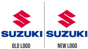
- In April 2025, Suzuki unveiled its first major logo refresh since 1958, retaining core legacy while sharpening for a digital, sustainable era.
- The updated “S” remains geometric but features thicker lines, more refined corners, and deeper red. Wordmark letters are now darker blue, slightly larger, and spaced with more air for screen readability.
- Designers emphasized adaptability, making sure the logo looks crisp on dashboards, smartphone apps, EV badging, and marine engines, all without losing recognizability.
Feedback online has been mixed, but many call it “crisp and modern,” noting Suzuki’s cautious yet confident visual evolution.
Typography & Color: Intentional Branding Choices
- Typography: Derived from Helvetica Neue Extended Black, the wordmark typeface is bold, structural, and sans-serif. The custom red “S” monogram gives identity and instant recall.
- Color Palette:
- Suzuki Red (#E60012) – energy, innovation, Japanese heritage
- Suzuki Blue (#0B2342) – stability, technical reliability
These hues have been consistent since the transition from black-and-white in the late 1950s.
Branding Insights & Strategic Lessons

Subtle Differences
- Consistency over Reinvention: Suzuki’s logo changed minimally, but thoughtfully, ensuring decades of brand equity were preserved.
- Monogram Strength: A single bold “S” allows for scalable iconography across industries and media.
- Subtle Evolution: Rather than discarding its past, Suzuki refined it, balancing nostalgia with clarity.
- Color Psychology: The consistent red/blue pairing balances passion with trust, vital for product credibility.
Suzuki’s Visual Journey in Context
While Suzuki refined its logo, other brands in automotive and tech did the same. For a branding comparison that balances simplicity and heritage, explore Ford’s logo evolution, another example of sustained visual identity across eras.
Tamper-resistant logos, minimal reinvention, and bold typography, LogoVent’s logo design services help brands find lasting clarity without sacrificing heritage.
Explore our packages to see how we build iconic wordmarks for modern brands.
Final Thoughts
Suzuki’s logo evolution is less about reinvention and more about strategic refinement over time. From an eagle-inspired mirrored “S” to a confident geometric monogram, the emblem has matured while staying recognizable. The April 2025 refresh modernized implementation, but definitions remain constant.
As Suzuki steers into electric mobility and global relevance, its logo stands as a testament to disciplined design, remaining memorable, modern, and deeply rooted. Ready to craft a logo rooted in legacy and built for tomorrow?
Get started with LogoVent’s expert design services today, where purpose meets precision. Get in touch with us by filling our form or contacting us directly, and we’ll get you started on your design journey.


