What comes to your mind when you think of the Jeep? Probably, you envisioned the rugged terrain and unstoppable capability because the Jeep is considered the most dependable vehicle. Though behind every iconic look lies the logo, the silent yet powerful symbol that tells Jeep’s story.
Over the decades, Jeep’s logo transformed from military roots to sleek, modern branding always rooted in durability and clarity. In this blog, we will discover the fascinating story behind the Jeep’s logo and its evolution throughout time.
Here’s a concise, year-by-year breakdown of how Jeep’s visual identity evolved and why each change matters.
Want a logo that stands the test of time? Let LogoVent bring your brand to life. Logovent logo design services create a memorable logo for you.
Just like Jeep’s logo transformation, if you want to explore the evolution of Kia and how the company has changed its identity over the years, this insightful article is a must-read.
1941–1945: Military Origins with a Tagline Twist
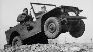
Military Origins
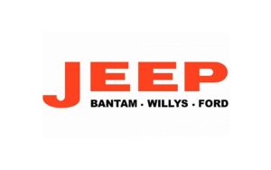
The Jeep’s original logo was militaristic. A large red “Jeep” in capital letters with the “J” large perched atop a line that reads Bantam, Willys, Ford in black, all in crisp sans-serif fonts. Also, it was steer and direct, and it was consistent with the no-nonsense military vehicle it represented.
This wasn’t just a logo; it was a war badge that stood for dependability and raw mechanical power. On the battlefield, soldiers knew they could trust Jeep, and the big red wordmark showed how brave and important its mission was.
In automobile industry there is another company parallel to the jeep that also has the strong grip in the market. The Suzuki and its timeless performance and logo design. Discover how S style Suzuki logo evolved and became the globally recognized brand.
The logo of the company is the first and best impression of the brand. As a professional logo design specialist at logovent, we understand. We partner with you to create a timeless logo design services for you. Here’s is our portfolio.
1945–1963: From Blocky to Stylish with Serifs and Quotes
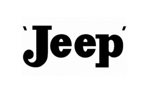
Blocky to Stylish
Jeep streamlined after the war by avoiding corporate credits and focusing on its brand identity. Besides the Jeep name with “Jeep” in title case surrounded by delicate quote marks, the script changed to a serif typeface.
Early indication that Jeep was moving past its military origins was the choice to employ a sleek, serif font, which gave the logo a more sophisticated, approachable tone.
This was the first phase of Jeep’s change from a car that was only useful for work to one that could also serve consumers. It was a reflection of the rising need for personal transportation and the confidence that came after the war.
1963–1970: Enter the Colorful Emblem
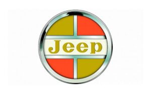
the Colorful Emblem
This was Jeep’s boldest move. The company unveiled a gleaming circular emblem with silver-framed red and gold segments. Its focal point was the “Jeep” name on a cream background, a visual shift intended to complement Jeep’s changing identity, particularly as it introduced the high-end Wagoneer and aimed to appeal to more “civilian” consumers.
Jeep showed it was ready to engage in a bigger market for vehicles by giving the Wrangler more color and a shape that made it stand out. It looked friendlier with the round badge, but still professional, which was perfect for the high-end Wagoneer that started a new part of Jeep’s history.
1970–1987: Geometric Shapes Meet Helvetica Bold

Meet Helvetica Bold
Jeep switched to a sleeker, more contemporary design by the 1970s. The logo’s bold, sans-serif “Jeep” was paired with geometric shapes (a red triangle touching a bright blue rectangle) to create a sleek, fashionable look that mirrored the company’s modernized car lineups of the time.
This style seemed sure of itself and ahead of its time. There were a lot of designers who liked Helvetica Bold, and it gave Jeep a clean, modern look. Off-road ads and handouts with geometric shapes stood out and showed that Jeep was changing with the times.
From tiny car emblems to towering dealership signs. Ford logo design reflected maturation into a global automotive brand. Here’s ford’s logo complete history.
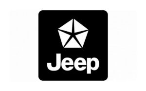
1987–1993: Chrysler’s Signature Pentastar Joins the Badge
Chrysler’s Signature Pentastar
Following Chrysler’s acquisition of Jeep, the brand needed to change to reflect the new ownership. Designers placed the Jeep wordmark beneath the recognizable Chrysler Pentastar in a black box with curved corners. Despite this corporate change, the logo retained recognizable components to balance the new corporate prestige with the old rugged appeal.
It was a mix of big business power and tough roots. The Pentastar was a symbol of Chrysler’s legacy, and Jeep’s clean wordmark reminded everyone of its real background as a utility-driven brand. This combination helped build trust among new buyers without turning off supporters who were already buying.
Logovent provide logo designs services that’s not just resonate your business identity but elevate it. From futuristic static logo to video modern animated & design logo logovent got you covered.
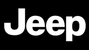
1993–Today: Minimalism Meets Timeless Recognition
Timeless Recognition
Jeep has embraced simplicity since 1993. The standard was the simple, sans-serif “Jeep” wordmark, which was frequently used in black or khaki. This understated appearance highlights Jeep’s core values of substance over frivolity.
The strength of the logo is its simplicity and immediate recognition, which perfectly conveys the strong yet modest essence of the company.
Simple does not mean boring. It means sophistication without any fabricated thing. Mercedes Benz is the practical example of simplicity in its logo formation. Explore the complete story of Mercedes Benz and how the company dominated the automobile industry.
Design Takeaway: The Power of Simplicity
Design Takeawa
Firstly, many brands lose clarity when they try to create eye-catching graphics or designs that follow trends. Shows us that power comes from simplicity. Jeep gradually reduced distractions in favor of heritage and readability.
Secondly, Jeep has mastered logo evolution, starting with bold red military text, moving to colorful circular emblems, and finally creating a timeless minimalist wordmark.
Lastly, though ownership, market positioning, and design trends have changed over time, the fundamental elements of strength, clarity, and a dash of rugged charm have remained constant.
You also need to transform your logo for the digital age? It is necessary to stay relevant and modern rapidly changing digital landscape. Explore our affordable business logo packages, crafted for state-of-the-art visibility and growth.
Closing Thoughts
The story of Jeep’s logo is about how design reflects identity, not just about fonts and shapes. Nonetheless, the Jeep badge you see today is the result of decades of development. Another key point is toughness and refinement.
Whether you’re driving on rocky trails or through urban streets, what began as a wartime stamp has evolved into a well-respected wordmark that is ready to go forward and is as durable as the cars it symbolizes.
Begin your transformative journey with logovent, where purpose meets precision. Contact logovent without second thought and we’ll get you started on your design journey.


