Graphic Designing is a very vast subject consisting of various design models. Skeuomorphic and flat design are both popular graphic design models in the industry.
Designers choose to work on these models according to the product requirements.
You might have googled skeuomorphism or heard about it. Skeuomorphic designs are usually complex designs. They often indicate the quality of the product that defines its uses or makes clear how it should be used more appropriately.
On the other hand, flat designs tend to be more simplified and minimal. This design model follows clear rules, and it’s difficult to design unconventional experiences by using a flat approach design model.
In this blog post, we will cover flat design vs skeuomorphism models, their benefits, and their drawbacks. So, let’s give it a read!
What is the difference Between Skeuomorphism and Flat Design models?
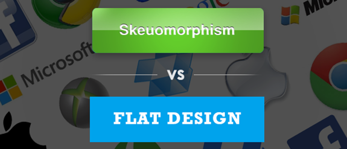
When it comes to flat design vs skeuomorphism, it’s better to understand both. Skeuomorphic designs produce graphics that resemble real-life visuals and objects. Flat designs ignore anything that resembles real-life visuals, like beveled edges, drop shadows, gradients, and so on. Many designers started to move from skeuomorphism design to flat design due to its clean look, good feel, and simple design. Flat design was adopted by Apple IOS7 and Microsoft’s Windows 8 initially, and the majority of the software nowadays uses a flat design language.
However, like other design model approaches, these designs also have their fair share of drawbacks and benefits.
Benefits of Skeuomorphism and Its Current Uses
-
- Skeuomorphic UI design lets users learn about how to use and utilize new or complicated technologies by associating them with real-life objects. It also decreases the learning curve of a product. But most importantly, skeuomorphic designs offer great affordances. The interaction with an object or product is what affordance is. Successful skeuomorphic interface elements do not use tool tips or popup text to explain their use of it.
- Although skeuomorphic UI design is not used frequently these days, still few web applications are currently using this design style. For example, paper, a drawing application, also follows the skeuomorphism approach by displaying the availability of drawing tools in their app to represent the working of those tools in a better way. The icon of “drawing on a tablet” depicts real-life interactions of drawing on paper. This illustrates skeuomorphic design perfectly.
As the above examples show, skeuomorphism is best for complex applications where associating with a real-life object is essential.
Looking for an Affordable
Logo Design Services
Get in touch with our 24/7 available representatives now!
Chat With us to avail 30% OFF
Drawbacks of Skeuomorphism:
- With the increasing familiarity and clear concepts of software and computers, the demand for teaching users how to use software through skeuomorphism is reduced. As I’ve mentioned before, skeuomorphism could increase product usability, but it has both good and bad consequences. If the skeuomorphism design is poorly created, then it could get frustrating for users to use it, as they are already aware of how the element should work.
- In terms of web development, skeuomorphism slows down the speed of website loading and limits creativity. It takes more work for designers to create skeuomorphic designs as it requires careful crafting, gradients, and the use of heavy images. The performance of the website is affected by the use of these elements.
Benefits of Flat Design
- Consistency is one of the best benefits of using a flat design. Many designers have adopted a flat design style, and users are satisfied interfaces have adopted the flat design and that users have gotten habitual in using it. In other words, users have an idea of how does a User Interface work.
For example, before the concept of flat design, most of the users didn’t know about the primary and secondary (ghost) buttons. But now, as soon the flat designs emerged, users got the awareness that the buttons having a solid fill, for example, represents the primary call-to-action, whereas the button having a border may represent something less important. It is illustrated in the audience report that the consistent element gives the impression that the functionality will not change even if the environment changes.
- Scalability is another benefit of flat design. Users rely on their mobile devices most of the time, where there is quite a valuable screen space available. With fewer graphical effects, flat designs are minimalist, which lets the user concentrate on the content.
For example, there is a website named, Poshly, which redesigned its website and made it to be more minimalist and flat. It benefited them with a 20% increment in user engagement and easy mobile development.
Drawbacks of Flat Design
Despite having a lot of benefits of flat design, it has several issues. These drawbacks are:
- Flat design can decrease the degree of easiness through which the user can discover all the features and elements of a new product when they first use it. For example, In Windows 8’s Metro Design, users find it difficult to distinguish between non-clickable and clickable elements. Even the icons of the product sometimes are not able to convey interactivity, although icons are considered to help customers interpret the use of the system and attract clicks.
- Usability issues, especially in the designs, which are created poorly without a proper thought process.
Things to keep in mind when designing
After considering all the different benefits and drawbacks of skeuomorphism and flat designs, there are some important aspects to keep in mind when beginning to design interfaces.
- Skeuomorphism style should be used in specific areas, especially where there is a difficulty in understanding the objective of the product, and when you relate it to real life, it helps in easily understanding the objective.
- Third-party developer support and Documentation are essential to crafting a consistent product across different sites.
Ensure that users can discover interactive elements
Conclusion
Undoubtedly, the design world was working on the skeuomorphism design approach previously. However, the flat design approach came in between and became a trend. But now, again, the skeuomorphic design approach is planning a comeback. Whatever the trend is, the successful design approach is the one that satisfies the user, enhances the user experience, lets the user enjoy the experience, and makes it simpler for them. This blog post helps you understand the clear concept, benefits, and drawbacks of skeuomorphism and flat designs, we hope it is helpful.
