achieved. As the creators of the modern blue jean, Levi Strauss & Co. have maintained a strong and recognizable visual identity for over 150 years. From rugged beginnings to global fashion dominance, the Levi’s logo has told a story of durability, Americana, and innovation through every phase of its development.
In this blog, we take a deep dive into each key stage of Levi’s logo evolution, examining the visual changes, strategic decisions, and iconic elements that continue to shape this legendary brand.
Looking to build a legacy brand? Explore our logo design services and create a timeless identity with LogoVent.
1886: The Two Horse Patch – Strength Through Symbolism
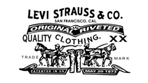
Levi’s Logo 1886-Present
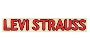
Levi’s Logo 1925-1929
Levi Strauss & Co. introduced its first major visual identifier in 1886, not as a traditional logo but as a symbolic illustration printed on a leather patch: two horses pulling in opposite directions on a pair of jeans.
This illustration wasn’t arbitrary. It was created in response to customers who couldn’t read English, particularly in the American West. The company needed a visual language that spoke of its product’s exceptional durability. The image of two horses failing to rip apart a pair of Levi’s became a powerful brand symbol.
Accompanied by the text “Patent Riveted Duck & Denim Clothing,” this image appeared on the rear waistband of every pair of Levi’s jeans. It was one of the earliest examples of brand storytelling through imagery and cemented Levi’s reputation as a tough, working-class product.
To this day, the Two Horse Patch remains in use on many Levi’s jeans, a testament to the power of visual symbolism.
1936: The Birth of the Red Tab
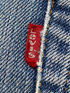
Fast forward to the 1930s: department stores were overflowing with denim products. Levi’s needed a way to differentiate their authentic jeans from copycats. The solution? The now-famous Red Tab, introduced in 1936.
This tiny fabric tab sewn into the right back pocket featured the word “LEVI’S” in bold white capital letters. It was small, subtle, and undeniably effective. This addition not only helped store clerks and customers identify Levi’s from a distance, but it also ushered in an era where fashion branding shifted toward the garment itself.
The Red Tab became one of Levi’s most recognizable trademarks, protected under U.S. trademark law and constantly enforced against imitators. Over time, variations of the tab have appeared in orange, silver, and black, but the red version remains the brand’s most iconic.
Great branding lives in the details. Browse our portfolio to see how strategic design elements build trust and recognition.
1940s-1950s: A Move Toward Typography
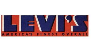
Levi’s Logo 1929-1943
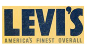
Levi’s Logo 1943-1949
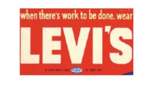
Levi’s Logo 1949-1954
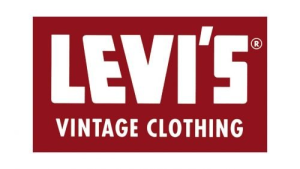
Levi’s Logo 1952-1966
In the mid-20th century, Levi’s branding matured. As the brand expanded internationally, it began formalizing its logo usage and leaning more heavily into typographic logos.
Throughout the 1940s and 1950s, Levi’s introduced wordmarks using clean sans-serif fonts. The text was often bold and capitalized, sometimes encased in rectangular or oval shapes. These logos didn’t have the ornate quality of luxury brands; they were designed to be readable, practical, and versatile across advertising and packaging.
This era reflected Levi’s identity as a no-nonsense brand for workers, soldiers, and average Americans. Their wordmarks communicated dependability and mass accessibility.
Though these early typographic logos changed frequently in size and spacing, the consistent use of the company name built familiarity. These were crucial developmental years that set the stage for a more unified identity.
Looking for iconic transitions in entertainment? Explore how MTV’s logo evolution mirrored youth culture across decades.
1967: The Batwing Logo – A Timeless Classic
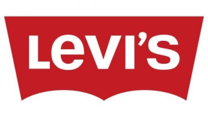
Levi’s Logo 1967-1999
The most recognizable Levi’s logo of all time was born in 1967, when Levi Strauss & Co. hired Walter Landor & Associates to develop a modern, cohesive identity.
The result? The “Batwing” logo, a bold wordmark with a curved top border mimicking the double arch stitching found on the back pockets of Levi’s jeans. The font was all-caps and sans-serif, radiating strength and confidence.
The name “Batwing” comes from the distinctive shape formed by the arch. The subtle connection to the actual garment design helped strengthen the brand’s authenticity and storytelling.
Over the years, this logo has seen color adjustments and refinements, but the core design has remained intact. Its simple, impactful silhouette works across tags, storefronts, digital platforms, and social media icons.
If you liked Levi’s heritage approach, take a look at the Nike logo evolution, from humble swoosh beginnings to global dominance.
1970s-1990s: Minor Variations, Consistent Identity

Levi’s Logo 1970s-1990s Black & White
Between the 1970s and 1990s, Levi’s stuck with its Batwing shape but made minor tweaks in font weight, color tones, and layout based on marketing trends.
During the 1980s, for example, you could find versions that embraced a monochrome aesthetic for more upscale lines, while other editions highlighted the classic red and white combo. The logo was often paired with slogans like “Original Riveted” or “America’s Finest Overall,” reinforcing the brand’s legacy.
This period also marked Levi’s foray into international markets, where the brand had to maintain consistency while resonating with different audiences. Despite these shifts, the Levi’s name and Batwing shape never strayed too far from their roots.
Want your brand to go global? Learn more about our brand identity packages tailored for scale and impact.
2003-Present: Heritage Reborn
Levi’s Logo 2003-Present
In the early 2000s, Levi’s returned to its roots with a refined Batwing logo that emphasized its classic red-and-white palette. Today’s logo features the all-caps “LEVI’S” text in white, set against a bold red (#C90016) background.
This version has a cleaner, more digital-friendly finish but remains true to its 1967 predecessor. The shape, proportion, and curvature are now optimized for mobile screens, embroidered labels, and high-resolution printing.
By emphasizing consistency and restraint, Levi’s has embraced “less is more” while reinforcing decades of brand equity.
Color Scheme: Bold Simplicity
Levi’s uses a deliberately limited color palette to great effect:
- #C90016 – Red: Represents passion, attention, and American heritage.
- #FFFFFF – White: Clean, readable contrast.
- #000000 – Black: Used in luxury lines or simplified variants.
This trio balances heritage with clarity, making the logo legible and effective across various backgrounds and product lines.
Typography: Strength in Simplicity
The Levi’s wordmark is set in a custom bold sans-serif typeface, designed to be modern, sturdy, and masculine. The uniform stroke width conveys strength, while the slight roundness adds warmth and accessibility.
The font’s simplicity enhances versatility, allowing the logo to scale without distortion across all platforms. It’s a powerful reminder that legibility and aesthetic don’t need to be at odds. Typography is the voice of a brand. And Levi’s speaks with confident clarity.
Conclusion
From Two Horses to the Red Tab to the Batwing, Levi’s has built a brand that balances function, fashion, and familiarity. Their logo evolution shows that even simple changes, when strategically timed and culturally resonant, can build an unforgettable identity.
Ready to build a logo with just as much staying power? Contact our design experts and let LogoVent craft a visual identity that stands the test of time.

