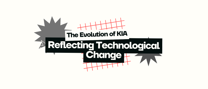
In the competitive world of the automobile industry, only a few brands truly stand out, and KIA is one of them. KIA Motors, founded in 1944, started its journey by manufacturing bicycle parts. Over the decades, it has evolved into a globally recognized brand in the automotive sector. Known for its reliability, adaptability, and innovation, KIA has constantly worked to keep up with changing technologies and customer expectations.
This growth did not just happen through the cars it built; it also happened through the brand image it developed, including its logos. The logo plays a vital role in how a brand is seen globally. It’s not just a symbol; it tells a story.
KIA’s visual identity has transformed several times over the years, and each version of its logo reflects a new phase in its journey. Every logo marks a historical shift in how the company presents itself to the world, showing how it has kept pace with change and innovation.
As KIA reshaped its image to align with a new era of mobility, Suzuki too carried out an inspiring transformation in its emblem. Explore the interesting story of the Suzuki logo evolution.
1944 – 1964: The Diamond and Gear Era

Diamond and Gear Era
When KIA was first established in 1944, the company focused on manufacturing bicycle parts. In 1953, KIA introduced its very first logo. This original design featured three diamonds with a gear in the center. Placed inside the gear was the company’s name, symbolizing precision and forward thinking.
The gear symbolized industrial growth and mechanical innovation, while the diamonds gave a feeling of strength and stability. It reflected KiA’s ambition to move into more technically advanced manufacturing areas.
Even though KIA was not yet involved in car production, the logo showed the company’s confidence and ambition. It sent a clear message: KIA was thinking ahead, and it was ready to grow.
1964 – 1986: The “Q” Logo: A New Identity
“Q” Logo: A New Identity
In 1964, KIA made a bold move by completely changing its logo. Gone were the diamonds and gear. In their place came a stylized “Q”. A minimalist and modern design that looked ahead to the future.
This redesign wasn’t just about visuals. It represented a major transformation. KIA was now entering the automotive industry, and the new logo showed its shift from small-scale manufacturing to a global business outlook.
The “Q” logo was simple yet sophisticated, giving KIA a more modern and sleek identity. It helped the brand appear more aligned with the future of transportation. While the meaning behind the “Q” was never officially explained, it became a symbol of innovation, separating KIA from older, more traditional car brands.
This phase showed that KIA wasn’t afraid to take risks and think differently. The company was no longer just making parts; it was building vehicles, and it wanted the world to know.
1986 – 1994: Embracing Simplicity

Embracing Simplicity
KIA developed an upgraded version of their logo in the late 1980s, this time utilizing an intuitive wordmark. In large, clean lettering, the company’s name, “KIA,” was now prominently displayed. The previous symbols were eliminated from the new logo, which concentrated on making the business name simple to read and recall.
The changes made were in line with KIA’s expanding standing as an automobile manufacturer. Customers found it easier to identify the company in other markets thanks to the straightforward and uncomplicated emblem.
The company was growing internationally, and the clear wordmark enhanced the brand’s credibility and professionalism.
During this time, KIA started to reach important markets where brand awareness and visual clarity were crucial, such as the United States. KIA’s goal of emerging as one of the biggest brands in the world was aided by this logo.
1994 – 2021: The Oval Era
The Oval Era
KIA modified its logo in 1994, adding a red oval to the word “KIA.” One of the most recognizable forms of the logo is this one. It was simple yet looked more professional and businesslike. The oval shape represented unity and worldwide reach, while the color red brought vitality and self-assurance.
As KIA expanded internationally and introduced new automobile models and markets, this logo went hand in hand with the company’s growth. Customers were more likely to trust and be loyal to the brand because of its simple circular appearance.
KIA achieved significant advancements in automobile design, technology, and quality throughout the ensuing 20 years. The brand seemed stable and consistent since the logo remained constant.
2021 – Present: The Futuristic Logo
Futuristic Logo
One of KIA’s greatest branding improvements to date occurred in 2021. The business presented a brand-new logo that appears sleek, contemporary, and futuristic. “KIA” is written in a stylized, continuous line in the new logo, which resembles a signature.
This modification was made as part of KIA’s rebranding campaign, which now uses the tagline “Movement that inspires.” KIA’s goal to become a leader in smart mobility, electric cars (EVs), and sustainable transportation is reflected in the modern appearance of the new logo.
In contrast to the previous oval logo, the new design piques interest. Because it is bold, disruptive, and modern, some people even find it difficult to read at first. That’s the main idea. KIA aspires to be regarded as more than simply another automaker, but as a creative, progressive business.
In conclusion
KIA started by making bicycle parts in 1944. Now, it is a leading car company worldwide. This journey is truly inspiring. The logo has changed over time. Each version shows a change in design and also in vision and purpose.
To stay relevant in a fast-changing world, KIA shows that it must keep innovating. This includes both technology and how the brand looks. KIA’s story of strength, growth, and goals shows in every logo redesign. It is clear that the journey is not over.
Just as KIA reshaped its identity through a powerful new logo, LogoVent provides logo design services that help brands tell their story and stay relevant in a changing market.


