When it comes to fast-food icons, few logos are as globally familiar as the image of Colonel Harland Sanders. From roadside chicken joints to a multi-billion dollar brand, KFC’s logo evolution has traveled a long road. Over the years, it has shifted from a vintage portrait into a clean, stylized emblem, without ever losing its Southern charm.
In this blog, we trace the fascinating evolution of the KFC logo, spotlighting how smart design, consistency, and cultural awareness helped transform a family recipe into a worldwide brand identity.
Want a logo that evolves with your business while staying unmistakably yours? LogoVent’s logo design services create memorable identities with longevity.
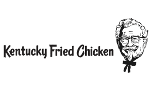
The Original Face of the Brand: 1952–1978

KFC 1952-1978

KFC 1959-78
KFC was officially born in 1952, but its logo, which features a hand-drawn sketch of Colonel Sanders, was anything but flashy. The portrait showed a friendly, bowtie-wearing gentleman with glasses and a goatee. It was authentic, homegrown, and deeply personal, just like the chicken recipe that made it famous.
This initial identity focused on trust and familiarity. The Colonel was the brand, and his face became the centerpiece of every bucket, storefront, and sign.
Though simple, this early version laid the foundation for brand recognition that would carry KFC through the decades.
Streamlined Yet Familiar: 1978–1991
KFC 1978-91
In 1978, the logo was cleaned up. The lines of Colonel Sanders’ portrait were refined, and typography was introduced alongside the image. The font was bold and straightforward, giving the brand a more corporate feel while still leaning on the face of its founder.
This version helped KFC stand out in a growing market of fast-food giants like McDonald’s and Burger King. The Colonel remained central, signaling authenticity in a world of processed foods and impersonal branding.
Looking for a refresh, not a rebrand? LogoVent’s brand identity design services help you modernize without losing your brand’s voice. Check out our portfolio, if you don’t believe us.
Curious how other global brands have balanced heritage and modern design? Check out our deep dive into the Volkswagen logo evolution.
Bold Colors and Simplicity: 1991–1997
KFC 1991-97
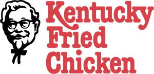
In 1991, a major branding milestone took place, Kentucky Fried Chicken officially shortened its name to KFC. This wasn’t just a modern abbreviation; it was also a marketing pivot, aimed at downplaying the word “fried” as consumer preferences shifted toward health-conscious messaging.
With this came a new logo: the Colonel’s face was simplified even further, and the color scheme shifted toward bold red and white, evoking appetite, energy, and urgency. The typography became more angular, reflecting a brand ready to compete in a fast-moving world.
This era marked KFC’s first steps toward stylization.
A More Modern Look: 1997–2006
KFC 1997-2006
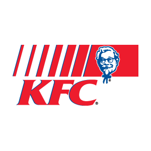
The 1997 redesign literally gave the Colonel a full-body makeover. Instead of just his head, the new logo depicted him in an apron, smiling warmly. It was more inviting and humanized the brand further, reinforcing KFC’s down-to-earth, real-food messaging.
Red became the dominant background color, making the logo highly visible from a distance (especially on signage and packaging). This version was also better suited for digital media, an increasingly important factor in the early 2000s.
Flat Design for the Digital Age: 2006–2018

KFC 2006-18

KFC 2014-18
As design trends shifted toward flat aesthetics, KFC followed suit. The logo received a minimalist update, less shading, fewer lines, and more graphic treatment. The Colonel was now a stylized illustration, almost cartoon-like, but still instantly recognizable.
Typography was sleeker, and the red-and-white stripes on the bucket made a comeback in brand visuals. This evolution helped the logo work better across digital platforms, from websites to mobile apps.
Going digital? Ask LogoVent about our animated logo design options for modern brand storytelling.
Flat design changed the game for many major companies. See how Samsung and Microsoft adapted their logos to meet digital demands.
Back to Roots, With a Twist: 2018–Present
2018-Present
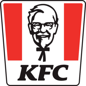
KFC 2018-Present 2
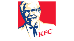
The most recent KFC logo evolution strikes a balance between nostalgia and modernity. The Colonel’s portrait is front and center again, but stylized with sharp, clean lines. The font is simplified, and the red bucket with white stripes is a prominent design element across packaging and ads.
In a return to heritage, the design channels vintage aesthetics while still feeling fresh. It’s a brilliant example of how to honor brand history without looking outdated.
This blend of old and new makes KFC’s current logo one of the most strategically sound in the fast-food space.
What Makes the KFC Logo Work?
Here are a few takeaways from KFC’s long-standing design success:
- Consistency with Evolution: While the look has changed, the Colonel has always been part of the visual identity. That continuity builds trust and recognition.
- Responsive to Culture: From slimming down the word “fried” to modernizing its iconography, KFC has adjusted its logo to reflect consumer values without losing personality.
- Stylized Simplicity: Each redesign has removed unnecessary details while preserving core visual cues, making the logo more versatile across formats.
KFC’s logo proves that you don’t need a full overhaul to stay relevant. Sometimes, a refined twist is all it takes.
Want more inspiration from brand transformations done right? Explore the Nike logo evolution and Puma’s logo journey, two global icons of athletic branding.
Why This Evolution Matters for Your Brand
Whether you’re running a small food business or launching a tech startup, your logo is more than just a design, it’s your brand’s handshake, promise, and first impression all in one. KFC’s story shows that when a logo is thoughtfully designed and strategically evolved, it can support decades of growth.
At LogoVent, we specialize in helping brands navigate this evolution with confidence. Our affordable logo design services are built for businesses that want strong visual identities without the agency price tag.
Pair your new logo with visibility, our website design and SEO packages give your brand the digital boost it needs.
From fast food to fashion and beyond, logo design tells powerful brand stories. Don’t miss our breakdown of the Gucci logo evolution or the creativity behind top movie logos.
Conclusion
From hand-drawn portraits to bold digital icons, the KFC logo journey captures everything a modern brand should aim for: authenticity, adaptability, and lasting recognition. It’s not about chasing trends, it’s about understanding your core identity and using design to express it over time.
At LogoVent, we help brands like yours tell visual stories that last. Whether you need a new logo, a modern refresh, or a complete brand identity package, we’re here to make sure your brand doesn’t just keep up… it leads the way. Contact us today to get started on your brand’s transformation.