If you are a true cinephile, you have spent hours in ground-breaking shows like Game of Thrones, The Wire, The Sopranos, or the comedic brilliance of Curb Your Enthusiasm. These timeless series have not only shaped television history, but they have also defined an entire era of premium entertainment. But beyond the content, have you ever taken a moment to notice the platform that brought these iconic titles to your screen?
We’re talking about HBO, short for Home Box Office. A name that’s become synonymous with high-quality storytelling and unmatched television experiences. While the channel itself is legendary, there’s another, often overlooked element that’s stood the test of time: the HBO logo.
In this blog, we dive into the captivating evolution of the HBO logo. A visual journey that parallels the brand’s rise from a niche cable provider to a global entertainment powerhouse. Whether you’re a designer, marketer, or simply a fan of pop culture history, this look at HBO’s branding evolution offers fascinating insight into how a simple logo became a cultural icon.
Let LogoVent bring your brand to life. Reach out today and discover how we can craft a logo that becomes the face of your legacy.
1972–1975: The Satellite Era & the First Rebrand
1972–1975: HBO was launched in 1972 as one of the first premium cable television networks in the United States. In its early years, HBO needed to create a strong visual identity to distinguish itself from traditional broadcast channels.
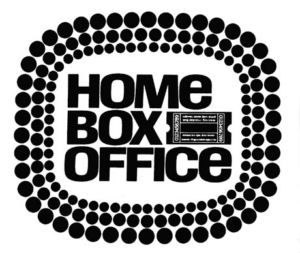
The original logo, used from 1972 to 1975, wasn’t the sleek black-and-white monogram we know today. Instead, it was a stylized ticket stub, a clever nod to the “box office” in its name. This design included the full name, Home Box Office, surrounded by a marquee light design, a subtle homage to the glamorous world of cinema.
This initial emblem was more than just decorative. It evoked the excitement of going to the movies, which was precisely what HBO was trying to replicate for audiences in the comfort of their homes.
The black, bold font used in this version conveyed authority and sophistication. At the same time, the white background symbolized clarity and openness, reinforcing the brand’s aim to deliver quality content in a straightforward, no-nonsense manner.
Even in its earliest form, the logo hinted at HBO’s aspirations: premium, cinematic, and innovative.
1975: A Bold New Identity Takes Shape
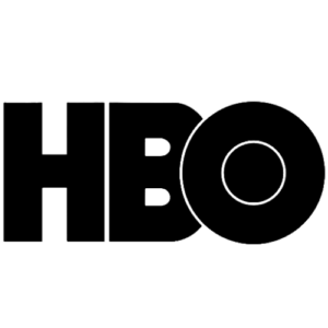
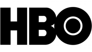
In 1975, HBO underwent a major rebranding. When the network first introduced a much simpler and bolder version of its logo, the now-famous HBO monogram, it was met with widespread acclaim. The design featured chunky black lettering in a sans-serif font. The letters H, B, and O were solid, with a creative twist; the O slightly overlapped the B, and the interior of the O cleverly contained a circle, making it resemble a camera lens or projector reel.
This logo, inspired by Avant Garde Gothic typeface, was striking in its simplicity and remains the foundation of HBO’s identity to this day.
It’s rare for a logo to remain so consistent over five decades, but the HBO mark has done just that. Why? Because it was built on timeless design principles: boldness, clarity, and minimalism. This version not only enhanced brand recognition but also positioned HBO as a serious player in the entertainment industry.
1980–1983: The Era of Innovation and Iconic Presentation
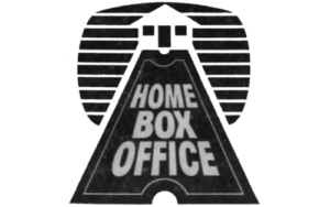
1980–1983: By the early 1980s, HBO had become a household name. But with increasing competition and growing demand for quality content, the network decided to refresh its branding not by replacing the logo, but by enhancing its visual presence.
In 1983, HBO introduced a slightly updated version of the logo. It retained the same three-letter format, HBO, nonetheless, with subtle changes, such as rounded corners and a more polished finish. Moreover, these tweaks gave the logo a more modern and accessible appearance, better suited to television screens and video formats.
But the most memorable innovation from this period wasn’t the logo itself. It was the legendary “HBO Feature Presentation” intro launched in 1982.
This elaborate animated intro became a cultural phenomenon. It featured a sweeping aerial shot of a miniature cityscape leading into space, followed by a gleaming HBO logo emerging against a cosmic background, accompanied by a powerful orchestral score.
Why the HBO Logo Works: A Lesson in Timeless Design
While many companies have redesigned their logos multiple times to keep up with trends, HBO has taken a different route. With only minor refinements over the decades, the core HBO logo has remained essentially unchanged since 1980. That consistency is a significant factor in the logo’s effectiveness.
Here’s why the HBO logo works:
- Simplicity: Three bold letters. Clean lines. No unnecessary embellishments.
- Memorability: The overlapping O is unique and instantly recognizable.
- Versatility: Works on all print, digital, and broadcast formats.
- Timeless Color Scheme: The black-and-white color palette makes it stand out without being loud.
Conclusion: A Logo That Reflects a Legacy
The evolution of the Home Box Office logo is more than just a design story. It’s a reflection of the network’s incredible journey. From a niche cable experiment to a global entertainment brand, HBO has always understood the importance of visual identity in storytelling.
The original ticket stub design captured the magic of the movies, while the minimalist monogram introduced in the mid-1970s brought authority and elegance. Each stage of the logo’s development reflects a strategic effort to enhance recognition, reinforce values, and ensure lasting impact.
Just like HBO’s iconic emblem, your brand deserves a logo that resonates, lasts, and speaks volumes. LogoVent, specializes in logo design services that tell stories, build trust, and create memorable brand identities.


