Few brands in the world carry the same historic weight as Ford. As one of the oldest and most influential automobile manufacturers, Ford Motor Company’s logo evolution reflects a legacy of innovation, endurance, and design sophistication. From handwritten marks to the sleek blue oval we know today, the brand’s identity tells a rich visual story.
For companies striving for this level of recognition, professional logo design services play a vital role in shaping long-term impact. Let’s take a deep dive into how Ford’s visual journey unfolded, through eras of growth, disruption, and reinvention.
1903: The First Logo – Complex, Crest-Inspired Identity
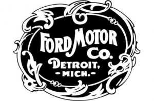
Ford Motor Logo 1903-1907
When Ford was founded in 1903, its first logo was far from the minimalist oval we associate with the brand today. The original mark was black and white with decorative flourishes, shaped like a coat of arms, and it featured a cursive “Ford Motor Co.” written across a circular gear and art nouveau border.
Ford’s first logo was not designed by a single renowned designer but was likely created in-house or by an engraver working closely with Henry Ford and his early team. The logo featured an ornate, Victorian-style crest that reflected the aesthetics of the industrial age, detailed borders, stylized lettering, and formal symbolism. The philosophy behind this original design was to convey credibility, craftsmanship, and prestige at a time when automobiles were still seen as luxury items. It mirrored the branding norms of the era, aiming to establish Ford as a trustworthy and refined manufacturer in a rapidly modernizing world.
This complex logo conveyed prestige and craftsmanship, a hallmark of early 20th-century industrial branding. However, the ornate look soon gave way to something more personal and signature-based.
Henry Ford’s vision didn’t just change the auto industry, it reshaped America. Learn more about Ford Motor Company’s founding and historical milestones.
1907–1912: The Birth of the Ford Script
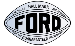
Ford Motor Logo 1907-1909
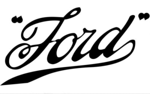
Ford Motor Logo 1909-1911
The now-iconic “Ford” script made its debut in 1907. Childe Harold Wills, one of Henry Ford’s first engineers, is credited with creating the script based on a stylized version of his own calligraphy.
Ford Motor Logo 1911-1912
This cursive typeface introduced a more human, personal element to Ford’s brand. The handwritten look symbolized craftsmanship, trust, and accessibility, qualities central to Ford’s vision of putting America on wheels.
Curious how timeless design can elevate a brand? Browse our logo design portfolio to see how we bring visual identities to life.
1912–1927: The Winged Triangle Era
Ford Motor Logo 1912-1917
In 1912, Ford added a new geometric shape, a winged triangle badge, to its logo lineup. The stylized Ford script was placed inside this triangle, along with the slogan “The Universal Car.” This iteration aimed to establish Ford not just as a product, but as a movement accessible to everyone.
Ford Motor Logo 1917-1927
However, despite its ambitious message, the winged triangle didn’t stick. Within 15 years, it was phased out in favor of a more focused, polished identity.
1927–1957: Introduction of the Blue Oval
Ford Motor Logo 1927-1957
1927 marked the true arrival of the now-famous Fordblue oval. The Ford script was set against a royal blue background, enclosed within a sleek, silver-bordered ellipse. The blue oval brought unity to Ford’s branding across models, marketing materials, and dealerships.
This version set the tone for decades to come. The royal blue color became symbolic of trust, reliability, and American manufacturing power.
Looking to establish a visual identity with staying power? Our web design services can help bring your branding to life, both online and off.
1957–1976: Flattening the Oval
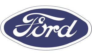
Ford Motor Logo 1957-1961
In the late 1950s, Ford experimented with flattened typography and a cleaner oval shape. While the overall form remained familiar, the script was refined and better adapted to print and signage requirements.
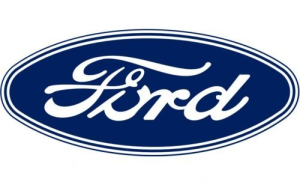
Ford Motor Logo 1961-1965
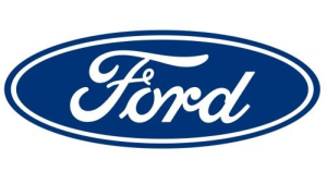
Ford Motor Logo 1965–Present
This period coincided with the rise of sleek car designs in the 1960s, think Mustangs and Thunderbirds. The logo echoed the aesthetic shift, shedding decorative excess for more geometric clarity.
The 1965 Ford logo, which introduced the refined blue oval design still used today (with minor updates), was created as part of a broader effort to unify the brand’s visual identity across all markets and advertising platforms. While no single designer is publicly credited with the final version, it was developed under the direction of Ford’s internal design and marketing team, likely influenced by designers within the Ford Styling Center.
The thought behind this design was simplicity, recognition, and scalability. The bold white Ford script, placed against a deep blue elliptical background, was meant to be instantly identifiable, elegant, and adaptable, whether on a car grille, dealership signage, or print material. The blue oval conveyed trust, professionalism, and heritage, while the hand-drawn script preserved the brand’s human and personal touch.
1976–2003: The Centennial Refinement
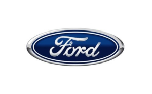
Ford Motor Logo 1976-2003

Ford Motor Logo 2000-2003
By the late 1970s, Ford introduced what would become the most long-lasting version of the blue oval, lasting nearly three decades. The script was more precisely rendered, and the blue gradient background gave the logo a sense of depth and dimension.
The oval’s clean curves and consistent proportions made it versatile for any context, from tiny car emblems to towering dealership signs. This design reflected Ford’s maturation into a global automotive brand.
2003–Present: The 100-Year “Centennial Blue Oval”
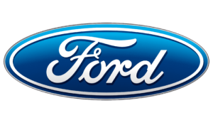
Ford Motor Logo 2003-2017
In 2003, to celebrate its 100th anniversary, Ford unveiled a slightly updated version of its logo, dubbed the “Centennial Blue Oval.”
While subtle, the updates were deliberate:
- A more vivid, gradient-rich blue brought a sense of energy
- The silver border was refined for digital use
- The script remained untouched, preserving legacy.
The updated oval was crafted for scalability and digital clarity, perfect for dashboards, websites, and smartphone apps. It’s still in use today, a testament to how timeless a well-crafted logo can be.
The iconic blue oval has become a symbol of resilience and recognition in global design circles. Explore how Ford’s logo compares with other automotive icons at 1000logos.
Typography & Color Palette
The strength of Ford’s branding lies not only in its consistent oval shape but also in the details:
- Font: The Ford script has remained untouched for over a century, an elegant, flowing cursive that signals both legacy and warmth.
- Color: The royal blue has shifted in tone across versions, from deep navy to brighter gradients. It’s paired with silver or white accents for contrast.
Together, the typography and palette present a strong, dependable image, a true visual asset in competitive markets.
What We Can Learn from Ford’s Logo Journey
Ford’s identity is a case study in knowing when to change and when to hold firm. The handwritten script, unchanged since 1907, reinforces tradition and trust. The blue oval, while evolving, remains instantly recognizable.
- Consistency Builds Recognition: Ford has kept its distinctive script font since 1907, proving that visual consistency over time builds strong, lasting recognition across generations.
- Symbolic Shapes Matter: The introduction of the oval wasn’t just aesthetic; it unified Ford’s global identity. Simple geometric shapes like circles and ovals are powerful tools for logo memorability.
- Strategic Modernization Is Key: While Ford’s logo evolved, it never changed just for the sake of trendiness. Each update served a purpose, whether for digital clarity, print scalability, or global unification.
- Color Drives Emotion and Trust: The blue and white palette was carefully chosen to evoke trust, dependability, and stability, qualities central to Ford’s brand. Color psychology plays a critical role in perception.
- Typography Is Identity: Ford’s unique, handwritten-style script has become just as iconic as its shape. A strong, recognizable typeface can be a cornerstone of brand equity.
- Adaptation Without Compromise: From ornate crests to minimal ovals, Ford’s logo changes reflect an ability to modernize without abandoning heritage, a balance every brand should strive for.
- Legacy Doesn’t Mean Static: Ford’s journey shows that legacy brands can evolve and refresh themselves while staying rooted in what made them iconic to begin with.
- Simplicity Scales: The streamlined 1965 design was born out of necessity, it needed to look clean and strong on car grilles, business cards, and television screens alike. Scalability remains a core design requirement today.
- Internal Design Strategy Can Succeed: Ford’s logo wasn’t crafted by a famous agency, it was a product of their in-house branding vision. When a brand knows itself well, it can shape powerful identities internally.
Final Thoughts
Ford’s logo hasn’t just evolved, it’s endured. Through over a century of global growth, economic shifts, and design revolutions, the blue oval has become one of the most recognized automotive icons in the world. Its strength lies in simplicity, consistency, and meaningful storytelling.
At LogoVent, we understand that a logo isn’t just a mark, it’s a commitment to how your brand is remembered. Our logo design services are crafted to blend timeless appeal with modern usability, ensuring your identity looks just as compelling on a billboard as it does on a mobile screen.
Ready to steer your brand toward visual consistency and recognition? Contact us and tap into LogoVent’s expert logo design services to build a timeless identity.
