The evolution of ExxonMobil’s logo is a masterclass in strategic branding, one that underscores the power of visual identity in establishing global recognition. From its roots in the Standard Oil Trust to the birth of the bold “Exxon” wordmark in the 1970s, every design decision has played a role in building trust and visibility. For businesses looking to craft equally impactful identities, understanding how legacy brands evolve can be a blueprint for success.
That’s exactly why logo design are crucial, not just for aesthetics, but for long-term brand strategy. Let’s explore how ExxonMobil shaped its iconic identity over the decades.
1904–1911: SOCONY Shields and Gargoyle Beginnings
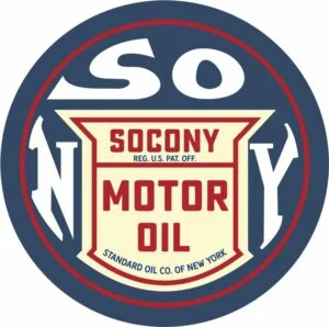
ExxonMobil Logo 1904-1908

ExxonMobil Logo 1908-1932
After Standard Oil dissolved in 1911, the Standard Oil Company of New York, abbreviated SOCONY, needed its own visual identity. Between 1904 and 1908, SOCONY used a circular badge featuring their name in bold sans-serif letters inside a shield, signaling solid reputation and product focus. A red outline added vibrancy and visibility. In this era, an early red gargoyle icon also appeared, symbolizing strength and industrial reliability.
SOCONY’s early identity was closely tied to the legacy of the Standard Oil Trust, whose 1911 breakup paved the way for the emergence of various regional oil companies. Learn more about Standard Oil’s historical impact on Britannica.
Curious how timeless design can elevate a brand? Browse our logo design portfolio to see how we bring visual identities to life.
1911–1939: The Rise of Mobil Pegasus
ExxonMobil Logo 1911-1931
ExxonMobil Logo1931-1932
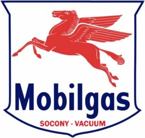
ExxonMobil Logo 1932-1939
By 1911, SOCONY merged with Vacuum Oil, forming Socony-Vacuum. They adopted the iconic red Pegasus, a winged horse signifying speed and progress. Initially used in a monochrome style, the Pegasus soon appeared within a white circle or shield with blue outlines and the wordmark “Mobilgas” or “Mobiloil.” The red-and-blue palette reinforced professionalism and energy.
ExxonMobil Logo 1932-1959
ExxonMobil Logo 1939-1955
This era firmly established the imagery most closely associated with Mobil and played a central role in its visual heritage across products and gas stations.
Your brand deserves a website that complements its identity. Explore our web design services built for clarity, performance, and impact.
1955–1966: Transition to Mobil Wordmark and Simplified Symbolism
ExxonMobil Logo 1955-1966
In 1955, the company streamlined its identity, shortening its name to Mobil. Logos featured a bold blue wordmark, caps in a clean sans-serif font, placed above a smaller Pegasus icon. The design rested within geometric forms such as a shield or rectangle, often with red arrows or shapes framing the bottom. This balanced heritage with conveying modernity.
1964–1973: Minimalism Emerges in Mobil Branding

ExxonMobil Logo 1964-Present
ExxonMobil Logo 1966-1999
Around 1964, Mobil introduced a new visual identity focusing solely on the wordmark, using blue letters with a red “o” to maintain color distinction. The Pegasus became optional and was gradually phased out in everyday branding. This minimalist logotype remained remarkably stable from 1964–1999.
Interested in merging legacy with modern brand identity? Check out how Mercedes-Benz refined its logo over decades.
1972–1985: Exxon Appears; Loewy’s Bold Double X
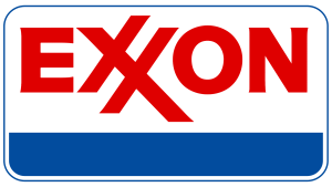
ExxonMobil Logo 1972-1985
In 1972, Standard Oil of New Jersey rebranded as Exxon, retiring Esso, Enco, and Humble brands domestically.
The transition to “Exxon” in 1972 was a strategic move to unify multiple regional brands like Esso, Enco, and Humble under one globally consistent identity. Here’s how Exxon officially got its name.
Renowned industrial designer Raymond Loewy crafted the new logo: red uppercase lettering in a rectangular frame, featuring the now-signature interlocking double X, a subtle nod to Esso’s “SS”. A blue stripe at the bottom referenced past color schemes and reinforced brand continuity.
1985–1999: Refinements Ahead of Merger
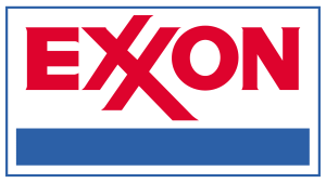
ExxonMobil Logo 1985-1999
Exxon refined its logo by sharpening corners, deepening the red hue, and tightening proportions. The emblem remained across pump signage, corporate materials, and retail assets as the company solidified its global stature.
1999–2016: ExxonMobil Merger and Unified Wordmark
ExxonMobil Logo 1999-Present
The landmark merger in 1999 brought the ExxonMobil wordmark, combining Exxon’s bold font and double “X” with Mobil’s lowercase “obil.” Installed in red with clean typography, the unified brand emphasized strength and cohesion, while eliminating brand fragmentation. Mobil’s Pegasus logo was officially retired.
For another logo built on typographic clarity, explore the Microsoft logo evolution.
2016–Present: Minimalist Identity for a Digital Age

ExxonMobil Logo 2016-Present
Today’s ExxonMobil logo is even more minimal, plain red wordmark on white, with no supporting frame or graphical elements. It optimizes legibility, enhances digital clarity, and modernizes the visual system, while honoring legacy through the double “X” identity.
Typography & Color: Precision in Simplicity
ExxonMobil’s typeface reflects Avant Garde Gothic Paneuropean Bold, customized for the iconic interlocking X symbol, a touchstone of brand differentiation. The bold red palette conveys energy and leadership; prior blue used for framing is now retired, keeping the focus entirely on strong wordmark visibility.
Branding Lessons from ExxonMobil
- Symbols give way to wordmarks: Mobil transitioned from mythical graphics to a modern typographic mark over time.
- Strategic name changes: The bold red “XX” in the Exxon logo was intentionally designed to evoke energy and stand out across signage, print, and broadcast. Explore the design logic behind iconic logos at AIGA.
- Color consistency: Red has remained constant since 1972, anchoring the brand across mergers.
- Refinement over reinvention: Changes were incremental, maintaining recognition and maturity.
Final Thoughts
ExxonMobil’s brand identity is a deliberate mix of legacy and minimalism: from SOCONY shields and Mobil Pegasus to Loewy’s interlocking double “X”, the logo has refined itself into a globally recognizable red wordmark. There’s no unnecessary decoration, just confident clarity. Ready to build a logo that echoes legacy and stands out for its clarity? Start your professional logo design journey with LogoVent today. Fill out our contact us form and we’ll reach out to you ASAP.


