Have you ever wondered about the brands that cross borders with ease, and what their interesting backgrounds might be? Currently, the food craze is at its peak, and people love to experience the bold flavor and global cuisine. Although it’s a trend, a few restaurants have genuine authenticity in their cuisine. Imagine standing in the long queue to enter the restaurant, the staff were so busy serving the tables.
It is the brand that creates the magic. Olive Garden is one of them; it is a globally recognized restaurant. Olive Garden is an Italian-American cuisine based in Orlando, Florida. The restaurant has more than 900 branches in the world.
The restaurant chain is unmatched in its category. The food hub was established under the umbrella of General Mills. General Mills made it a separate food hub in the mid-90s. Until then, the Olive Garden had made a distinctive name in the Italian-American traditional cuisine category.
Just like other globally recognized brands, Olive Garden is also known for its captivating logo design. Indeed, it is the first and best impression that consumers notice in a brand, regardless of its category. Since its inception, the Olive Garden has undergone significant changes throughout its history. Each Logo carries some meaningful message, resonating with the brand’s evolution and changing dynamic according to the specific era.
The history and evolution of the Olive Garden logo not only highlight changes in design but also show the commitment to its legacy. No doubt, the brand logo is the identity, and consumer demand and expectation over time.
Planning a brand revitalization without losing legacy? Explore LogoVent’s logo design services, perfect for modernizing with respect and strategy.
The Initial Logo 1982: A Fresh and Authentic Beginning
The Initial Logo 1982
The original and initial Logo was launched in 1982; it was a minimalistic yet sophisticated design. It is based on the restaurant name in a serif font, showcasing indigenous cultural and traditional Italian grace.
The initial word “Olive” was colored in pigment green, symbolizing the olive, a dominant ingredient in Italian cuisine. On the other hand, the “Garden” emerged as a brownish hue. It highlights the connectivity with the earth and the warmth of an Italian garden.
The first Logo symbolizes and aims to convey the message of a customer-oriented, friendly atmosphere and simplistic setting.
1989-1998 Logo: The Bold Turn Toward Elegance
1989-1998 Logo
Black is considered a complex color, but its use somehow depends on the cultural context. The black color also means elegance and sophistication; this time, the Olive Garden came up with a whole new color pattern.
Changing the logo color from green to black, which gave it a more bold and gracious look. From 1989 to 1998, the Olive Garden brand was identified through its black Logo.
Furthermore, at the bottom, the designer this time mentioned the “Italian Restaurant” proclaiming the authenticity and status of the catering foundation.
The designers divided the phrase into two parts, keeping one under the inscription “Olive” and the second under “Garden.” The letters in this Logo were small but in capitals and typed in block serif type.
1998-2014: A Vibrant Blend of Tradition and Flavor

Vibrant Blend of Tradition
Before starting the twentieth century, Olive Garden made another bold move by modifying its logo designs and colors from a black serif font to a vibrant green color, and removing the word “the” from the previous Logo.
Furthermore, they added the graphical part on the right side of the words. It was a purple grape with elongated, curved details.
The new watermark, with the addition of the grapes, gave a vibrant look to the Logo. Apart from that, the designer made some significant changes with letters, changing the letter “O” to lowercase, before it was in capital form. The minor details and additions eventually gave an immensely new look.
In the Logo, the serifs were removed from the phrase “Italian Restaurant”. A grape brush, symbolizing Italy’s winemaking tradition, was added to the upper right corner, with a detailed vine and miniature carved leaves.
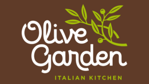
2014: Modern Simplicity with a Legacy Touch
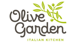
The present form of the Logo has been transformed totally, in style and elements. The emblem has been divided into two branches of an olive tree that have fruits interwoven to the right of the word olive.
The second aspect of the company name is Garden. The phrase Italian Kitchen is given below and explains what the menu of the restaurant chain is. Designers made the green color lighter, curved the font, and made the font straight.
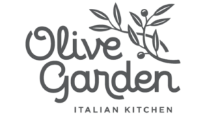
Font and colors
The history of changes in the Olive Garden logo, however, is the sophistication of the visual range provided in it. During the evolution, the elements became better. They transformed to the Italian theme: at first, it was underlined with the help of the so-called emotional handwriting, then with the help of a grape brush, and finally with an olive branch.
The whole was done to impart the name of the network, just as it was criticized as being the artificial essence of the Italian spirit.
The logotype now consists of the Eldwin typeface of The Northern Block. In earlier forms, the text was composed in a separate style, soft italics, resembling handwriting.
Looking for a brand evolution that respects your legacy while preparing for the future? Our portfolio showcases how we’ve helped businesses do just that, across industries and design styles.
Final Thought
The fascinating story of the Olive Garden logo and how its evolution showcases how worldwide famous brands adapt to modify or shift their brand identity according to consumer behaviour and brand.
There’s a small number of brands that actually carry the legacy of their brand identity from their very initial Logo to current ones. Through its various changes, the Olive Garden logo has successfully ventured to feature the brand’s vision without harming originality.
From traditional Italian cuisine to modern American dining experience, the Olive Garden has come a long way. The adaptability is not only about changing or altering the logo style, font, and design.
However, it is also about speculating a deeper understanding of the significance of the brand identification. The connectivity with the culture and customer made it stand out in the changing dynamics.
As Olive Garden continues to thrive and make an impact on dining experiences, it will be riveting to see how its logo and branding approach will adapt to future challenges and opportunities in the restaurant industry.
If you want your brand to stand out in the crowd through its visual identity, trust in the logovent ability to make that happen for you with confidence. Contact with logovent design service professionals without second thought and start your powerful visual journey with state-of-the-art logo designs.


