Few emblems in the automotive world carry the same gravitas and recognition as the BMW logo. Clean, circular, and consistent, the BMW logo has long been a symbol of engineering excellence, luxury, and German precision. While it’s often associated with propeller blades slicing through the sky, the true story behind the logo, and how it evolved, is more layered than most people realize.
In this blog, we’ll break down the evolution of the BMW logo, from its aviation-linked roots to its minimalist 21st-century form. Whether you’re a car enthusiast or a business owner building your brand identity, this journey offers timeless lessons in logo consistency, heritage preservation, and forward-facing design.
Want a logo that blends history with modern style? LogoVent’s logo design services craft identities that resonate across decades.
The Origins: A Legacy Rooted in Flight
BMW 1913-16
BMW 1917-1933
BMW, short for Bayerische Motoren Werke (Bavarian Motor Works), was founded in 1916 as an aircraft engine manufacturer, with its original name being Bayerische Flugzeugwerke. The name was changed to its current iteration in 1922, with its first official logo appearing in 1917, featuring a roundel with the company’s name encircling a blue-and-white checker pattern.
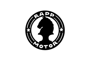
It’s also interesting to note that the company is also closely tied with Rapp Motoren Werke, which was founded in 1913, hence the “Motorenwerke” name origin. But the assets of Rapp Motoren Werke were later transferred to BMW in 1916-17, giving birth to BMW as we know it. So, there are a couple iterations of the logo that can be considered as the “original” BMW logo.
Popular belief suggests the blue and white segments represent a spinning aircraft propeller seen from the front, reinforcing BMW’s aviation beginnings. But this interpretation actually came later, thanks to a 1929 advertisement that depicted the logo superimposed over rotating propeller blades.
In truth, the blue and white quarters are drawn from the flag of Bavaria, paying homage to the company’s roots in southern Germany.
This early logo tells us two things: visual identity often weaves in regional pride, and brand stories sometimes evolve after the design.
Looking for a logo that tells your origin story with elegance? LogoVent’s brand identity design services ensure your brand’s roots shine through.
Fascinated by automotive design stories? Don’t miss our in-depth look at the Volkswagen logo evolution, another brand that soared from mechanical roots to global recognition.
The 1930s–1950s: Strength in Consistency
BMW 1933-1953
BMW 1953-1963
Throughout the early and mid-20th century, BMW’s logo underwent only subtle tweaks. Typography was refined, borders were thickened or narrowed, and the blue-and-white pattern was rendered in various shades. But the core concept never changed.
This long-term consistency helped BMW build lasting recognition, even as it transitioned from aircraft engines to motorcycles and eventually automobiles.
At a time when many companies rebranded with every trend, BMW’s commitment to its original identity set it apart. The brand wasn’t just building vehicles, it was building trust.
The 1963 Redesign: A More Polished Look
BMW 1963-1997
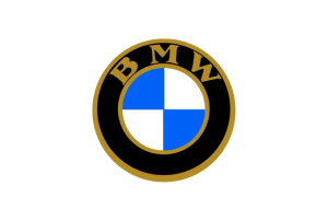
In 1963, BMW refined its logo again, giving the letters a cleaner, more modern typeface while sharpening the border. It remained faithful to the circle and the Bavarian color scheme but improved legibility and visual polish.
This version appeared on brochures, car hoods, and advertisements, solidifying it as a badge of luxury and performance.
By this time, the BMW emblem had become one of the most respected in Europe and was gaining traction globally, especially in the growing American market.
Digital Age Adaptation: 1997–2020
BMW 1997-2020
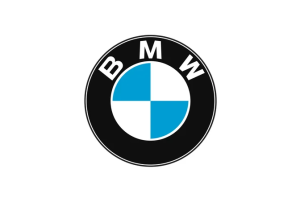
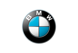
BMW updated its logo subtly again in 1997, this time focusing on three-dimensional effects. Shadows, gradients, and metallic finishes gave the logo a more “machined” look, perfectly aligned with the brand’s high-performance identity.
This iteration responded to the demands of the digital age, where logos were expected to have more depth and texture on screens and signage.
Need a logo that works seamlessly on screens, apps, and print? Explore our animated logo design and modern branding packages at LogoVent.
Want to see how tech brands have evolved visually in the digital space? Explore the bold transformations in the Samsung logo evolution and Microsoft logo history.
The Flat Revolution: 2020–Present
The Flat Revolution 2020–Present
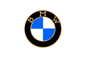
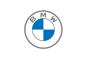
In 2020, BMW embraced flat design, removing all shadows, bevels, and effects to produce a clean, modern version of the logo. The change was significant, especially because the emblem was now semi-transparent, a bold shift from the solid black border that had defined the logo for over a century.
This redesign wasn’t just about aesthetics. It was about signaling change: toward sustainability, innovation, and digital transformation. BMW was preparing its visual identity for electric vehicles, mobile apps, augmented reality, and global branding across digital touchpoints.
For many brands, this is a crucial reminder: your logo doesn’t need to be trendy—it needs to be timeless, and adaptable.
Why BMW’s Logo Evolution Works
BMW’s logo journey offers several key lessons for modern businesses:
- Heritage Matters – The logo has always reflected the company’s roots in Bavaria, even as the brand expanded globally.
- Subtle Evolution Is Powerful – BMW avoided drastic overhauls, choosing instead to refine and modernize with care.
- Symbolism Supports Identity – Whether interpreted as a propeller or a nod to heritage, the logo has always stood for movement, engineering, and excellence.
- Digital Adaptation Is Key – The 2020 update shows how legacy brands can remain current by embracing simplicity and screen-first thinking.
These principles are foundational to how we approach visual branding at LogoVent. Whether you’re creating a new identity or revamping an old one, affordable logo design services should give you both clarity and flexibility.
Curious how luxury and sports brands approach logo longevity? Check out our breakdown of the Puma’s logo history for more identity insights.
Logo Evolution That Moves With the Brand
Logo Evolution That Moves With the Brand
BMW’s story proves that logos don’t need constant reinvention—they need relevance. Each version of the logo reflected a moment in the brand’s growth: from aviation to automobiles, from analog to digital, from fuel to electric.
This kind of evolution is possible when design is intentional, strategic, and built around a strong central concept. It’s not about chasing aesthetics. It’s about designing with purpose.
Ready to future-proof your brand identity? Pair our website design and SEO marketing with lasting logo strategies tailored to your market.
Final Thoughts
From its aviation-inspired roots to its minimalist 2020 redesign, the BMW logo has become a masterclass in brand consistency, cultural relevance, and global adaptability. It’s clean, distinctive, and meaningful, everything a great logo should be.
At LogoVent, we help brands like yours craft iconic visuals that hold up across markets and mediums. Whether you’re launching a startup or redefining an established brand, our logo design services are designed to deliver clarity, impact, and staying power. Because a great logo doesn’t just look good, it drives your brand forward. Contact us today to get a consultation.


